
Amazon Flex App & Design System
At Multiplayer, one of our biggest clients is Amazon. On my second project with this client, I worked on the Flex app (for delivery drivers) both mobile and tablet, as well as the Design system that supported all platforms.
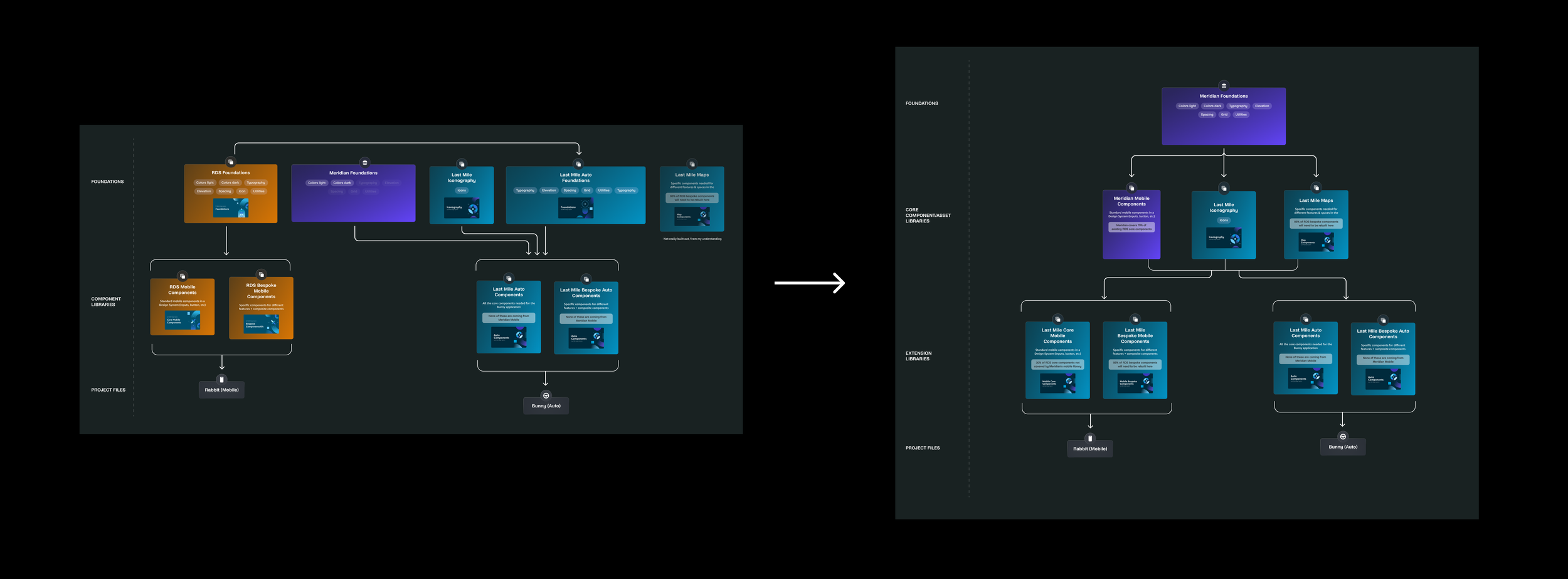
Before I started on this project, the Flex app used the Rabbit design system (RDS) (foundations, icons, core mobile components, bespoke components, & workflows) that was a copy of a bigger design system (Meridian). RDS was to be deprecated and replaced by a new system (Last Mile Mobile) that would be a branch off of Meridian so I was responsible for redesigning all of the RDS files using Meridian styles & tokens, so that when the branching was done all components could be dev’d out using Meridian code as a base. This included all foundations, icons (502), core mobile components (46), bespoke components (61), map components, and workflows (79 workflows with ~10 screens each). On top of this, I was responsible for redesigning the tablet version of all components & screens in a separate library (Last Mile Auto).
Process
First, I started with an audit.
Since there were three libraries (with files for foundations, icons, core components, bespoke components, and map components), I had to look through all three to figure what could be deprecated from each and what needed to be redesigned & rebuilt. Initially there were 57 core components in the extension library that went down to 37 on the first audit and 15 on the second
Meridian had it’s own mobile components so if a component already existed there, it had didn’t need to be rebuilt, but if it didn’t exist then it would need to be rebuilt and connected to the Meridian tokens.
I set up multiple Asana boards & ran weekly team meetings to check in and make sure that everything was on track while updating change logs in all files any work was being done. I was also responsible for doing RXBR reviews for teams using the systems, holding office hours for ad hoc requests, and intaking new components (and being in the know about all new components being worked on) so it was imperative to keep the team updated in case other tasks came up.
Since there were lots of moving parts it was important to make sure the client understood progress and priorities.
Asana Boards
Then I updated all of the tokens.
This meant going through every component and updating all fonts, colours, and spacing with the right Meridian token.
Meridian also had dark mode so the correct semantic tokens had to be utilized. Once this was done all components had to be moved to the Last Mile library and all sticker sheets had to be updated with both dark mode and light mode components and examples. I was also adding notes within each page around what was different from Meridian and why the change was needed.
Once the audit was completed, I set up a project plan. I worked in two week sprints, with weekly team meetings & accompanying Asana boards & Quip (for weekly task logs).
Meridian Token Updates
The goal was to use as much of Meridian as possible and if not, then use native components so dev time would be decreased however we had to think of the user first and do what was best for them, and what was best and the most consistent for the system. If it was a custom component then we built that but the due diligence had to be done.
I had to research all native components for feasibility however, if the RDS / Last mile team needed something custom, then that was what needed to be designed.
Native Component Research
If a component didn’t exist in Meridian the team urged us to use native iOS / Android components
I also looked at ways to make the system better
If there were components that could be merged, or made with fewer variants, or just made better because of Figma improvements, then I remade them.
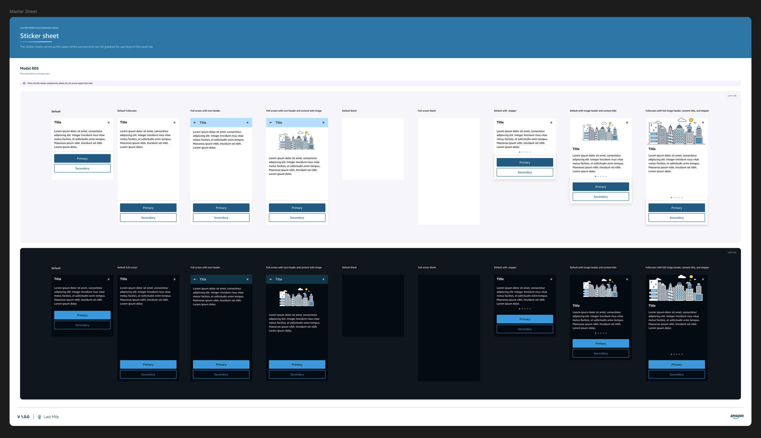
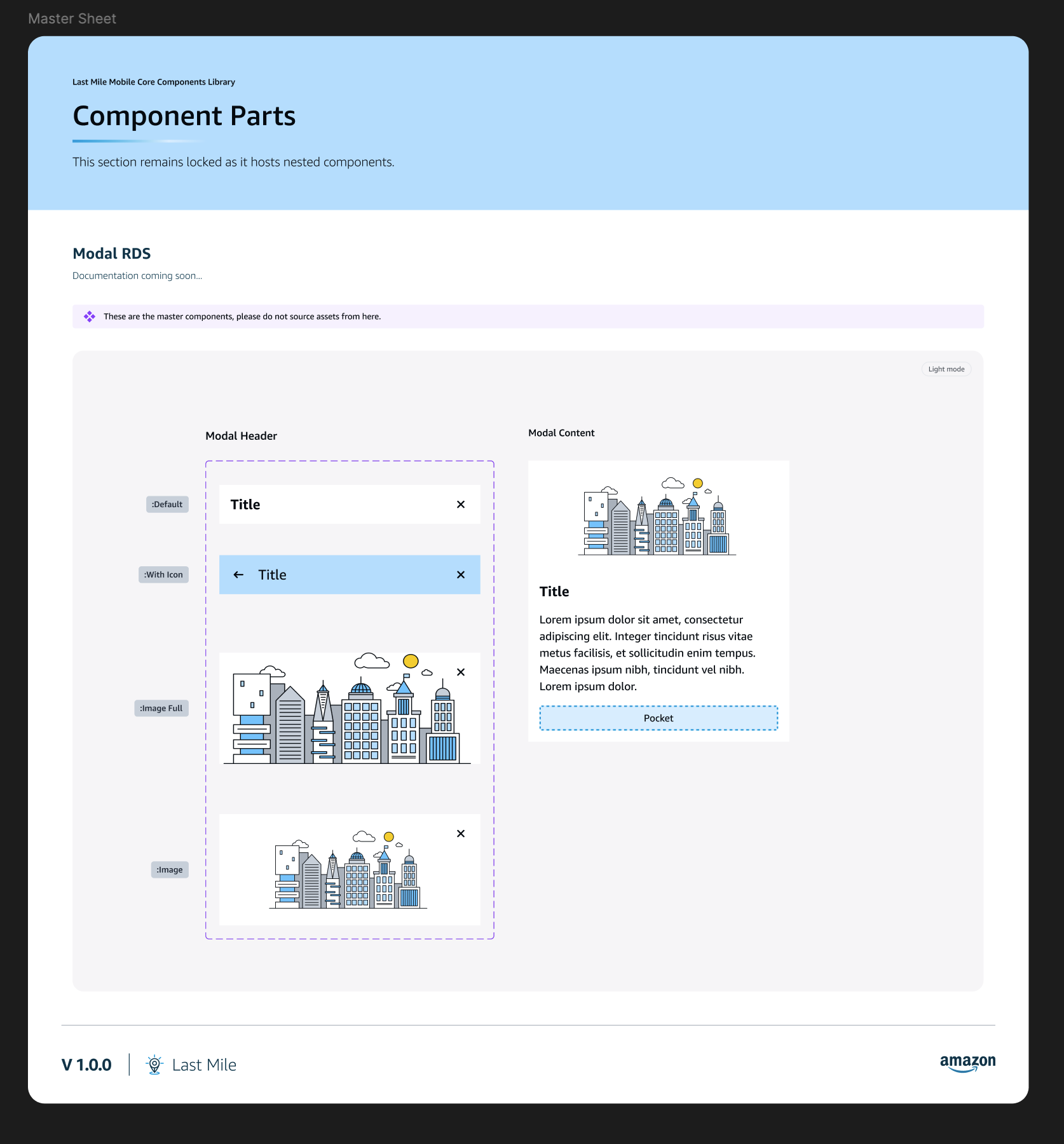
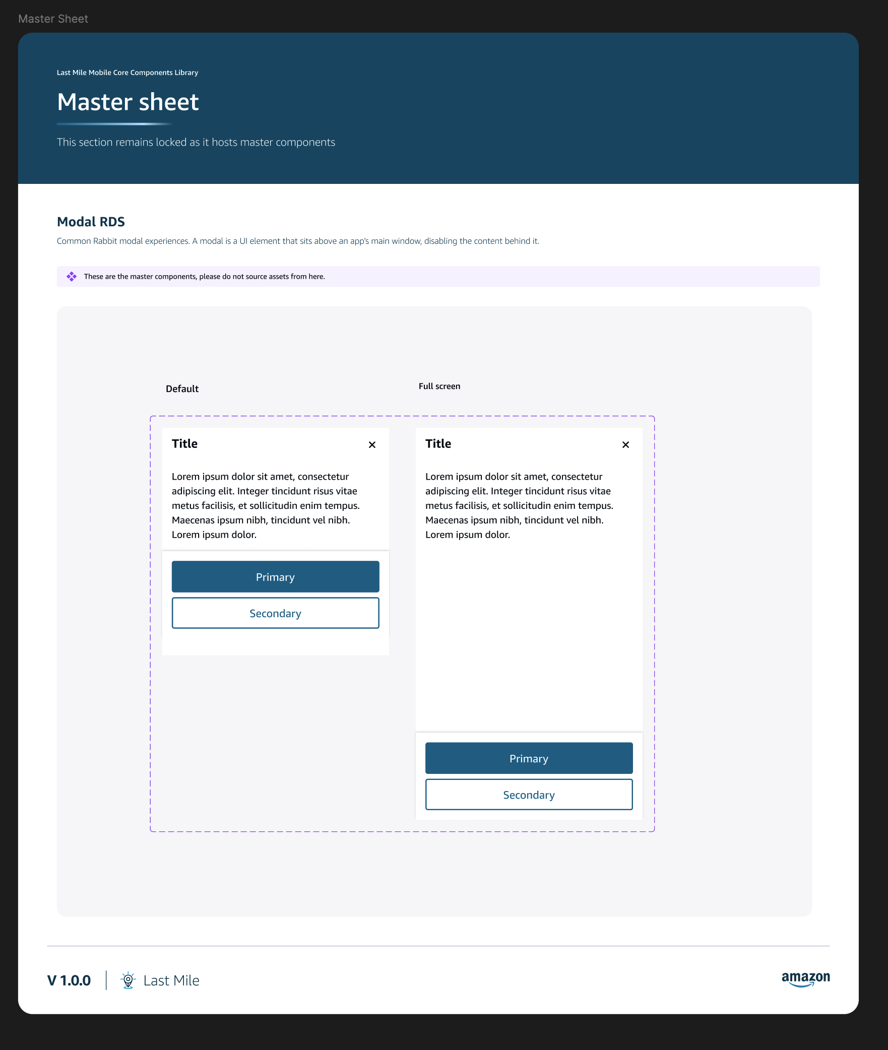
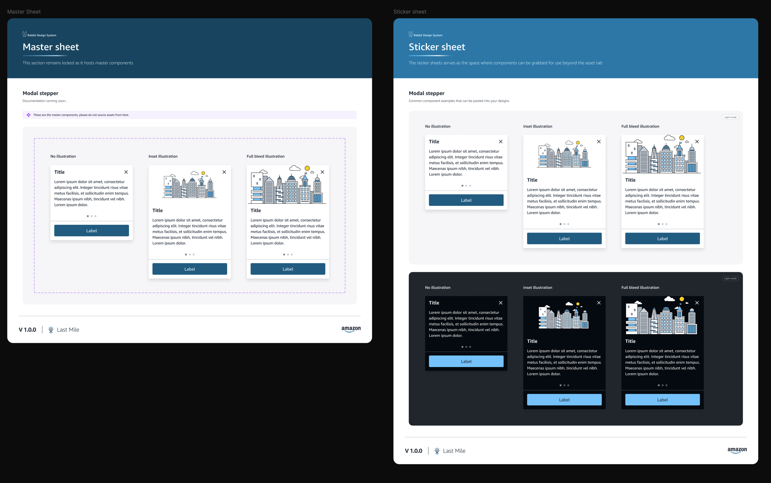
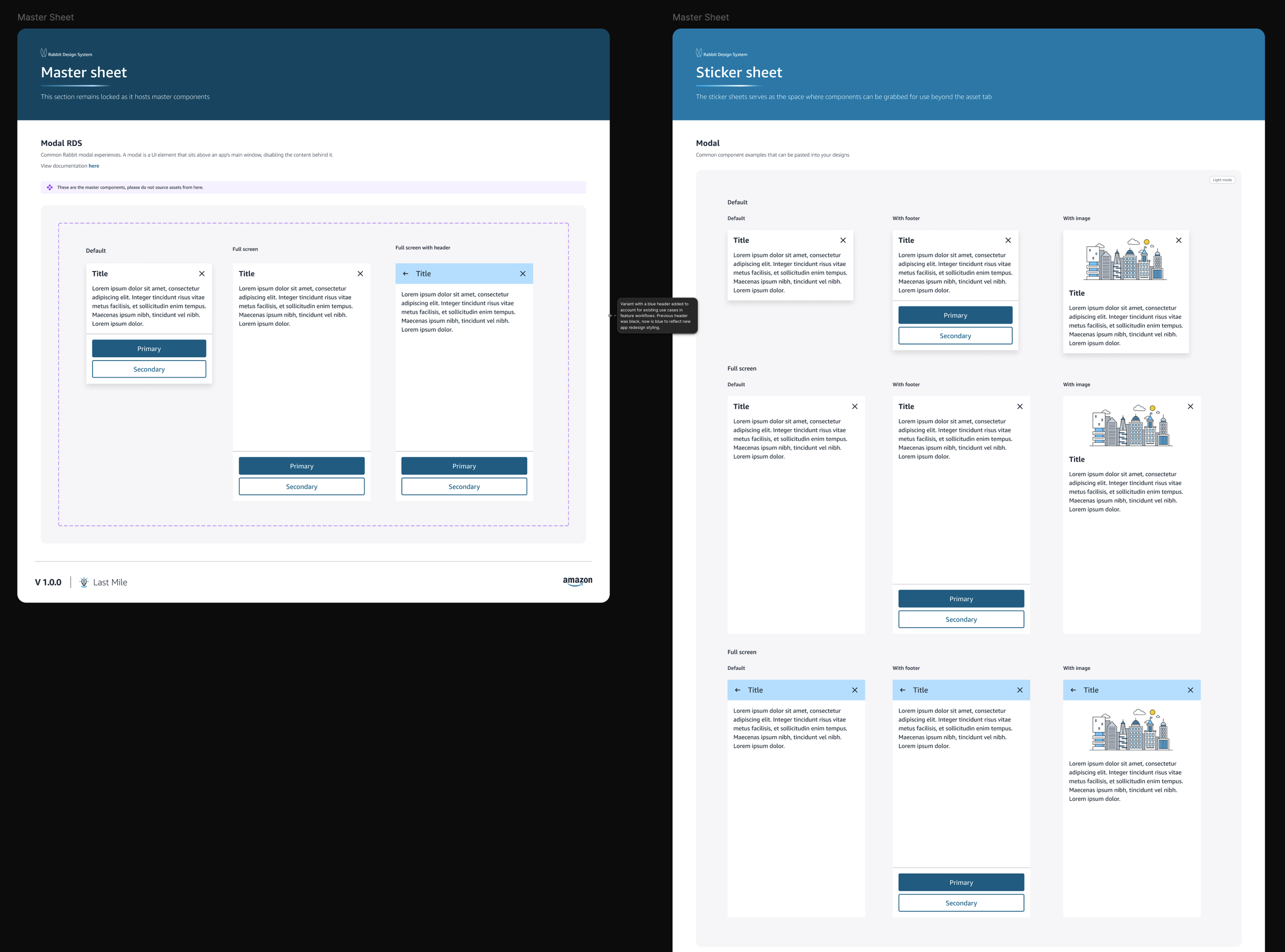
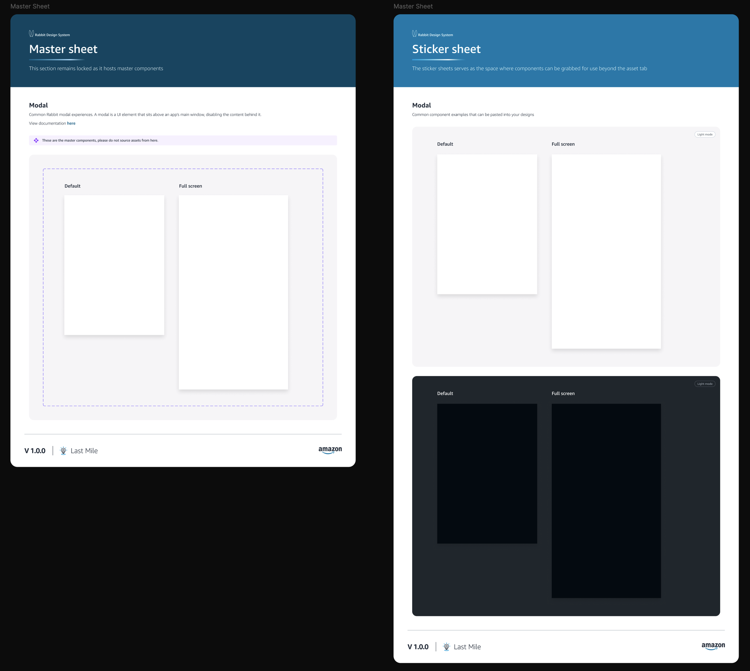
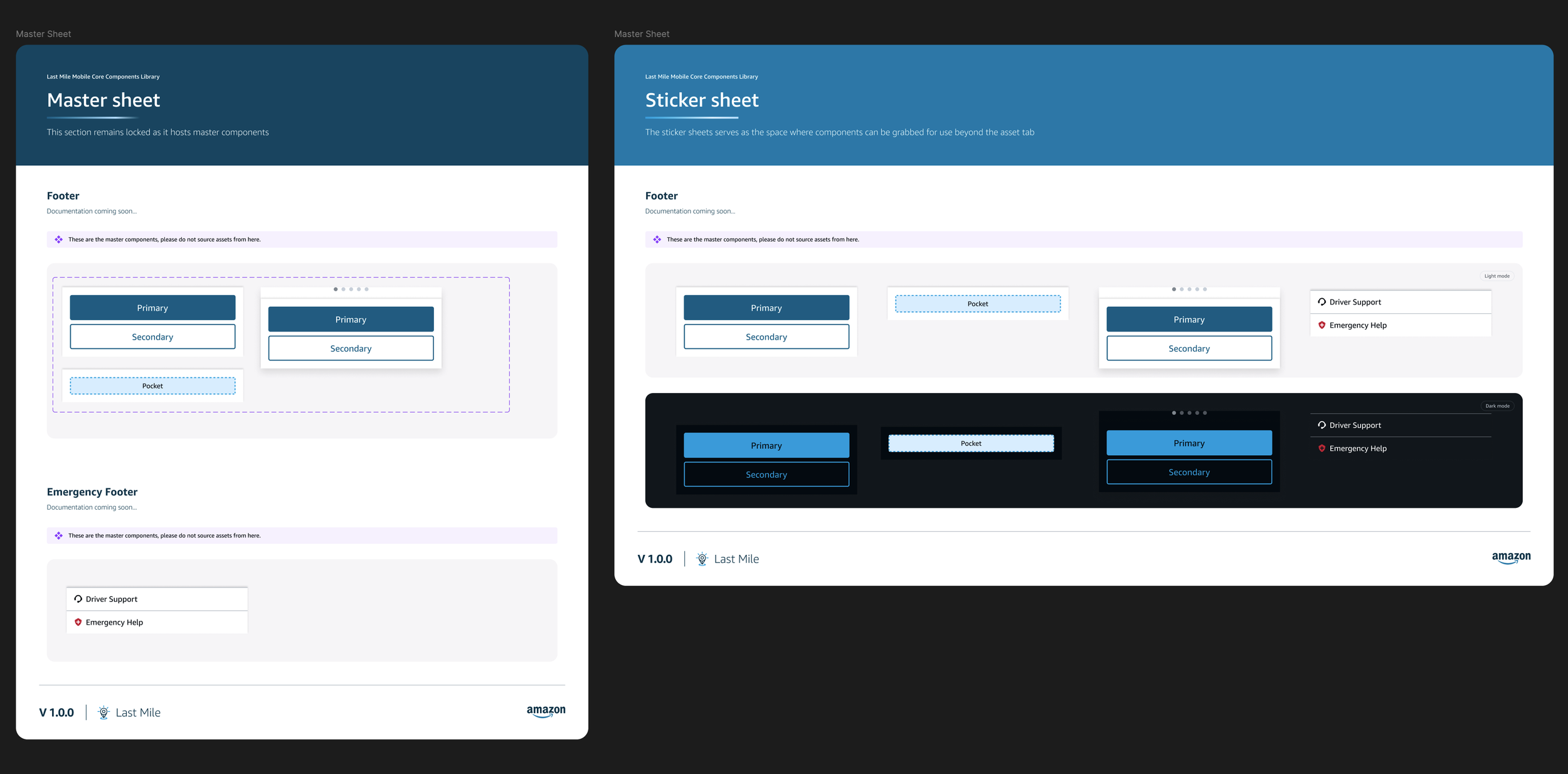
For example, the Modal component pictured below was remade because it was separated into with a footer with a stepper, and a version that was blank, and a version with an image in the content container. I was able to remake the footer as well as the component parts and the modal with just two variants that could be customized using properties to have as many variations as needed.
After 3
After 2
After 1
Before 3
Before 2
Before 1
After 4
This ensured that designers had all the properties that they could need and could change instances easily with the click of a few buttons instead of detaching and recreating the component.
The appearance was linked to the property instances and set up with default content & preferred values
Properties
Linking appearance
All components were then set up with the correct properties (to match the Meridian Library)
Preferred Values
Iconography
I also remade the icon library
Initially icons were in multiple files, with multiple pages, inconsistent sizing, and lots of repeats. I updated it from 502 icons to 246 icons with 4 standard sizes.
There was no consistency, and designers didn’t know where to look for the icons they needed often using the wrong ones because there were so many repeats. I audited all the icons, comparing sizes (coloured outlines below indicate icons coming from different files), design, and usage to see what was needed and what wasn’t, and then rebuilt the system. The new system included standard sizing, no repetition (obvy), tags & descriptions for searchability / findability.
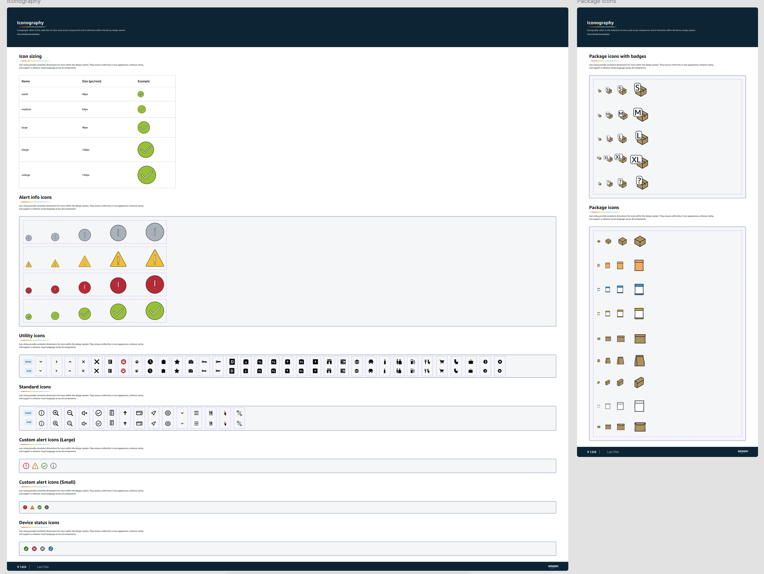
Before: Auto Page
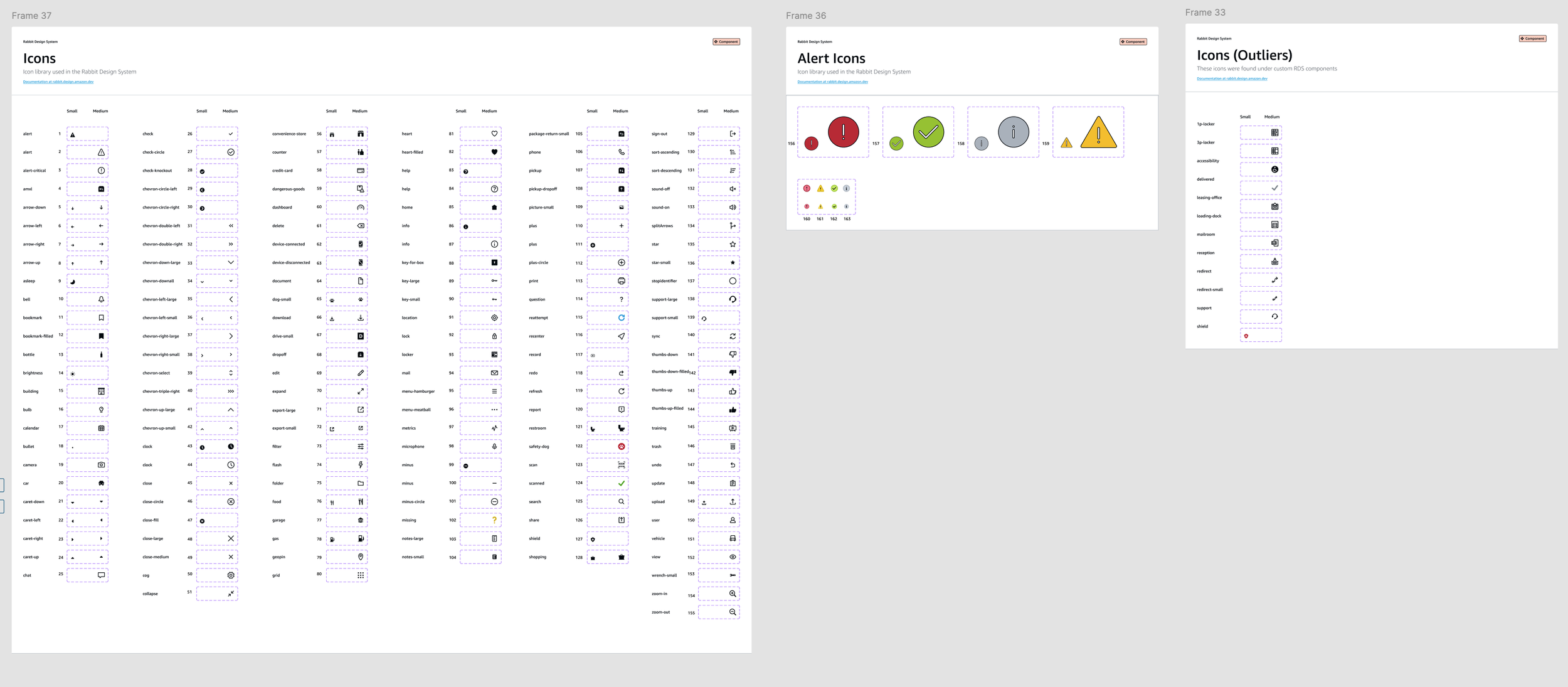
Before: Mobile Page
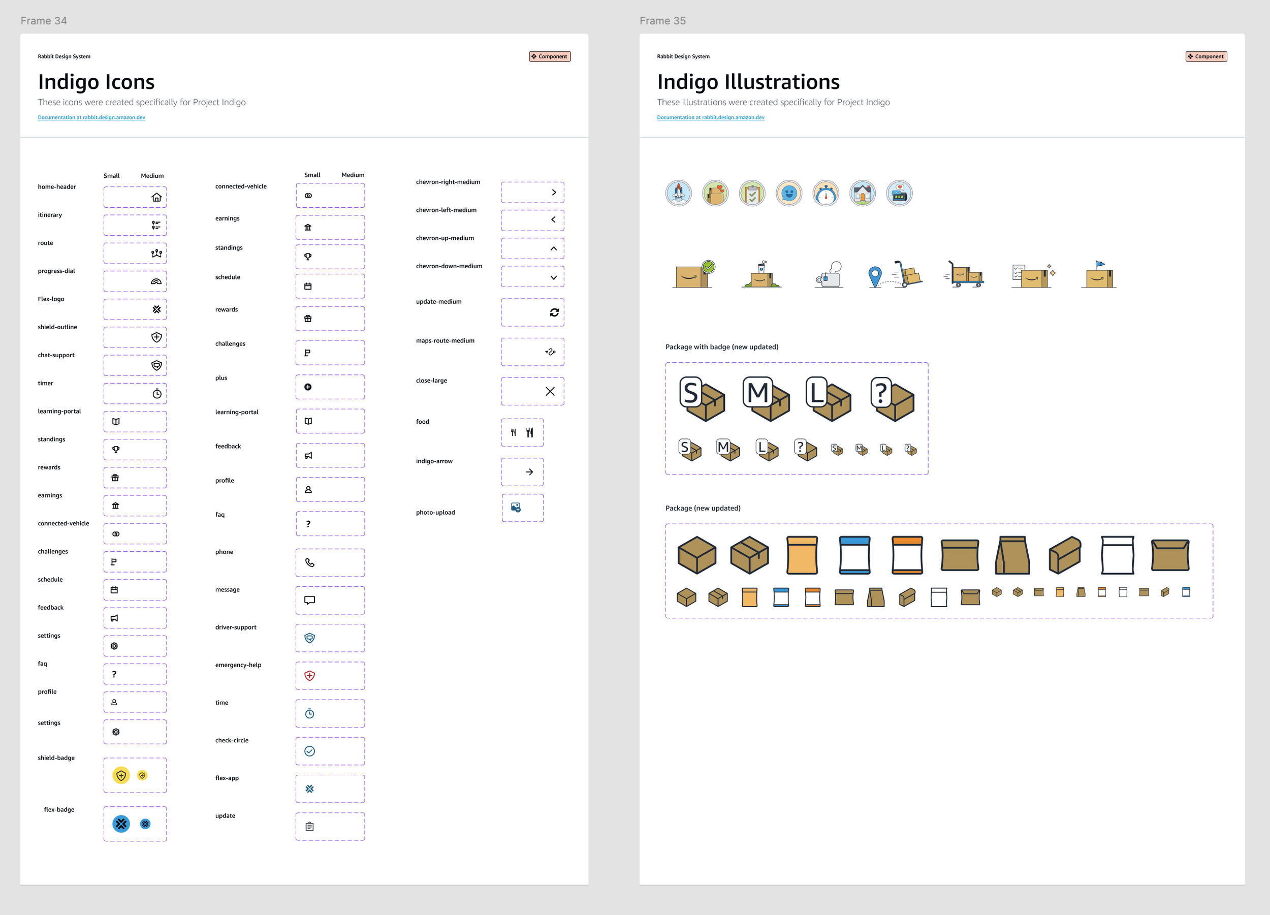
Before: Mobile Page 2
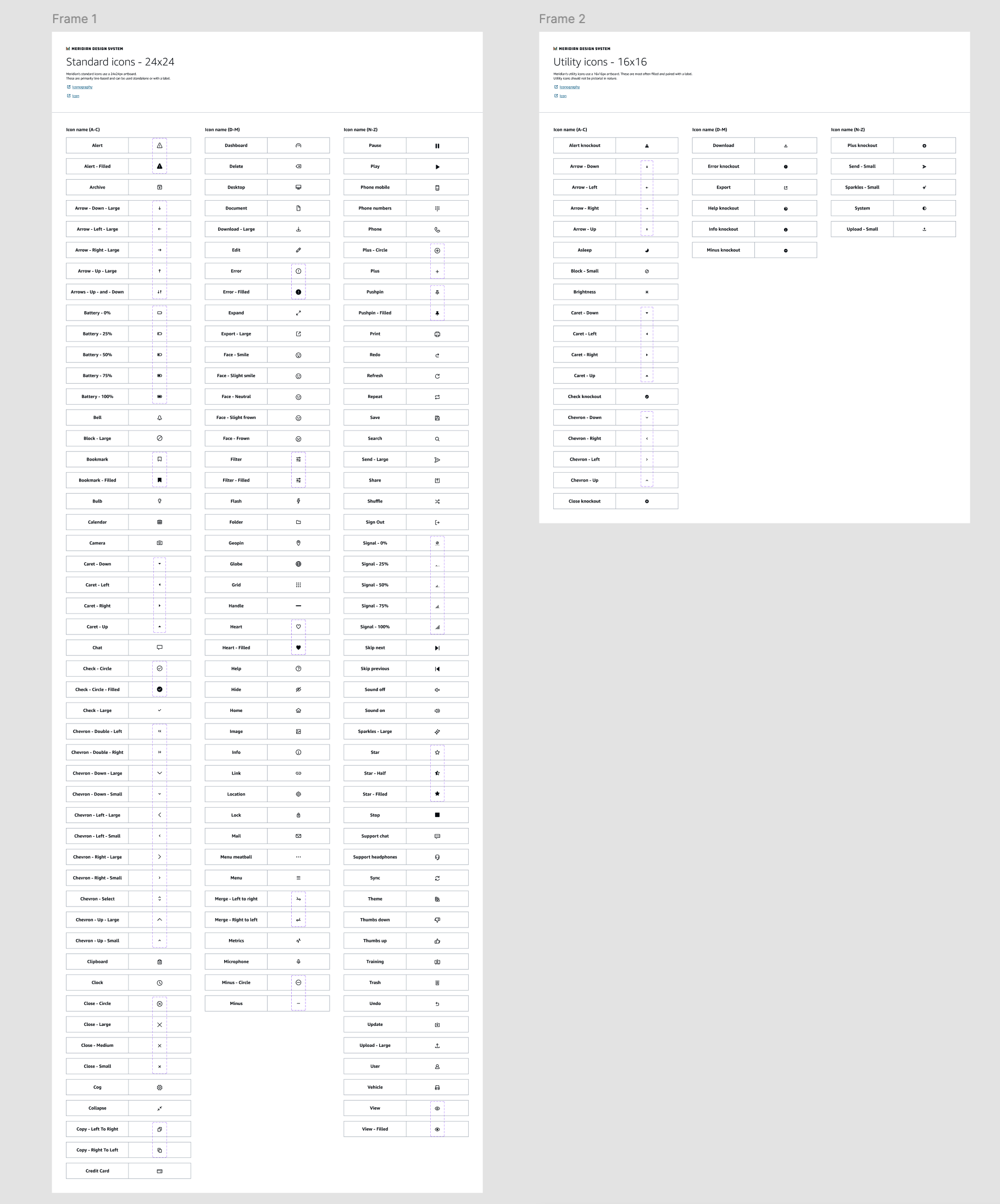
Before: Meridian Page
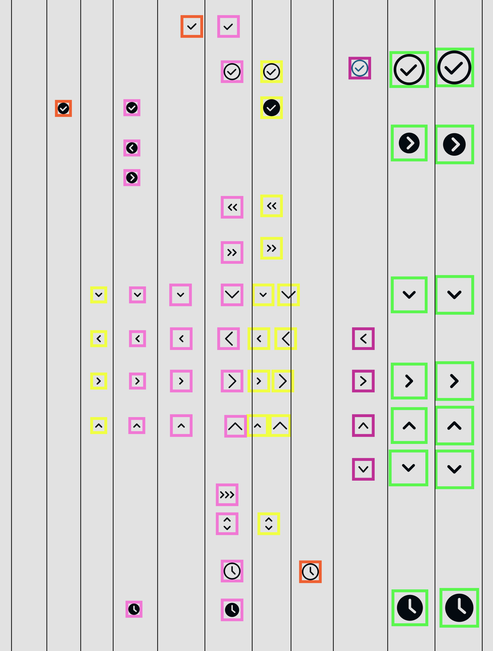
During: Size audit
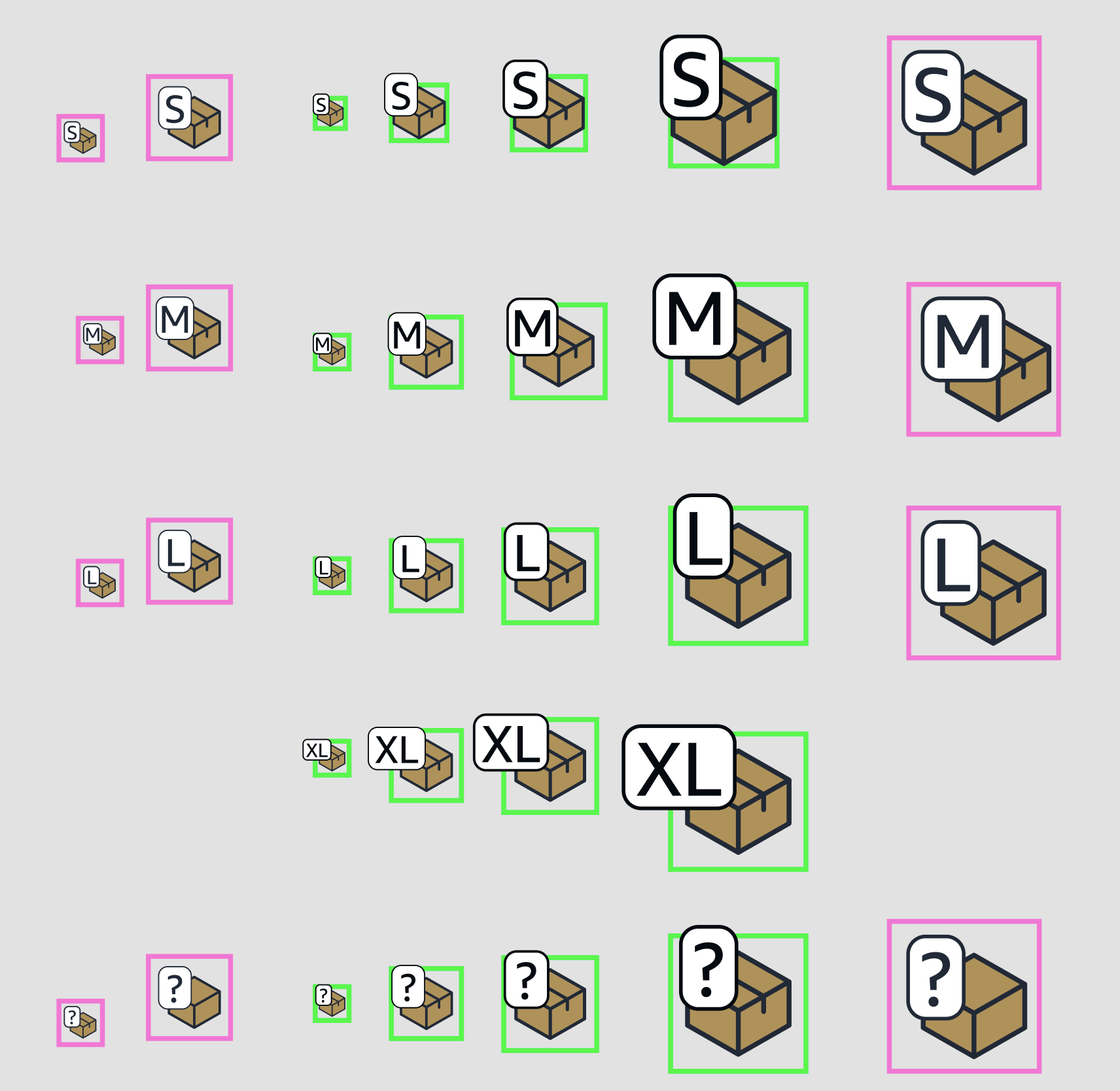
During: Illustration icon size audit
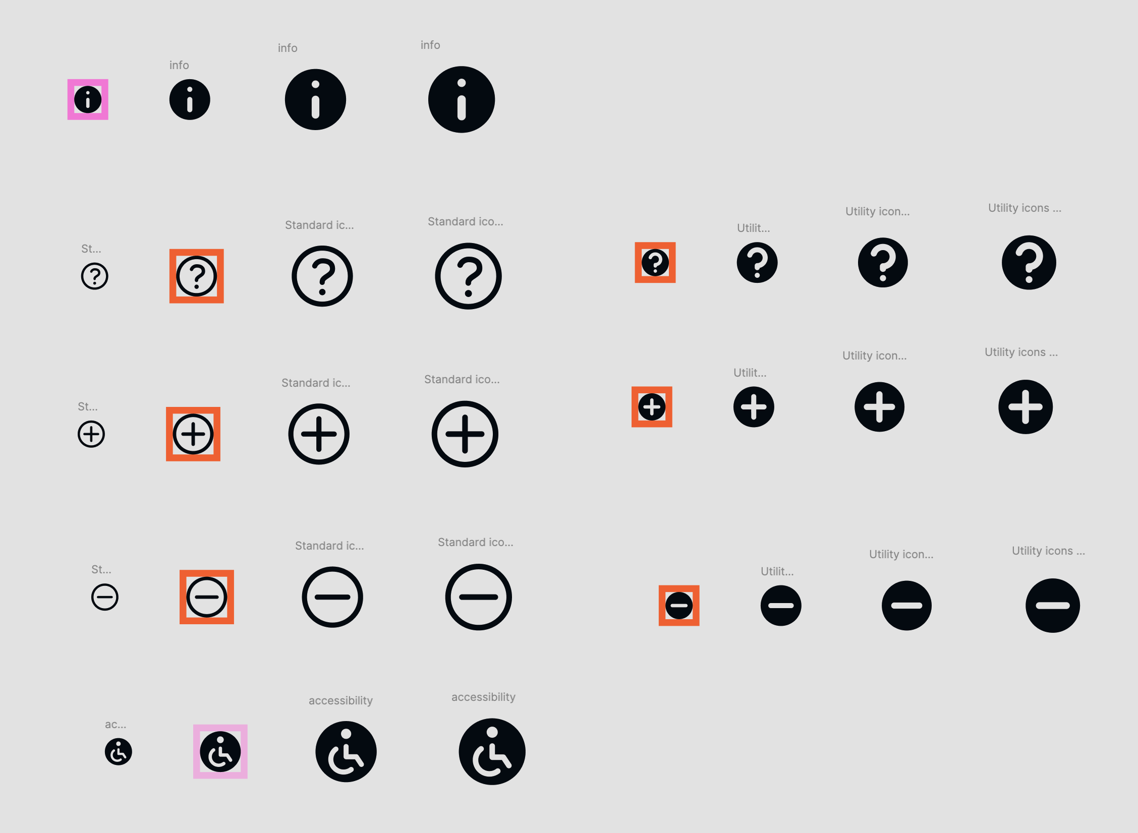
During: Circle icon audit
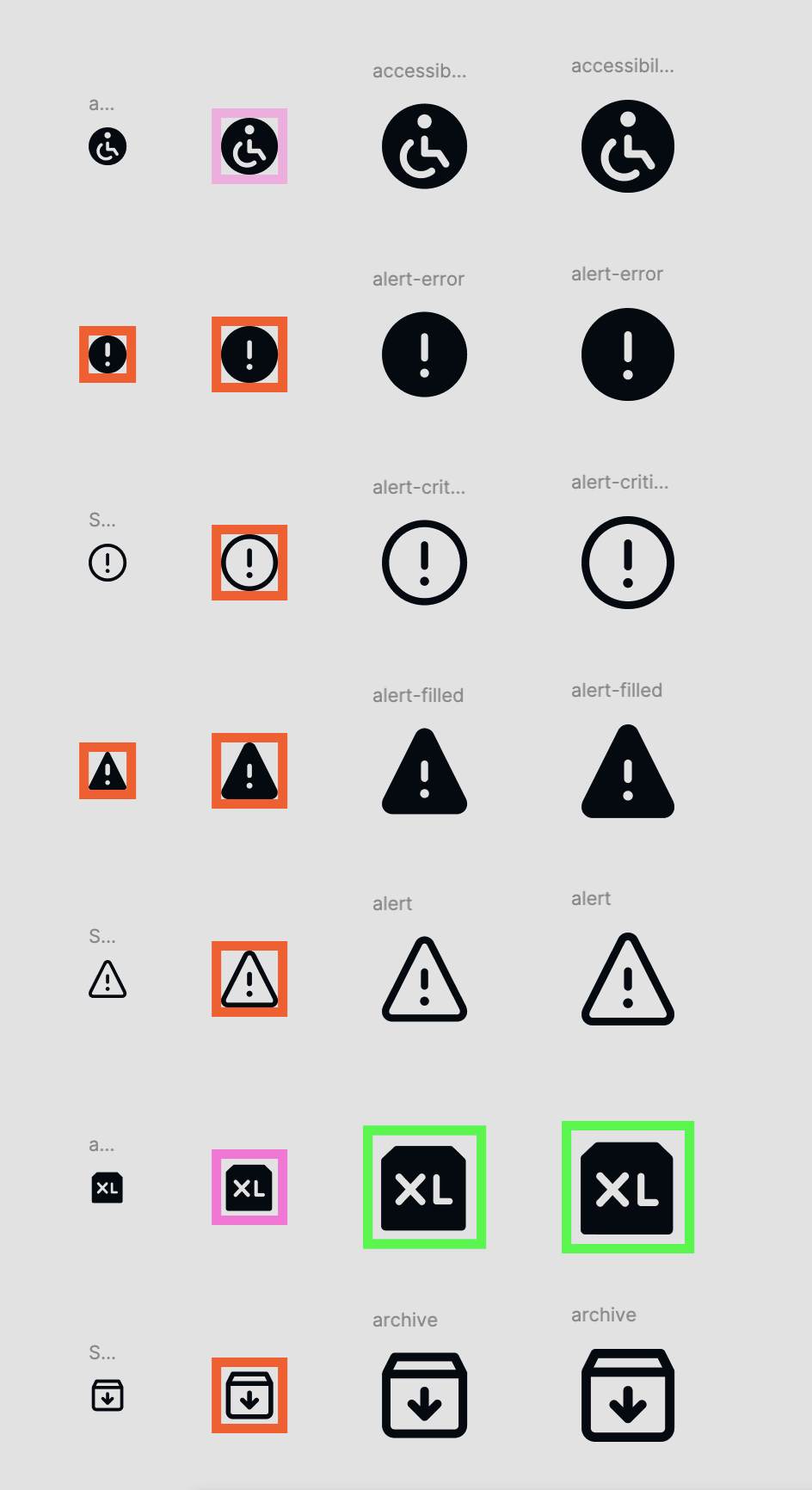
During: Icon audit
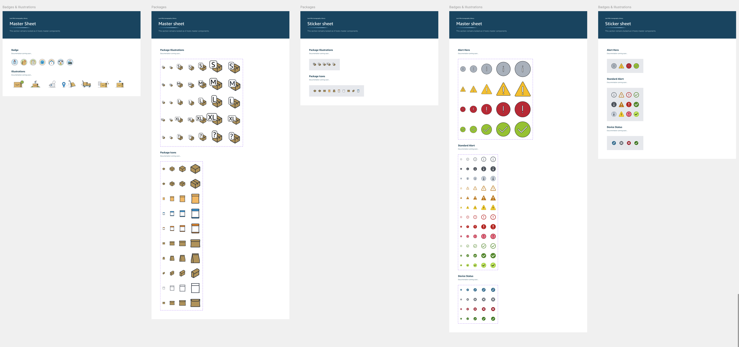
After: Illustration & alert icons
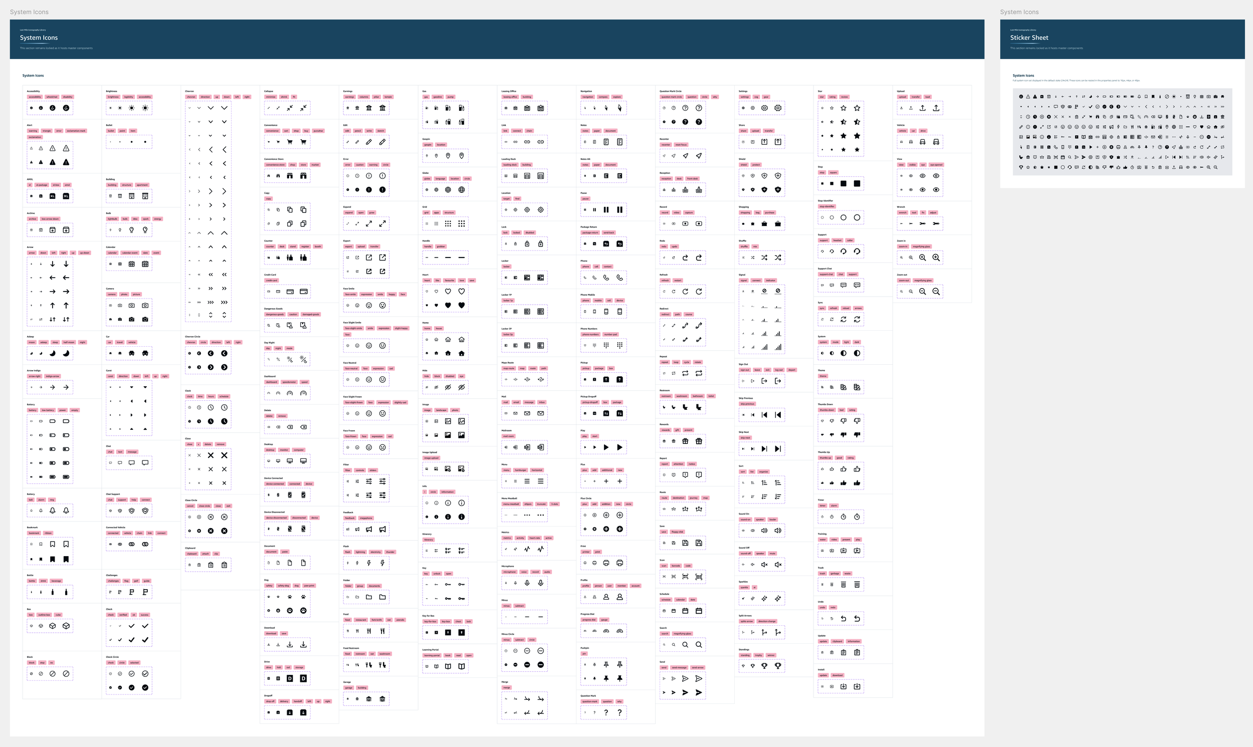
After: System icons master sheet & sticker sheet
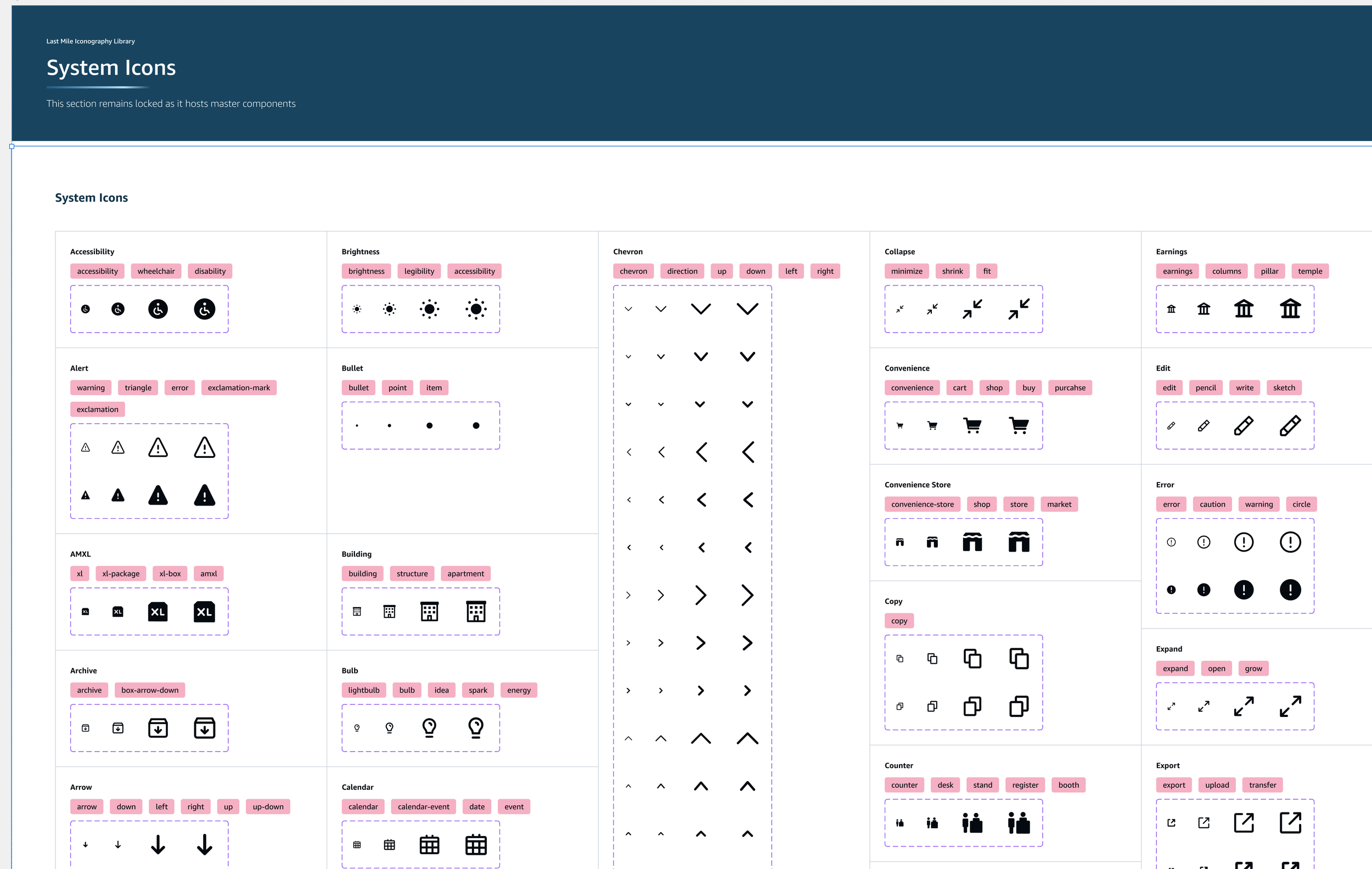
After: System icon tags for searchability
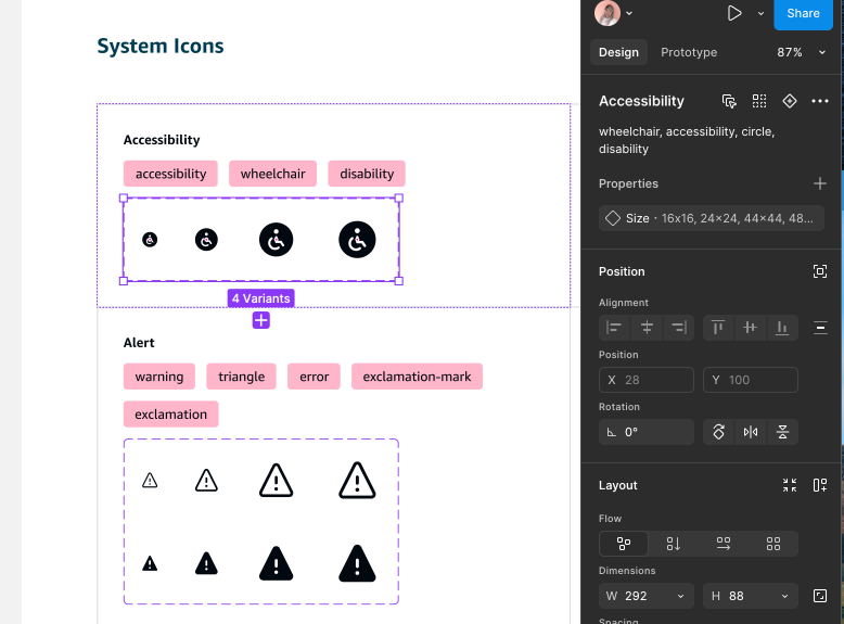
After: System icon descriptions for searchability
Workflows
Because this was done in tandem, it took a lot longer than anticipated, but in the end, every single screen of the Flex app had to be redesigned with the right components & Meridian tokens in both light and dark mode for both DAs & DPs (drivers who were hired through Amazon & used Amazon vehicls and those who were not - like Uber drivers who set their own schedules & used their own vehicles).
There were 996 screens that had to be re-designed using the new components in…the big pivot happened when 27 workflows were completed which took around 6 weeks.
This was done while rebuilding all bespoke components and map components
2/79 workflows
Workflow Prioritization
Once the icons were updated I rebuilt all workflows - 996 screens total
The big pivot…
After months (if not years) of work, we had to pivot
The client team (& leadership) changed, so there was a new push to use even MORE of the Meridian components, rebrand the work, and re organize the system (again) based on team governance
We had to re-audit the 37 components again, and see if there were more ways to use Meridian components and brought them down to 15 core atomic components. Since a lot of the Bespoke components were team specific we also looked at how they would be built and who would maintain / govern them once they were built, and how we could build a system around everything.
Over weeks the team looked at all 3 libraries again making more strict cuts. We looked at usage of all components in all workflows, dev implementation estimates (using Meridian components would be a much lighter lift than making new components), and had multiple workshops with the client to present our recommendations.
This was done while rebuilding all bespoke components and map components
Mind Map
New Figma Structure
All components had to be re-audited and re-organized to fit this new structure
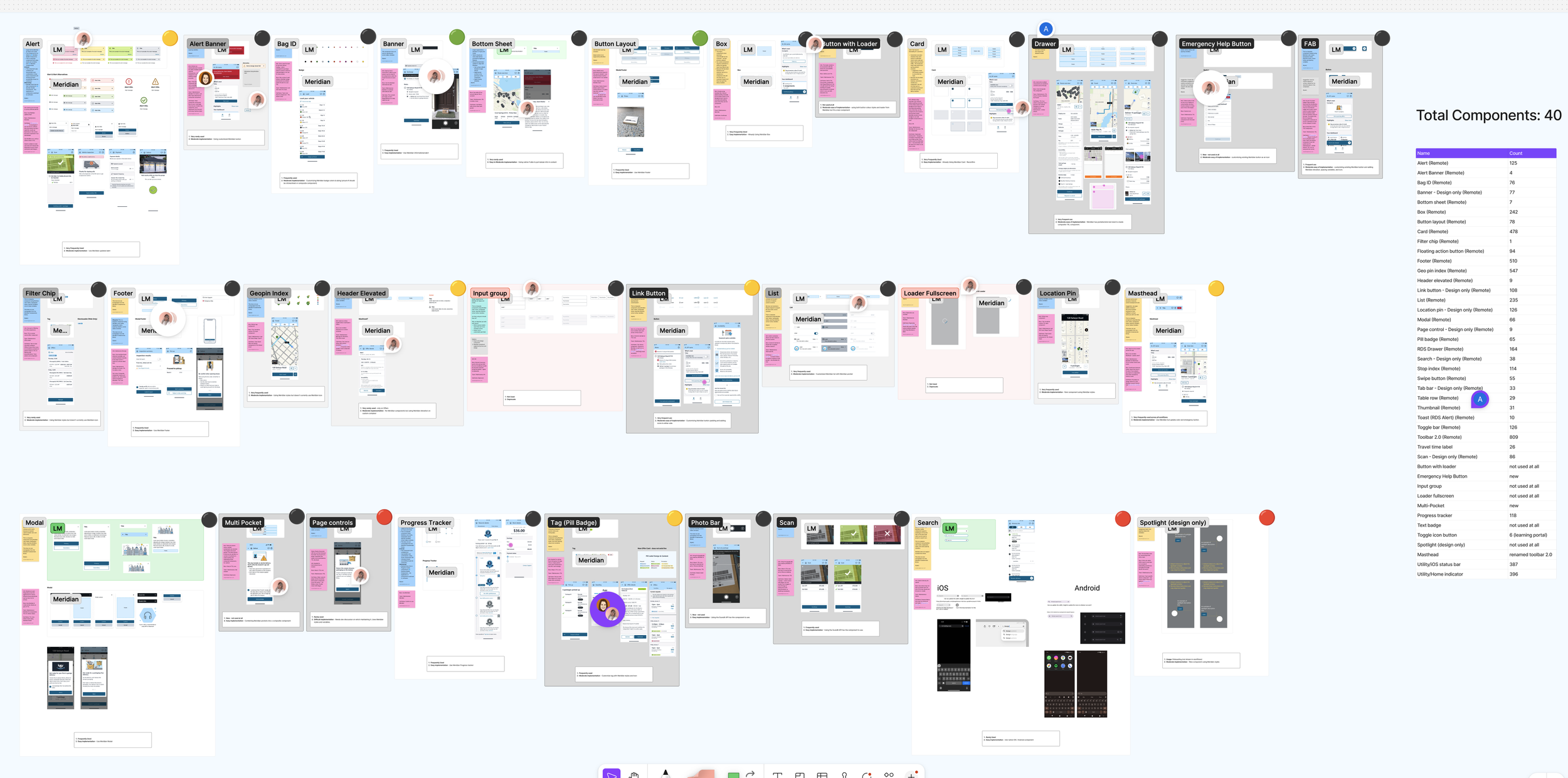
Component audit workshop info
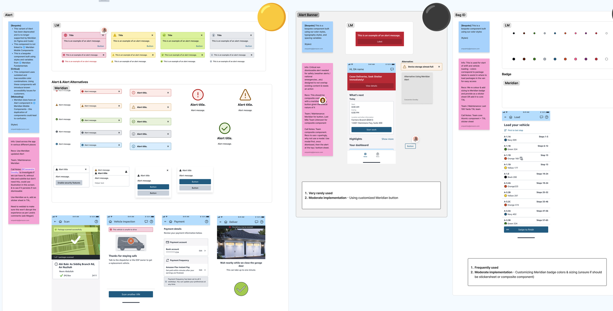
Component info
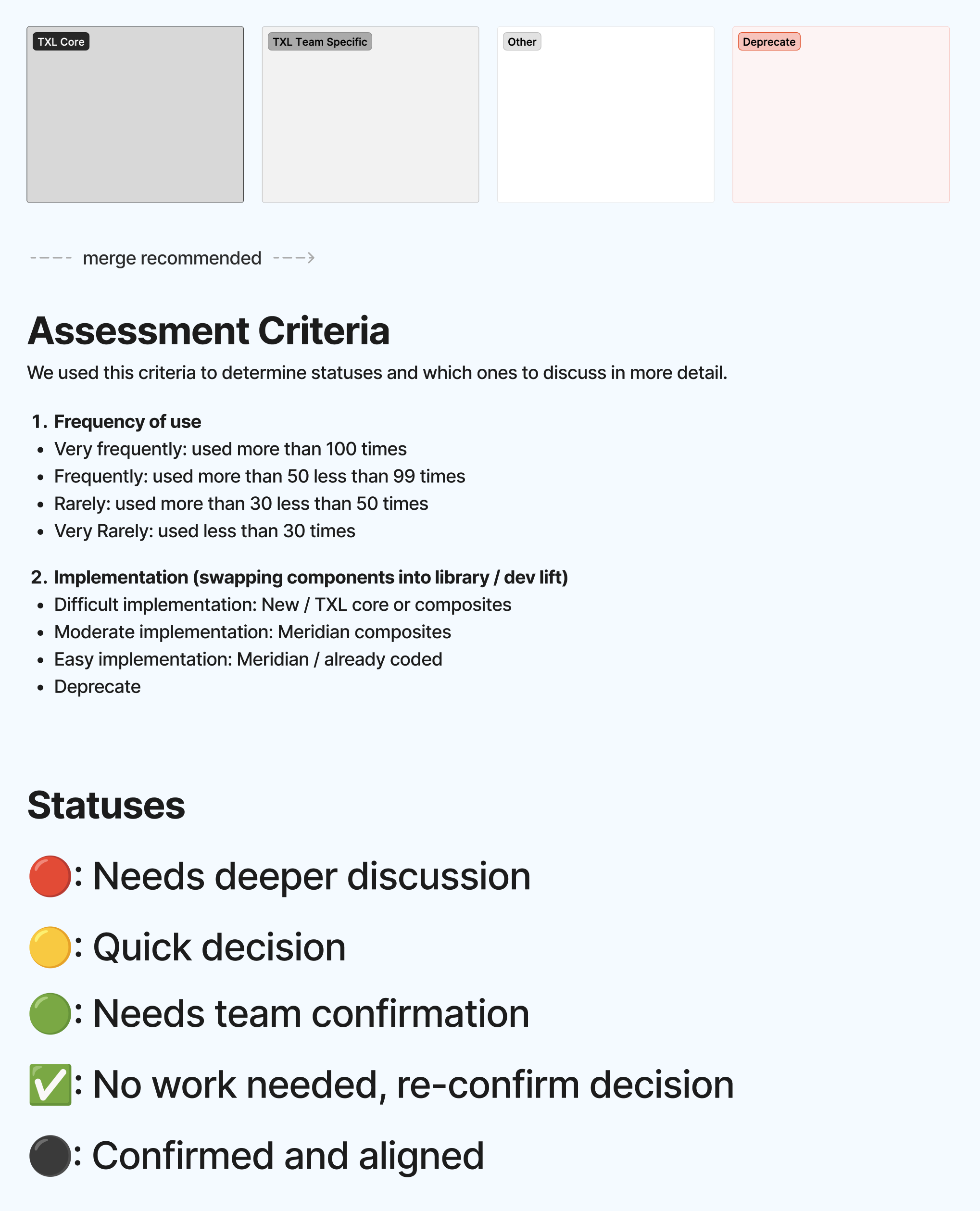
Legend & criteria
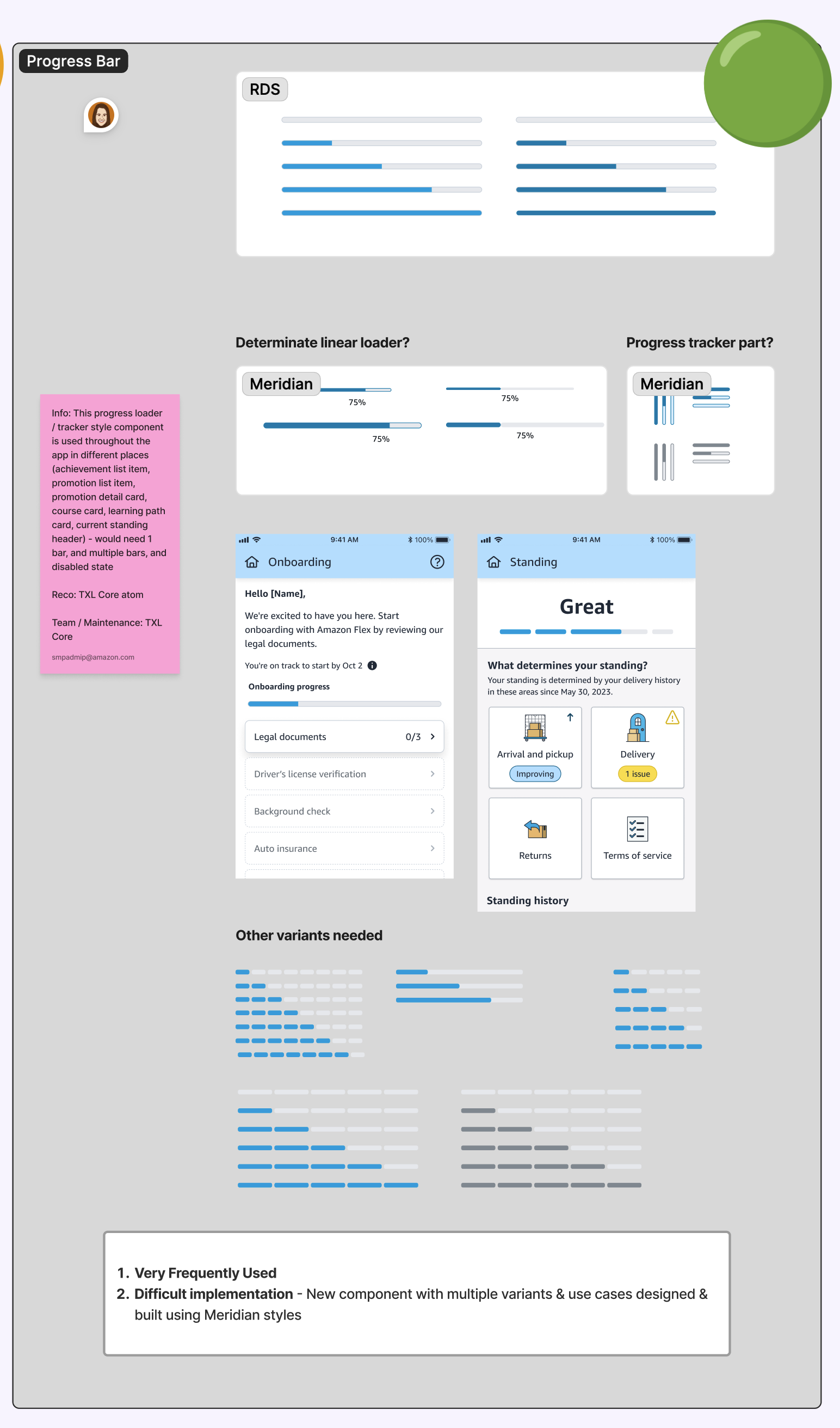
Component example
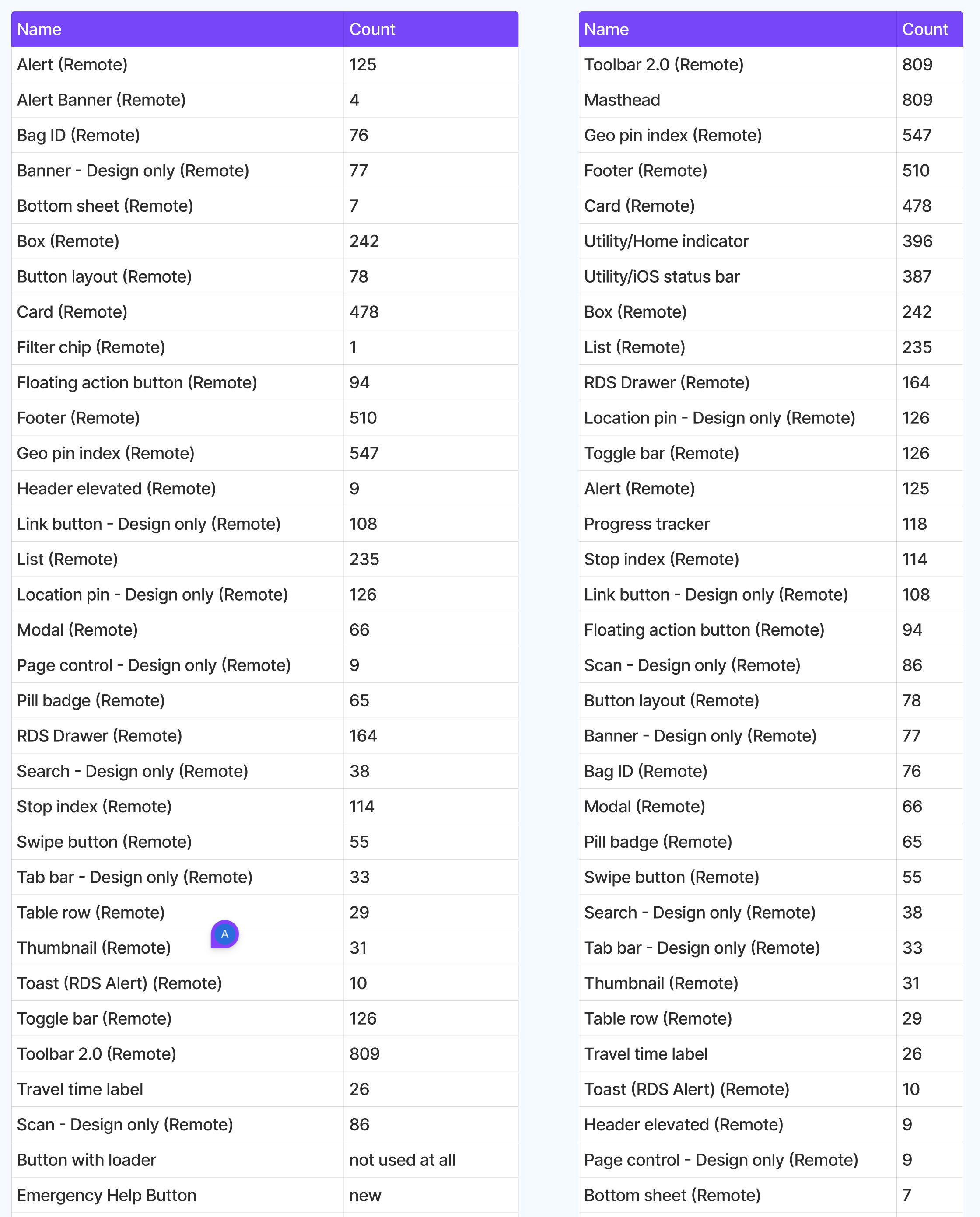
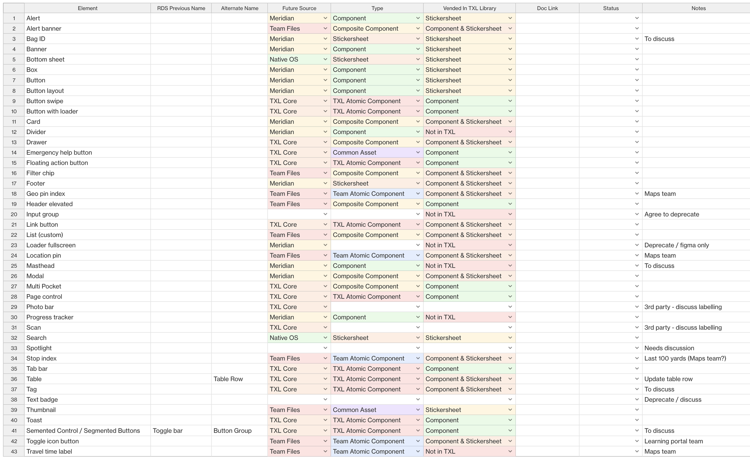
Master Sheet 1
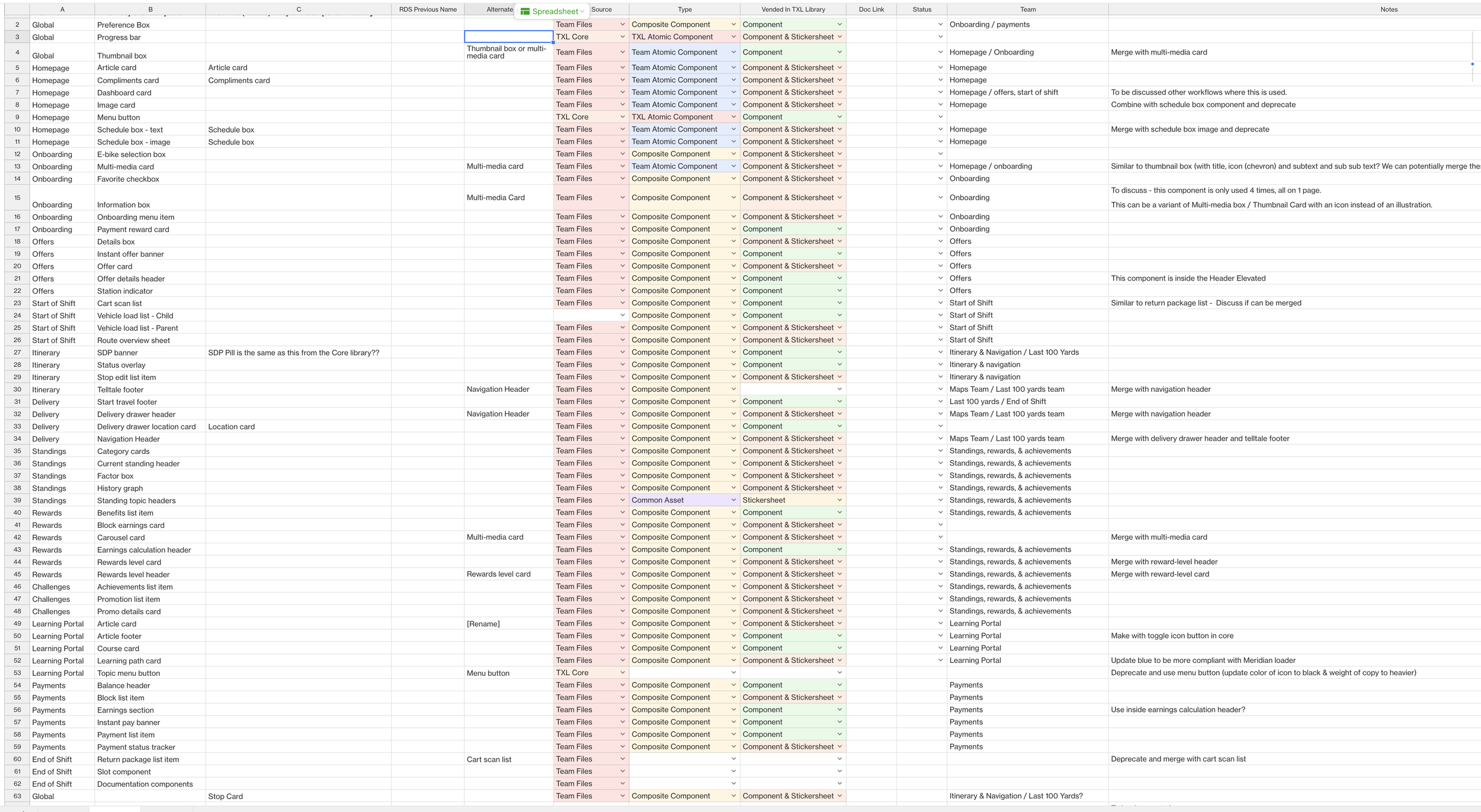
Master sheet 2
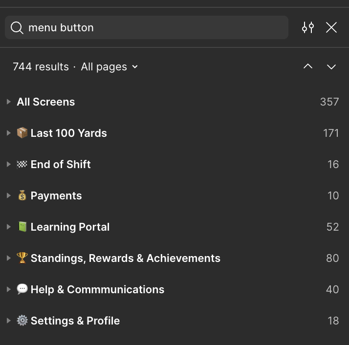
Component count by team
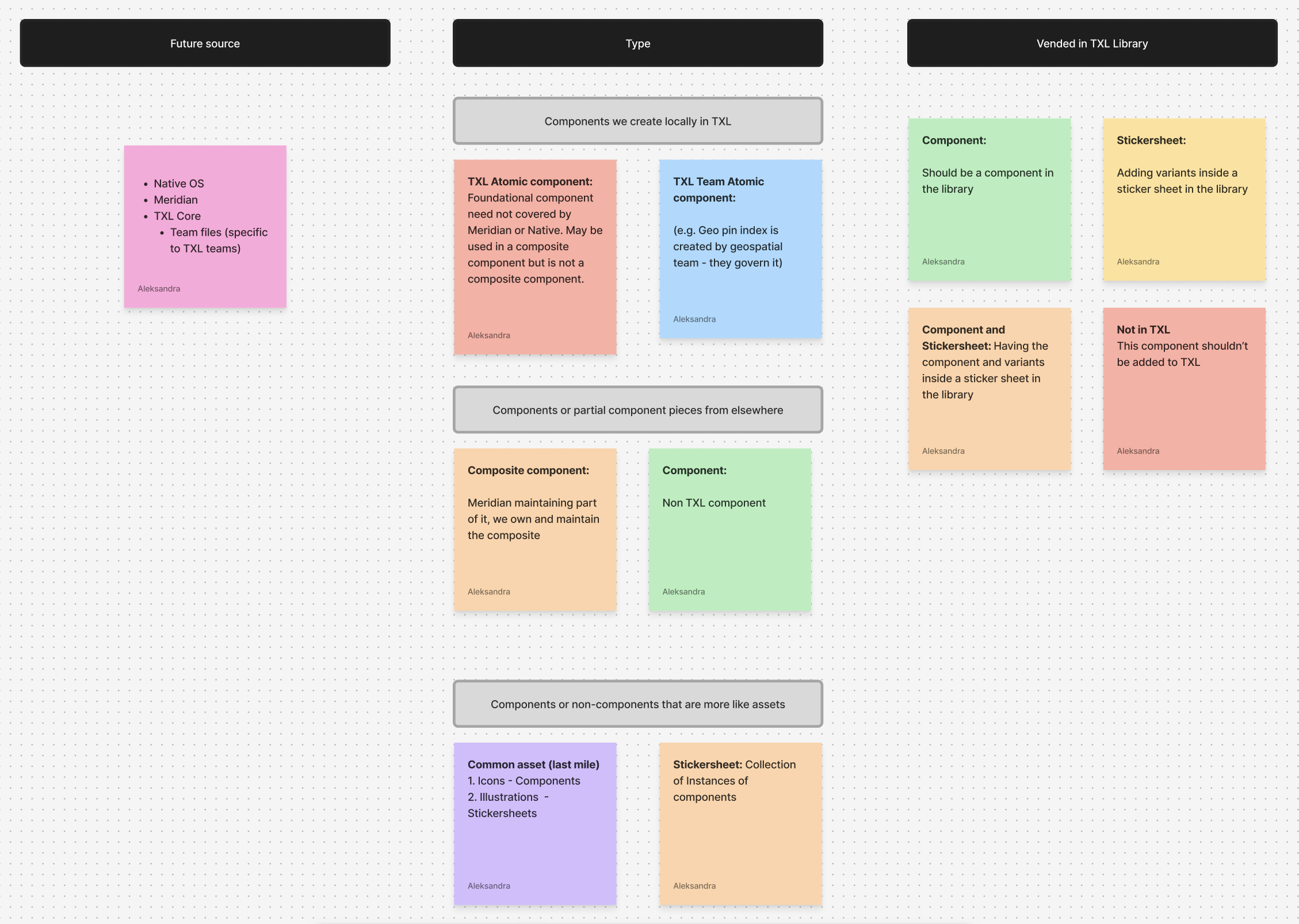
Structure criteria
We had a very short timeline and lots of stakeholders as well as questions that needed to be answered before we could move forward. There were too many unknowns to just make changes that would affect a lot of people.
I created a new project plan in Asana to track progress for our new launch as we had to have multiple additional calls and workshops to understand how the components differed from what was in Figma and what was live, how some could be rebuilt using Native code, and how that would affect the team.
New Asana Boards
After we aligned on the new structure, I created a whole new Figma space for all the assets.
The biggest hurdle was ownership of the new system and the components. Since there would not be consistent maintenance we had to set everything up so that it had the least work, and would not block our teams from continuing their work.
Components were organized into Core, & Composite that would be maintained by us (the goal was to have these under 10 - bringing them down from 37 - which was initially 57 when I started this project), then deprecate the rest (15 were deprecated and the team was to use Meridian components instead), make some into Native components (6 were to use Native code - even though we researched more), and 13 were to be managed by other teams.
Once the second audit was completed, components had to be organized, re-made, and documentation had to be created.
New Figma Space
We would have to design multiple screens using Native components for both iOS and Android and then present it back to the team and the devs and get everyone to sign off on moving forward with them. We documented all options and all notes on where we could foresee issues so the team could make educated decisions.
For the components that the team decided could be dev’d using Native iOS / Android code, we had to make sure the solution was feasible for all teams.
Native iOS & Android research
Native mocks
Additional work also had to be done for certain components that were not going to be custom
iOS Details
Finally, components had to be re-made, sticker sheets created, and documentation written (along with training guides!)
The longest parts of this process were the final steps due to busy calendars, vacations, and end of year approaching (and just everyone always being very busy at Amazon).
As components were being re-made, and documentation created, there were rounds of reviews with various subject matter experts. Since many designers worked in silos, as they provided new information on what was live, what the interaction patterns were, and what was in development, we had to pivot and edit. There was no single source of truth so getting the right information to add to documentation was challenging. Team members also moved in and out of roles so even finding the right person took time.
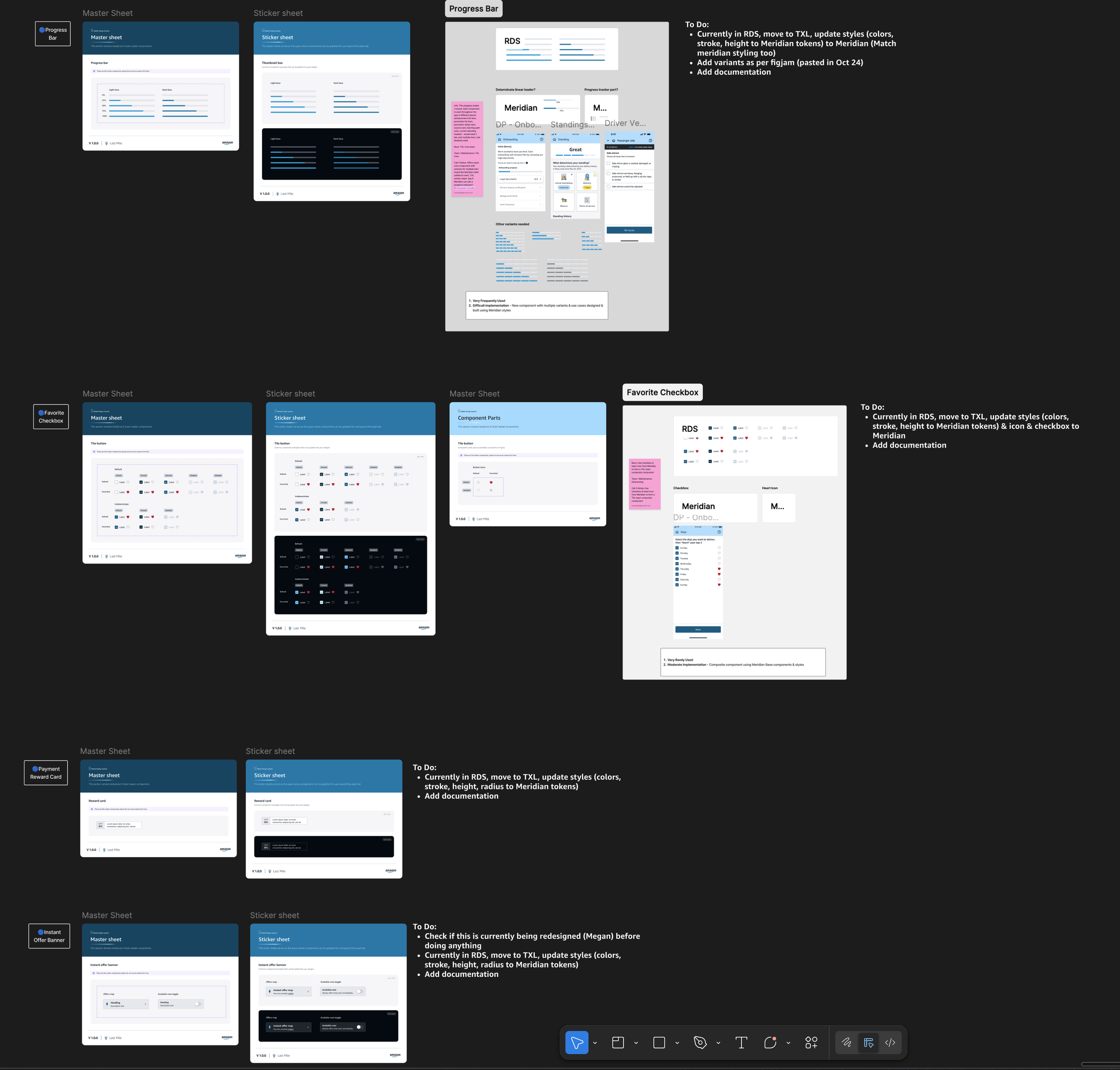
I put all the components that already existed in one place and added to do's
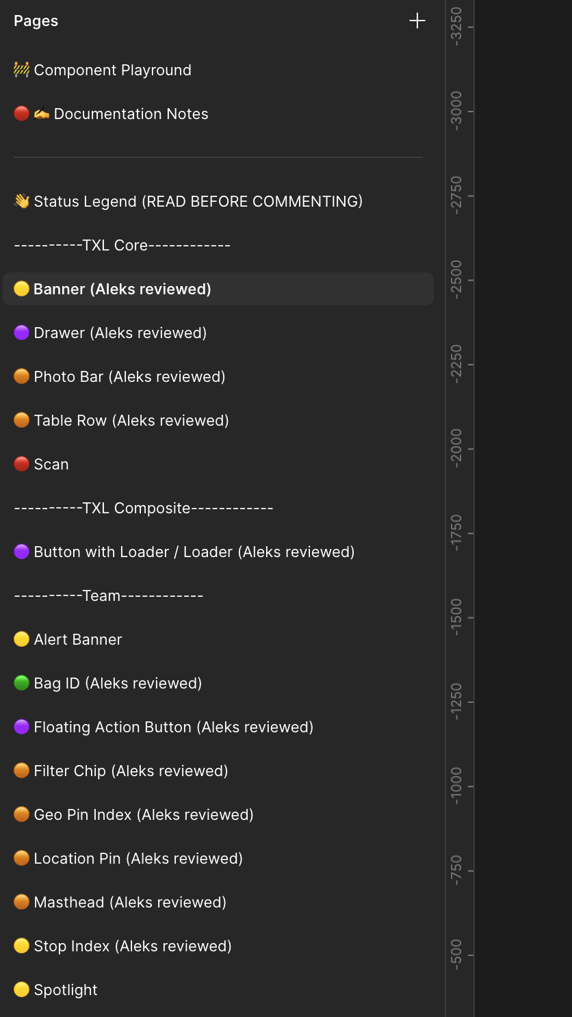
Each page was named by section / component and had a status tracker
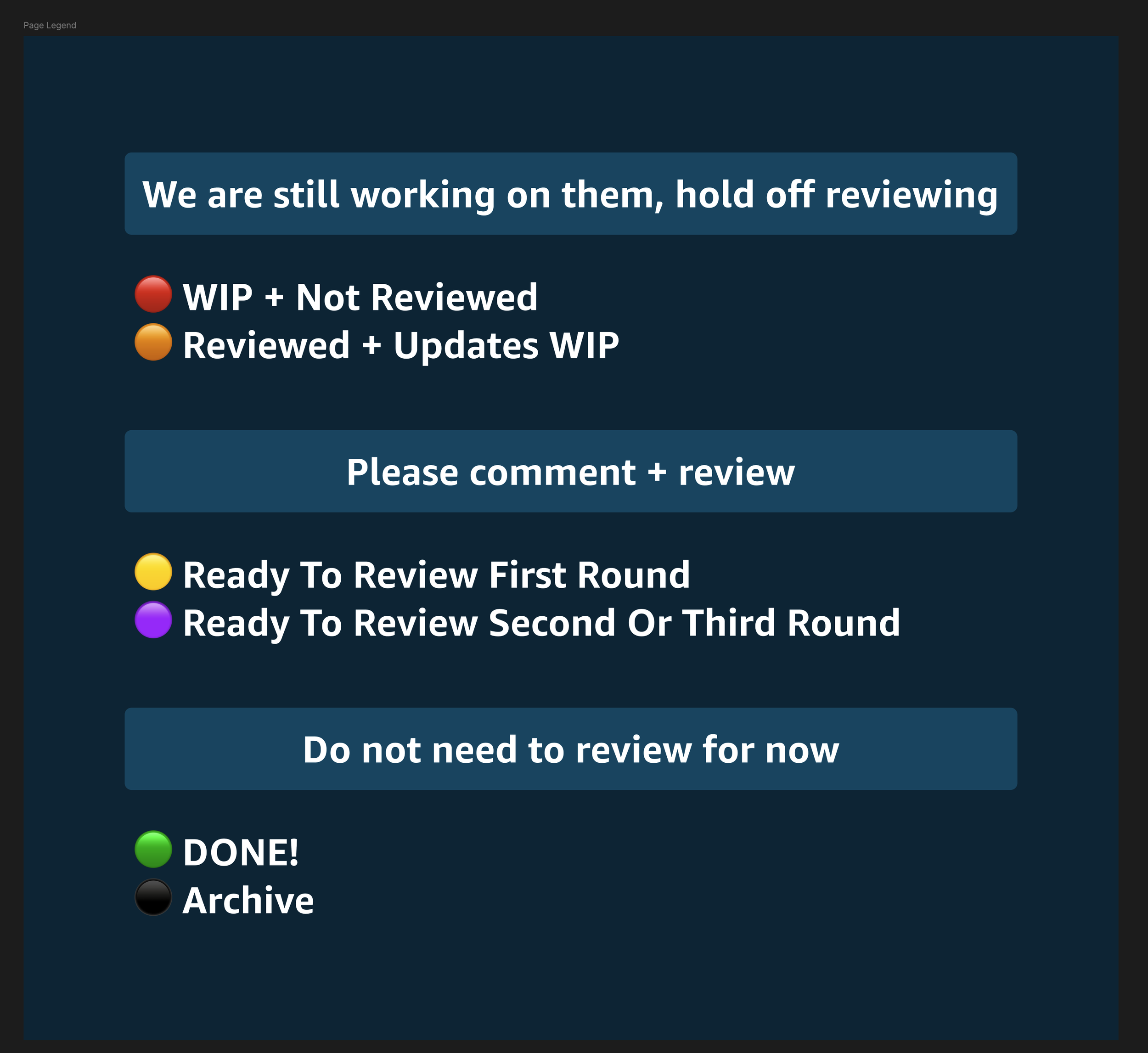
Status's had to be updated constantly since there were multiple rounds
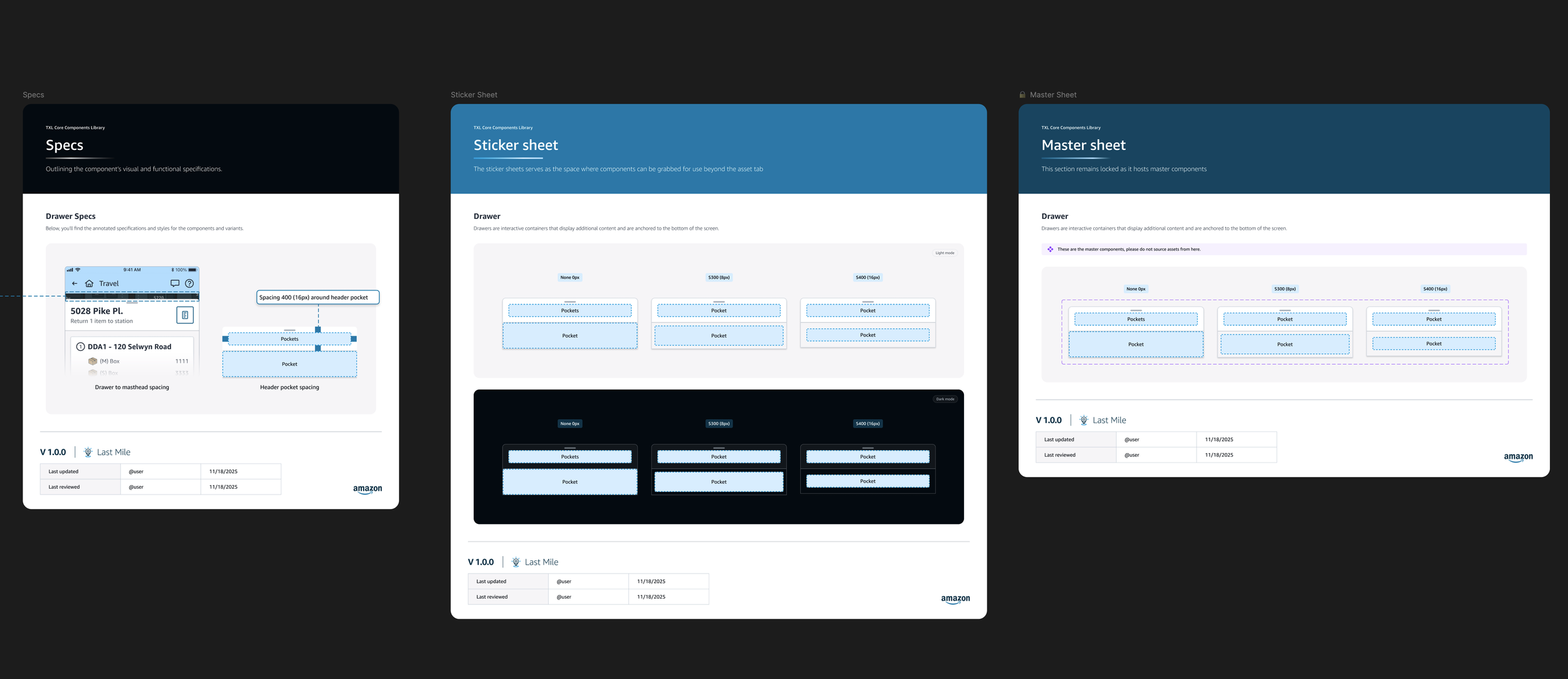
Master sheets, sticker sheets, and specs were created
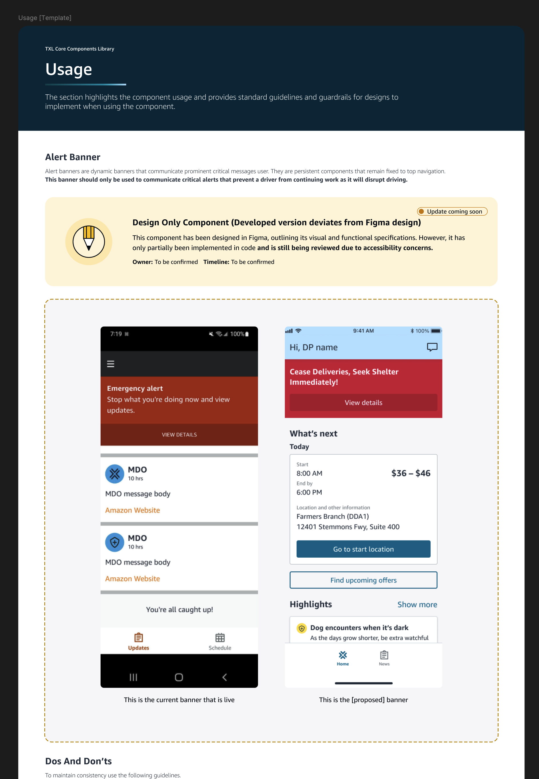
Usage documentation was created and varied depending on the type of component
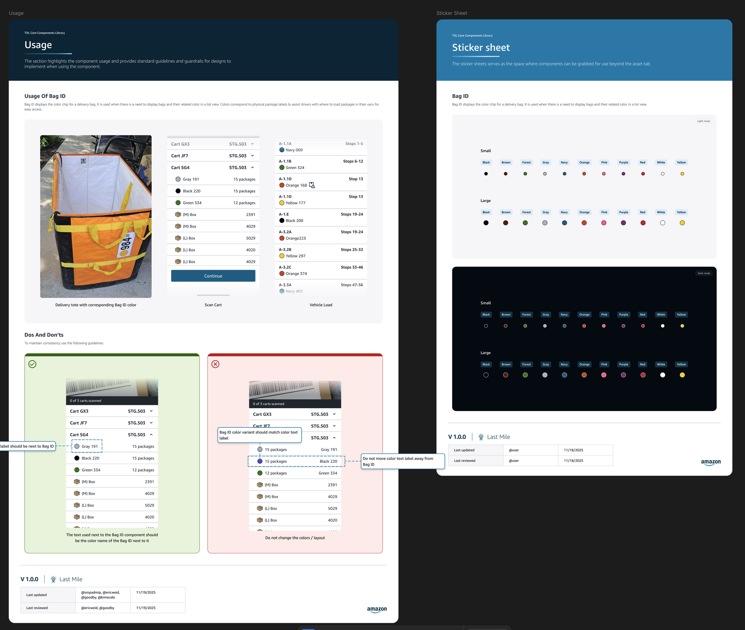
Do's and Don'ts were documented as needed
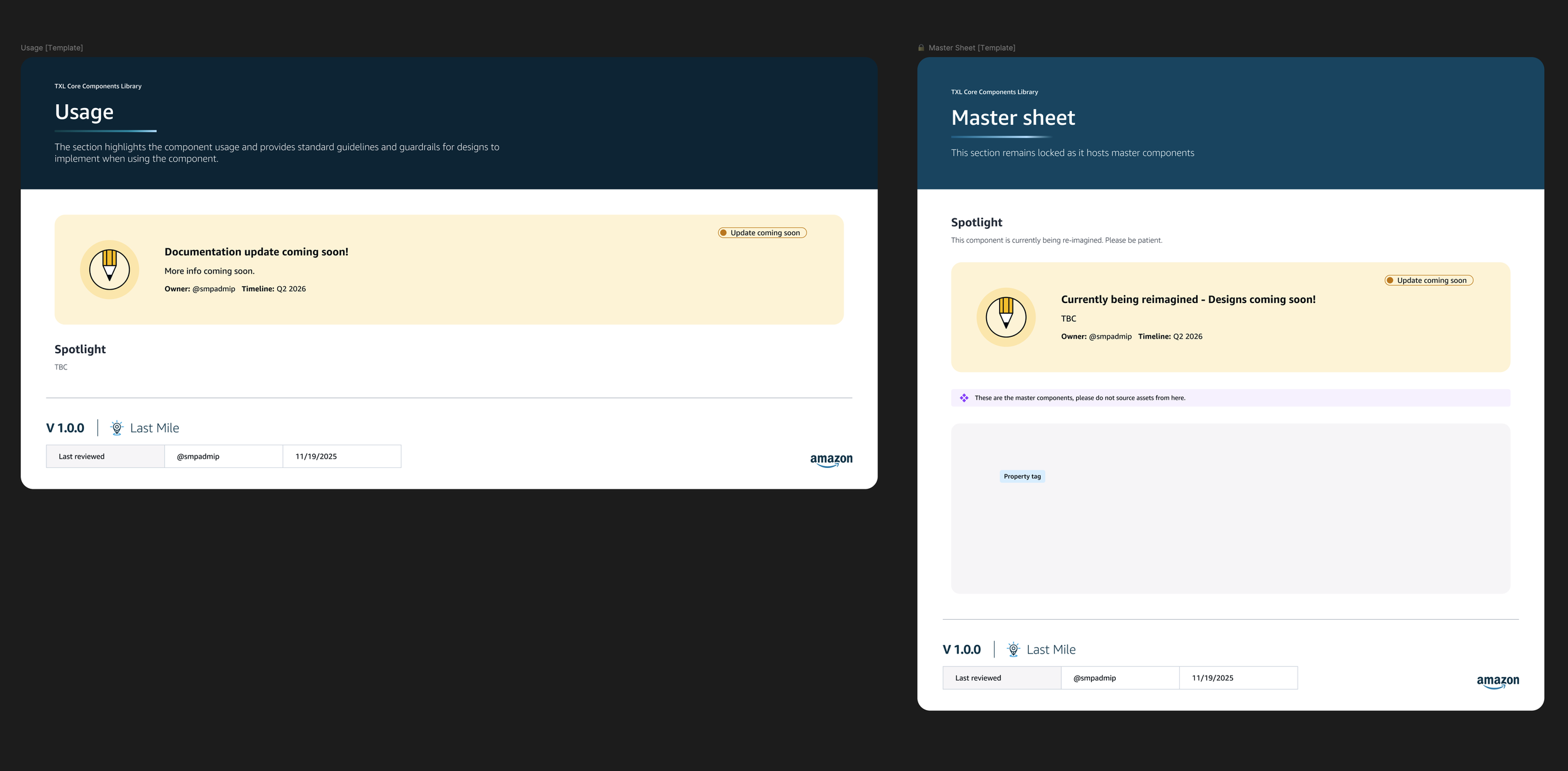
Even WIP's had to be documented in case designers were looking for them
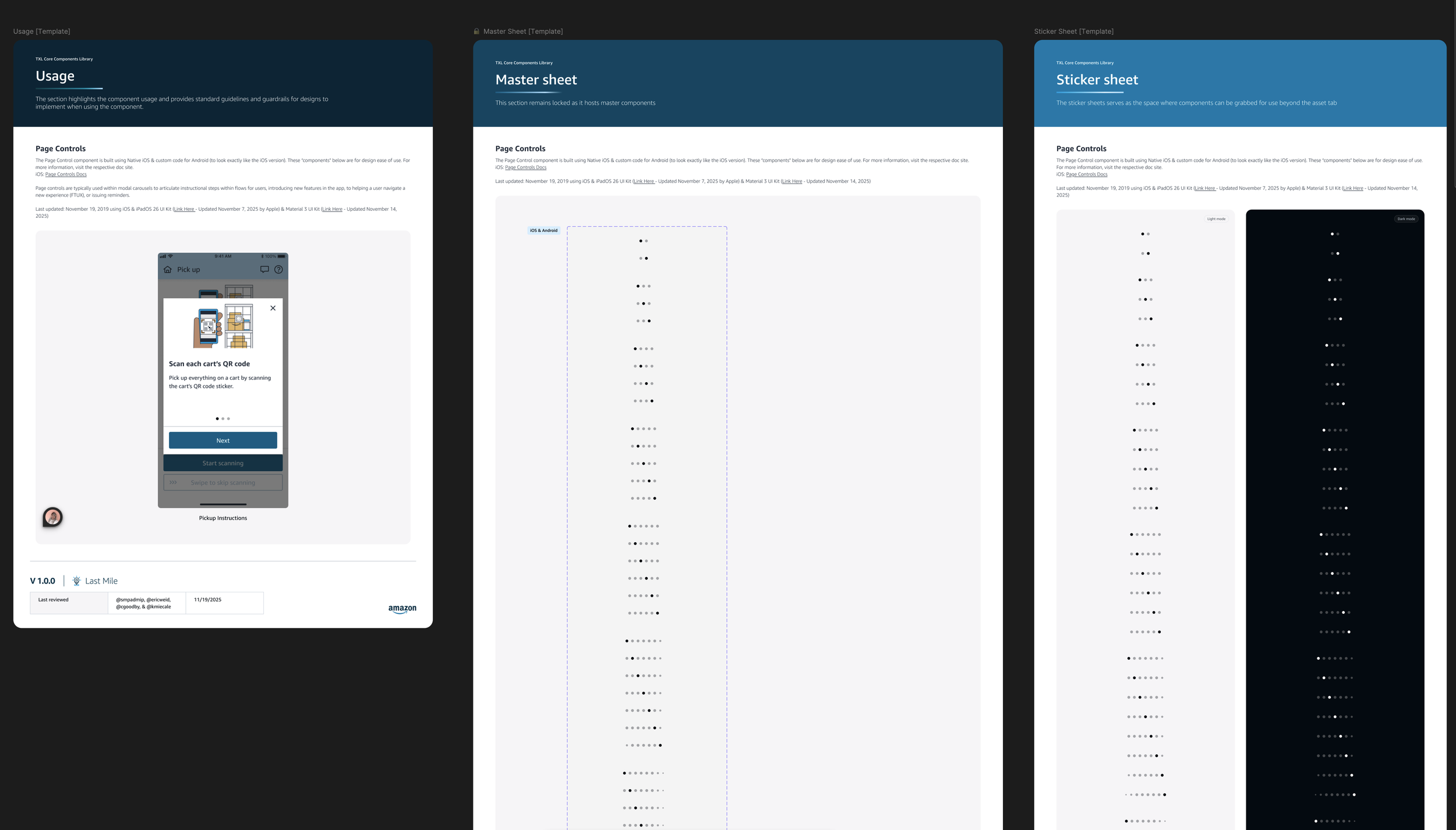
Half Native and half custom component
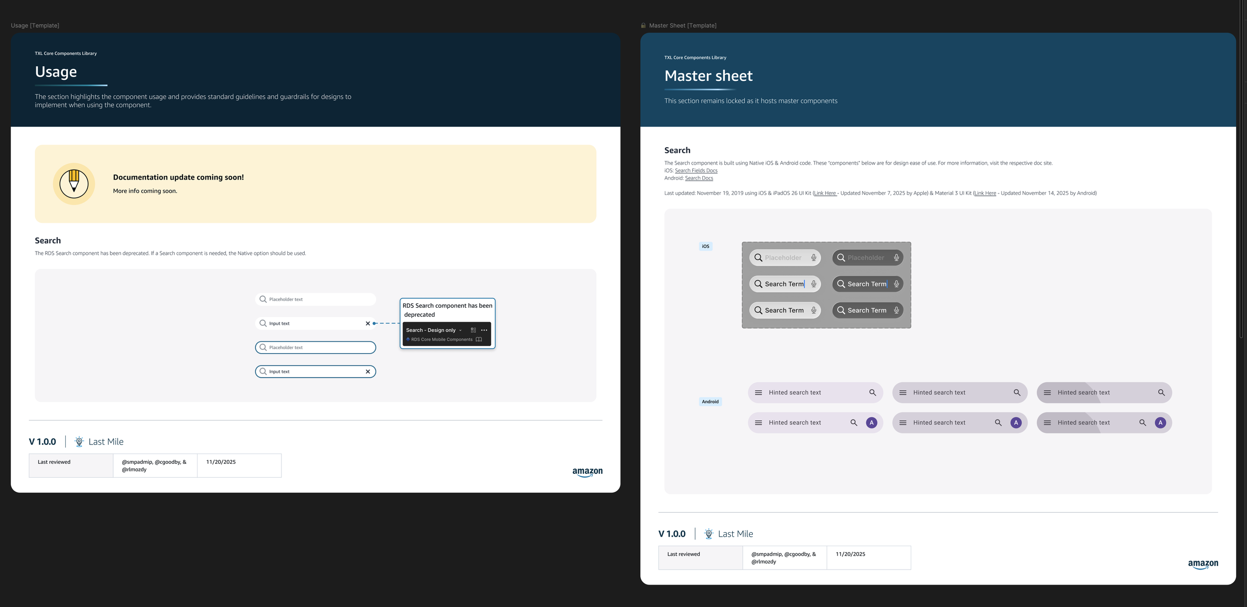
Native component
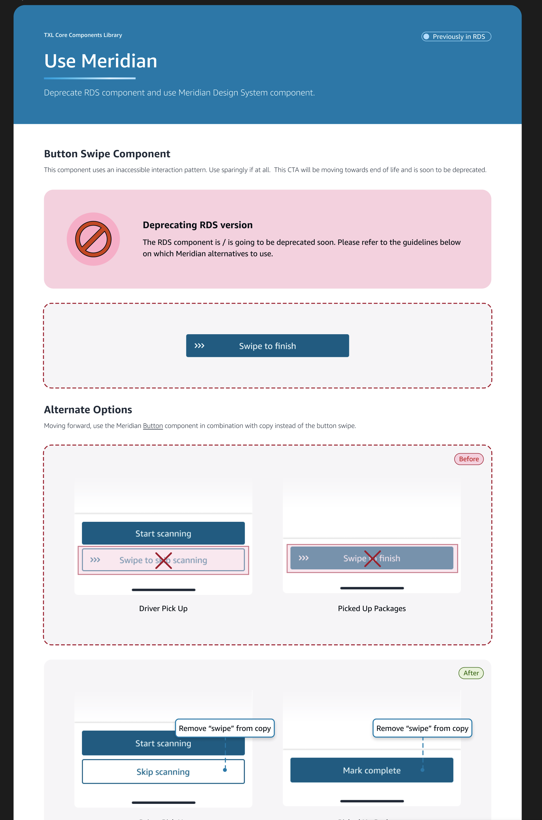
If a component was deprecated, options were documented
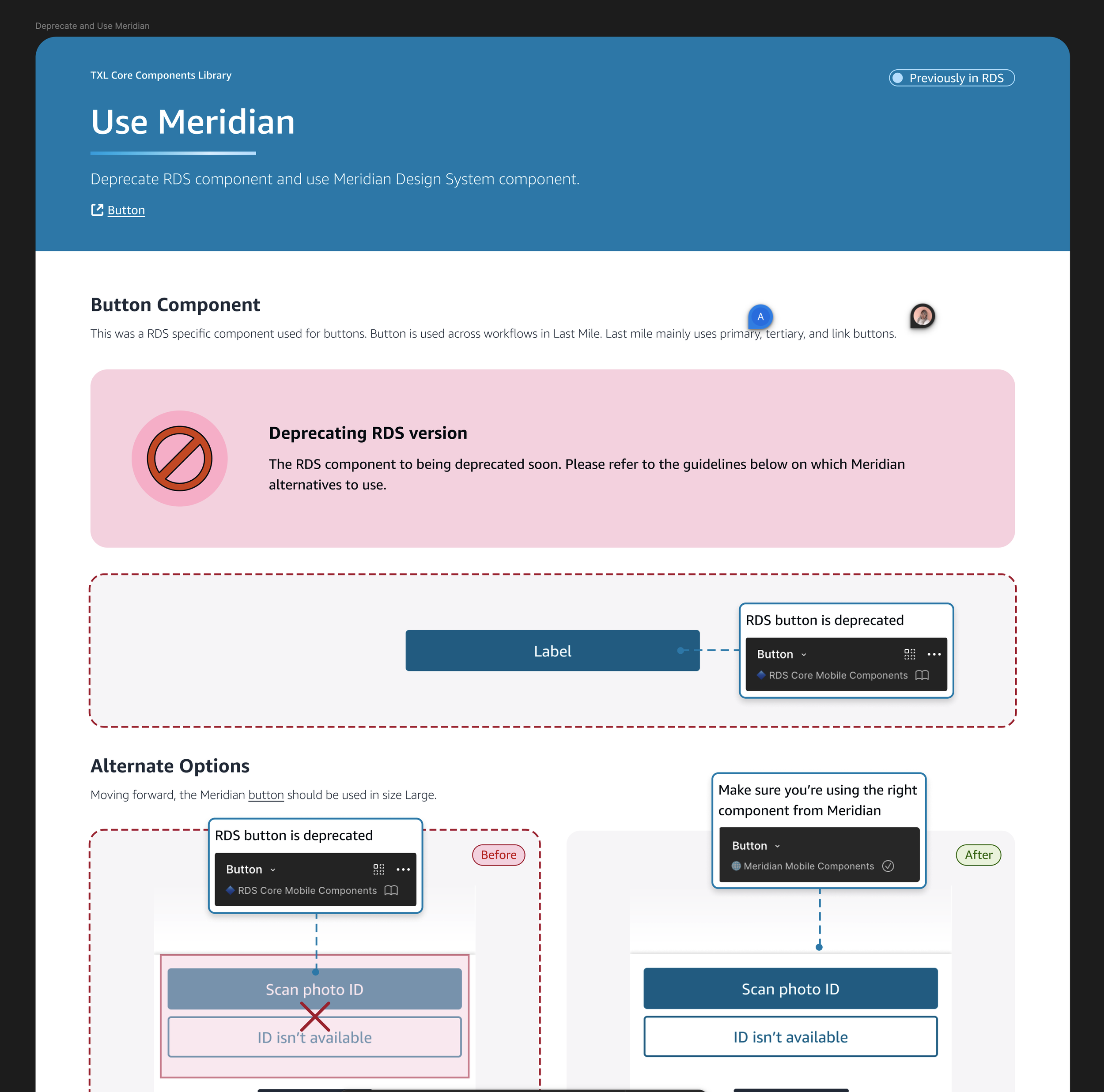
Annotations were used to help users understand what the changes were
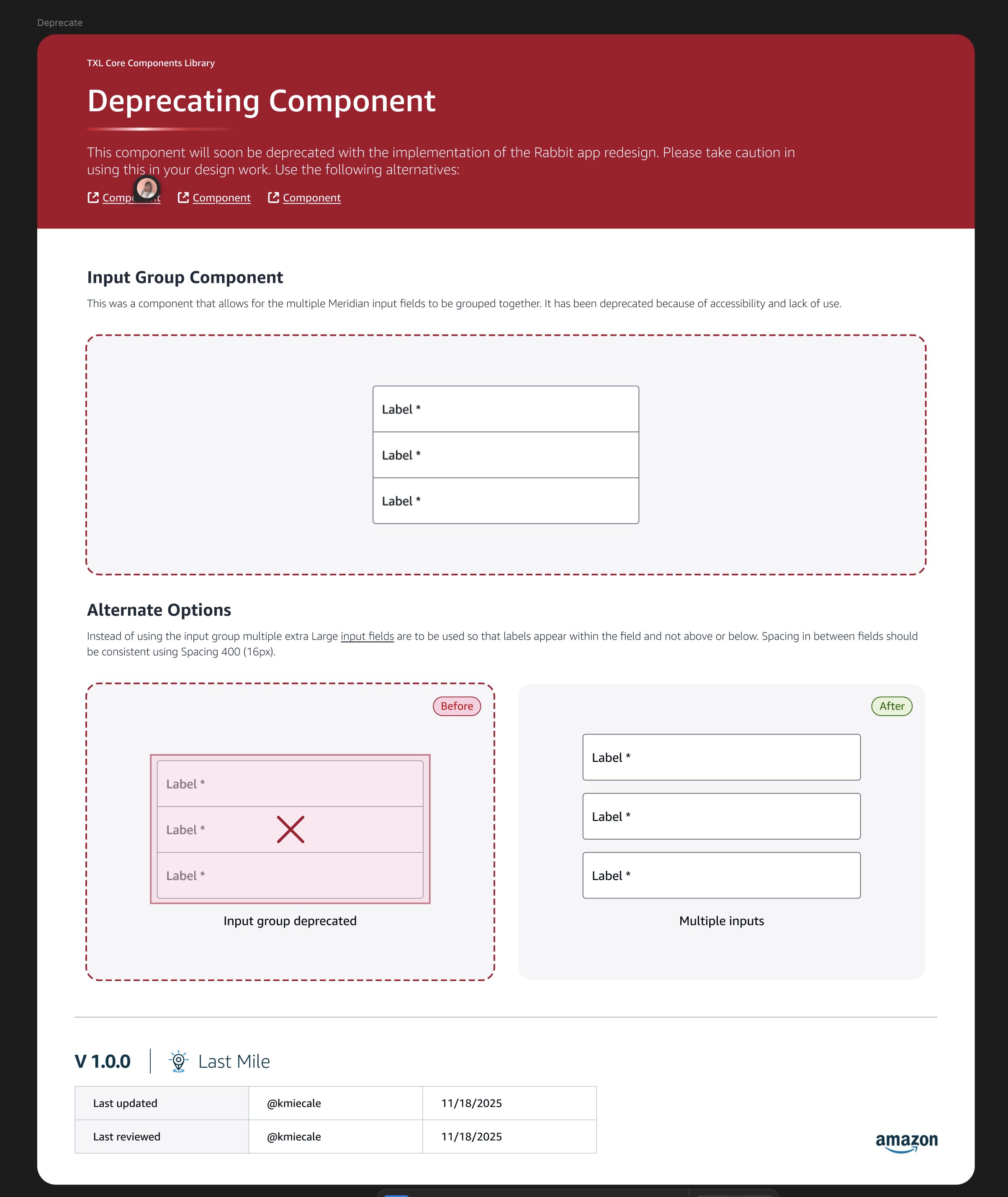
Deprecating component
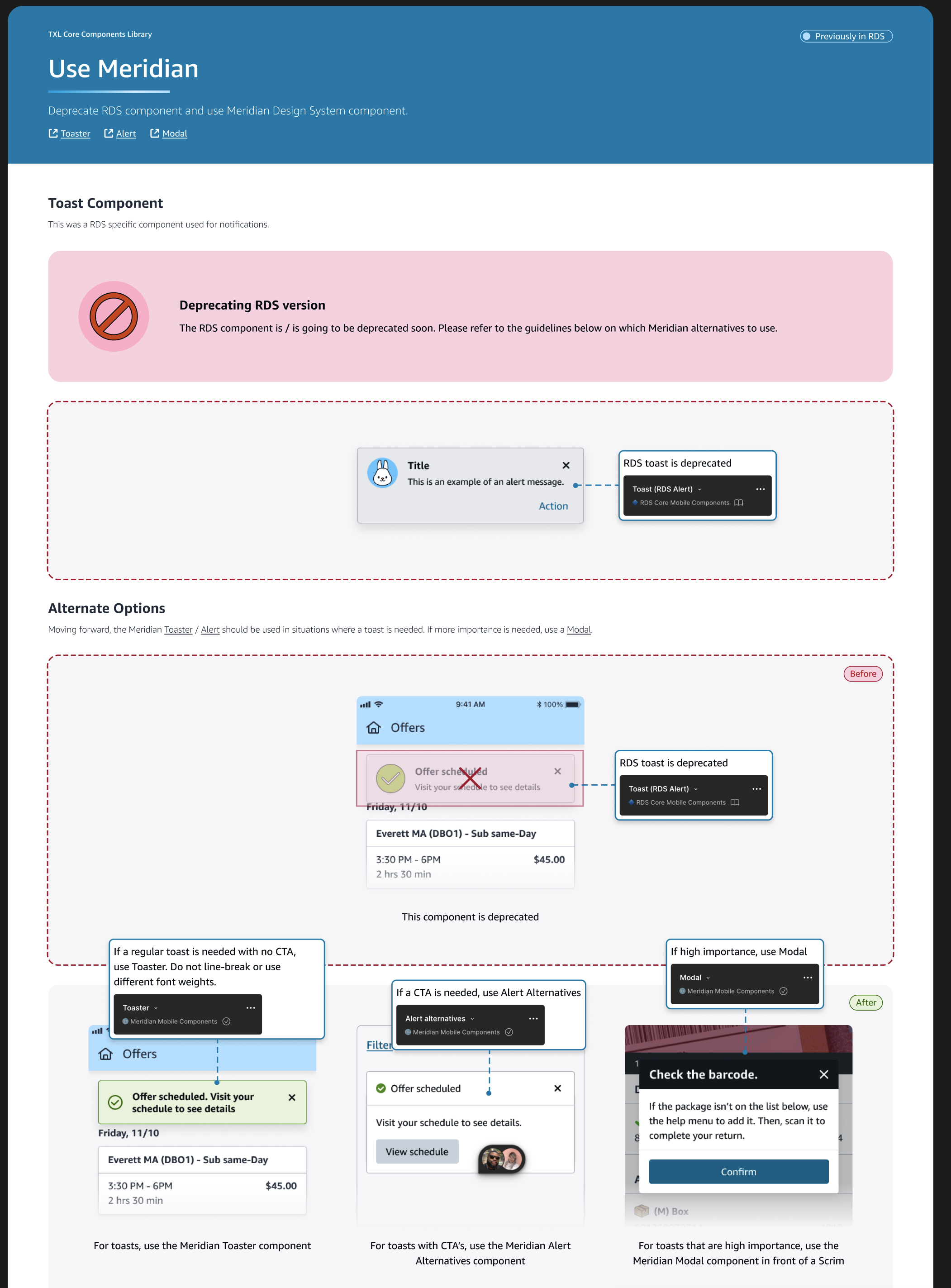
Toast options
To quickly deprecate the old fundamentals I then vibecoded a Figma Plugin
I was able to quickly rename 230+ variables in the library to let users know they could no longer be used.
The plugin ran through all variables and renamed them to append “ - DEPRECATED” to the name so that users would know not to use them. Using AI I was able to vibecode the plugin in under 30 minutes and run it to rename all variables with one click as opposed to manually renaming them.
ChatGPT prompt
Cursor code
Before plugin
After plugin
I managed a weekly team meeting (that was actually twice a week after the pivot), 2 daily stand ups (with different stakeholders), a junior designer that was on the project 50% of the time helping, multiple Asanas, Figmas, Figjams, To Do lists, along with all meetings with devs and designers to provide context, subject matter expertise, reviews etc and those meeting notes. I also kept a running list of what was being done every week and planned for the following week (along with the full sprint plan) and updated the team on a consistent basis if anything was changing so that their priorities were met.
There were a lot of people involved who had no time so it was imperative that the team stay connected on a consistent basis
Asana’s
Weekly Quip