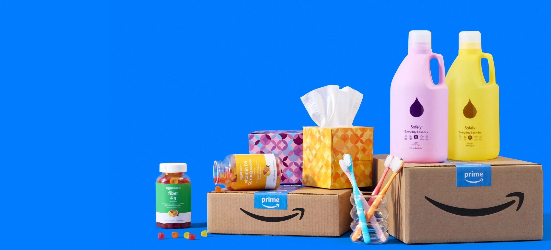
Amazon App
While working at Multiplayer, I was an embedded contractor at Amazon.com, working on the Add to Delivery project that aimed to change Amazon users’ mental models from basket building using a cart and “Add to Cart” CTA (to lists), and instead have a timed “Add to Delivery” CTA (with a 1-Click purchasing interaction) where users would see Amazon as their go to errand runner and continuously add to their deliveries.
This project had many implications throughout the Amazon App, with multiple touch points throughout the user journey, and even more teams (some teams owning just a single line of copy on any given screen and consisting of multiple levels of designers, PM’s, and leadership). While iterating on Northstar designs, we were designing MLP screens, iterating on components that would be used across screens & the user journey, working with all the other teams to align on copy / design, and doing user testing. We were also presenting to leadership on a monthly basis.
Before I outline what I did in this project, I want to call out one of the biggest challenges.
Because this project would re-shape the way that customers use the Amazon app, there were a lot of eyes on it, a lot of excitement around it, but also a lot of teams involved. The biggest challenge was getting alignment from every stakeholder at all the different stages of the project.
The team we were on was pretty exploratory so we were asked to think outside the box, but stay within the Rio design system guidelines. Typically a single designer would work on a single workstream with 1 PM and then present to leadership. Because Add to Delivery (AtD) had so many touch points we had 1 full time designer (myself), 1 part time designer (50% capacity), 1 Rio designer (25% capacity), 1 researcher (25% capacity) and 1 design manager (25% capacity). We also worked with 12 PM’s and their respective leadership (5+ members per PM), along with each tech team responsible for any of the screens AtD would be surfaced on (10+ per team / screen).
Also the team (GDCX) didn’t typically have that much design support before, so were used to PM’s + Tech making all design decisions and trickling them down so we had to shift all our ways of working over time.
Process
First, we started with some explorations.
While exploring our north star vision, we were also exploring all the ways we could put Add to delivery throughout the customer journey. We mapped out various flows and the existing customer experience to understand what we could do now, and in the future.
We had to work with multiple different stakeholders and teams to understand what the constraints were within the different frameworks and what we could update now, and what would need additional tech support.
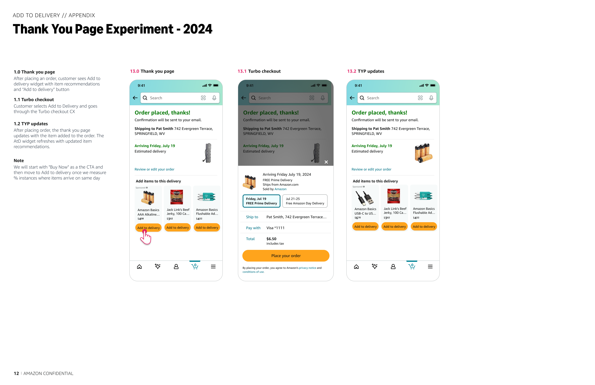
When the project was initially brought to design, PMs envisioned that they would send users a notification saying they still had time to add items to their delivery, and users would be taken to a landing page where they would be shown low cost items to add to their delivery based on previous buying habits. The first thing we did was try to understand what notifications were currently being sent, when in the customer journey, and where we could insert AtD. Over many conversations with the Notifications team, I drew out their current customer experience.
Step One: Exploring current Notifications
Current Notification Touchpoints
Then looked at how AtD could fit within current frameworks.
Step Two: AtD Initial Flow
Initially (and consistently throughout this project if I’m being honest), PMs were not very clear on their requirements, but they were very prescriptive on what experiments they wanted to run, where AtD was being surfaced, and what it needed to have. We had lots of people in lots of rooms with very big opinions who were unable to commit to any single path forward. In a bid to move the needle, design kept asking the questions and mocking up possible solutions so that teams could see what their options were. Even if we weren’t able to find the right solution, we wanted to narrow down the options.
Then we started diving deeper to understand our current landscape.
AtD Initial Flow
The more we kept working, the more the team realized that their initial scope was too small, that AtD was going to need to be surfaced in more places, and that there were many experiments that would need to be fleshed out, so that we could understand the flow as a whole & how customers would adapt. In an attempt to capture all the various experiments and understand what screens needed to be designed & developed for each one, as well as what components could be used in multiple places, I started mapping out all the possible flows we would need to explore.
Step Three: Additional AtD Flows
Additional AtD flows
We were also requirement gathering and trying to understand what we would need at every touchpoint.
Step Four: Workshops
In an attempt to narrow down our scope and split up the project into phases we ran multiple workshops to make sure everyone was on the same page, and aligned on what we were designing and launching and when. This also helped capture things that were being lost in translation with all the documents and slack messages we were trying to keep up with.
We also looked at AtD all up and how it would work throughout the whole experience.
MVP Workshop
While also exploring some of the components in various pages in tandem.
Working with different designers and different teams, I started exploring specifically what AtD would look like in various places. I documented requirements, pros & cons, outstanding questions, and edge cases to make sure all our bases were covered.
We had to work with multiple different stakeholders and teams to understand what the constraints were within the different frameworks and what we could update now, and what would need additional tech support.
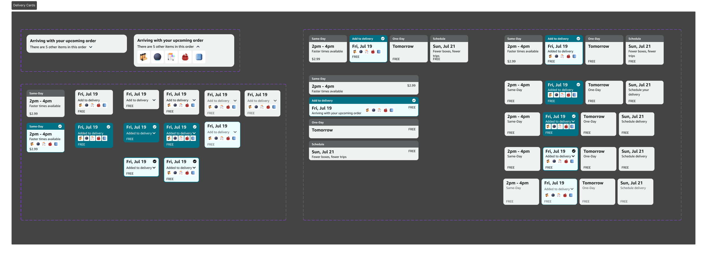
Delivery options card
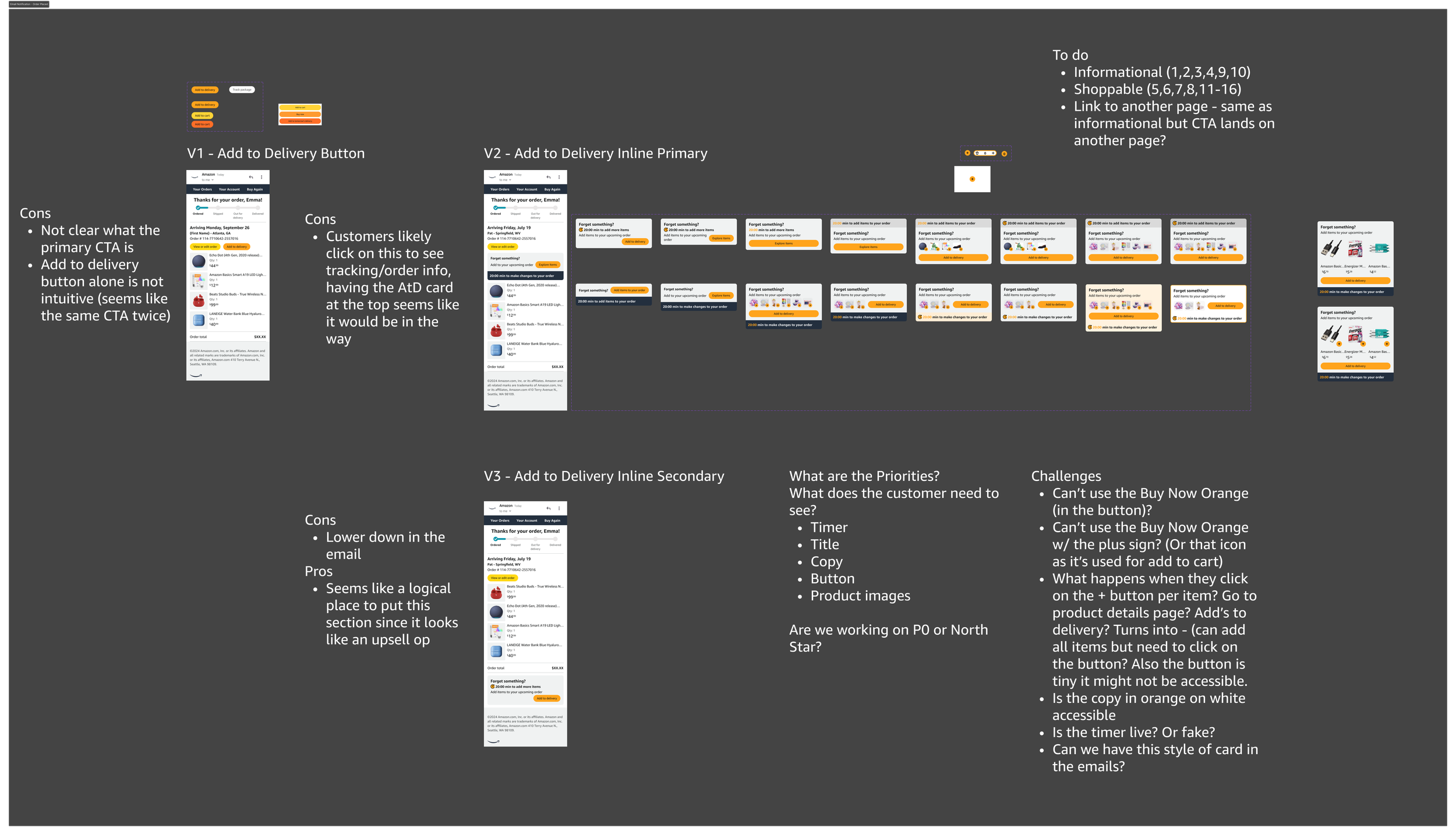
Email notification AtD widget
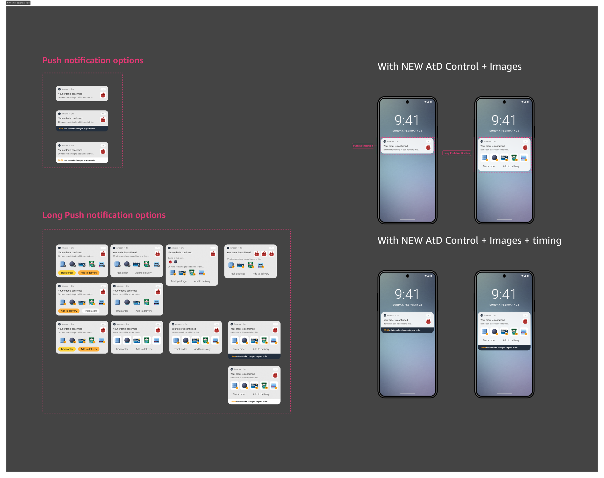
AtD notifications
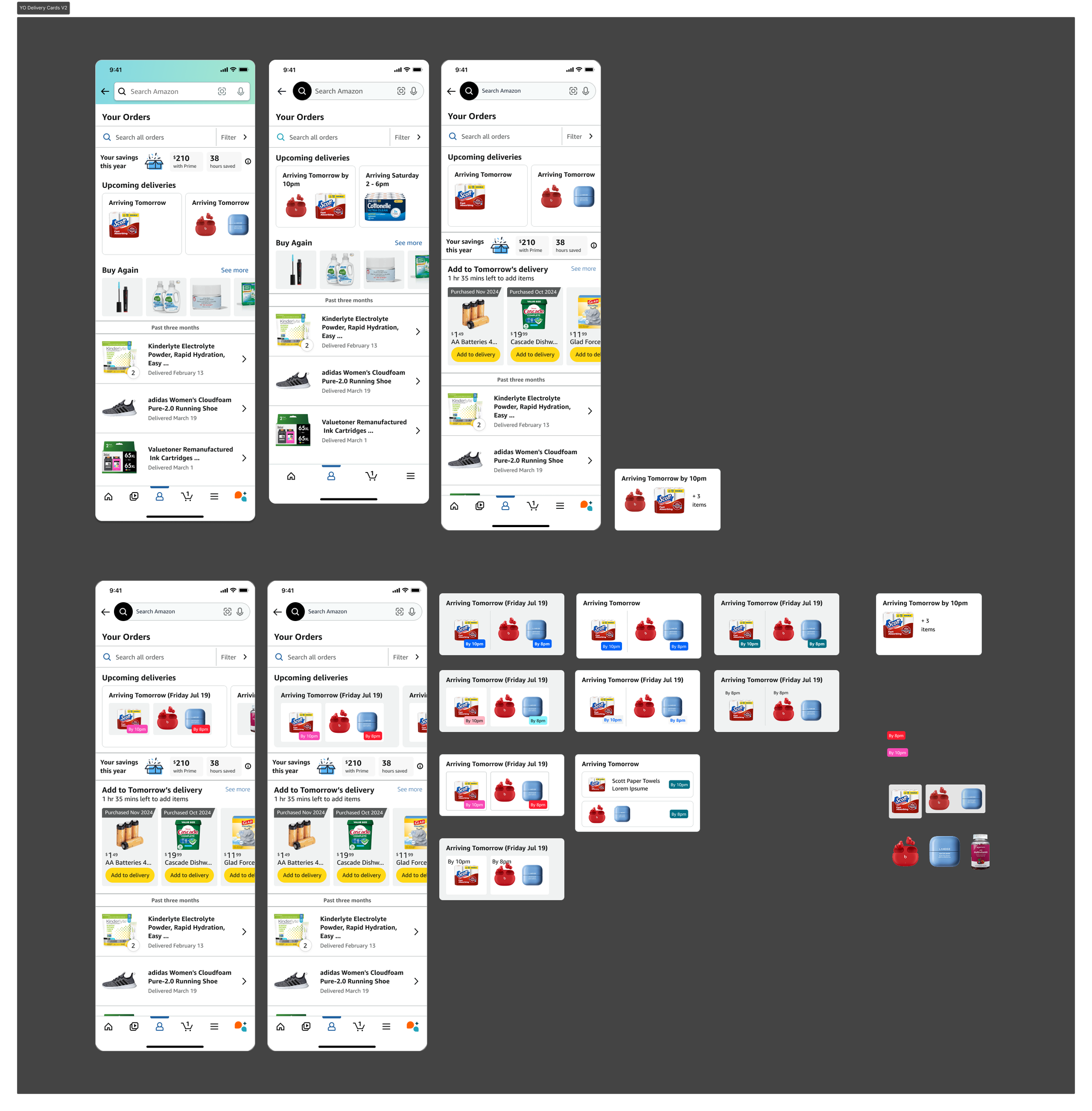
Your Order page delivery info
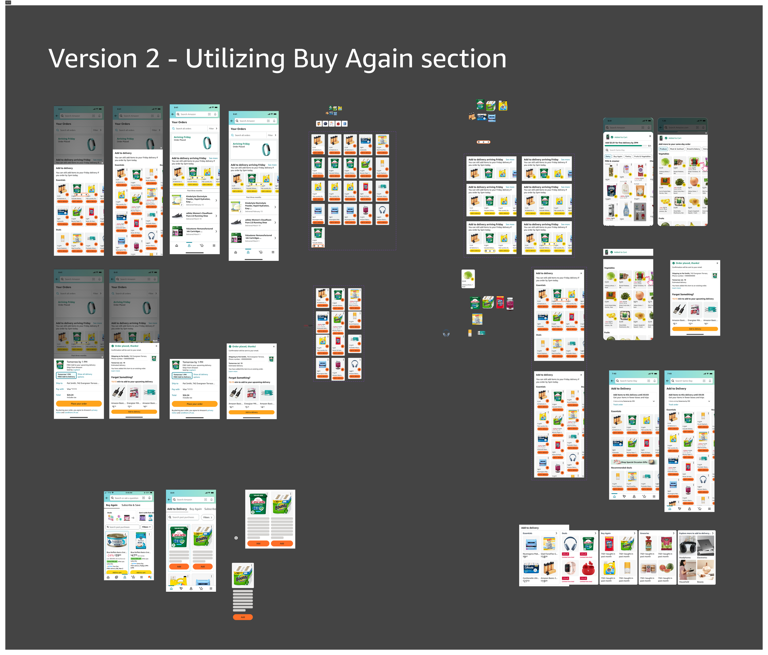
Landing page / Storefront explorations
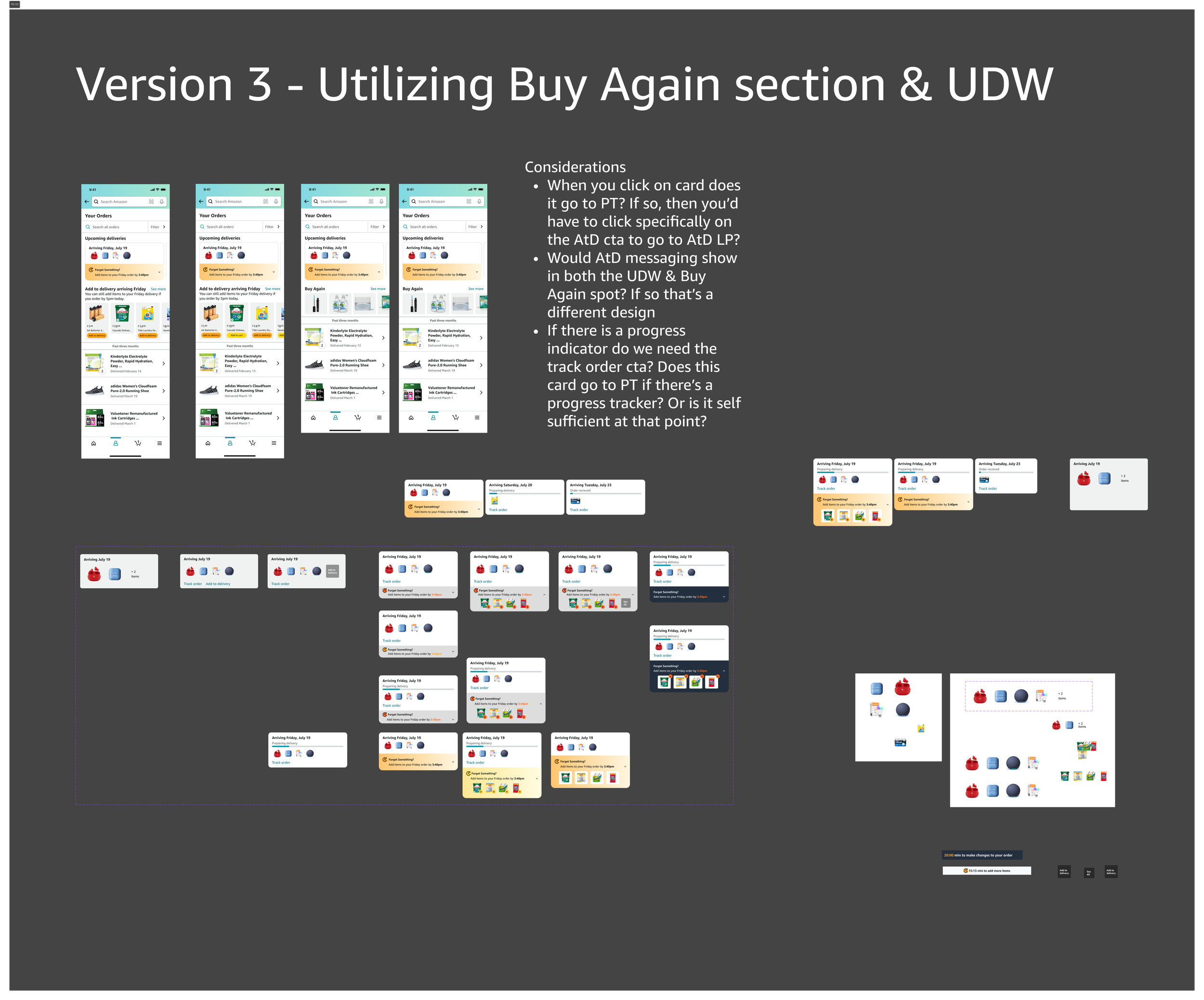
Your Order page widget and Buy Again section
One of the challenges with this project was the team didn’t really know what they needed a lot of the times, so design was encouraged to envision it. Initially the team was designing the north star vision, and then planned on running various experiments to test how it would be received, if it would increase click throughs, and conversion…etc. The first test was around an ingress from a notification landing you on the thank you page. As the project grew and we saw the need for multiple touchpoints on many screens and we worked on what AtD would look like on those screens, we started putting it all together and mapping out the flows with the various screens including what AtD would look like. We broke the flows out into different routes depending on the use case so that the team could see how AtD would function as parts of a whole. There were intially 12 flows mapped out (only a few pictured here).
Step Five: Putting it all together
Flow 4
Flow 2
Then we started putting it all together.
Flow 1
We were also concurrently working on the North Star designs & presenting to leadership on a regular basis.
Each presentation would need rounds of annotations and many different screens, all of which would need revisions after every review - L10 (VPs +) reviews would also need to be reviewed by internal teams (PMs) then their leads as well as design leads (10+) as well as L8’s so any one presentation would need at least 4 rounds of reviews each round leading to 40+ comments (in sometimes under a week).
Our ways of working were definitely being tested. Comments were taken out of Figma and put into Quip documents (proprietary Amazon software kind of like Google Suite) and then prioritized based on how important they were, if the change could be made in the allotted time, and if they were feasible. A lot of them (if not most) were always prioritized as high priority so this process was not super helpful, and seemed to be making more work. As I said, we were also doing a lot of exploration elsewhere, with a lot of team meetings, and trying to keep track of notes in quips, messages in slack, outcomes of meetings…etc. To combat this we started using Asana to help track design asks (more on that later).
Nov 21 Presentation
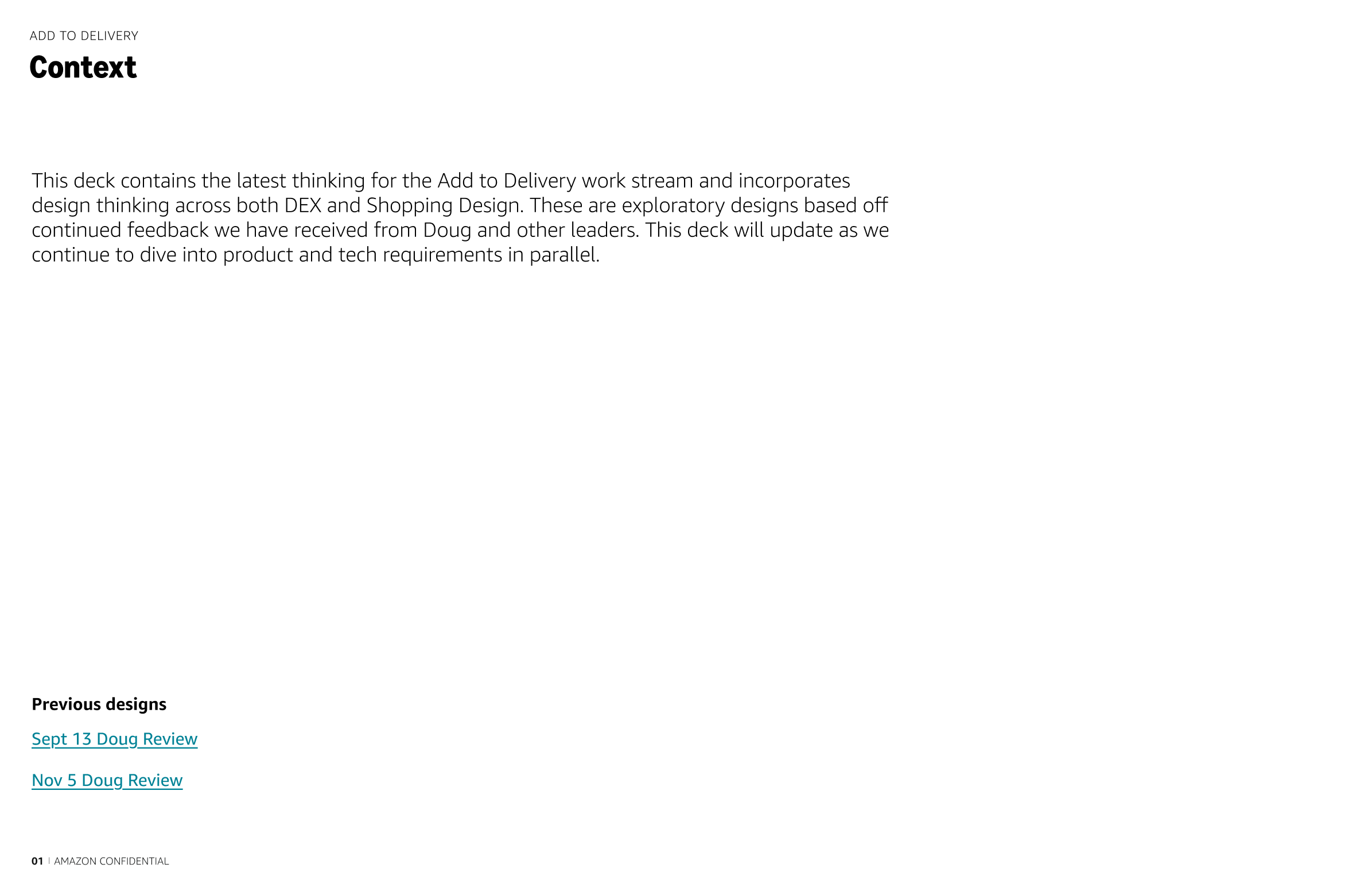
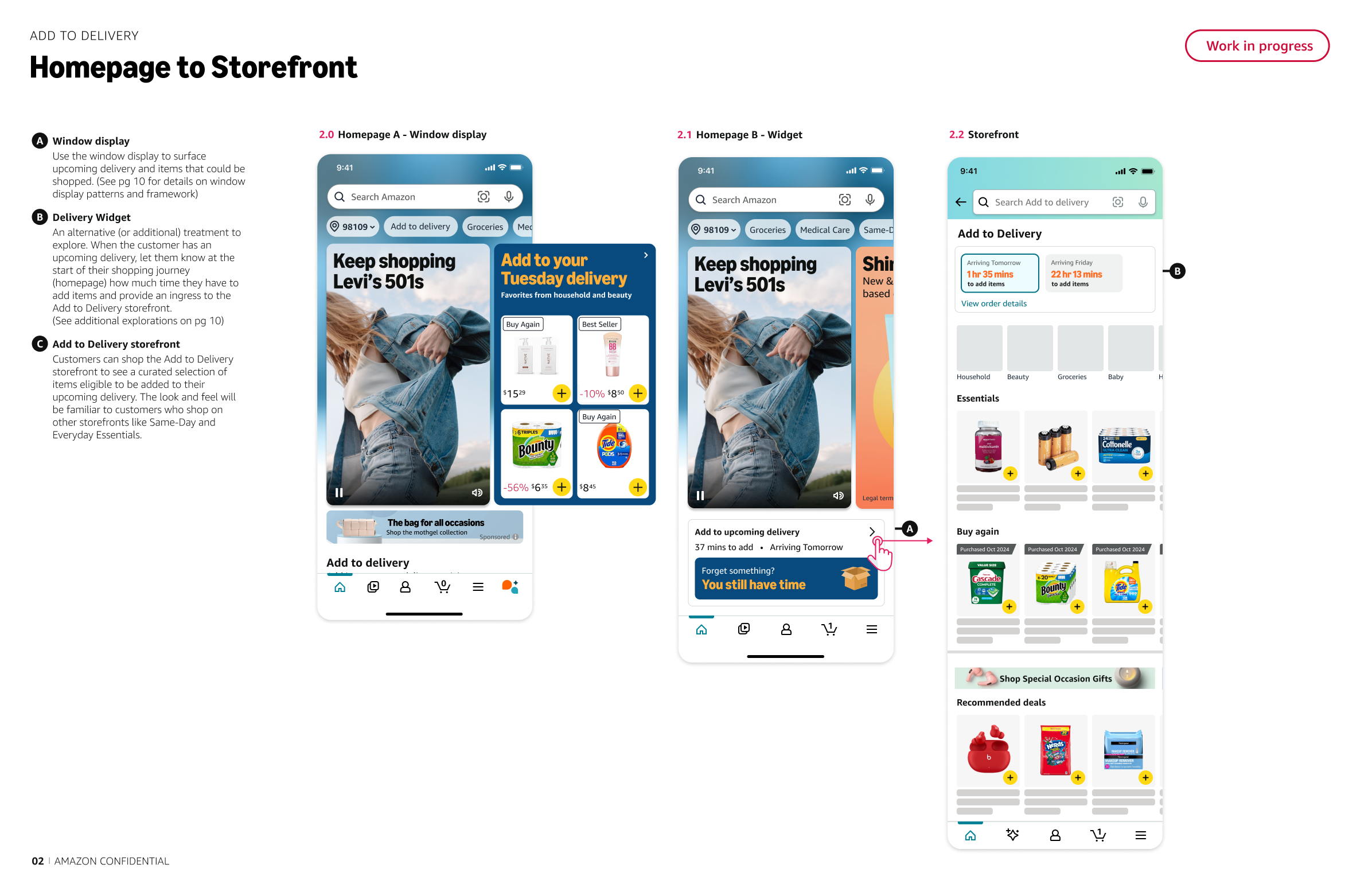
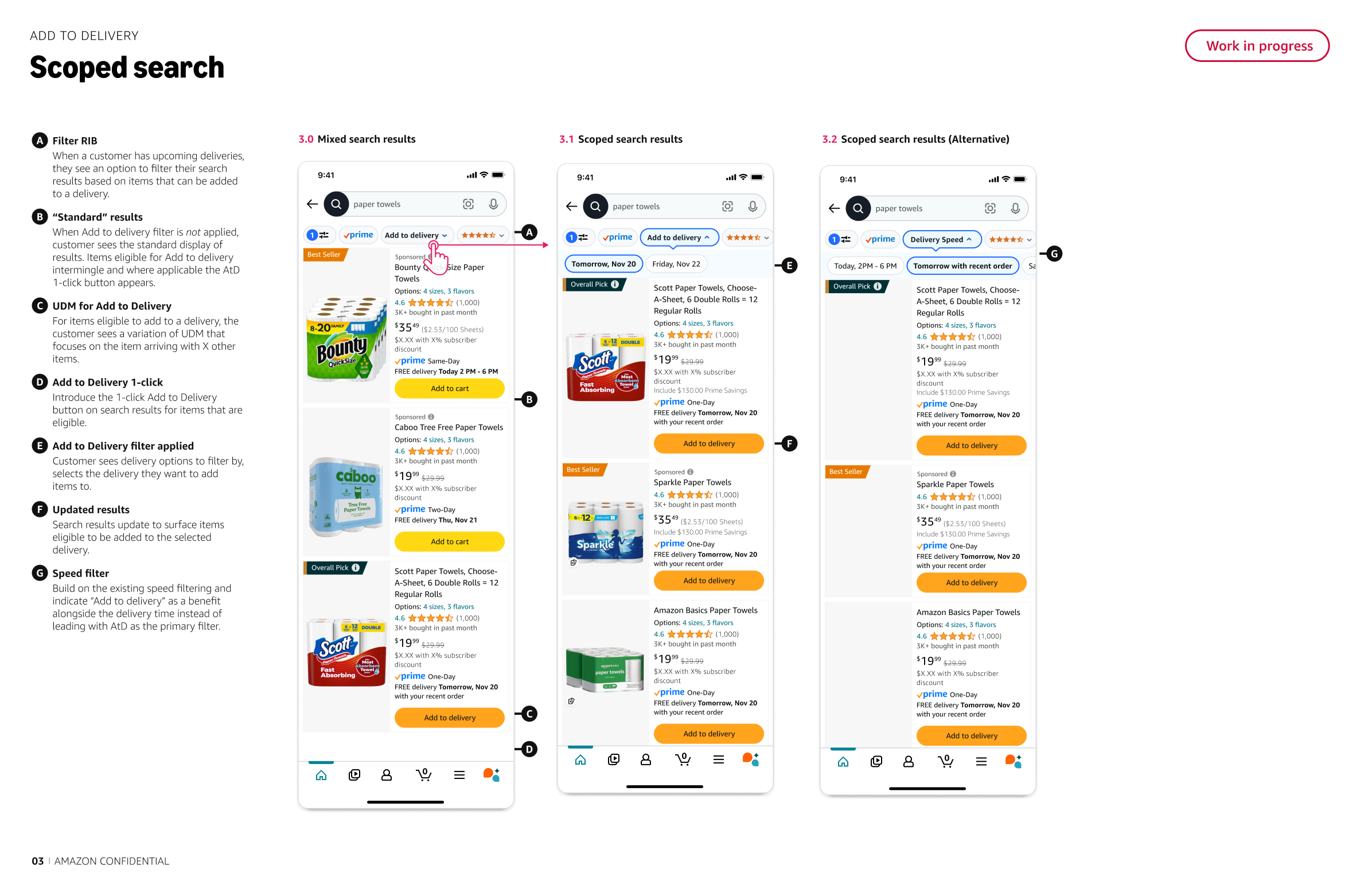
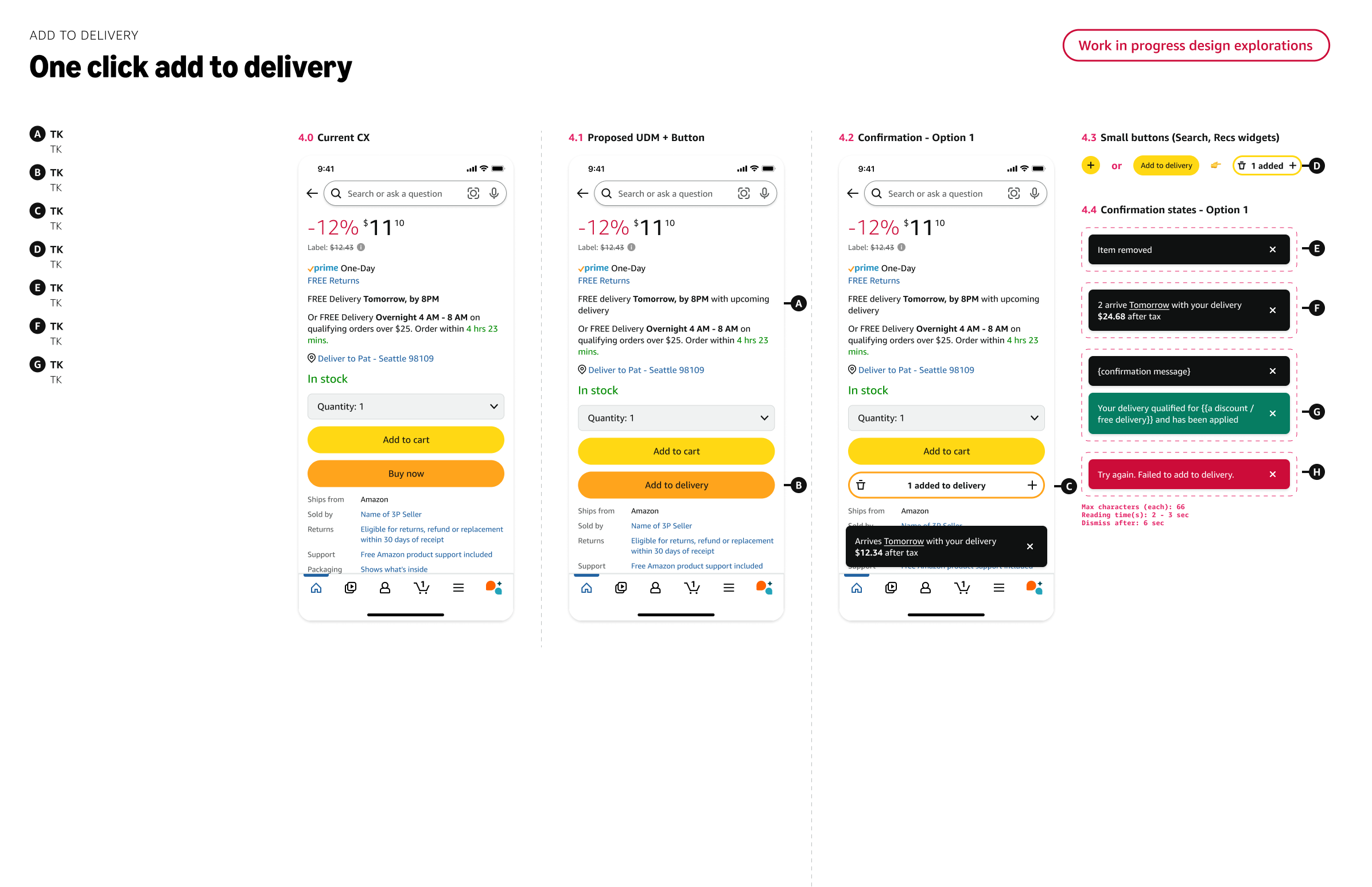
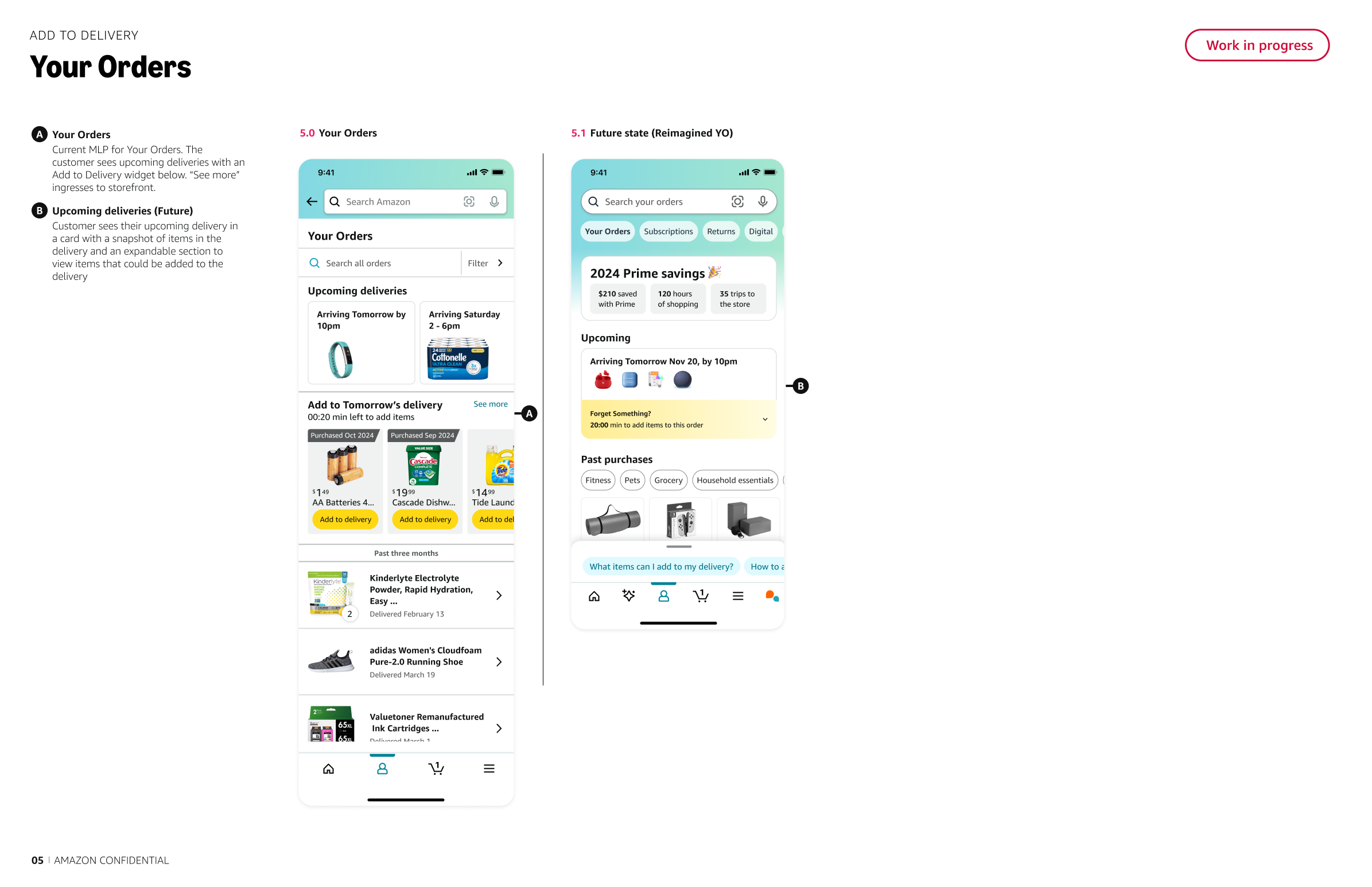
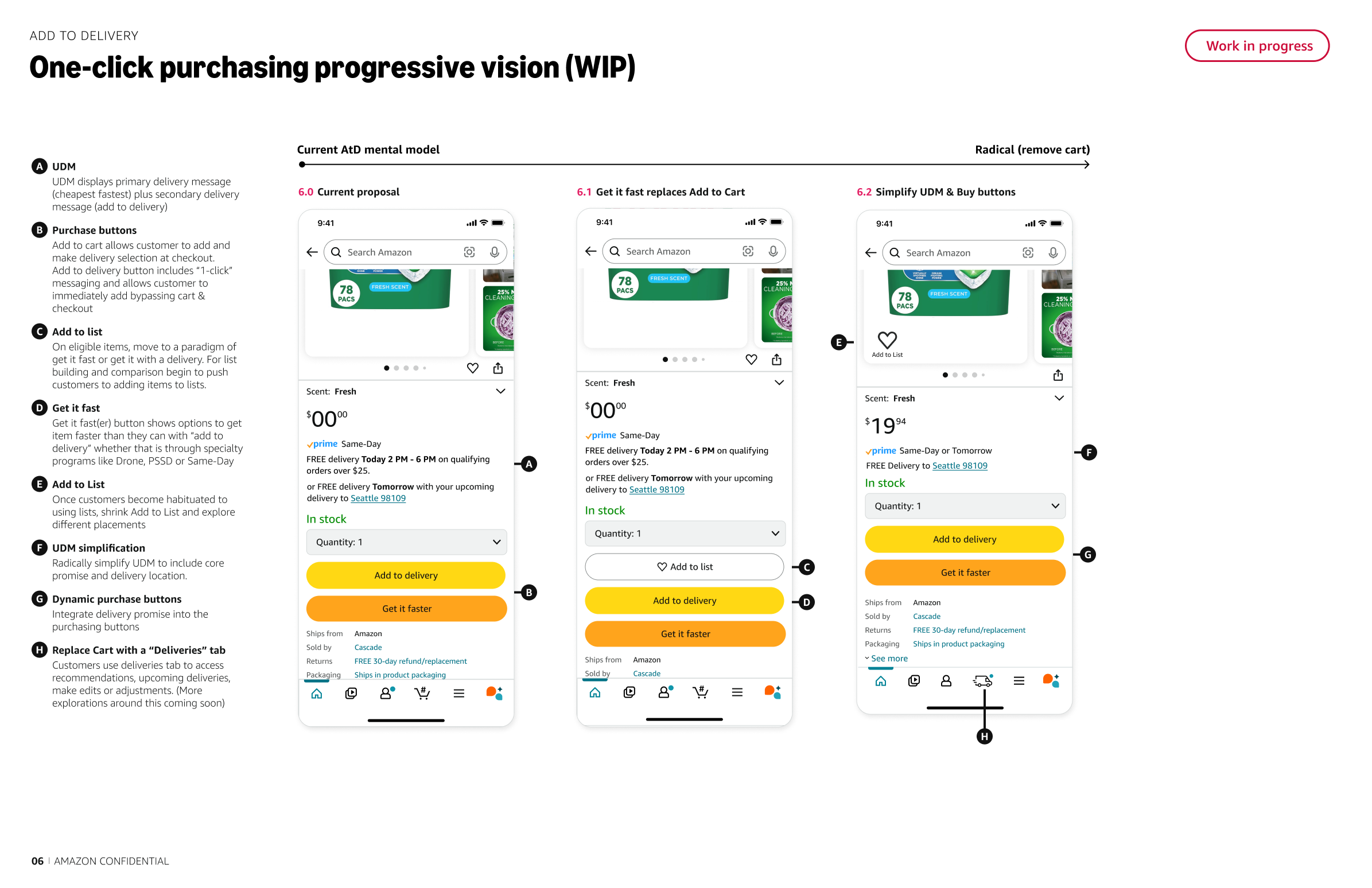
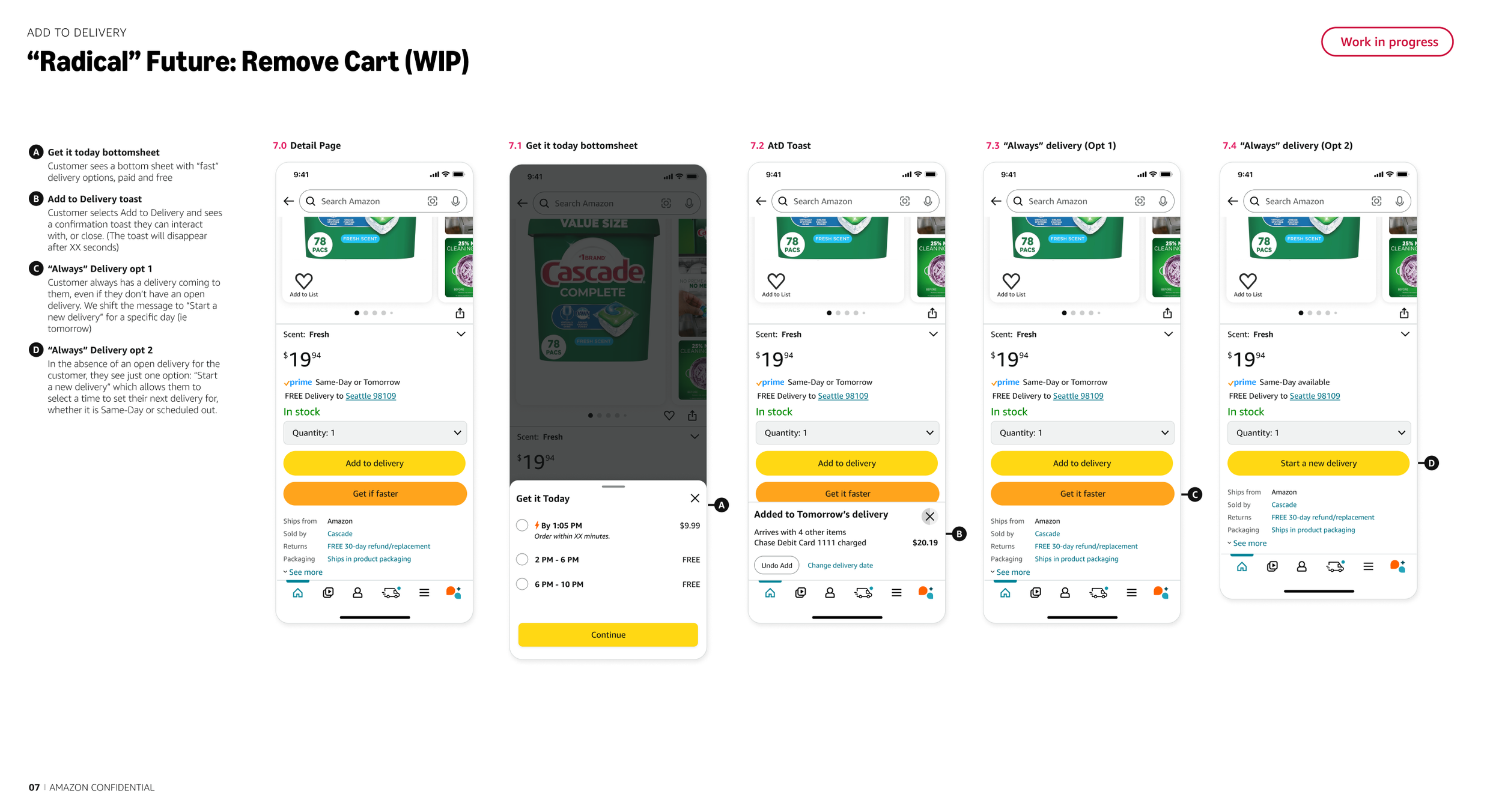
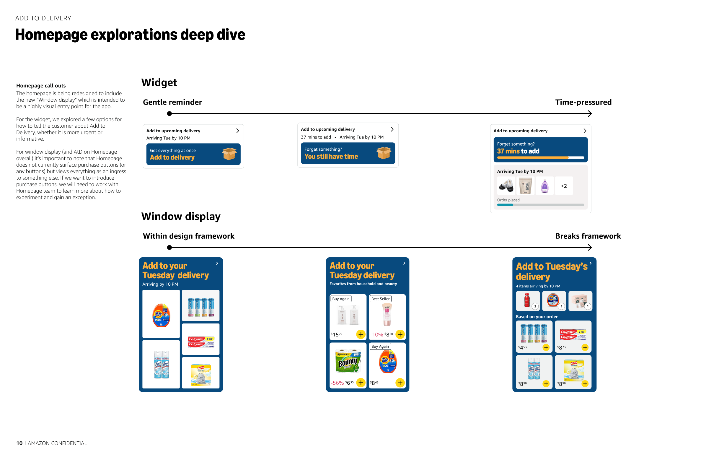
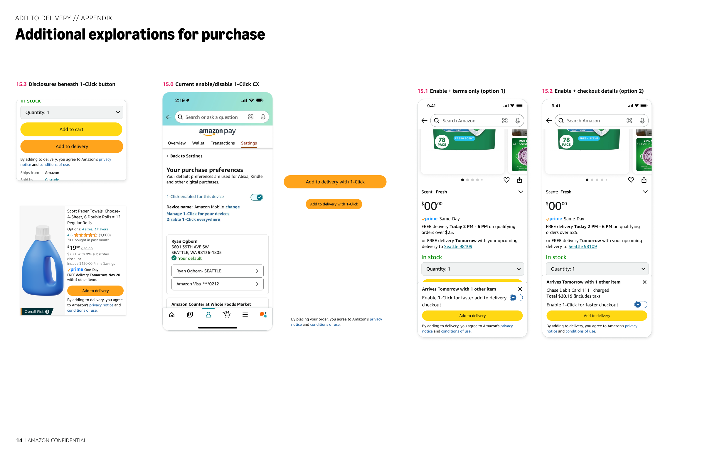
Even the simplest comment led to multiple discussions with other teams, searching for the right template (if there was one) or the person who owned what was needed, screenshots upon screenshots of the current experience, designing full screens from scratch (since we were in the exploration phase and a lot didn’t exist in our DS that we could use) and then updating to include AtD.
A lot of the screens were also being re-designed at the same time so in some cases we had to design two versions, pre and post launch of the new screen (the Me Tab explorations pictured). Other teams were also working on other patterns that leadership liked that we would have to incorporate. And I’m not going to even start on the button colour debate and how many times I had to change it from yellow to orange to a different orange back to yellow and then again to the first orange (all because teams were not aligning).
Step Six: Iteration
Me Tab Pre & Post Launch Iterations
After each review, we iterated.
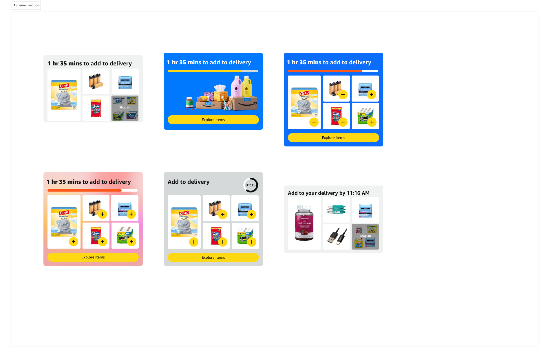
Email notification iterations
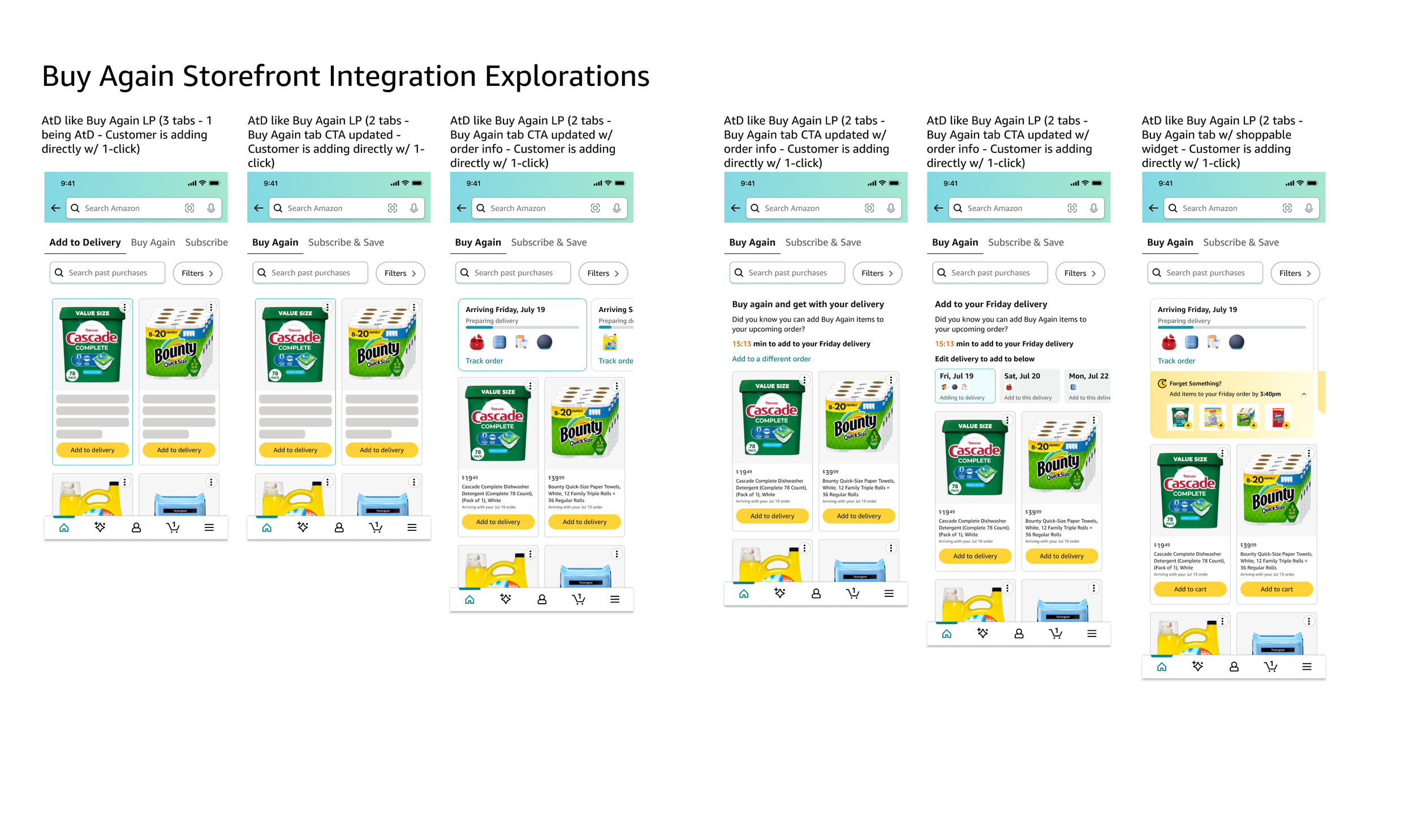
Storefront alternative using Buy Again landing page iterations
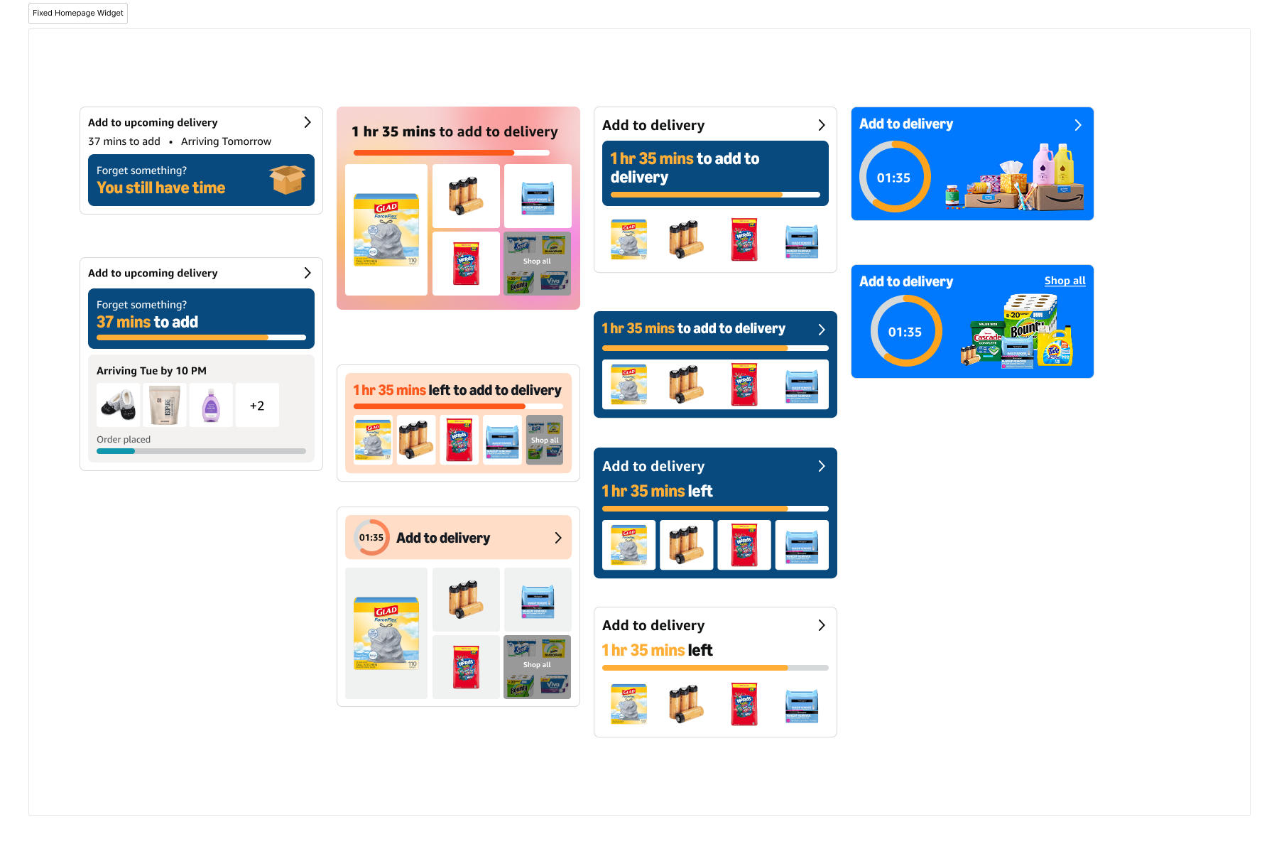
Homepage permanent placement iterations v2
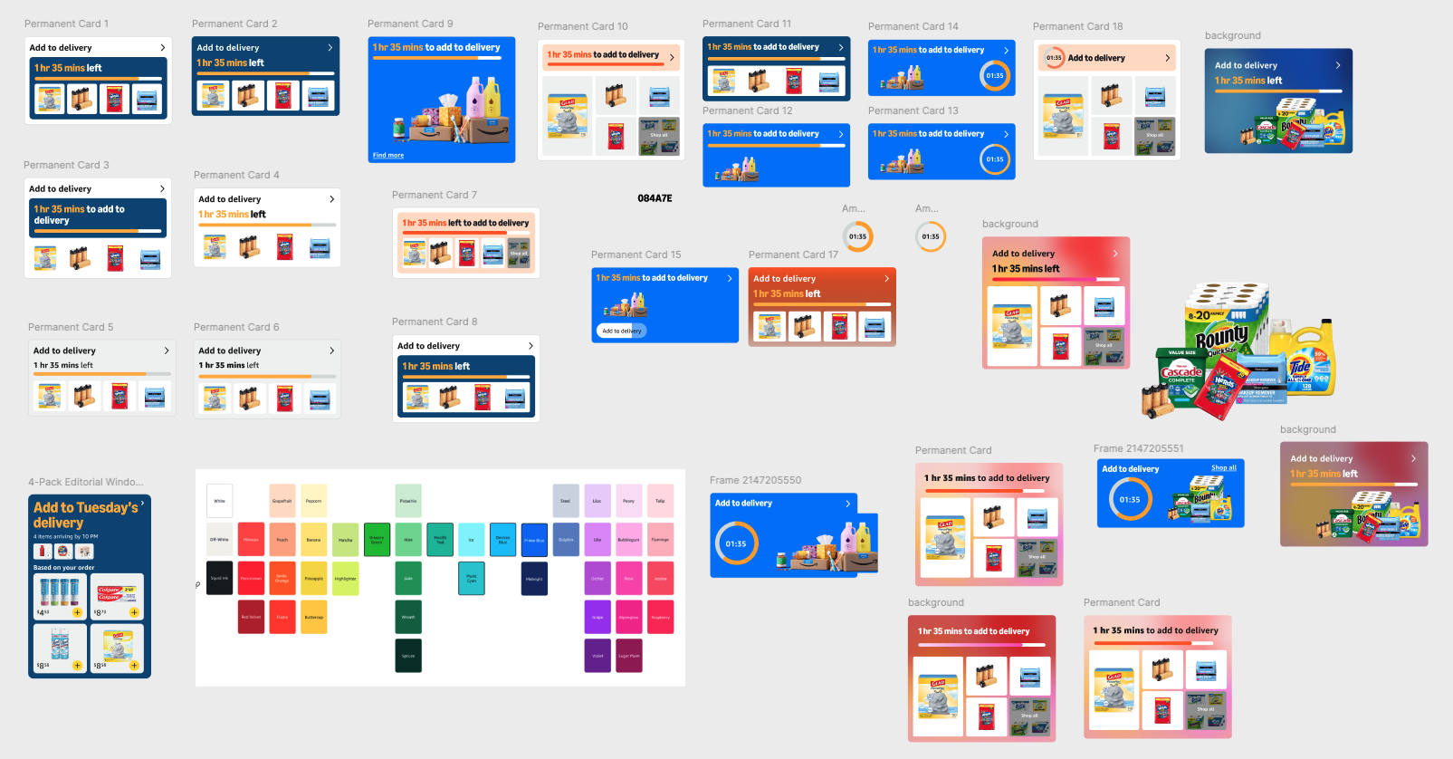
Homepage permanent placement iterations v1
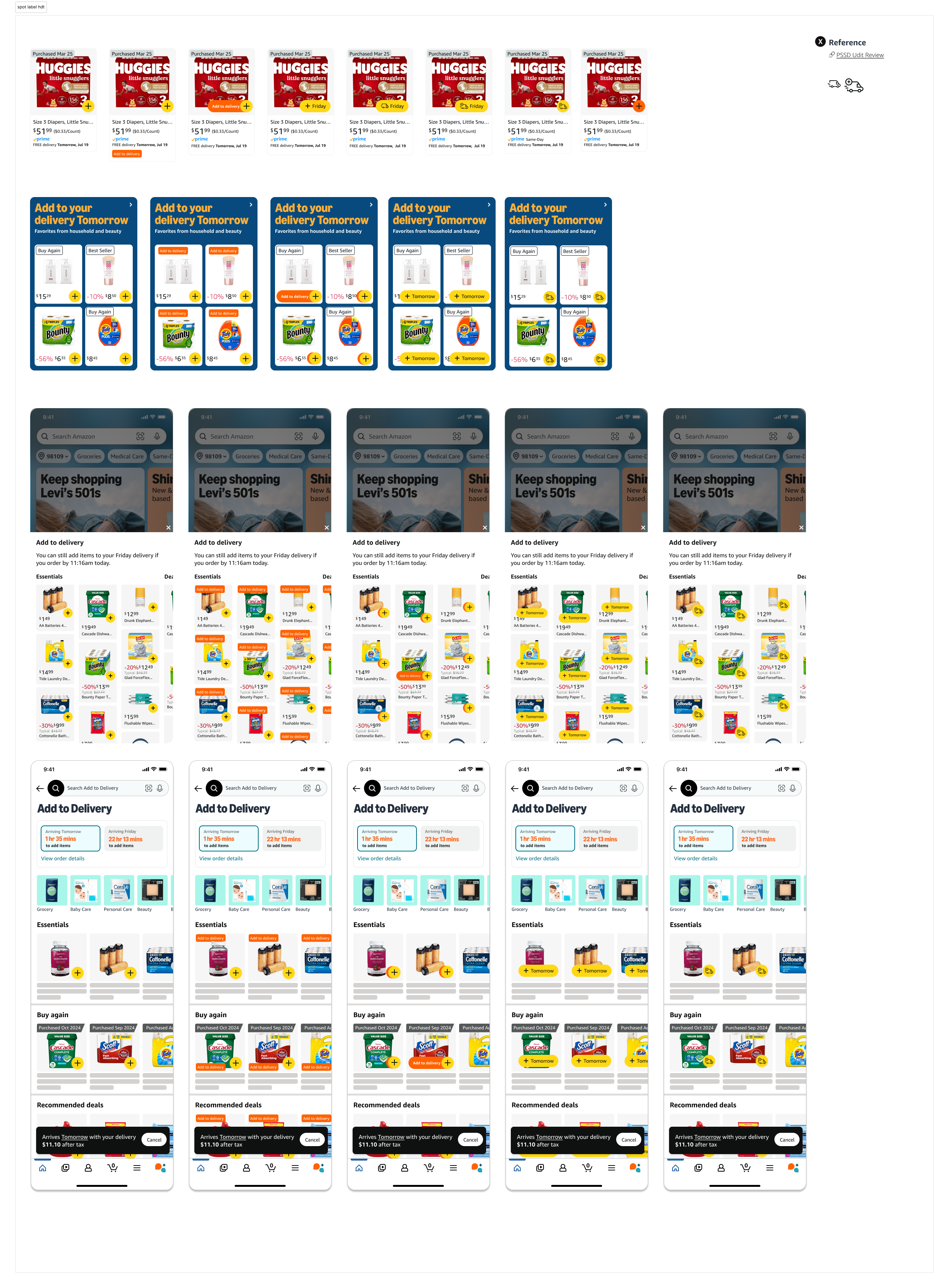
Spot AtC on the Storefront bottom sheet using Capsule CX iterations
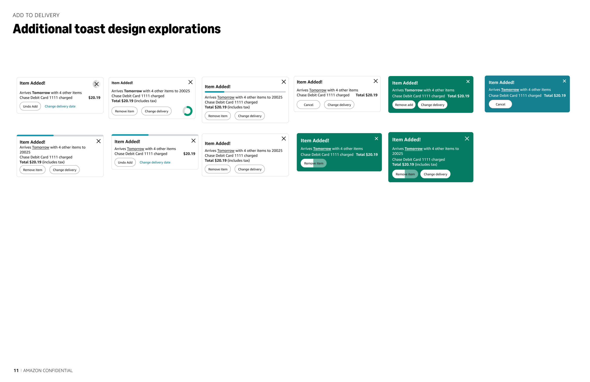
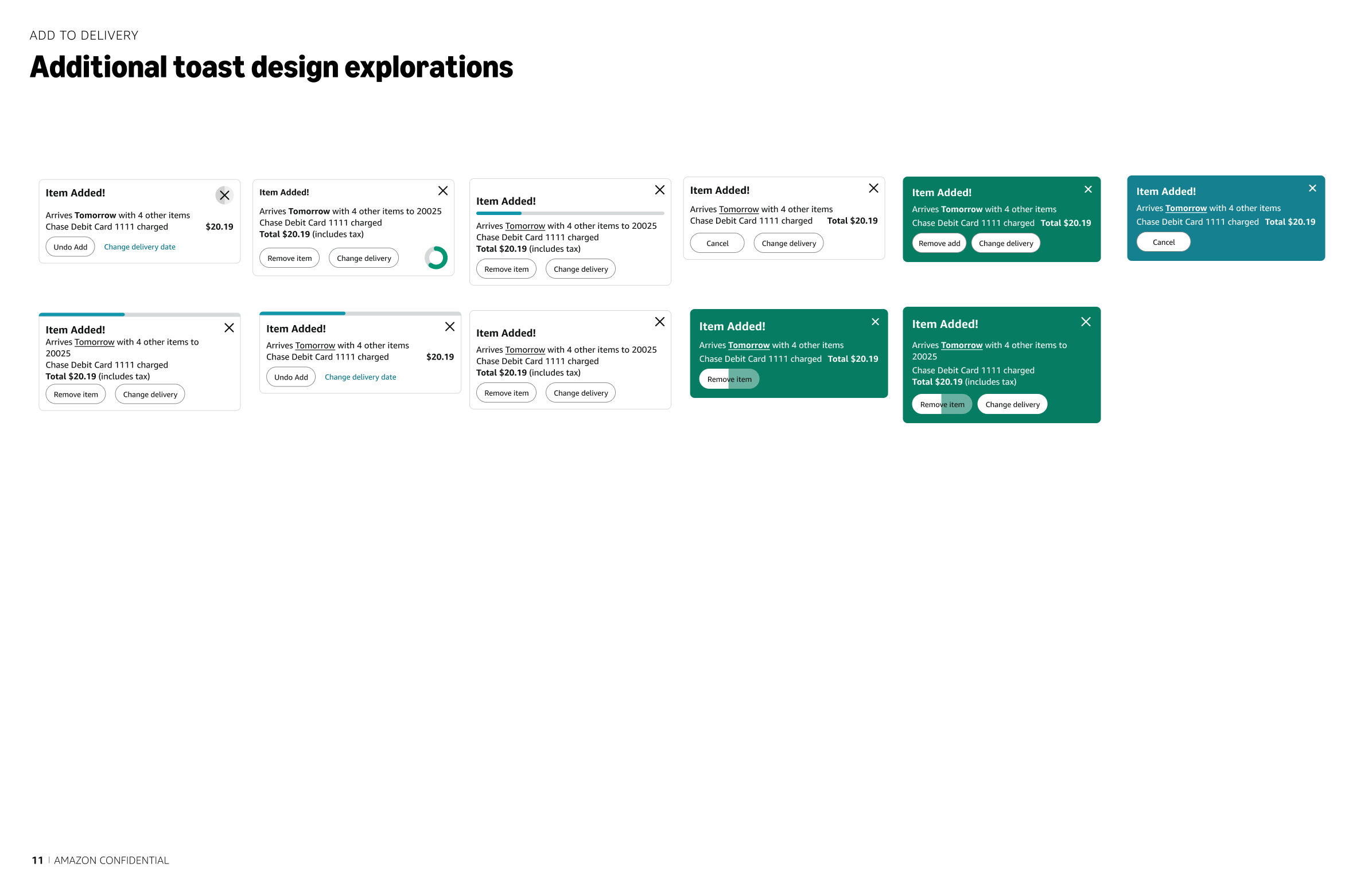
Toast iterations
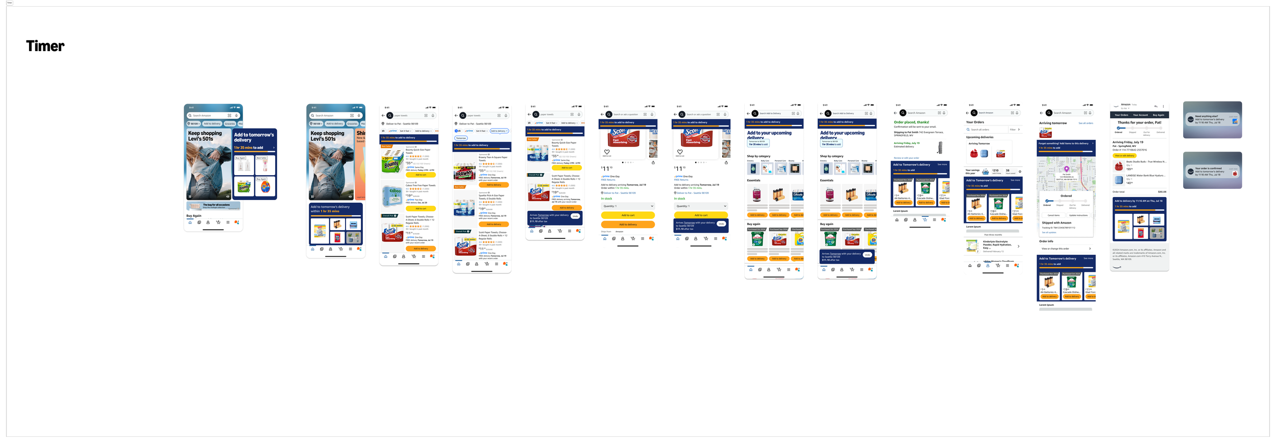
Timer Exploration
Design was tasked with exploring all options not only using existing frameworks and patterns, working together to merge future concepts, but also to create net new experiences. As we designed the north star, the north star was broken down into “spicy ideas” for ideas that were too out of the box so that teams who owned specific pages understood that these were highly debated topics but we still needed to explore if they were right for our customers, and to scope their feasibility.
I also explored solutions to specific problems, for example exploring all the ways we could let the customers know they had a specific amount of time to take an action (but within a button), or how we could let the customers know they could change their Address / Payment method (but do it using the least amount of vertical space).
Step Seven: More Explorations
Timed button options
Spicy Idea
Address & Payment info options
There were also a lot of continued explorations.
I mocked up 17 versions of each of the screens where AtD would be surfaced with various different colour options to help with branding the add to delivery experience. I also presented to stakeholders to short list the options to show to leadership who were aligned on the final colour chosen (navy blue) however, the branding of AtD became a hotly debated topic especially once the Rio design systems team (and brand management leader) got involved (understandably). To move the project forward our team had to work with the Rio & Brand to get an exception to use any colour patterns that were not approved.
Step Eight: Visual Identity
AtD Colour Explorations (Short List)
AtD Colour Explorations (All)
Once leadership was satisfied with the north star flow, as well as a very rough MLP plan, we were asked to think about theming Add to delivery.
We also started thinking about how we would tackle all the different use cases
For example, what would happen if a customer had more than 1 upcoming order? What if they had 0 orders? Or needed to change their payment method or address? A big part of the AtD vision included a “1-Click” purchase confirmation which used the payment method and address of the first order. This caused many ongoing conversations with many teams and even more iterations around how this would be tackled from a design & tech perspective. Since we were also designing both for our north star & MLP in tandem, all explorations around how we would design for these use cases had to be designed for both as well.
Step Nine: Delivery Number Use Case
What about 2 deliveries?
What happens if you only have 1 delivery?
Step Nine: Time Runs out Use Case
Add to delivery was dependant on a current open delivery so we knew that there would only be so much time to add to that first order (namely, from when it was placed until when it was delivered). Long term, the vision was that select items could be added at any stage up until the first order was delivered with item selection becoming smaller as time passed. Because of this, we would need a persistent countdown timer that was ideally dynamic (static for MLP) so we also had to plan for what would happen when time ran out. As I was designing for this, I realized AtD would actually have to change on every single screen it was surfaced on as well as depending on how many open orders the customer had. Which meant a lot of design iterations.
Timer Runs Out - Thank You Page
And finally, 0 deliveries?
Another use case that was top priority was when time runs out.
Timer Runs Out - Search Page
Timer Runs Out - Detail Page
The final use case I looked at, was what would happen if the customer needed to change their payment method or address after purchasing.
The team was still debating between a bottom sheet versus a toast, but we also needed to continue explorations for this use case since they kept going back and forth. Using toast as a template (and designing some options in a bottom sheet - not pictured) I started designing out how customers could change their address or payment method once they had placed an order. To complicate things, we weren’t using the default payment method and address to place orders but the last used (or used in the initial order the customer was adding to). So we couldn’t use existing infrastructure. And if we did, we had to figure out how to get the customer back into the purchase flow (which was almost impossible from a tech perspective).
Step Nine: Payment method / Address Change in 1-Click
What if a customer needs to change their address?
What happens if payment fails?
The team split up all the planned experiments into quarters, and we were tasked with mapping out the flow (and screens for each). There were 3 experiments (weblabs at Amazon) that were planned for Q1, and 5 that were planned for Q2, all that were to be scoped and planned in a month (while prepping for the presentation that would accompany the document). Design was given very loose outlines of each experiment, so we started putting together what we understood, to start having the conversations with PMs. It seemed like a lot of guess work and a lot of digging to get the information we needed. We also set up multiple meetings to review with PMs & tech partners, as well as longer stand ups. Unfortunately we were not getting the feedback we needed until the last minute which was causing even more churn. And conversations would continue around colours, and toast vs bottom sheet, which still weren’t decided.
Step Ten: Experiment Breakdown
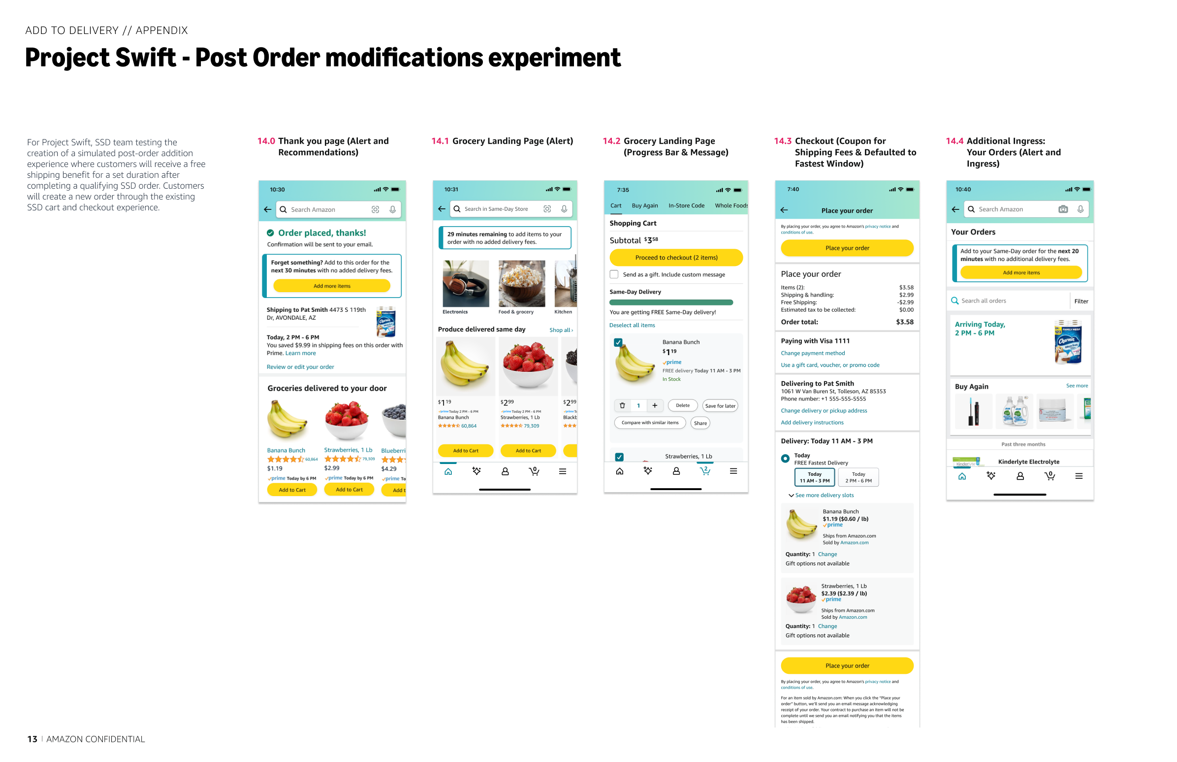
Add to Delivery for Non-SSD
Thank You Page Experiments
Add to Delivery for SSD
While looking at various use cases & working on the north star vision, we were tasked with breaking down the MLP plan into quarterly experiments & scope with the tech team.
Q1 experiments dropped down to 2, and Q2 dropped down to 1 (which was initially in Q2). From a tech perspective we couldn’t do any of the things we planned on doing, when we planned on doing them, so we pivoted once more. Our experiments became if we couldn’t do what we wanted, what could we do, and our presentation reflected this. Instead of full experiments, we were launching things in phases and planning to test as we went. For example, starting with messaging, would customers understand the value prop of Add to Delivery? This approach became confusing for leaders quickly as changes were seen as too subtle. Even our PMs could not align, and if they couldn’t align, they would remove experiments from the presentation(s). In an attempt to shift mindset and point us in the right direction, we started doing some very quick user testing.
Step Eleven: Pivoting
One Experiment with Phased Launches
By the time we spoke to tech, and had multiple reviews with the internal team, the scope changed again.
To narrow down a path forward, we pushed for the team to incorporate user testing.
There were lots of hotly debated topics and a lot of churn throughout this project, and no matter how many times we had a conversation, it would continue to be debated.
Step Twelve: User Testing - 1. Toast vs Bottom Sheet
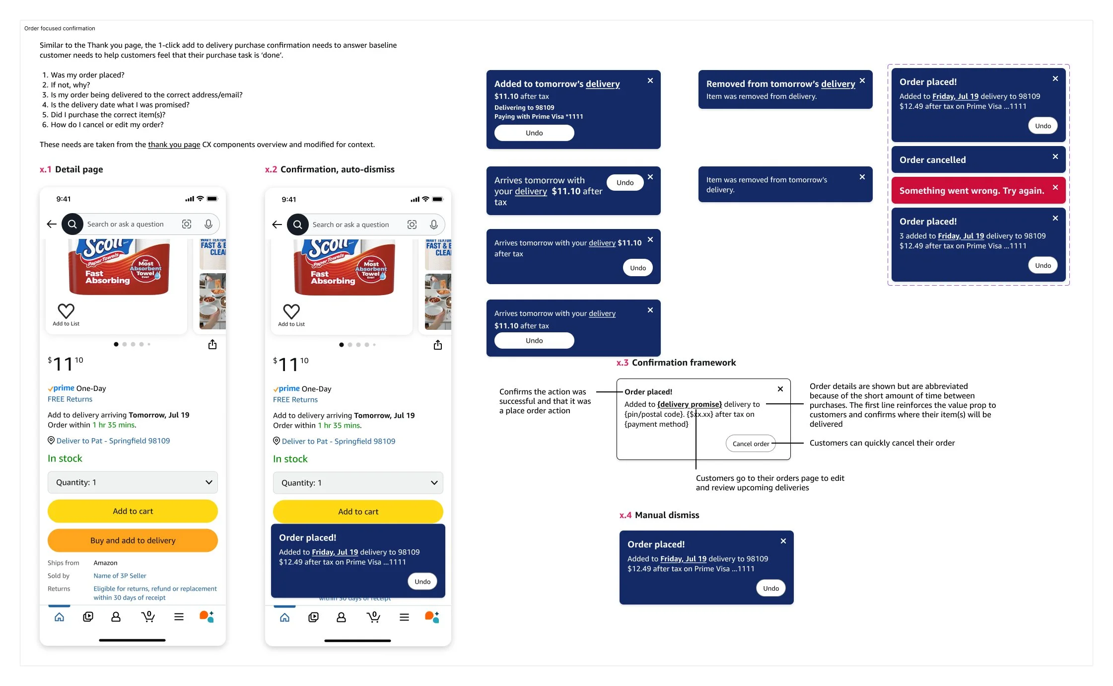
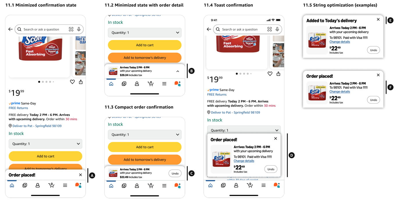
One of the main things that consistently came up was using a bottom sheet or a toast as the purchase confirmation for 1-Click. Leadership was very excited about 1-Click and didn’t want it to look like the existing bottom sheet we were currently using for turbo checkout, but we didn’t have an existing pattern in the design system that could accommodate everything we wanted to do (be manually dismissed, have controls within etc.) otherwise. We were tasked with using an existing pattern or coming up with a new one but each option had a different timeline (and tech feasibility). Before we even got to the point of testing, we’d already gone through at least 5 iterations (not pictured) but the team kept leaning towards toast. We had to choose one to move forward with in the weblab (and for tech scoping) but would switch if it didn’t perform well. We tested the two options pictured (along with a smaller toast) with 25 participants for clarity and comprehension - to see if they understood that they were making a purchase, and if the use of a toast as a confirmation was enough (without an additional step). Although users were very excited around the feature (to be able to add to a delivery already on it’s way) they much preferred the bottom sheet to both versions of the toast. The majority of participants strongly preferred the Bottom Sheet treatment over both Toast treatments. Bottom Sheet was overwhelmingly preferred for its clarity, comprehensiveness, and alignment with Amazon's existing aesthetic. 22 of 25 participants rated the Bottom Sheet as the clearest option compared to 3 selecting Toast Big and 0 selecting Toast Small. But even with these results, the team moved forward with the Toast, working on updating for clarity, & adding a manual dismissal so that it could compete with the bottom sheet.
Toast
Bottom Sheet
By the time we tested our CTA options, we’d probably presented options at least 5 times, iterating on at least 70 variations. We also worked with a UX Writer to make sure we were following Amazon’s voice, a legal representative to make sure we weren’t being misleading (on the first launch of AtD, customers would actually not get their items at the same time on the same truck, it could be delivered on multiple trucks to arrive within the same promise window), as well as a researcher to run this study.
Step Twelve: User Testing - 2. CTA
CTA Ranking
CTA User Study
We tested 10 CTA’s with 25 users to try to understand if it was clear that a purchase was being made, and to see if they could understand when their item would arrive. We grouped the CTA’s in 3 separate groups to see if that might help - one group for emphasis on the purchase action, another with the emphasis on the date of arrival, and another with the emphasis on the addition of the item to an existing order. “Add to upcoming delivery” was favoured by 15, however users still thought they would be taken to an additional checkout step and not that they were making a purchase.
We also ran another study where we asked 220 participants to rank the 10 CTA’s. “Add to upcoming delivery” was ranked number 1, however due to other use cases, the team wanted to move forward with adding a date in.
Our next test & another hotly debated topic was the CTA for AtD. It seemed like every week we were iterating on the CTA, so it was imperative that we get closer to a decision.
This study was to further understand if there is a better button CTA than what we came out of the last test with specifically for the scenario where a customer has two delivery options. At Amazon, the fastest delivery option is always defaulted, but for AtD, there are scenarios where AtD is not the cheapest or fastest option. For example, if Same Day delivery is available, and the user is adding to a delivery arriving the next day. Amazon uses messaging on each page called the Unified Delivery Message (UDM) to let customers know when they can expect their delivery but there are many rules around how UDM should be used (more on that later). In the scenario tested, we showed users two messages, one ‘attached’ to the AtD CTA, and one ‘attached’ to the AtC CTA. We wanted to understand if users would be able to understand these conditions and if the button CTA being specific would help.
Results showed that "Add to tomorrow's delivery" button and "arrives with tomorrow's delivery" messaging was overwhelmingly preferred (23 out of 25 participants). Temporal specificity ("tomorrow") was also more effective than relative terms ("upcoming," "recent") and consistent terminology between the delivery message and button label improved comprehension.
Step Thirteen: User Testing - 3. CTA & UDM
CTA & UDM User Study
We had one use case where it was imperative that the CTA be as clear as possible, so once we narrowed it down, we re-tested for this use case.
I know you’re probably saying wasn’t this put to rest after the user testing? Unfortunately it was not. Even though users preferred the bottom sheet option, the team still pushed for the toast because it was a true 1-Click experience. Leadership really liked it and wanted it to work, so we had to keep coming back to it. Other teams were also working on similar patterns so in an attempt to move towards a bottom sheet experience we eventually picked up some of those designs and iterated on them in conjunction with the other teams. For 6 months we flip flopped back and forth and explored what seemed like every variation you could think of. Every time we were happy with a solution, another piece of feedback would come up or someone would get wind of another project and we would go down another path, a lot of them leading to dead ends, or back to paths we’d already been on. Finally, once we understood that we were not using an existing pattern and building a new purchase confirmation we knew we were on the right path.
Step Fourteen: Iterating
Purchase Confirmation
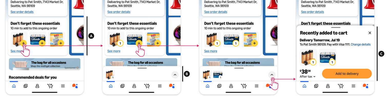
Once we knew what version we would go with, we had to help the team understand the interaction - for a true 1-Click experience we wanted the user to be able to continue shopping without too much of a disruption, so we put together a few versions of how this would look.
Hotly Debated Topics - 1-Click Purchase Confirmation
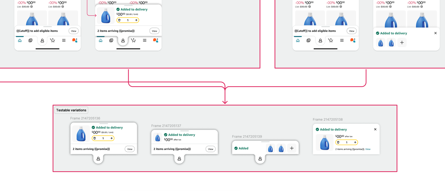
First version of a bottom sheet
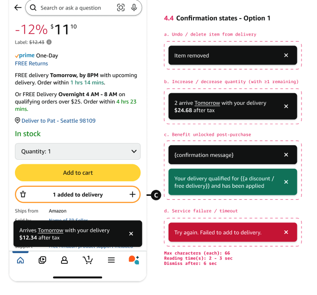
First version of the toast
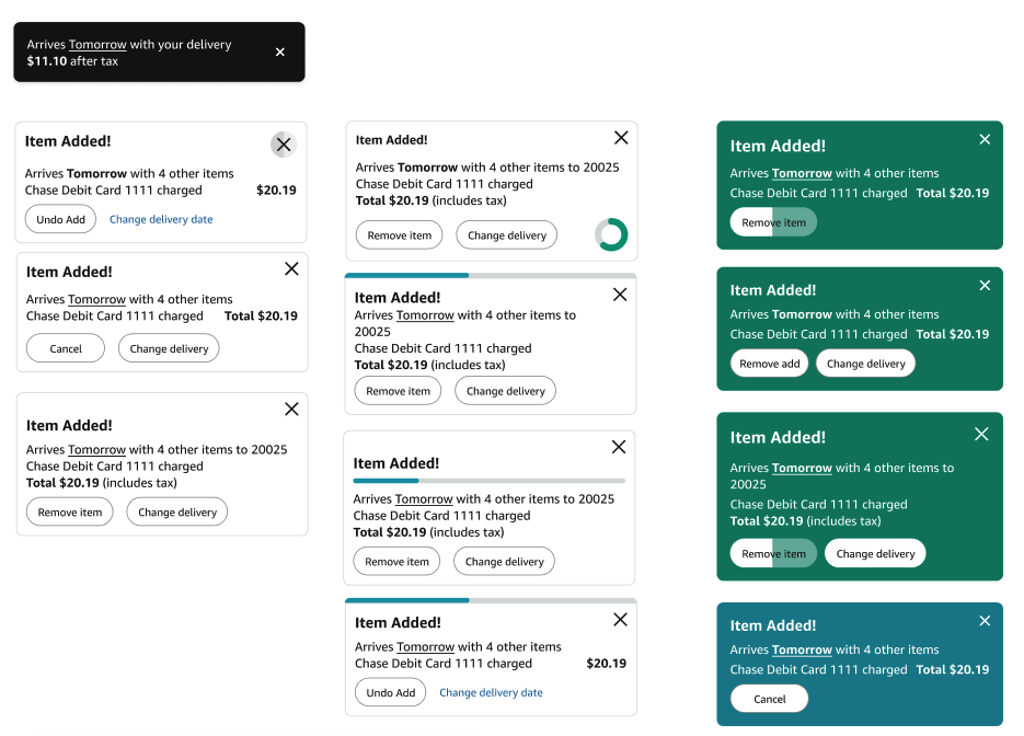
Toast explorations (V1)
Navy toast explorations
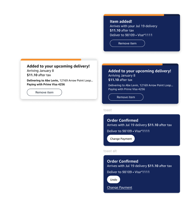
Navy toast explorations with timer
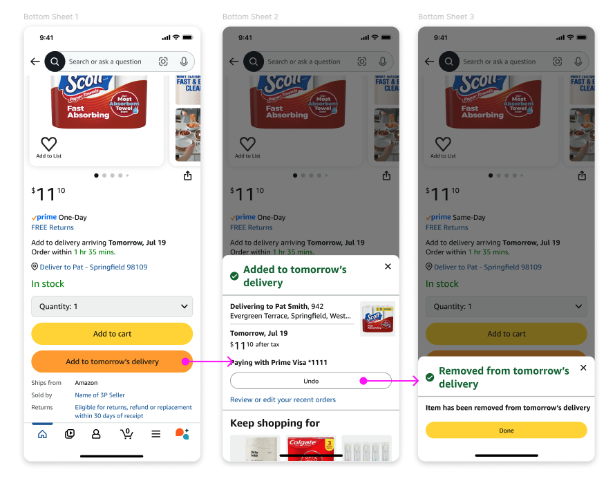
Second bottom sheet explorations

Toast explorations (black - existing pattern)
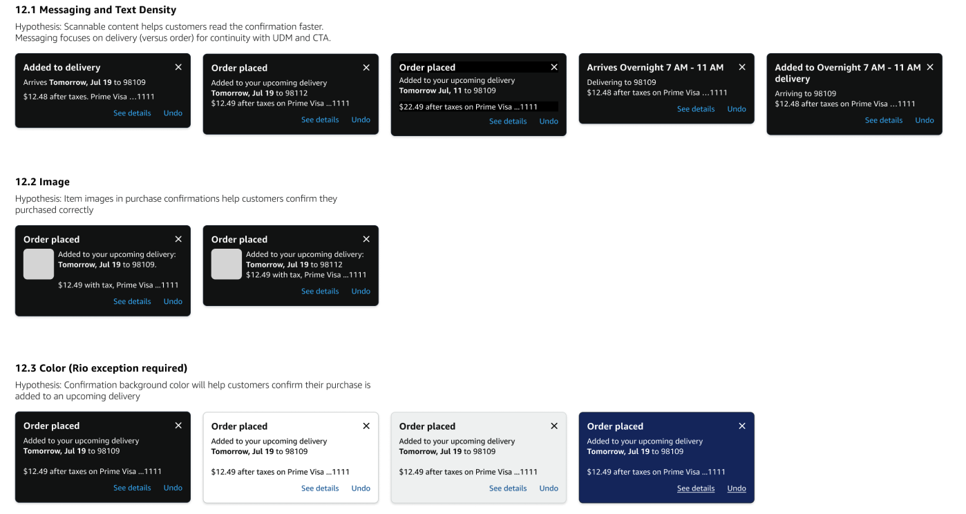
Toast colour explorations
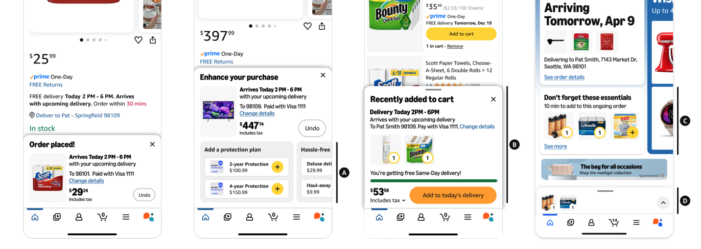
Follow me Checkout 1
Follow me checkout 2
Final toast experiment options