Amazon Robotics Warehouse Dashboard
On my current project as an embedded designer at Amazon, I am working on a dashboard for all Amazon warehouse Operations Managers on site at each of the Amazon Robotics Fulfillment Centres.
One challenge at Amazon for Operations Managers (OM) and anyone working at an Amazon Fulfillment Centre (FC) is the sheer amount of tools available. At Robotics FC’s, not only are OM’s responsible for the full flow of all items going in and out of the FC, but also all the warehouse workers and all the Robotics within the space. There are numerous different robots, people, workflows, and tools to monitor everything so that Amazon can fulfill customer orders from each FC in an timely manner. Due to all the things that need to be monitored, the OM’s have numerous tools and dashboards that they monitor to keep track of everything and everyone and make sure things run smoothly. Each tool also shows many complex metrics for the various things that are being monitored indicating that there is an issue once a set threshold has been breached.
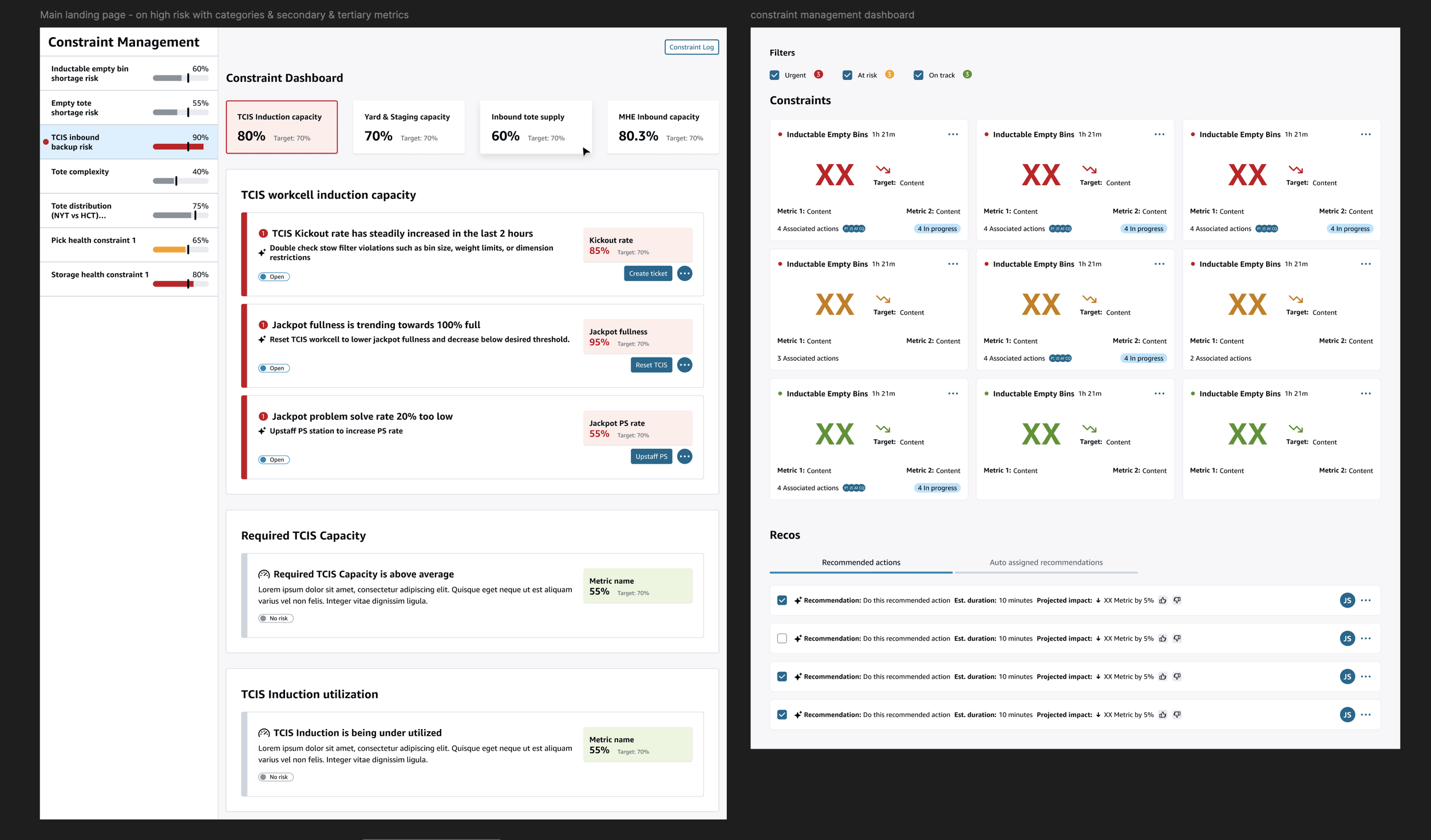
The dashboard utilizes metrics from all equipment to show downward trends
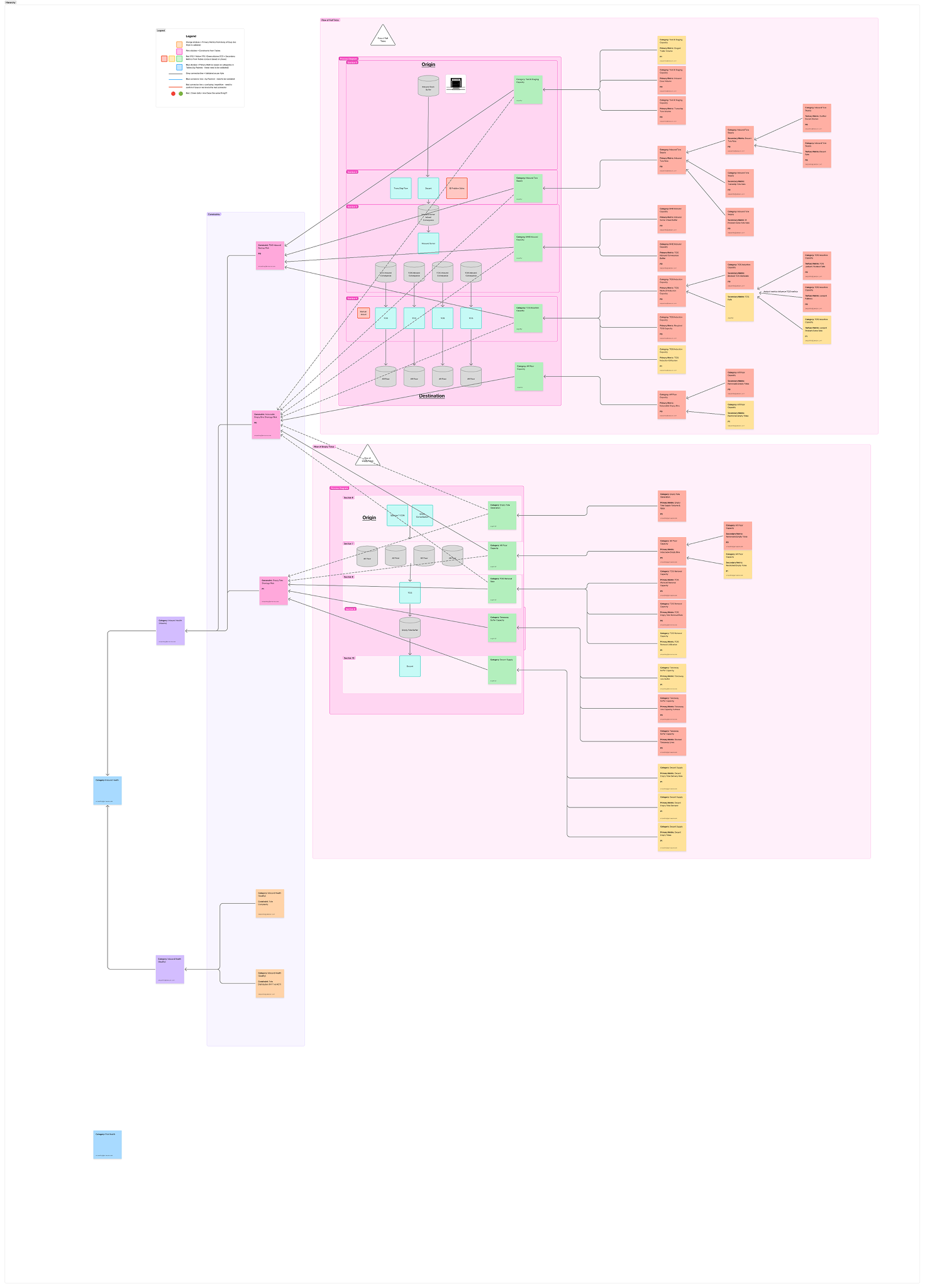
Currently OM’s use monitors to track all metrics and do their own mental math to understand if there’s going to be a problem, when the problem will happen, how the metrics affect the problem, and then decide on what to do, when to do it, and prioritize all issues based on experience.
It takes a lot of time for users to get up to speed to be able to do this, and there is really high turnaround in these roles. It also takes a lot of time for users to do these tasks to understand what solutions to utilize to mitigate problems. Systems are in place to alert OM’s however most of these systems alert the user after there is a problem, and througnput has already been affected. The new dashboard aims to utilize AI to do all the mental math the users typically did, prioritize actions, and make recommendations based on gathered data from previously successful solutions. There are many metrics and dependancies that need to be tracked and then presented back to the user in a concise way so that they can be actioned before throughput is affected. We also have to take into consideration various decision trees, and full workflows.
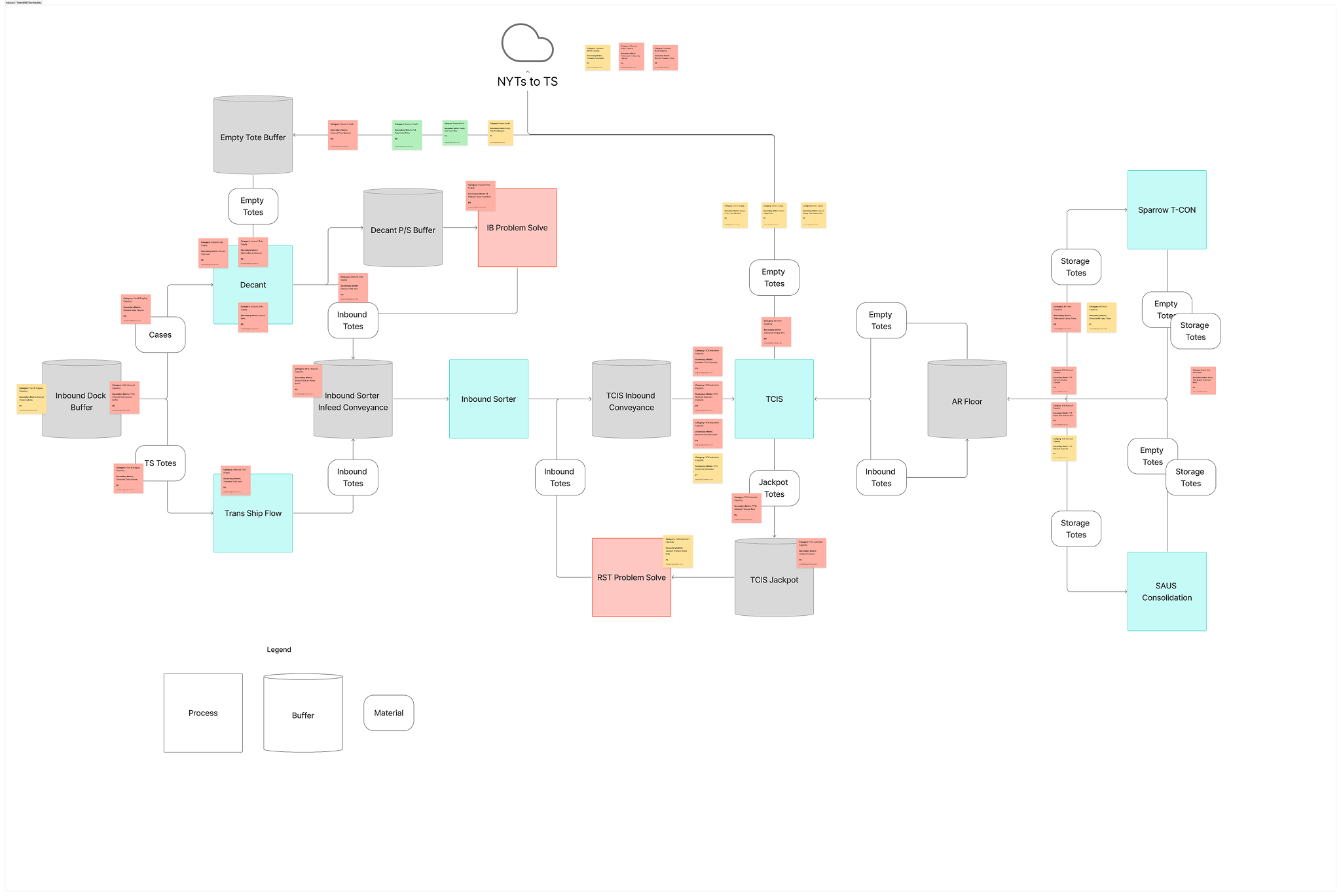
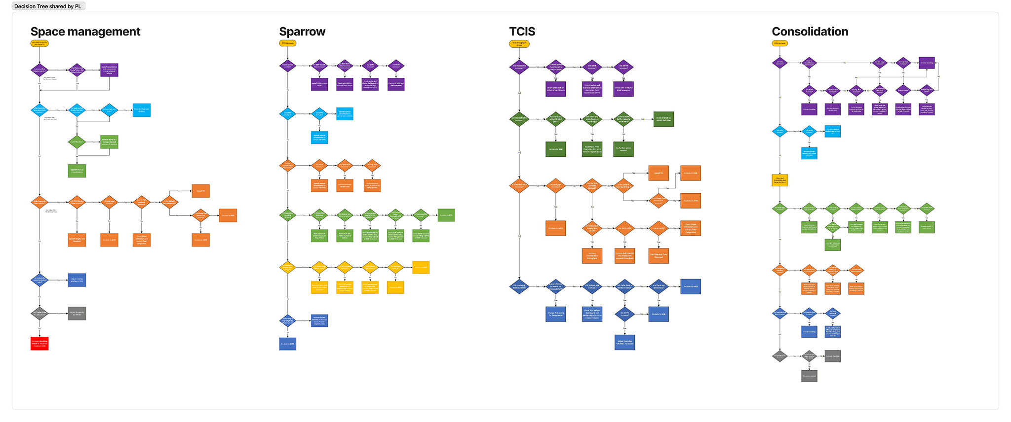
There were also many teams working on similar dashboard that were needed across other teams
The information was difficult to gather, to understand, and other teams were also working on similar dashboards. Teams were also working on requirement gathering while design was tasked with designing a solution. And devs were already trying to figure out whether they could even gather the data needed. So instead of designing a solution specific to any one team or metric, our aim was to create a framework that could be flexible to any information on any team, in any type of FC (regardless of how many humans and robots there were).
So I started working on trying to figure out how the information could be organized to give the user only what they need and help them do their work faster without having to do the mental math themselves by putting together some quick wireframes.
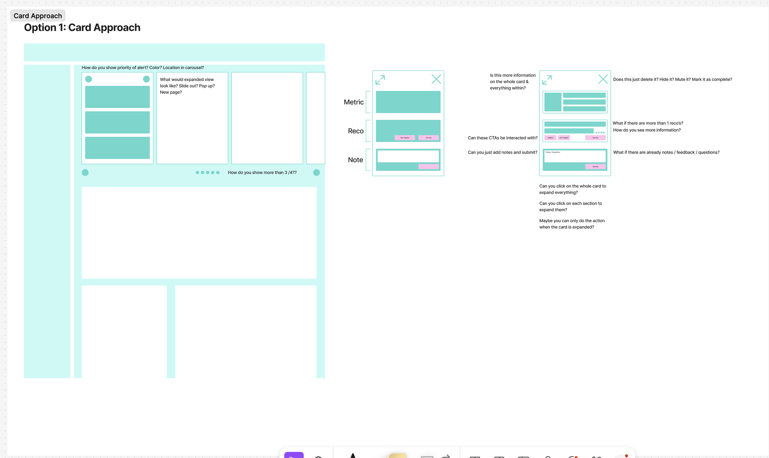
Card approach
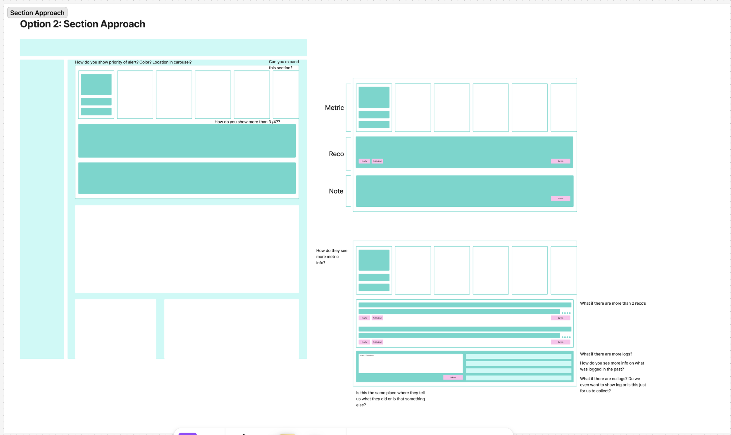
Section approach
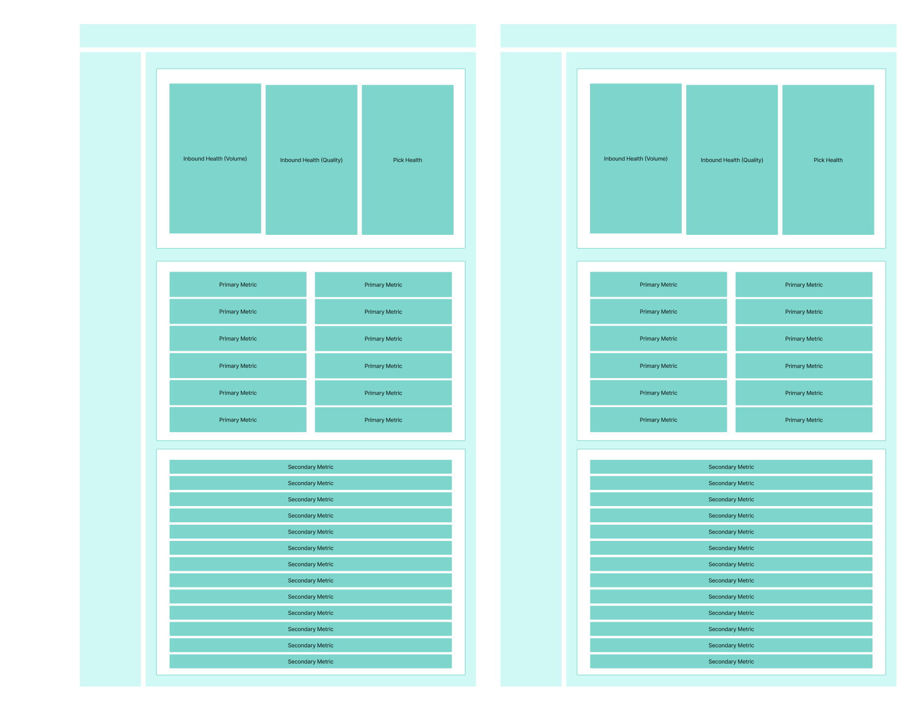
Spatial hierarchy approach
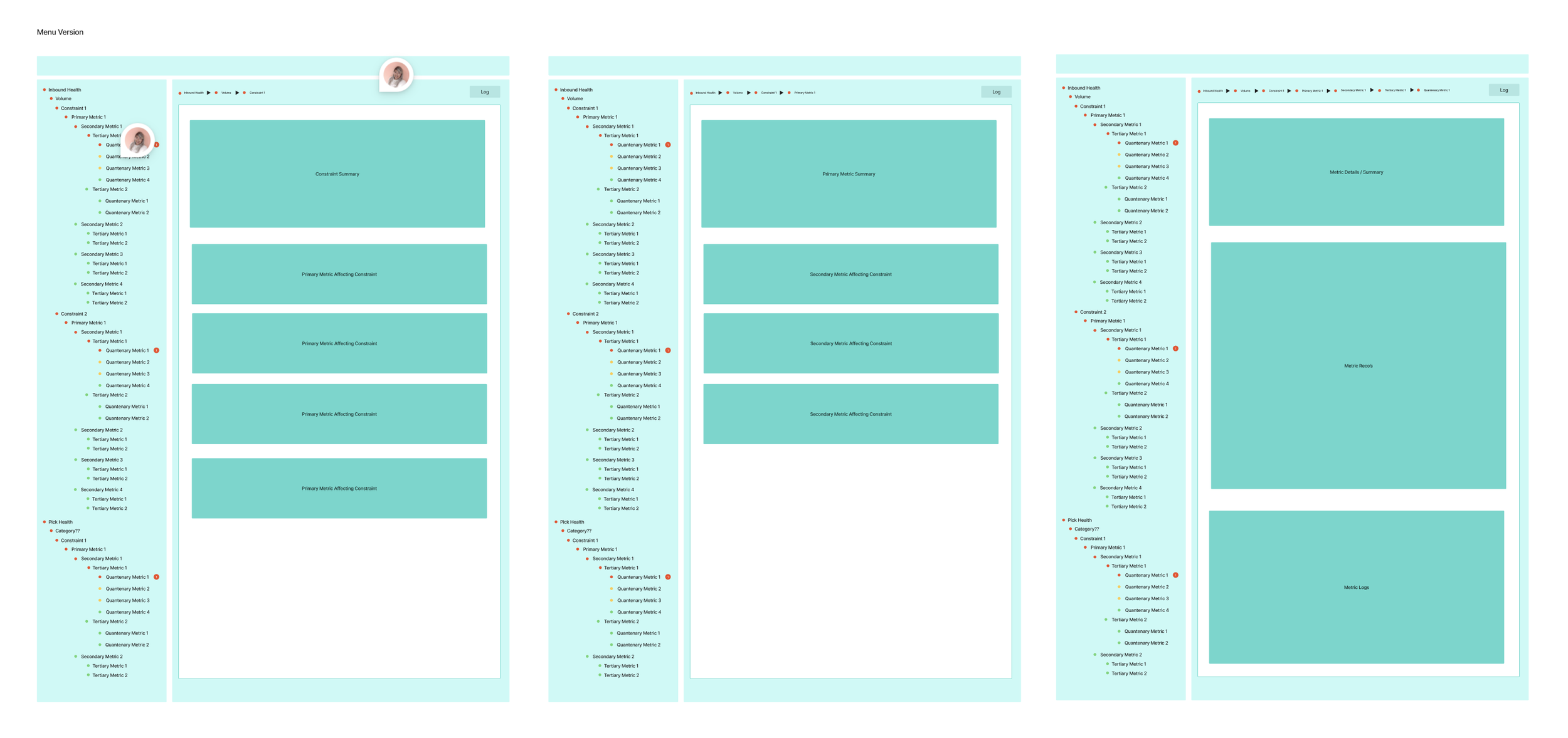
Side menu approach
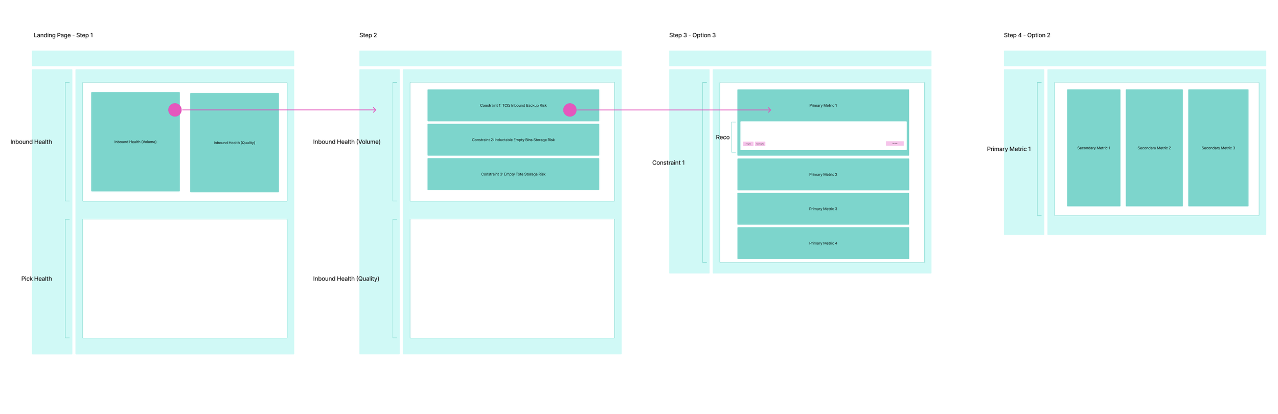
Page approach
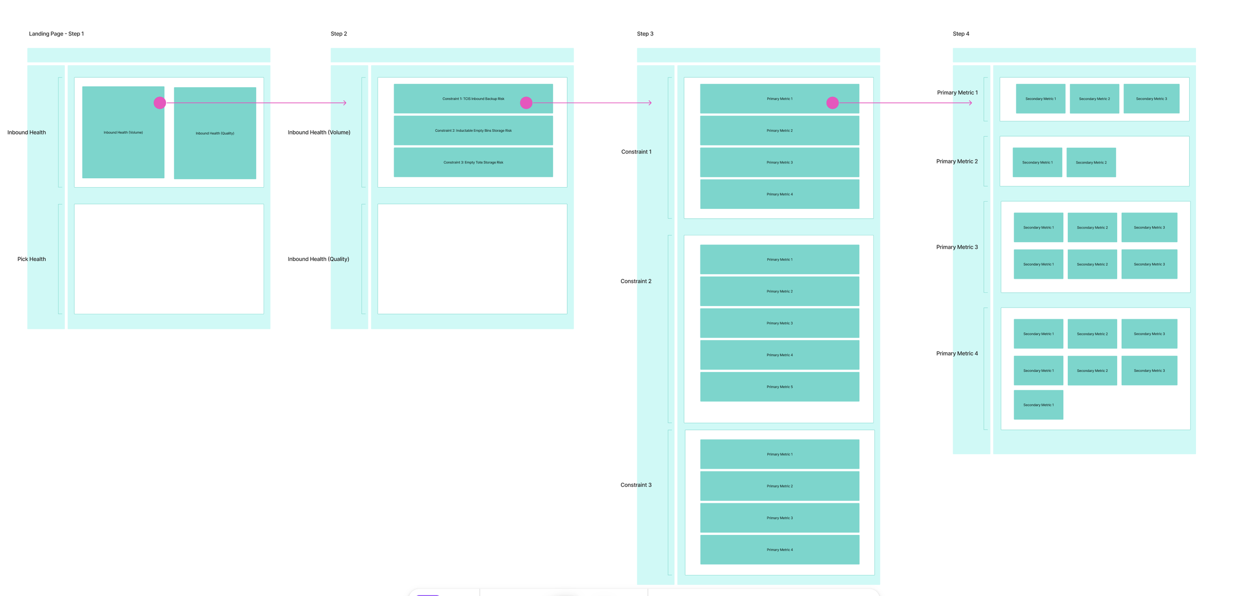
Metric approach
While wireframing we had a few ideas that we quickly validated using AI
While ideating, we used Claude to quickly come up with different ways we could lay out all the things we needed to see from a user perspective to see if there were ways all the information could be laid out to hit all of our stakeholder and user needs.
The goal was to populate our wireframes with content and be able to see if our wireframes made sense when information was added, and to get a prototype that was usable to see if the flows made sense.
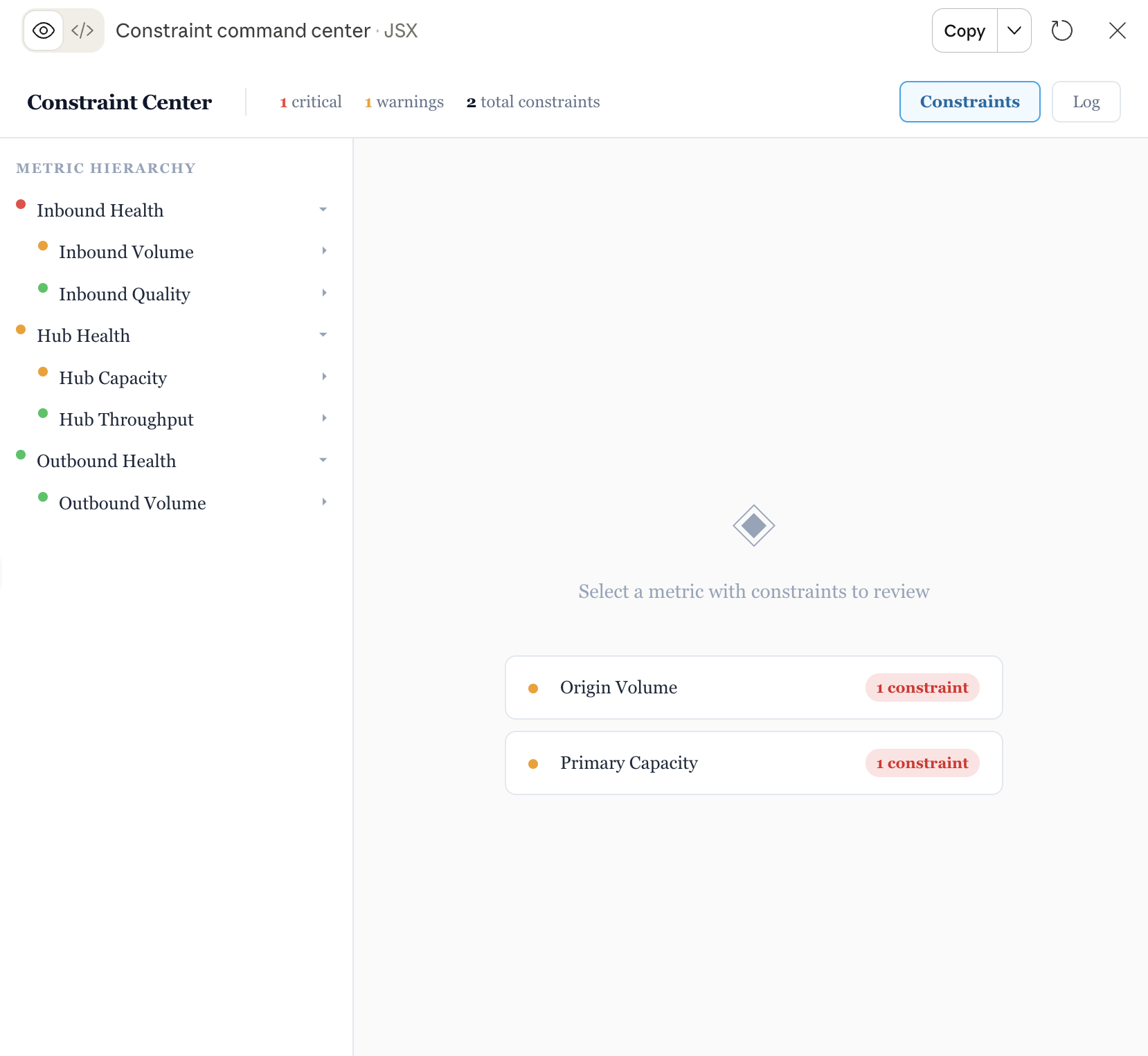
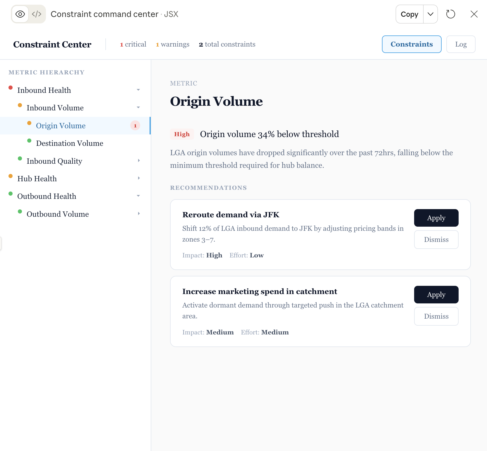
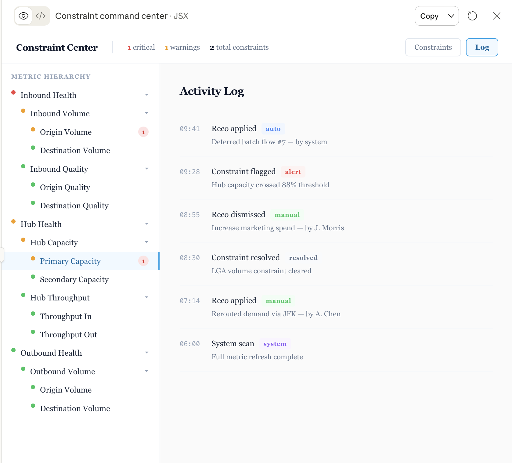
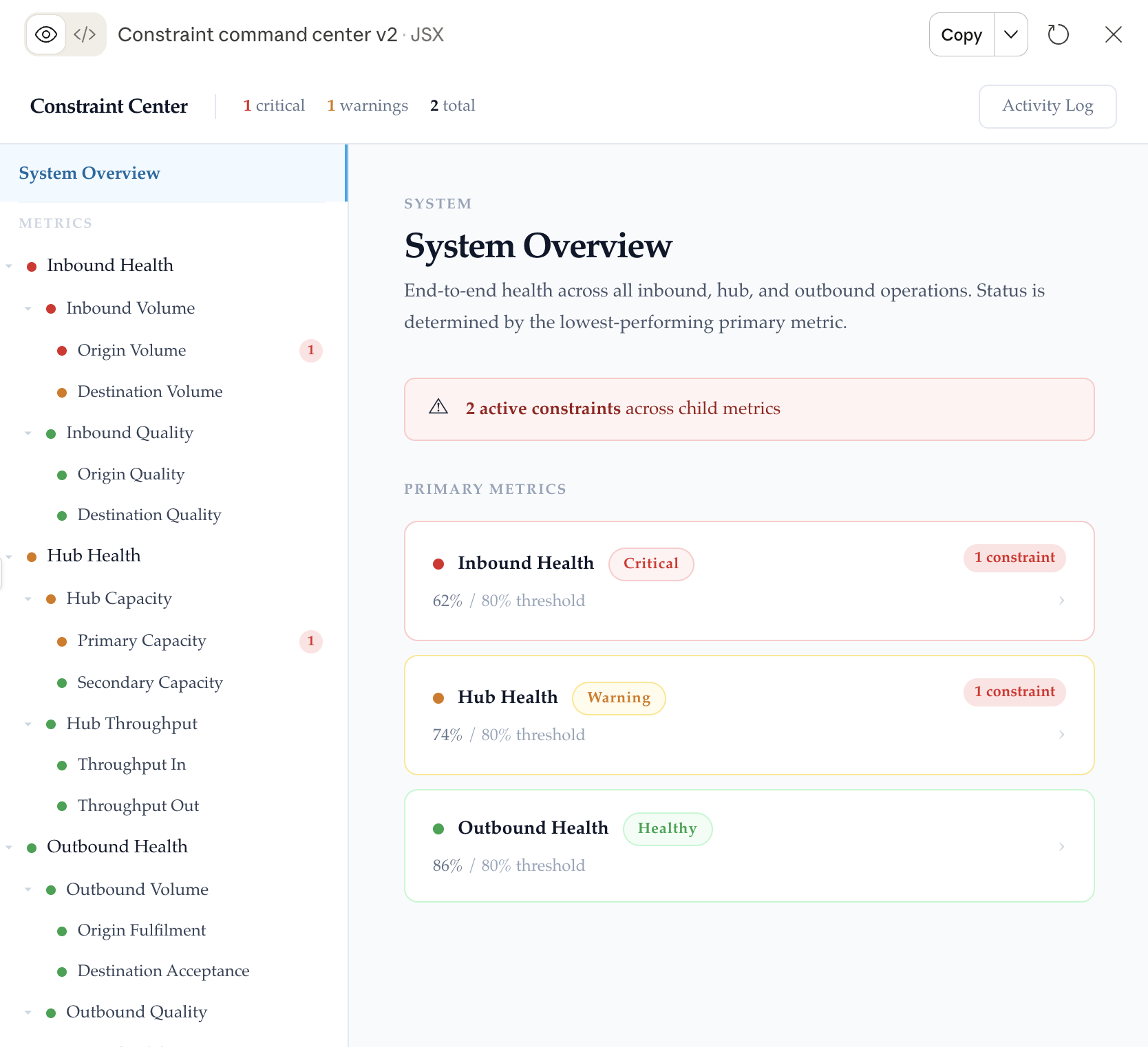
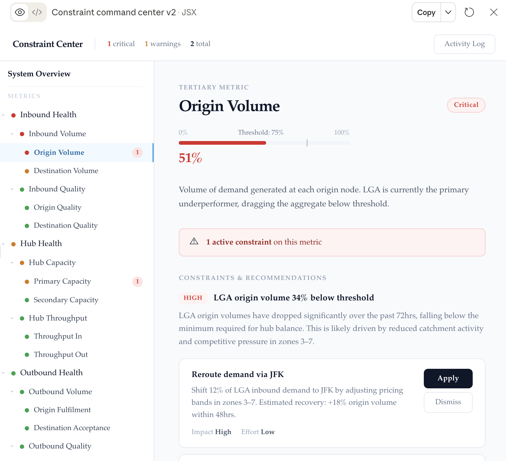
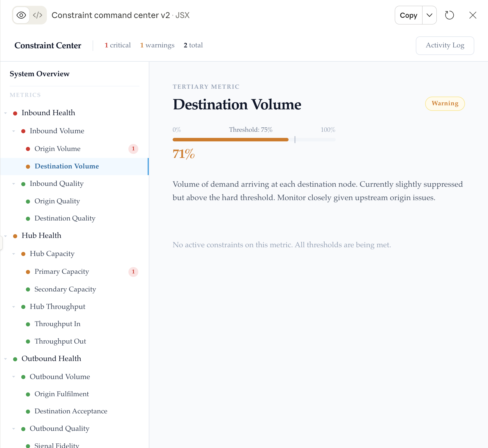
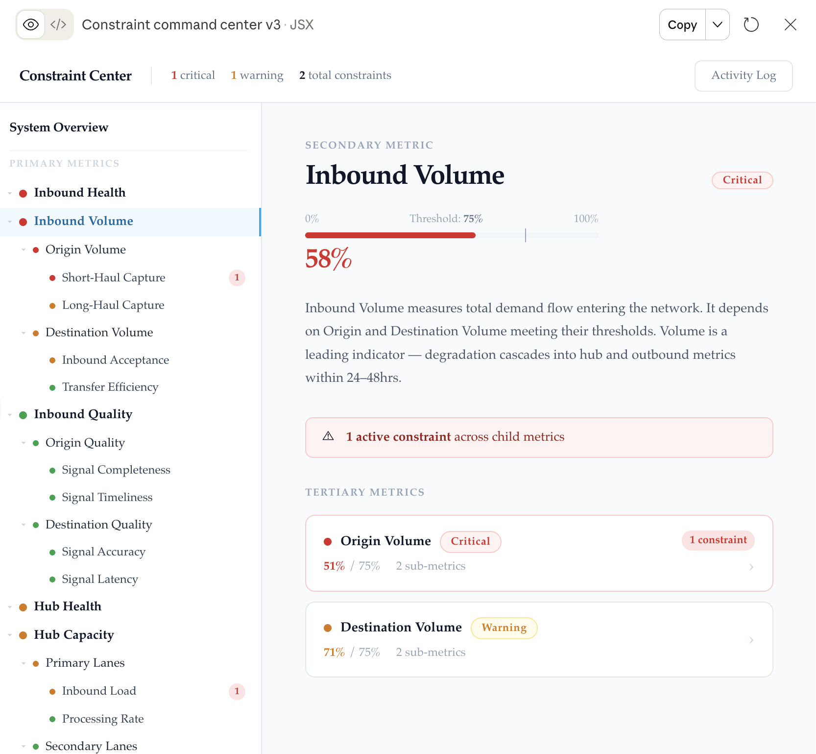
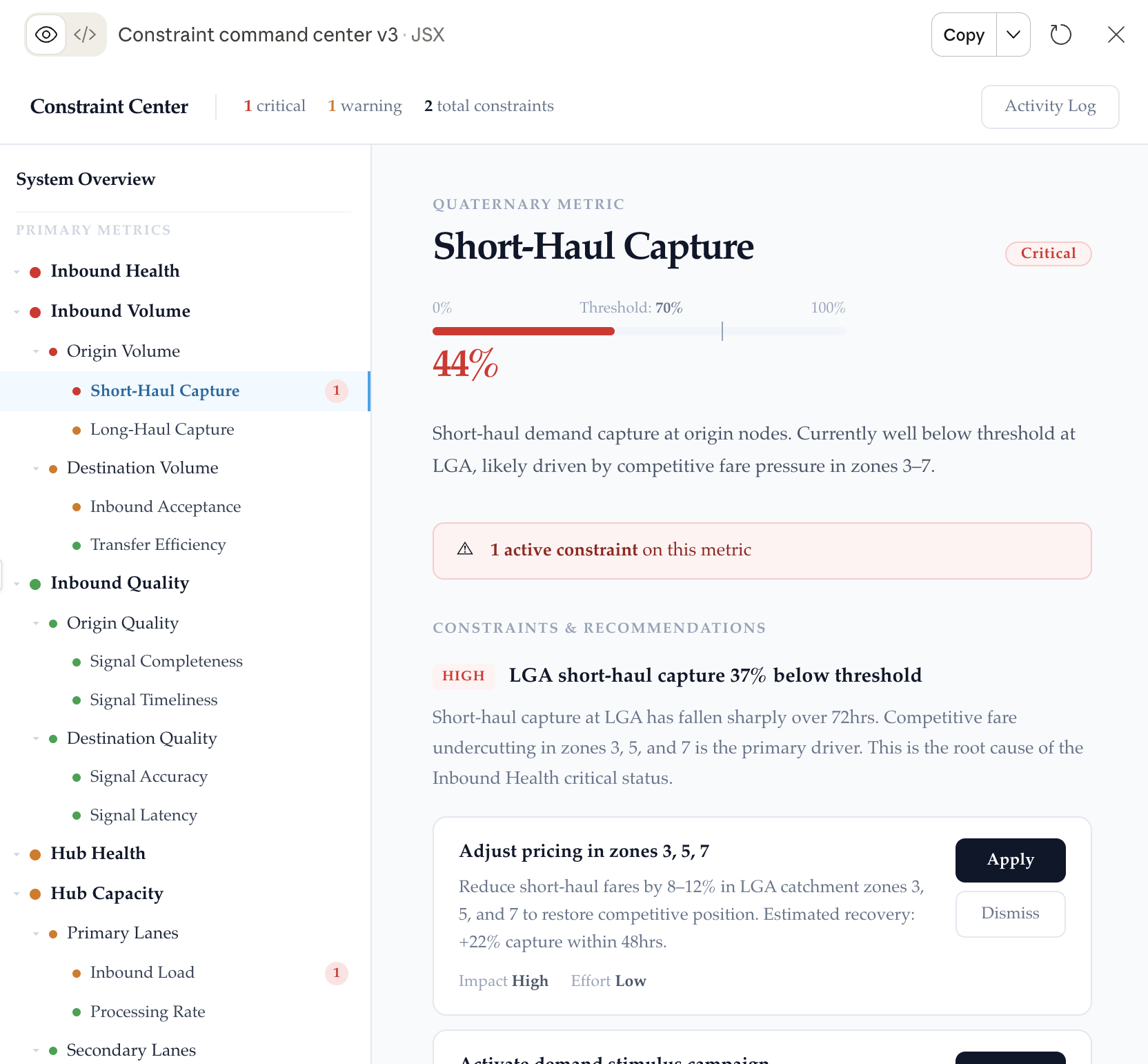
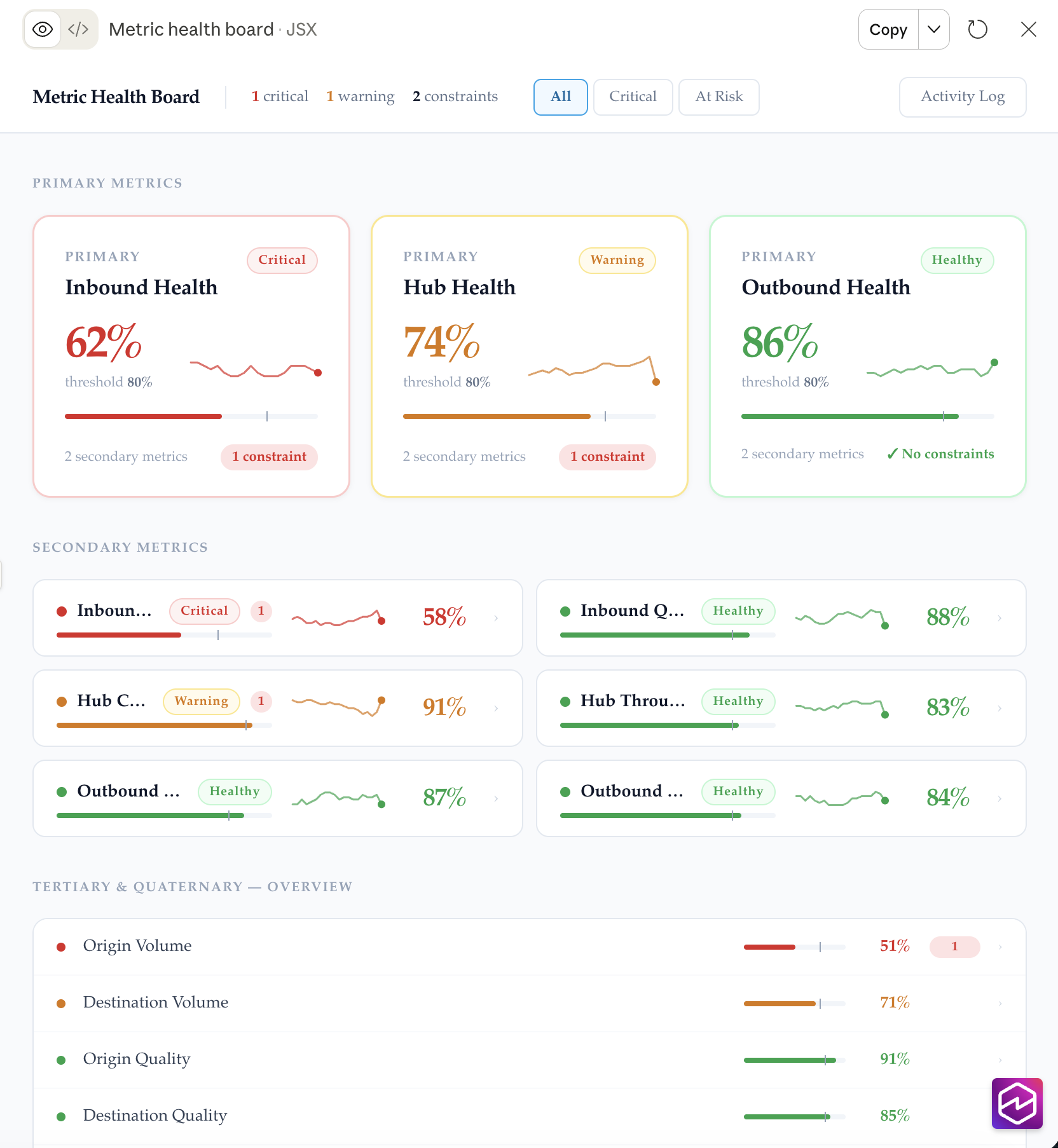
After wireframing we decided on a few concepts to design out.
We explored three different concepts adding content to see if they made sense. We wanted to see if they would work or if they would be too overwhelming when realistic information was added.
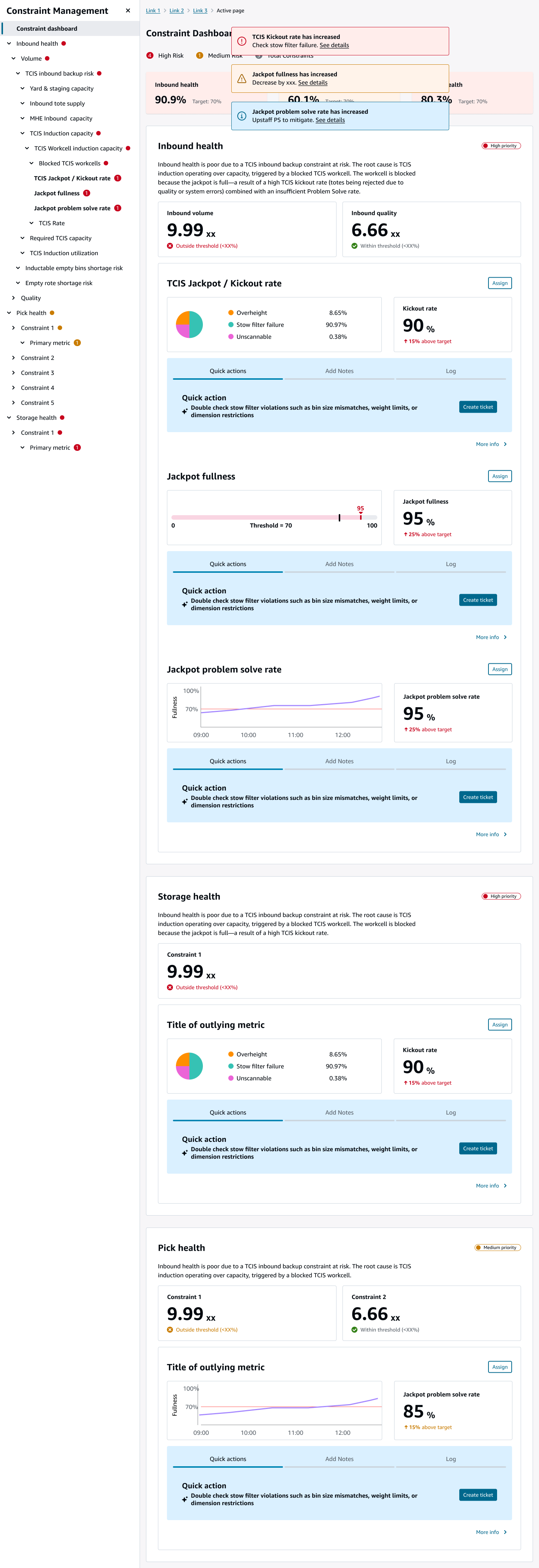
I designed various versions of the a few approaches to share internally with the team and stakeholders. I iterated on ways to show recommended actions, alerts, menus, metrics, and ways to group information and make issues findable, however every iteration was too overwhelming when realistic information was added. If the internal team and stakeholders couldn’t understand these designs, how much better would the user fare?
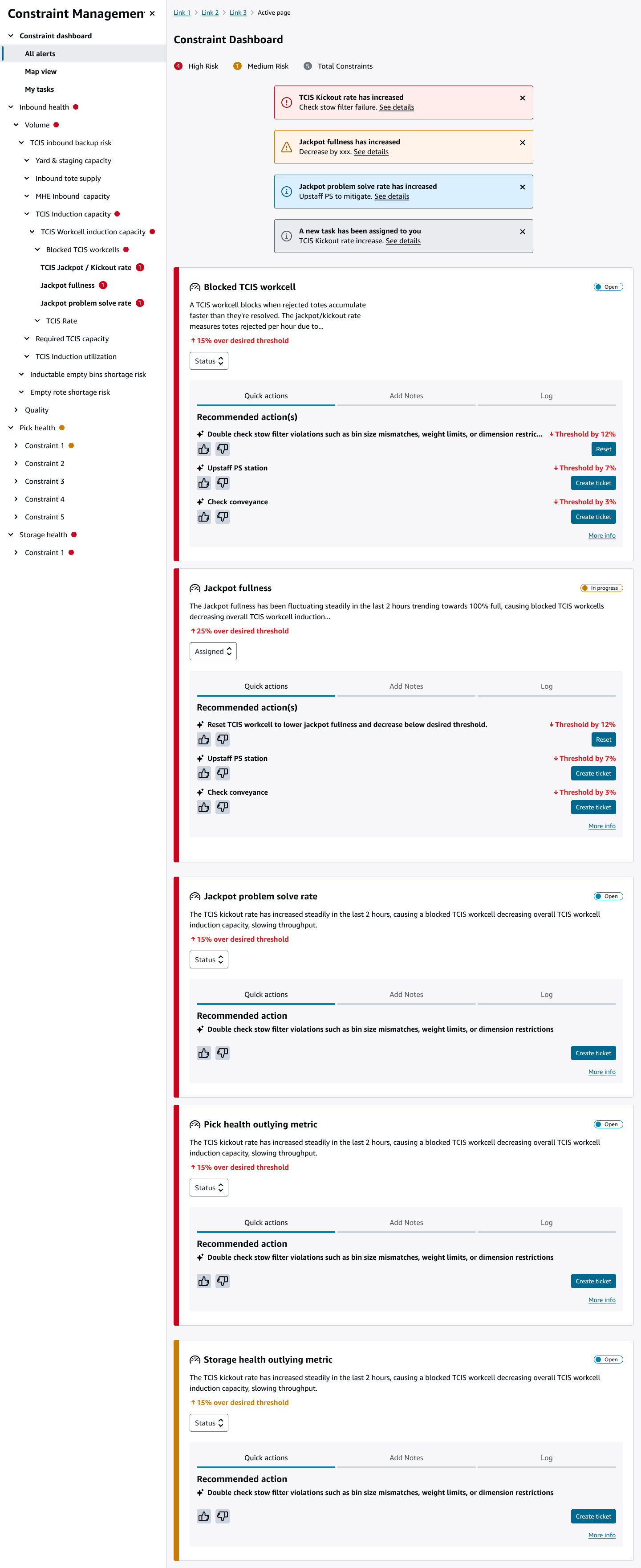
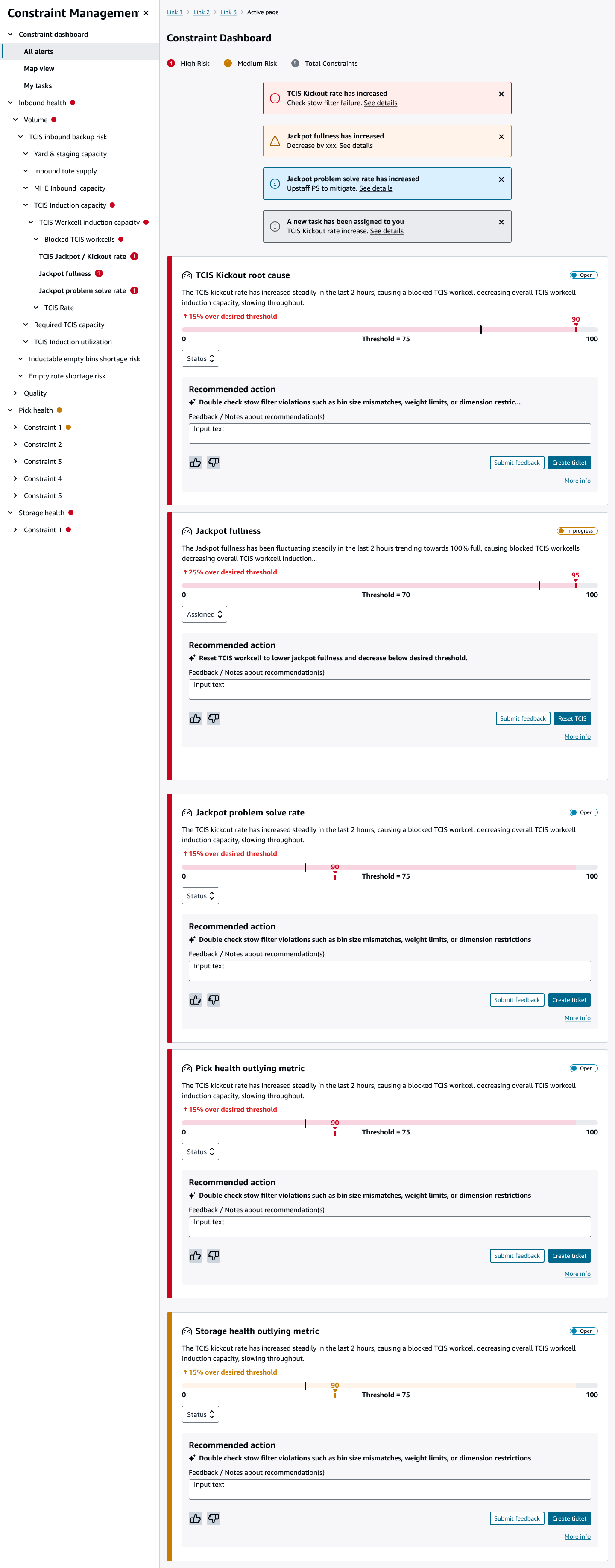
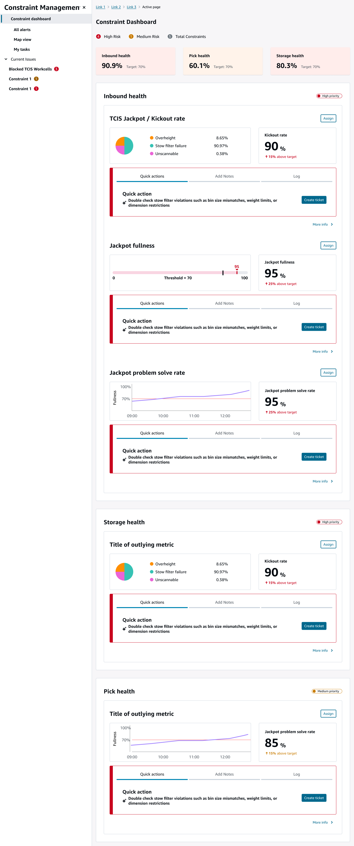
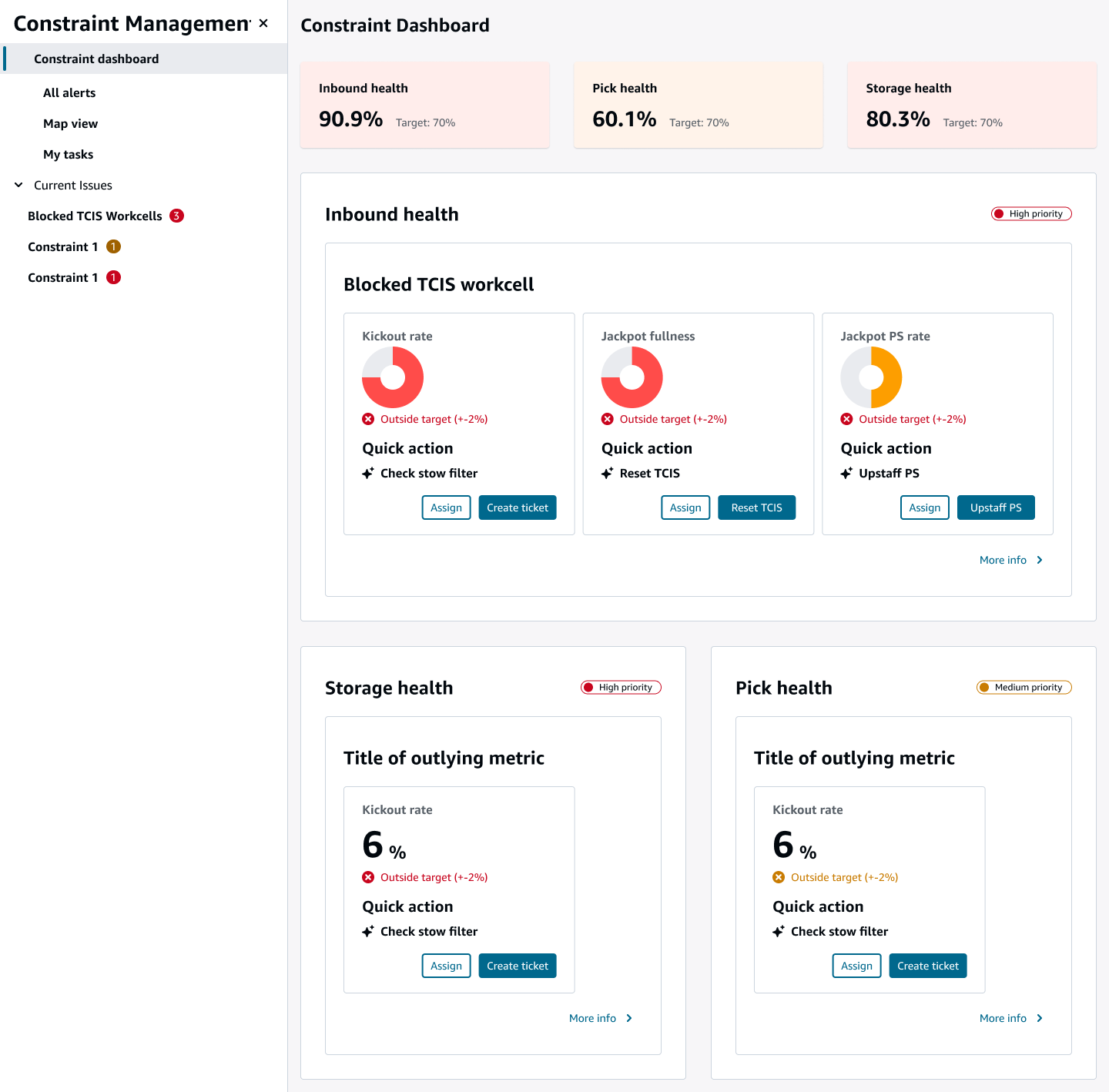
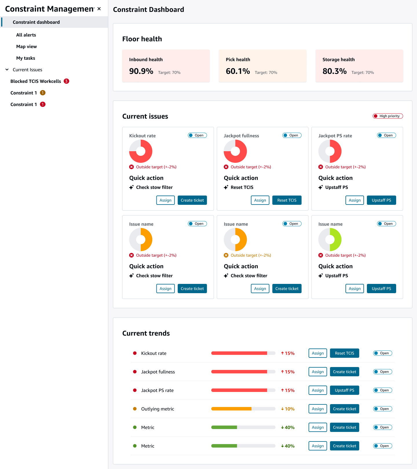
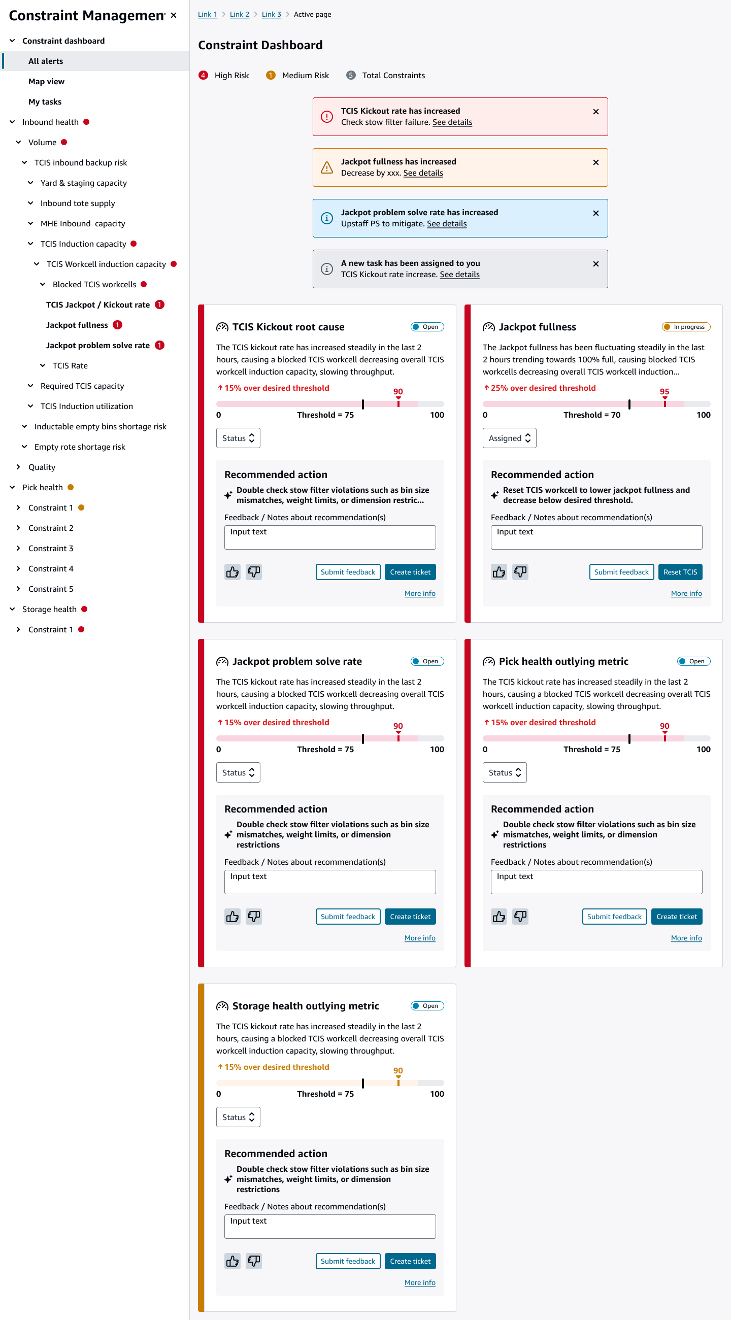

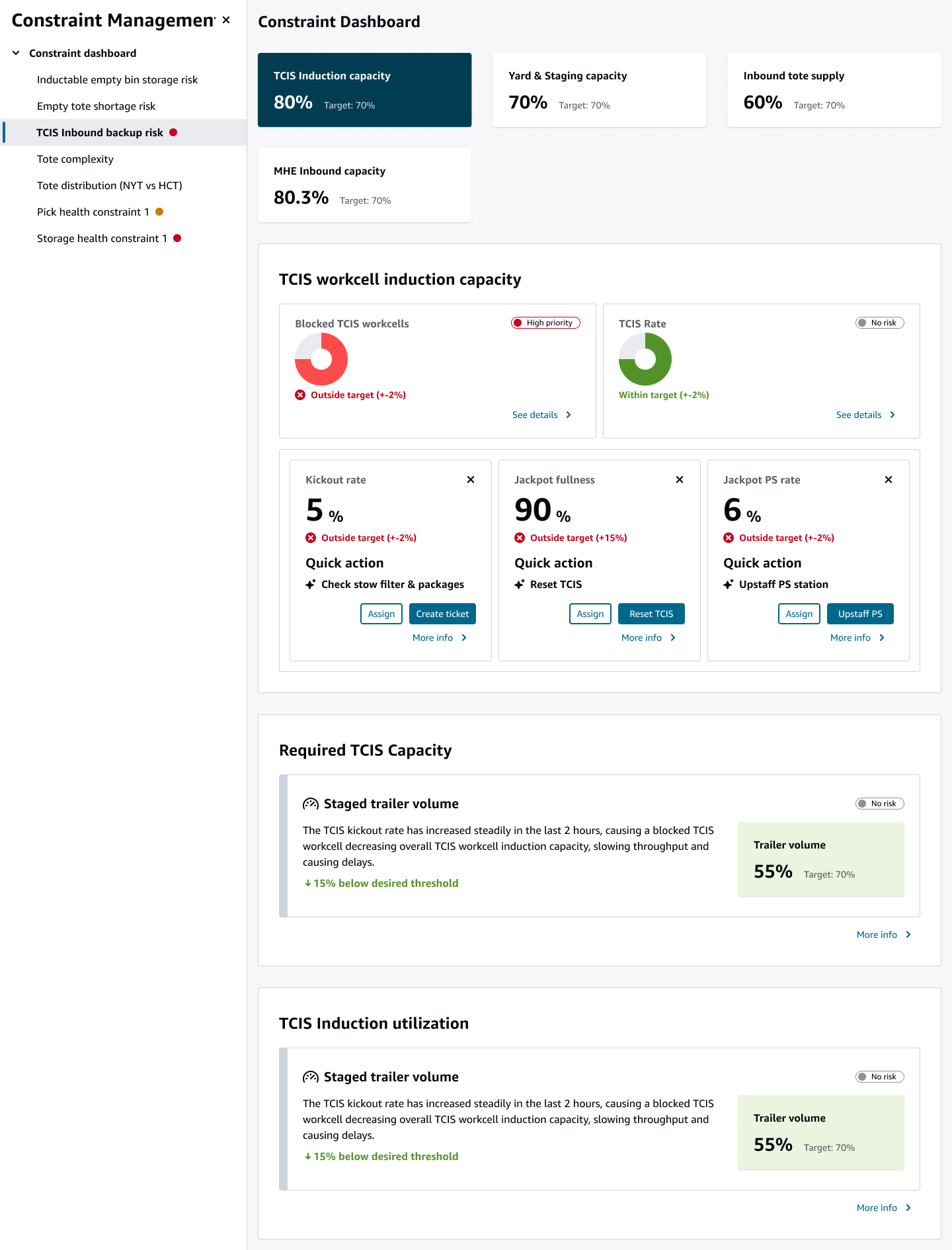
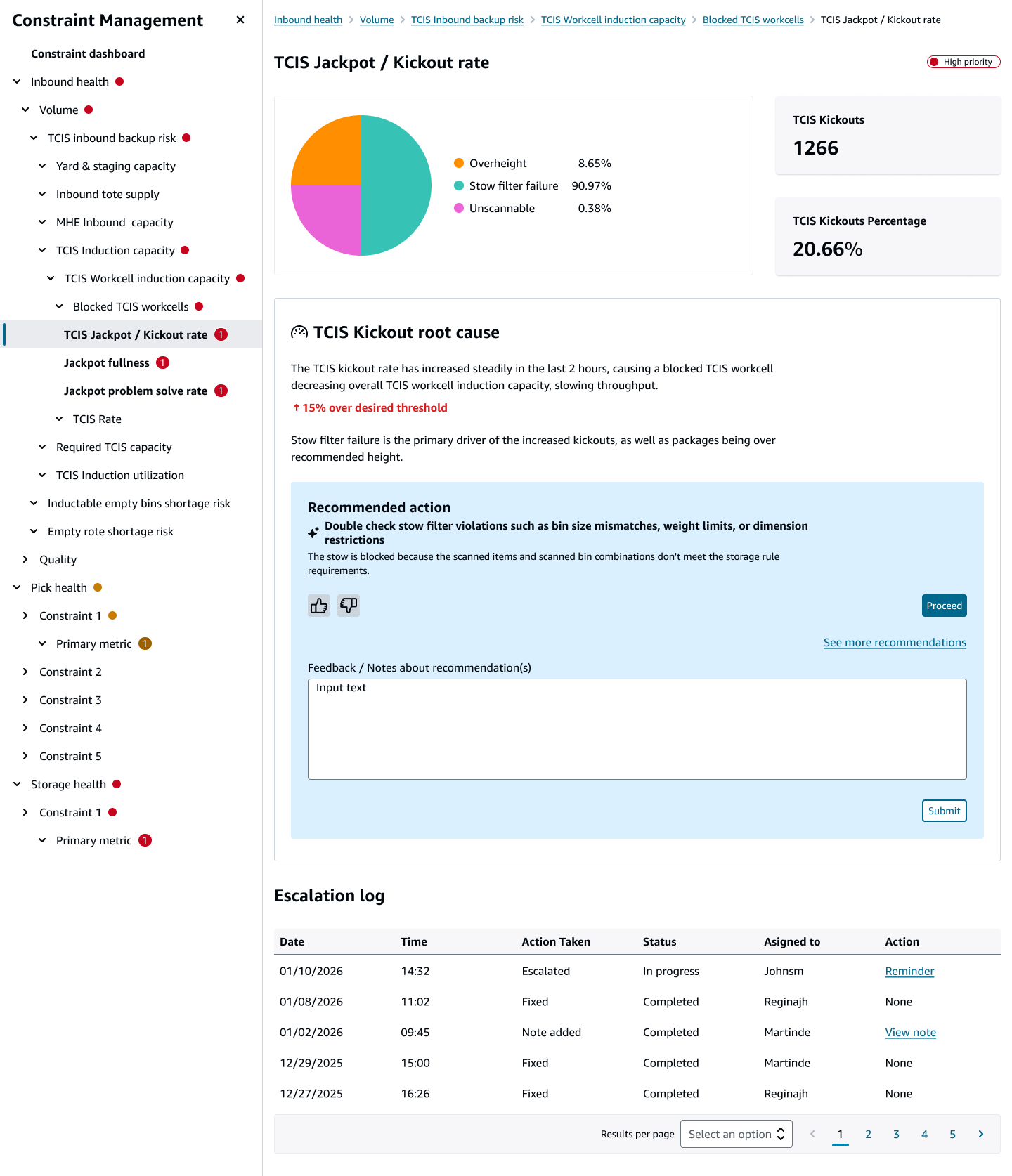
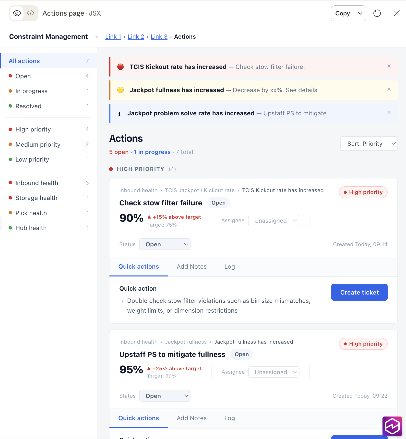
Requirements also became clearer
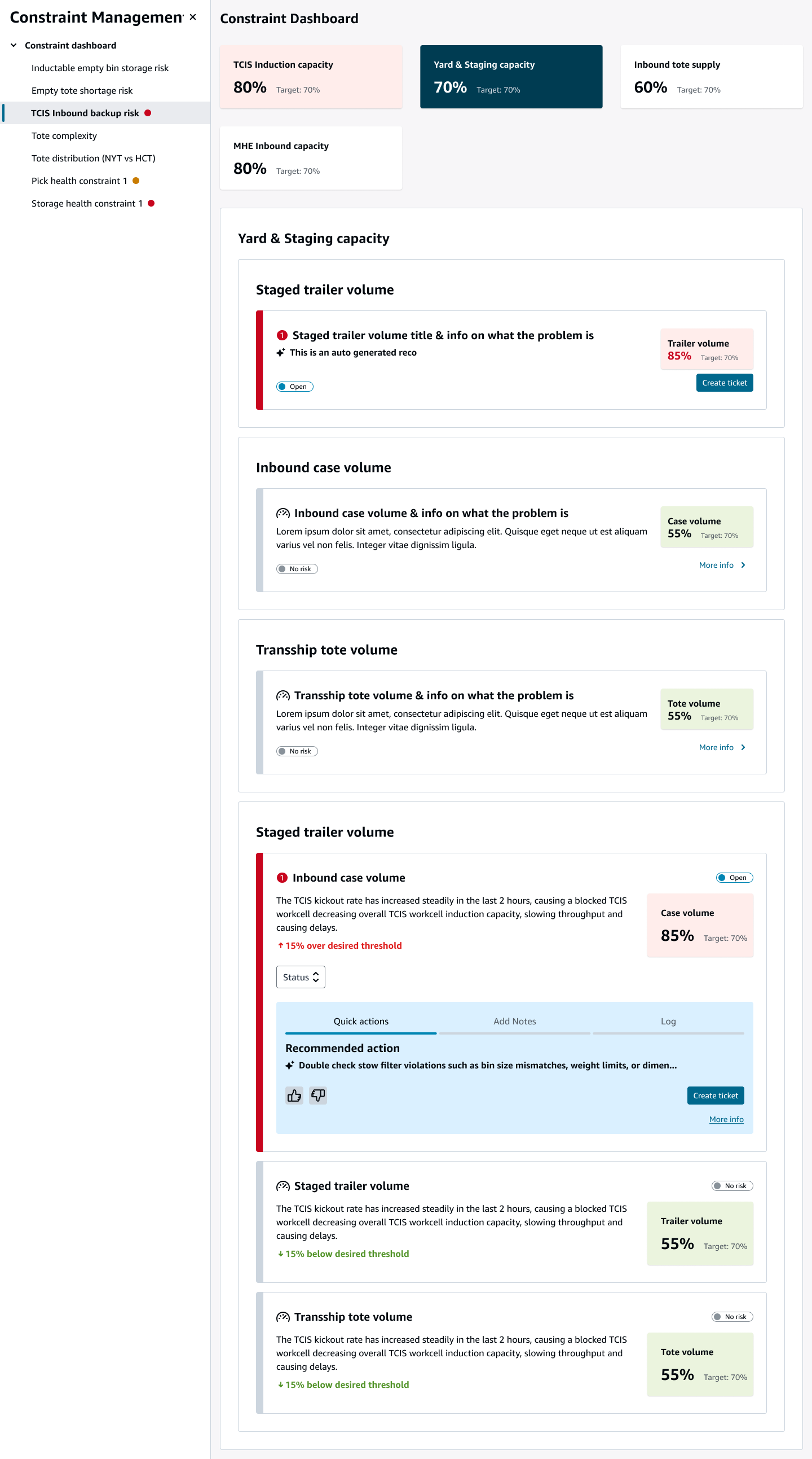
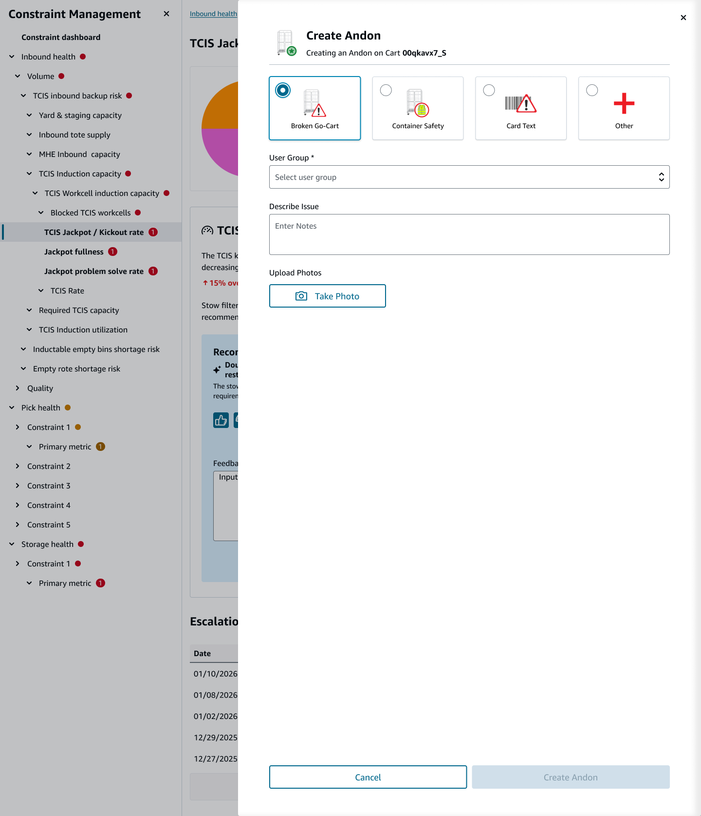
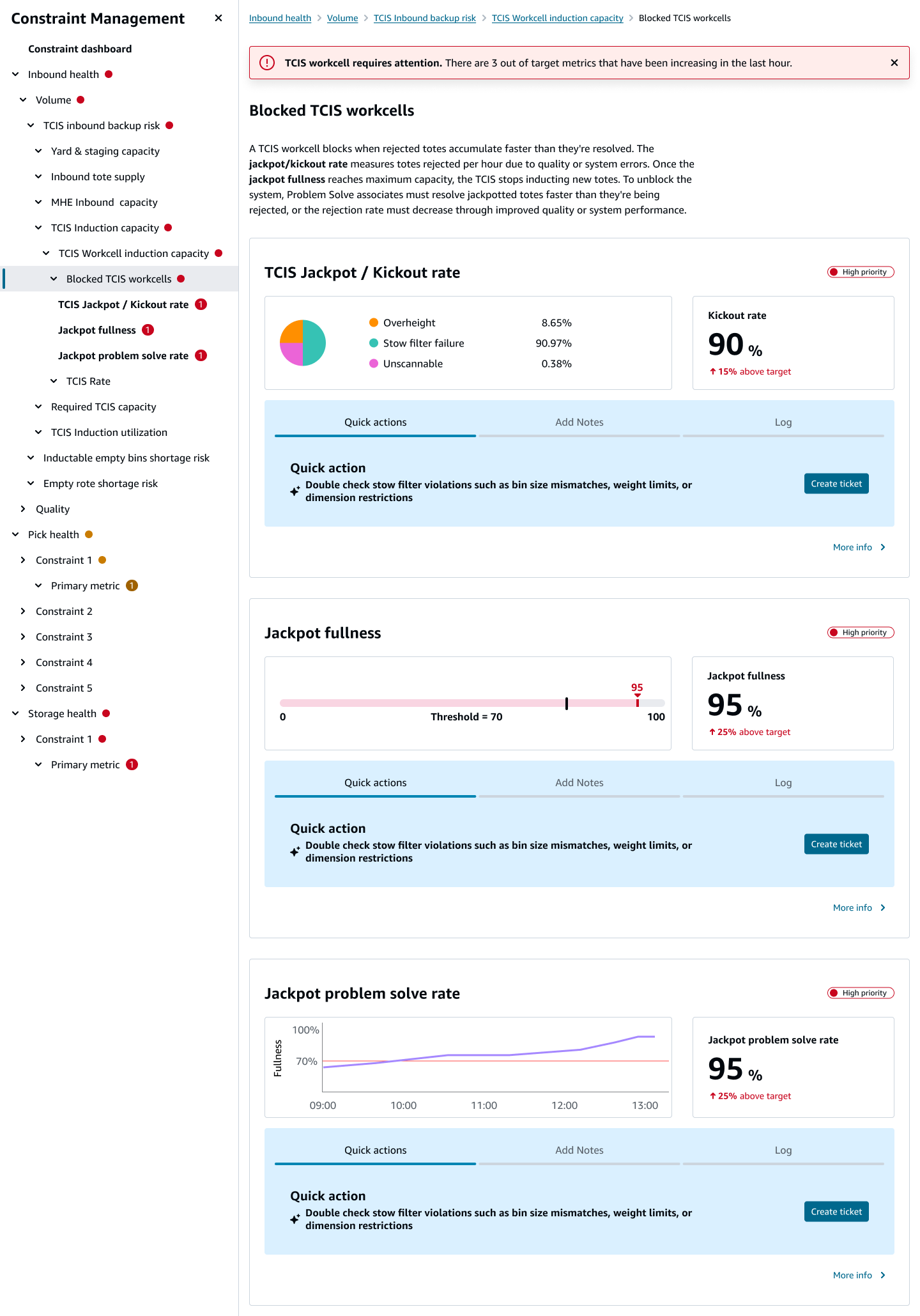
Instead of showing metrics and a lot of information upfront, we decided to show less up front concentrating on what was trending negatively, and what needed to be actioned right away. We also chose to move forward with the concept that was familiar to users based on existing user research.
I used Figma Make to quickly iterate on ideas and ways to present information that the user would need to make decisions quickly and know exactly where problems were occurring (or potentially occurring), and take an action.
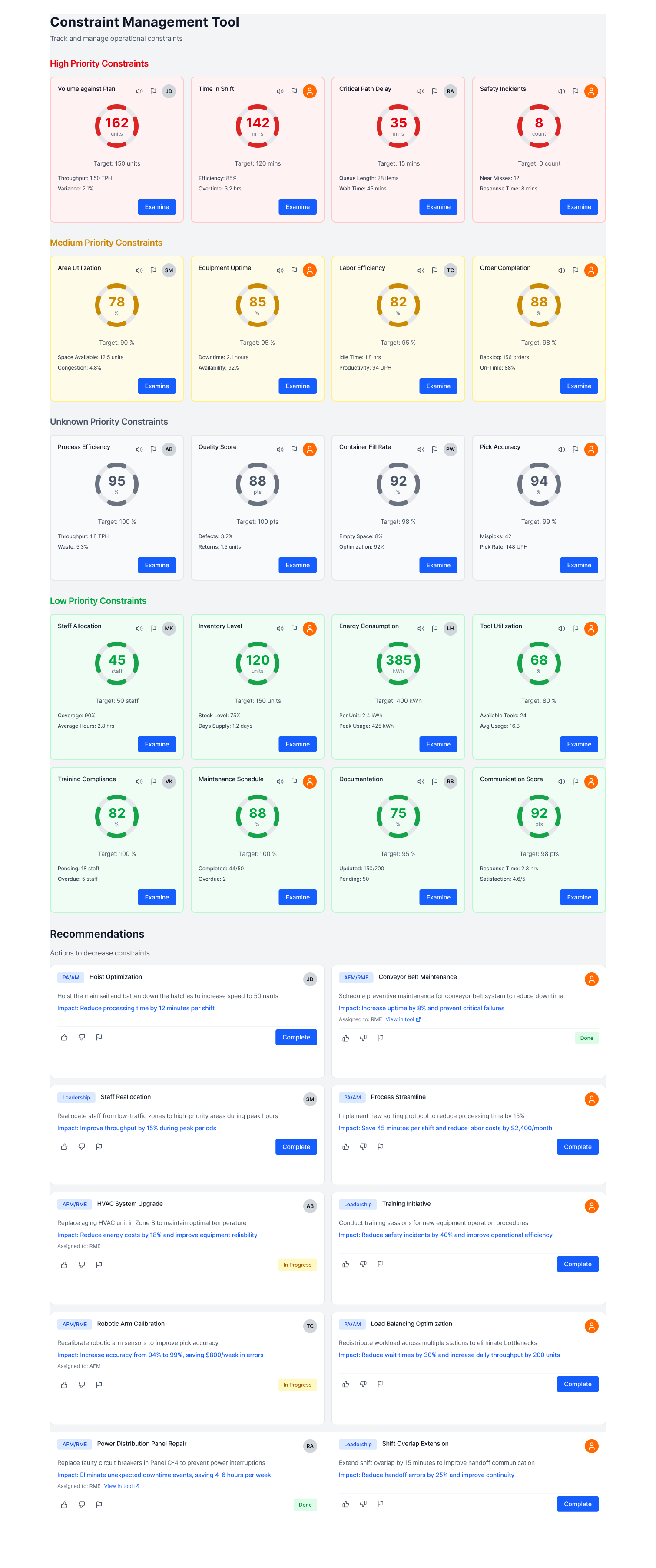
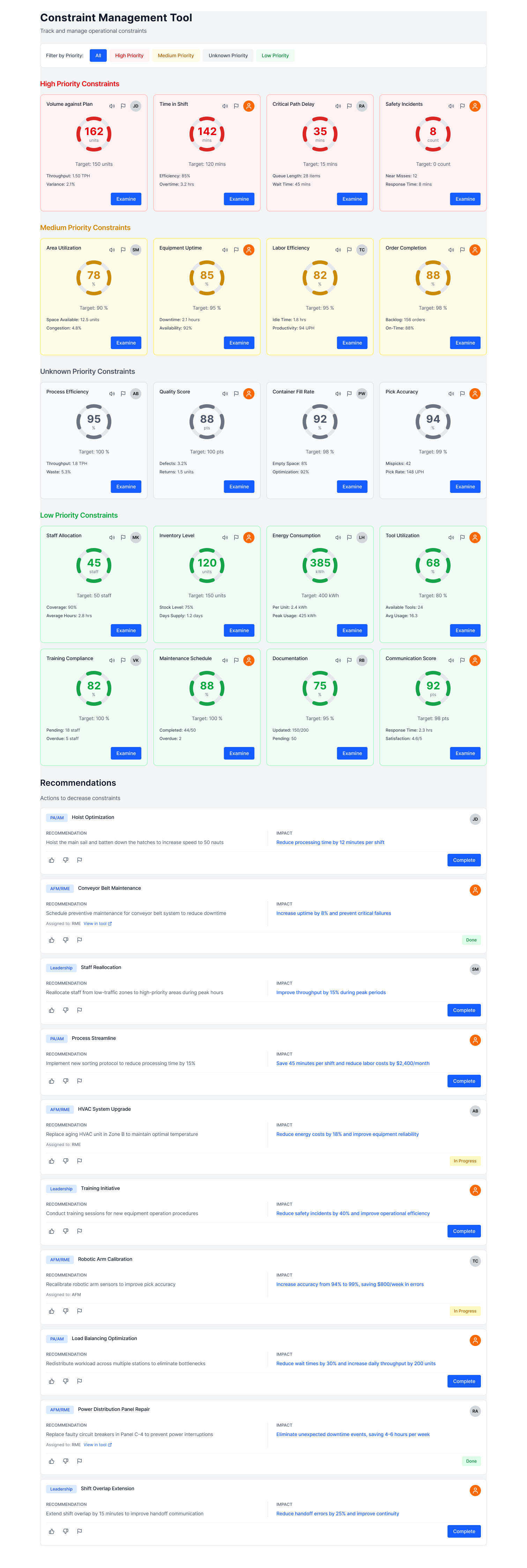
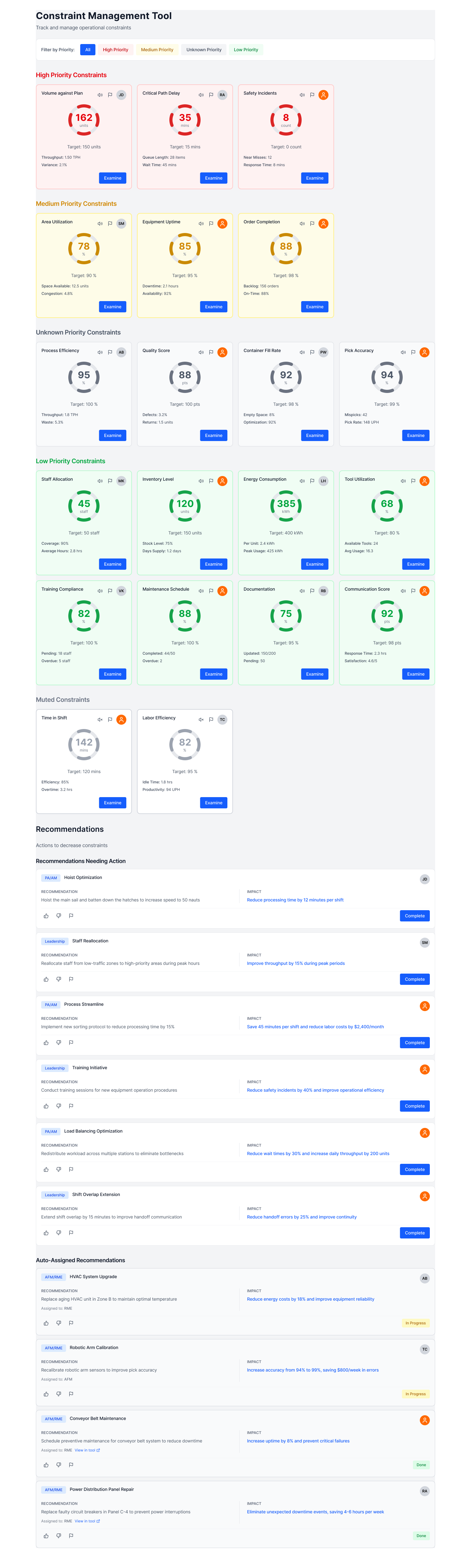
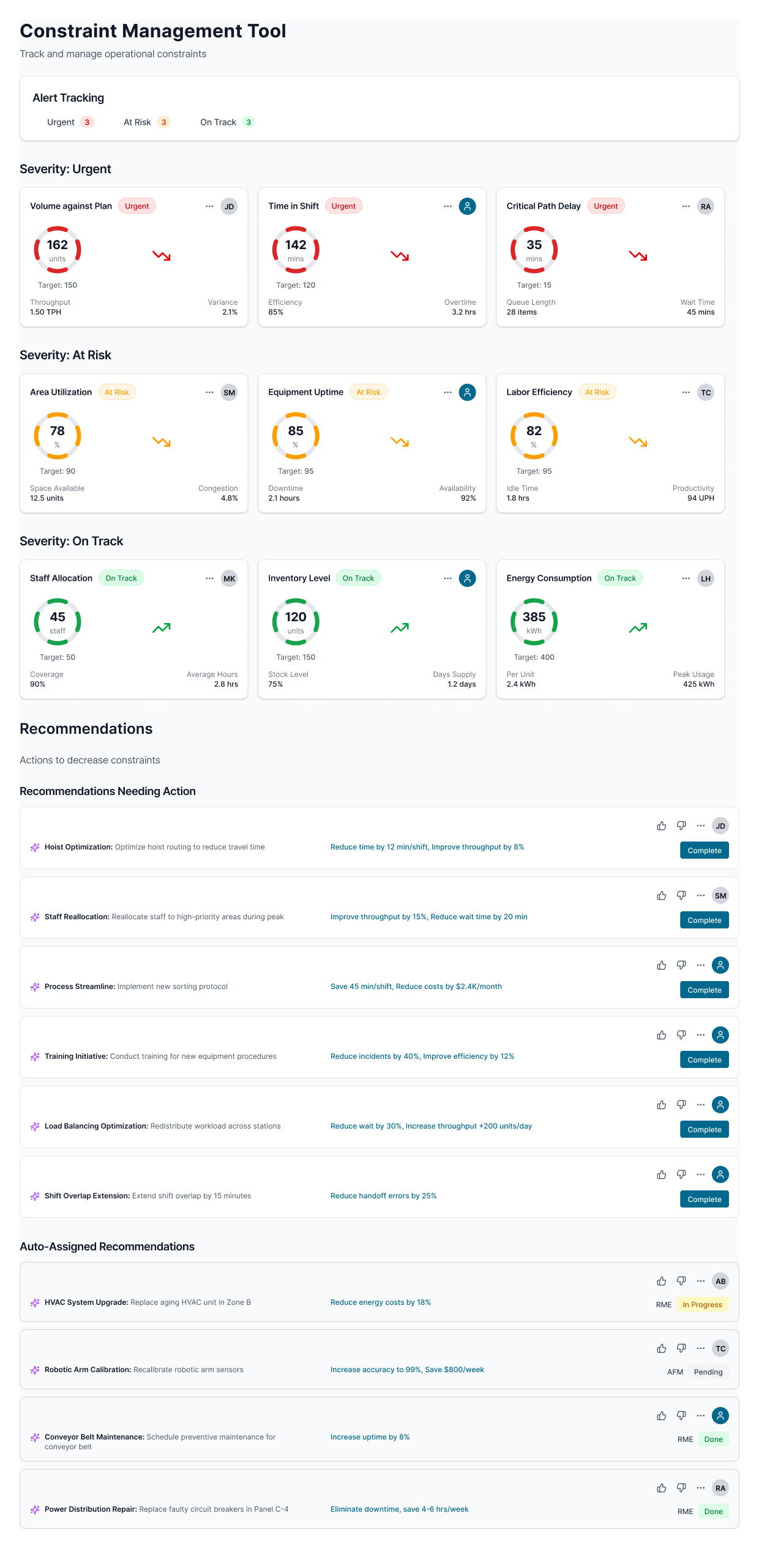
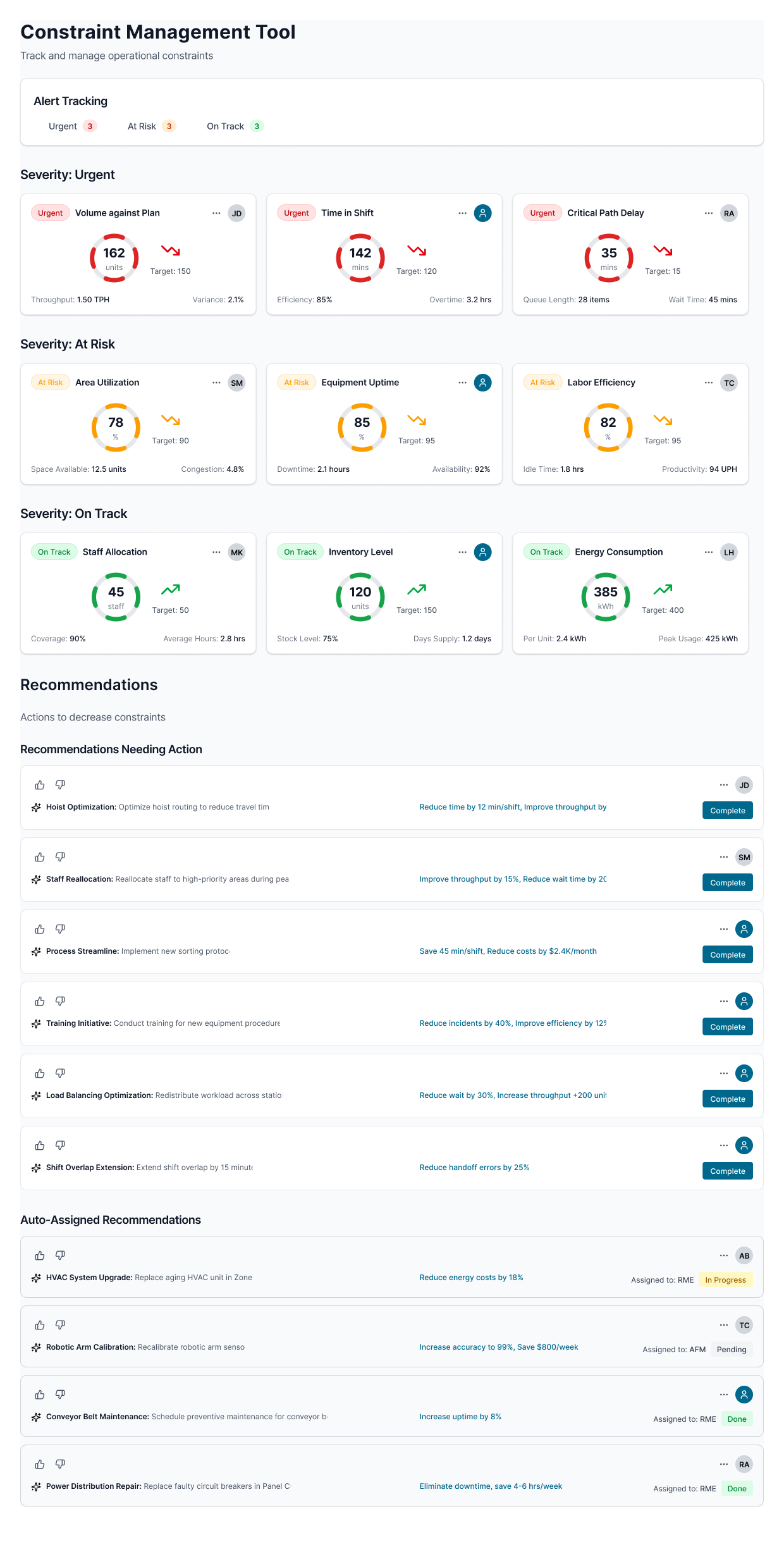
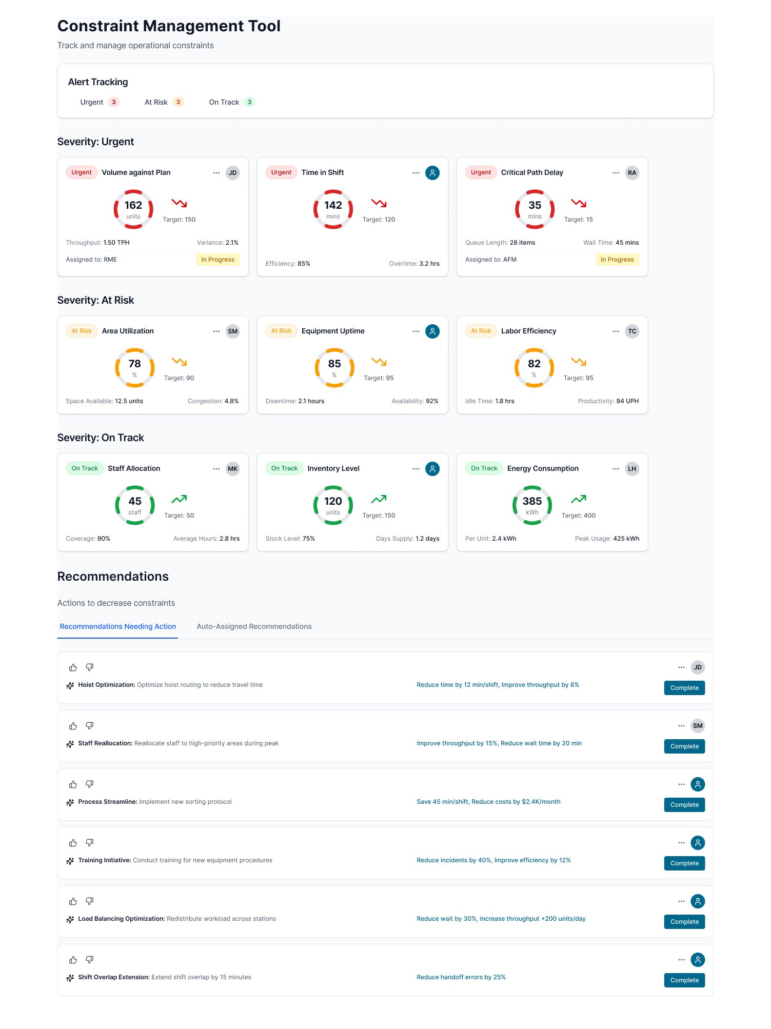
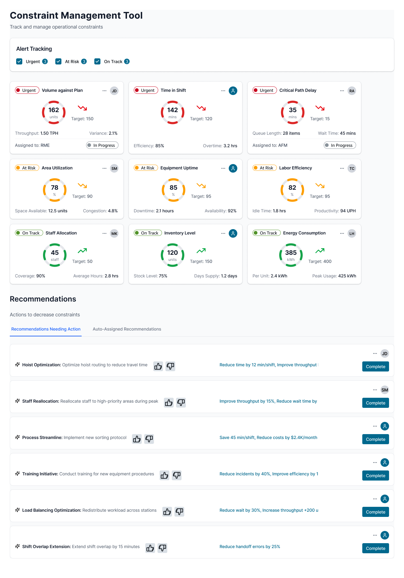
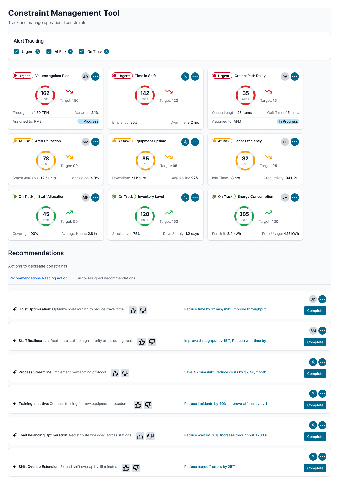
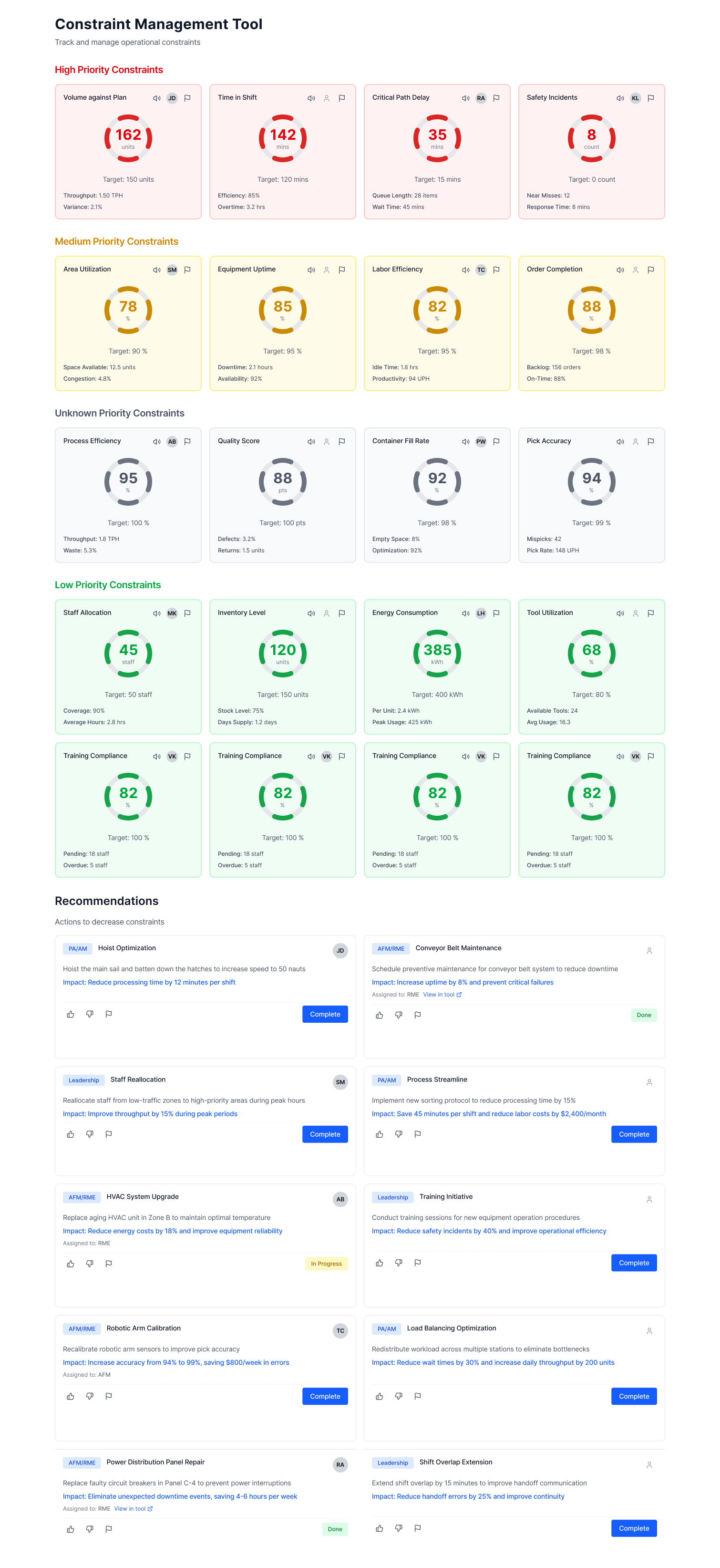
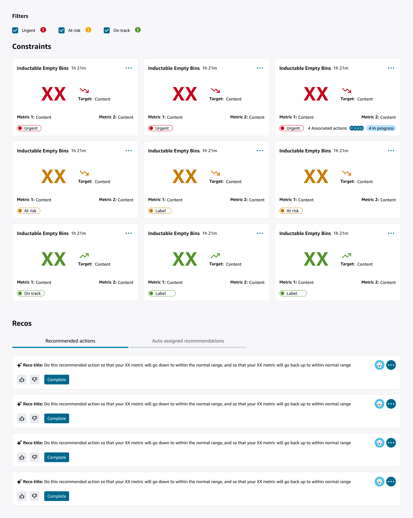
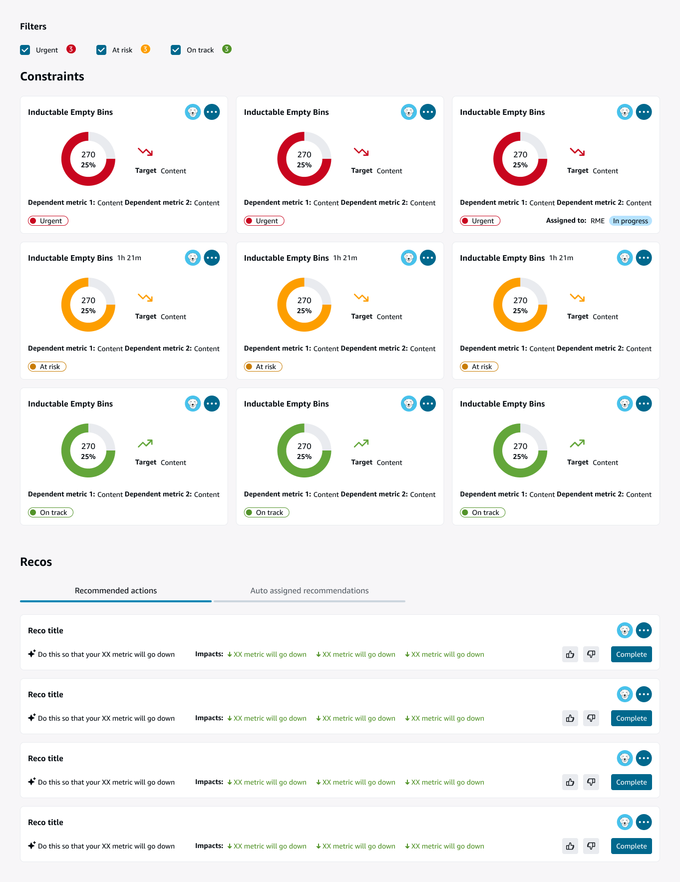
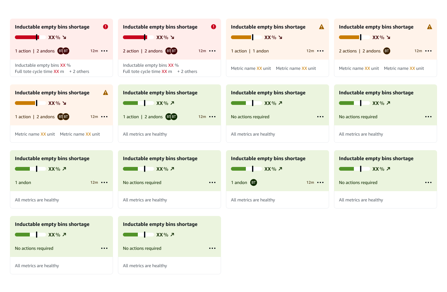
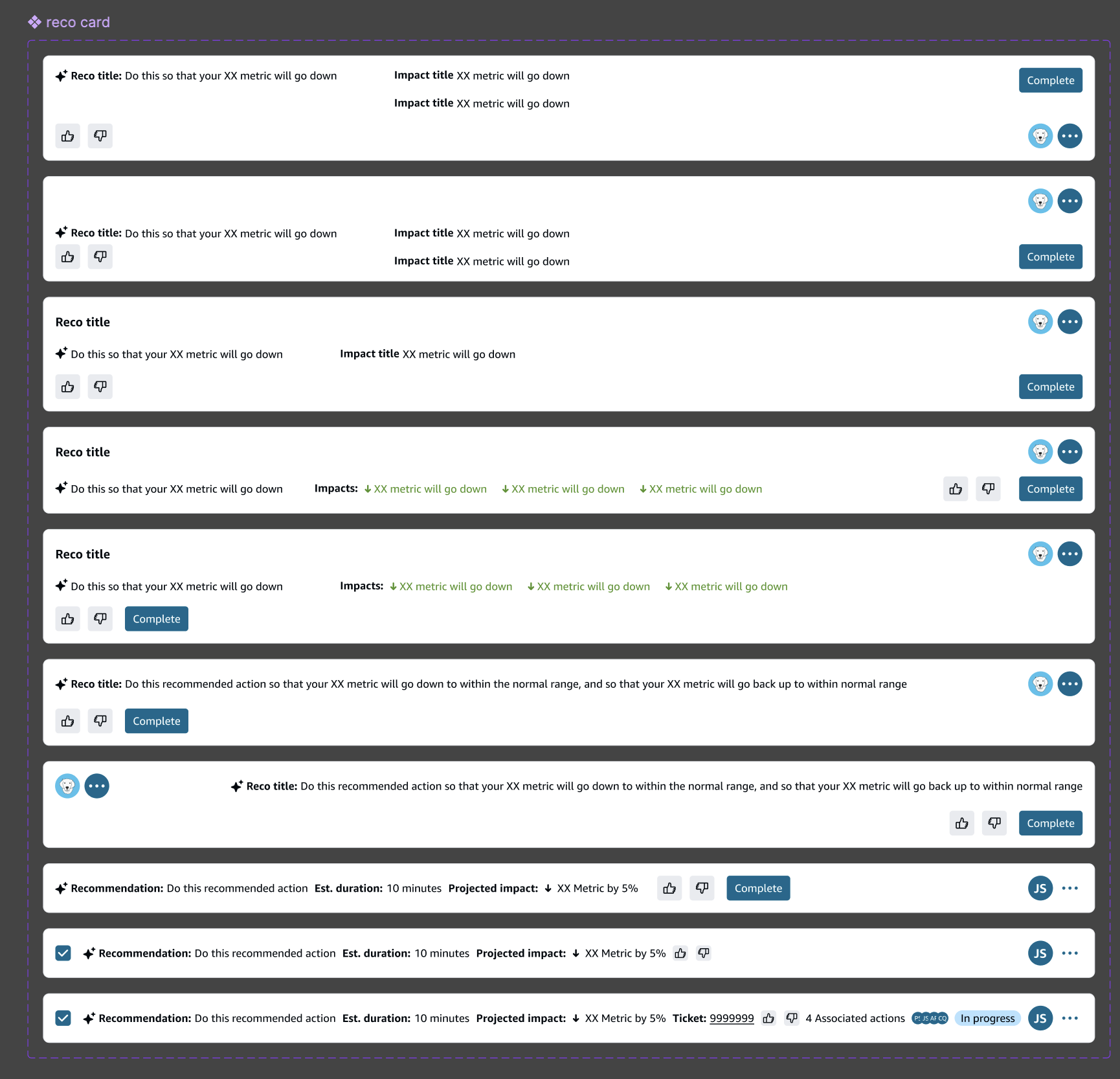
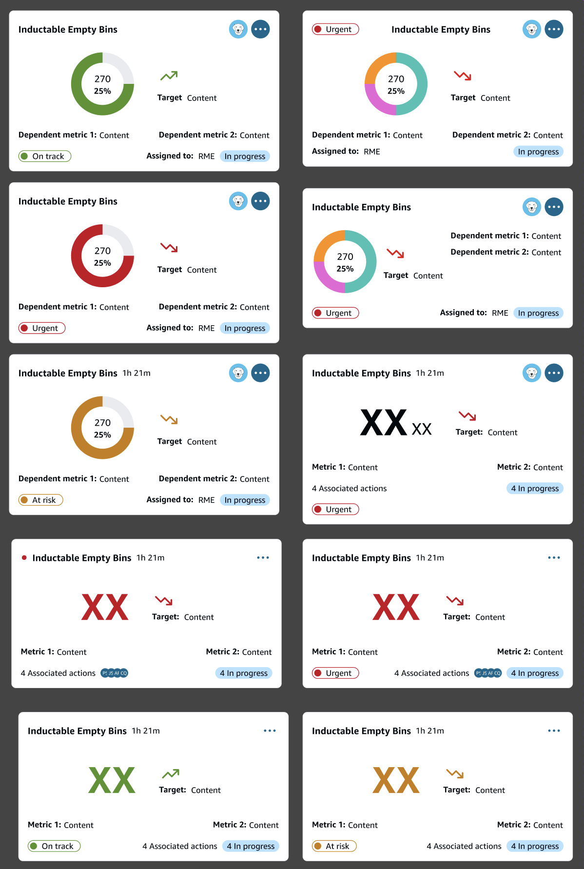
Once we had a good layout, we iterated on the specific cards
Cards showed only the information the user needed and actions that could be taken without being too overwhelming.
I looked at sizing, spacing, colour, and hierarchy to present information quickly and concisely. The dashboard needed to be scannable as well as informational, and work in numerous situations at FC’s with many different needs.
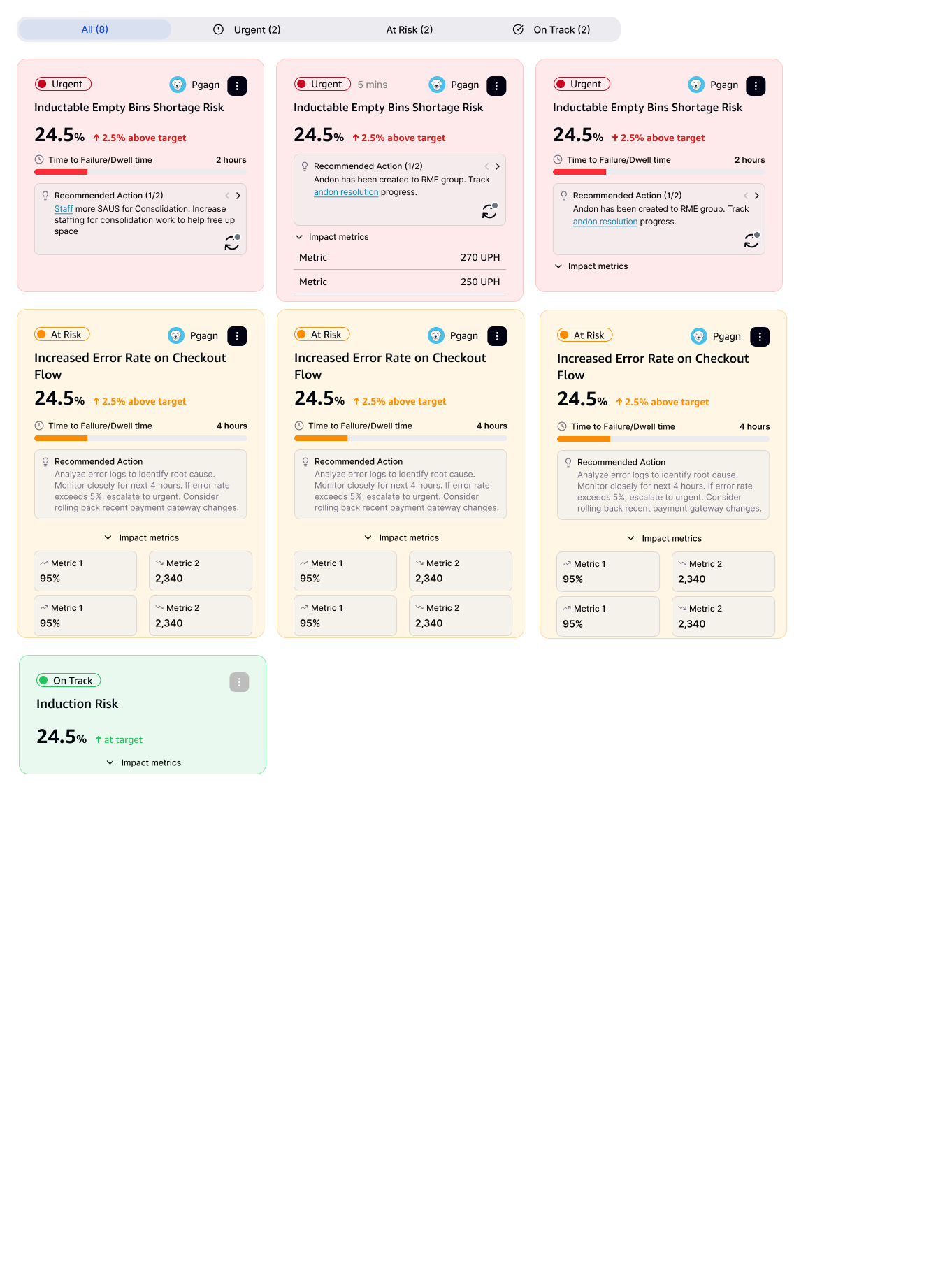
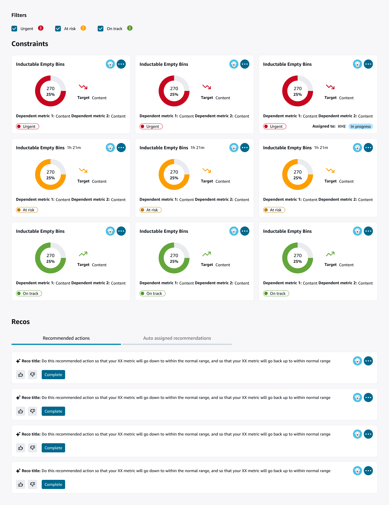
We also did some user research along the way
This is an ongoing project and I am currently working on, and research is starting this week. Our designs and everything thus far is based on previous user research and tools designed based on those for the same users. Since there are many stakeholder opinions and design has felt like we’re going around and around just designing, we’ve decided to validate some of our designs and decisions based on feedback.
Ideally this would have been done before we even started designing but the quick turnaround time and stakeholders insistence that research had already been done and their need to see deliverables and move forward didn’t allow for it. Once the teams had some ideas to see and work with we decided to do some quick research to confirm what we knew about the user, ask some open ended questions around what they would want to see, and possibly validate the designs we were already working on.