
Honda
At Dentsu, one of our biggest clients is Honda. Our team is responsible for their website page designs working closely with their development agency, building and maintaining their design system, and adding & updating site features.
A lot of our projects working with this client are last minute, with limited time and assets, and rounds of feedback. Our biggest challenge however, is working with an external development agency and understanding exactly what code exists, and designing within those constraints or designing with enough lead time to have new components developed within the clients tight timelines.
How did we overcome this challenge?
We built a design system. Every single component needed on a consistent basis was designed out in Figma so that there was no deviation from existing code.
Initial designs were done by another agency and the website was built before it came to Dentsu, so even though we had a Design system, it was piece meal and although it was updated a bit initially before I joined the team, it wasn’t maintained properly with so much new work coming in. After more agencies started using it, and in the midst of some big sitewide updates & onboarding additional new users (agencies & dealers), it became clear it needed to be updated.
So we updated the Design System
Instead of spending unnecessary time while creating page designs designing new components or layouts or updating existing components and layouts with auto layout…etc, our designers could concentrate on designing solutions for our clients needs.
Using a phased approach I put together a plan to redesign the Design System starting with the fundamentals, setting up the typography & colour styles in Figma, and then redesigning each component with the updated styles. Working with a junior designer, we redesigned each component from the ground up, and put together all documentation.
Design System 1.0
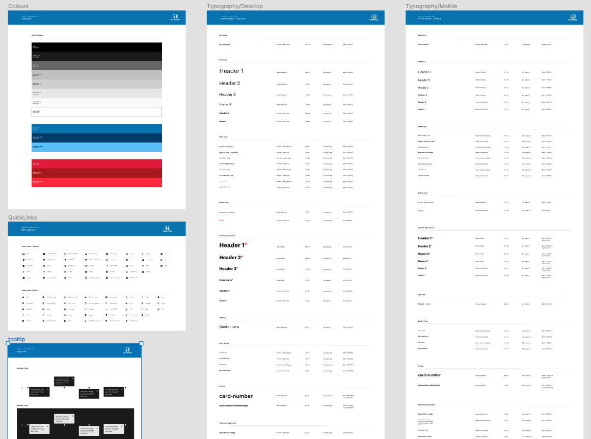
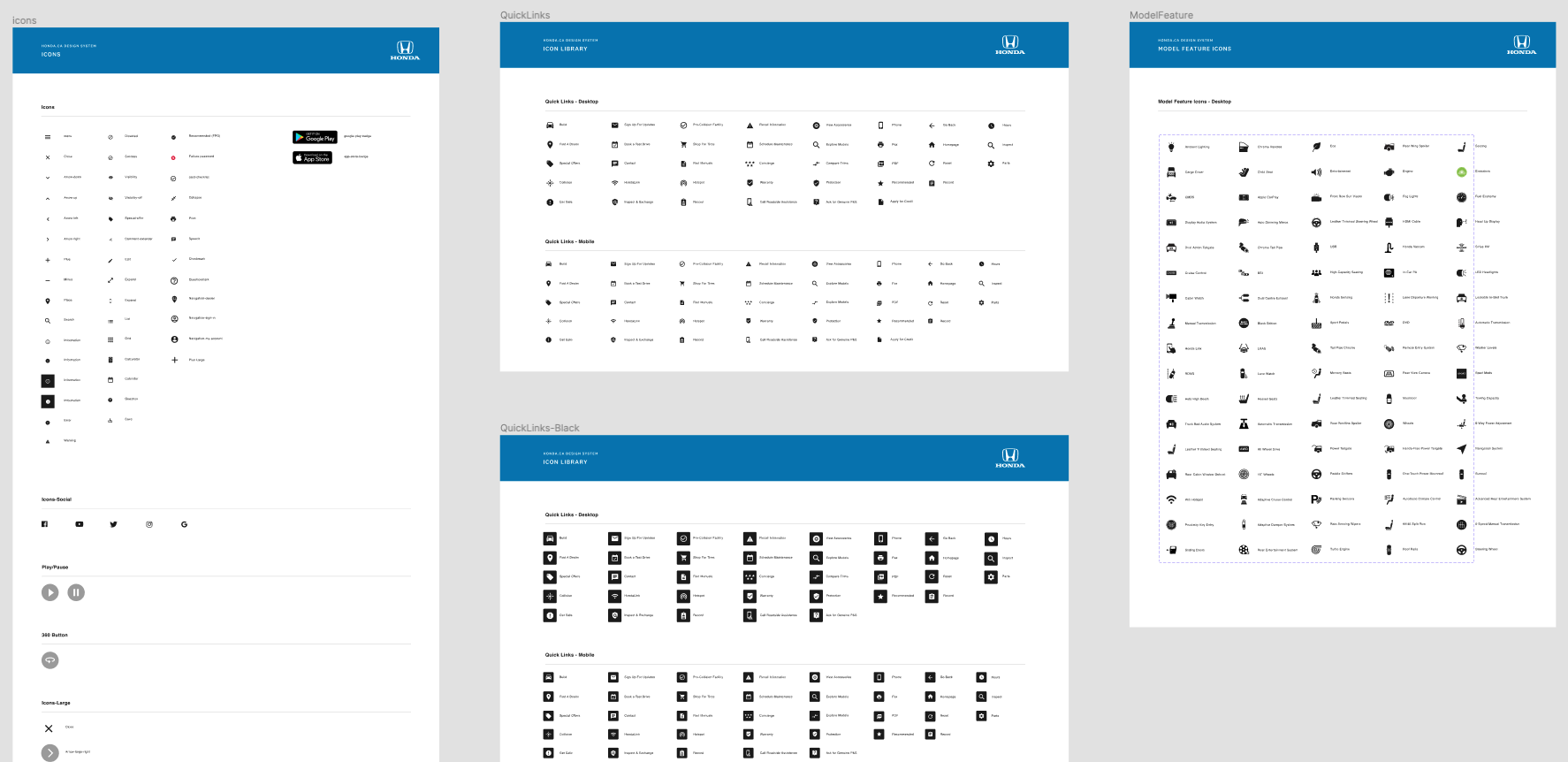
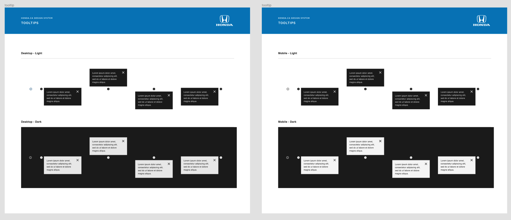
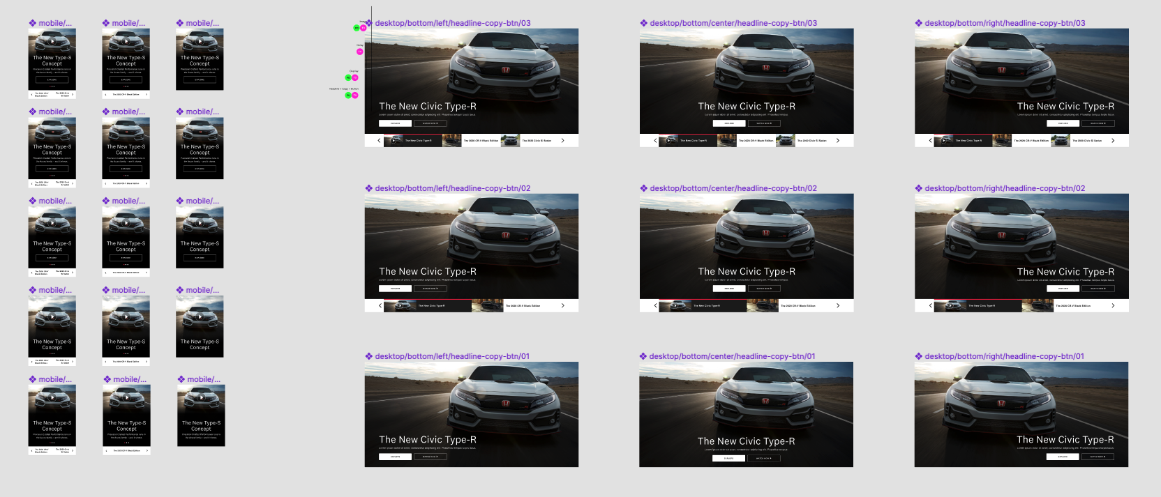
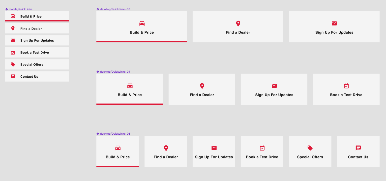
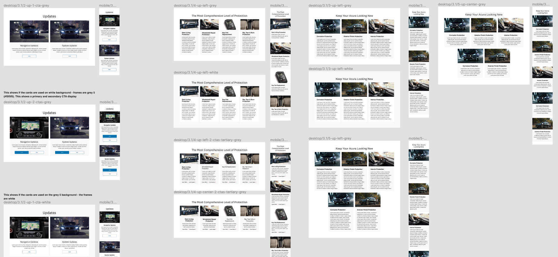
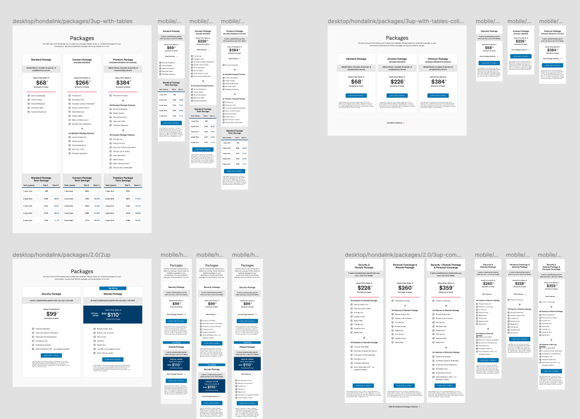
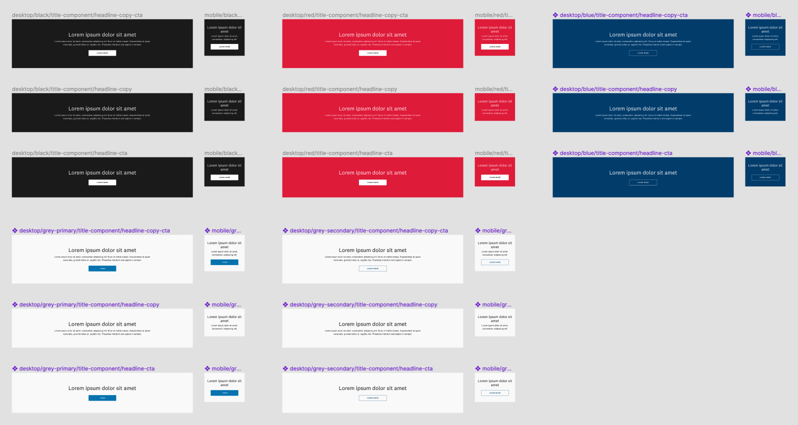
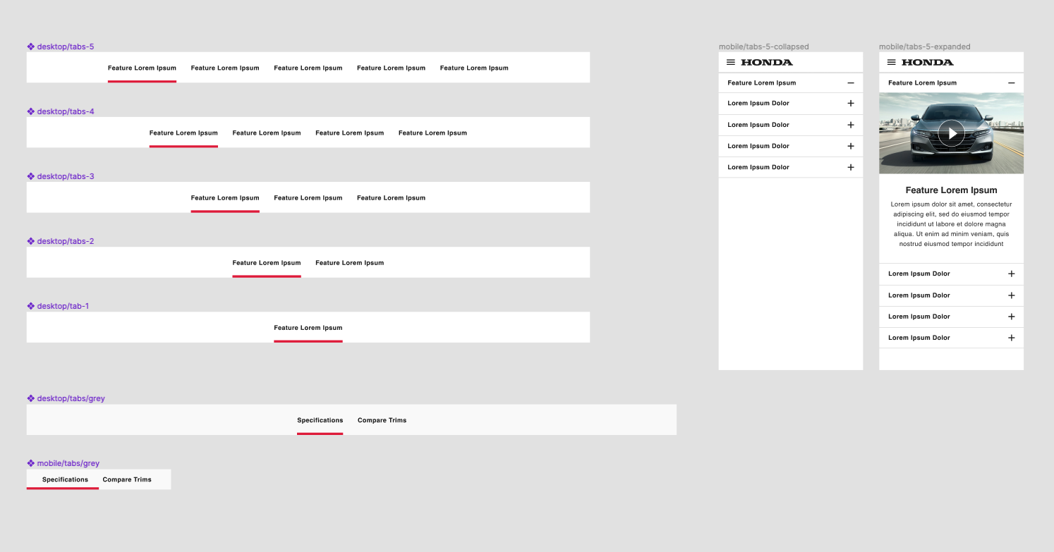
All components had to be updated
Components were built initially one at a time without variants or auto layout, so they all needed to be updated / merged. There were also duplicates and components within other components were using incorrect base components and some weren’t even components at all.
There were also multiple code bases being used on the front end and there was no way of differentiating the components in the Design System. On top of all of this, there was no 1:1 parity on the front end, so every single component needed to be assessed. I audited the front end and each component to figure out what needed to be consolidated, updated, or just discontinued.
Design System 2.0 Planning & Process
The design system updates were designed using a phased approach. First, I mapped out what pages were needed based on the user flow of the experience we would be working on.
Step One: User Flows
Dealer User Flow
Step Two: Component Planning
Looking at what components were needed in those pages, I added them to a component list that was used to plan our timelines and keep us on track.
Once all components were accounted for timelines were scoped out based on dev sprints.
Component List
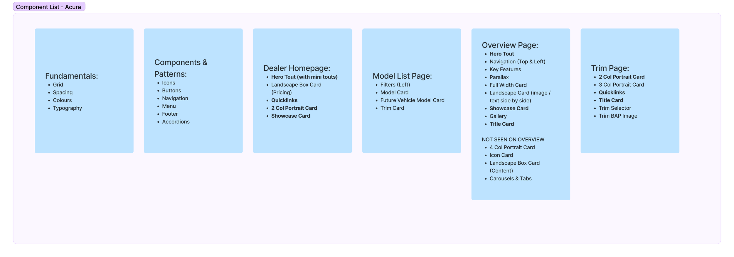
Component List
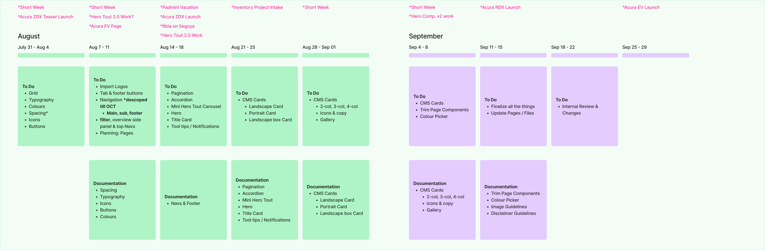
Phase One Components
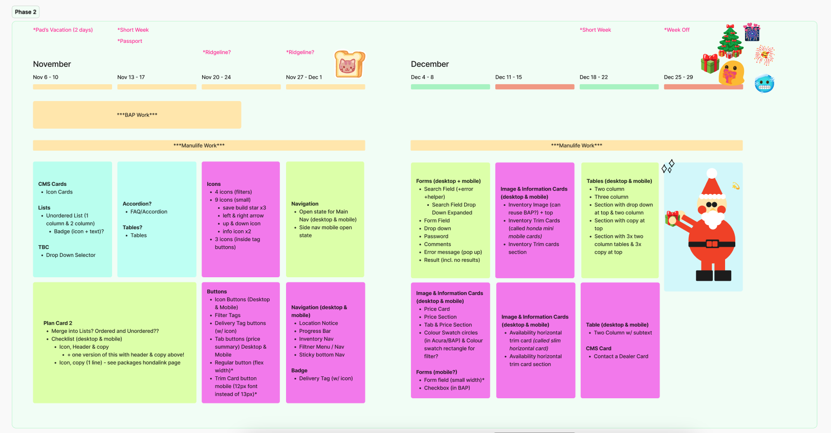
Phase Two Components
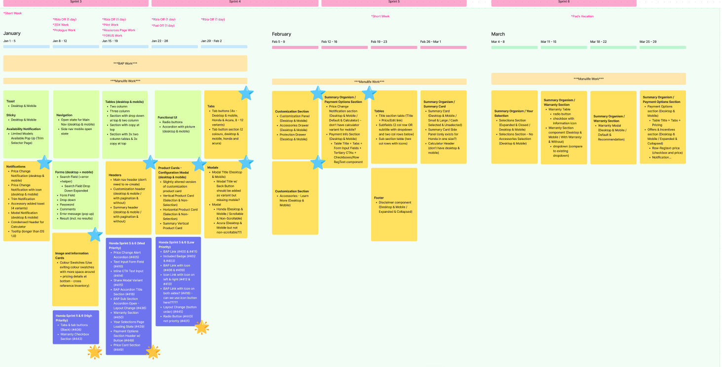
Phase Two Components Continued
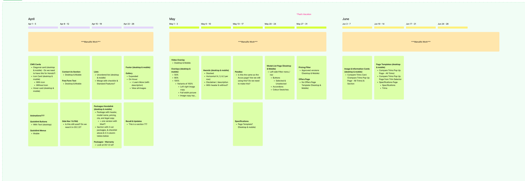
Phase Three Components
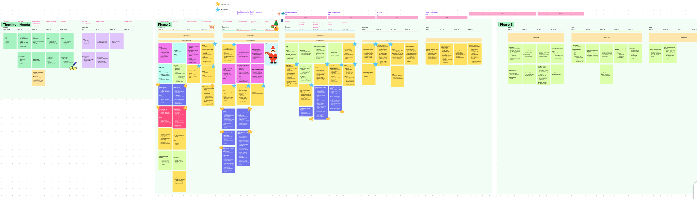
Full Timeline
Step Three: Component Audit
Before components were worked on, they were audited. I looked at the live site and every instance of the component on multiple pages to see if they were needed, how often they were used, how they were used, and what their designs were so that components could be updated / deleted / merged as needed.
Text Button Audit
Trim Card & Navigation Audit
Step Four: Component Re-Build Strategy
While re-building components, we also had to strategically plan what was to be built and how - For example the card component used across multiple pages had so many variants all with different parts instead of building the same component over and over, we made one parent component with specific items in each container and hid containers that were not needed depending on the card.
Card Component Update
Step Five: Component In-Take
When new components were designed for new projects or user experiences we also had to make sure they matched the design system. The same process was used to list out components to in-take into the design system using a phased approach but every single component was audited and updated before it was added to the design system so that all experiences were consistent.
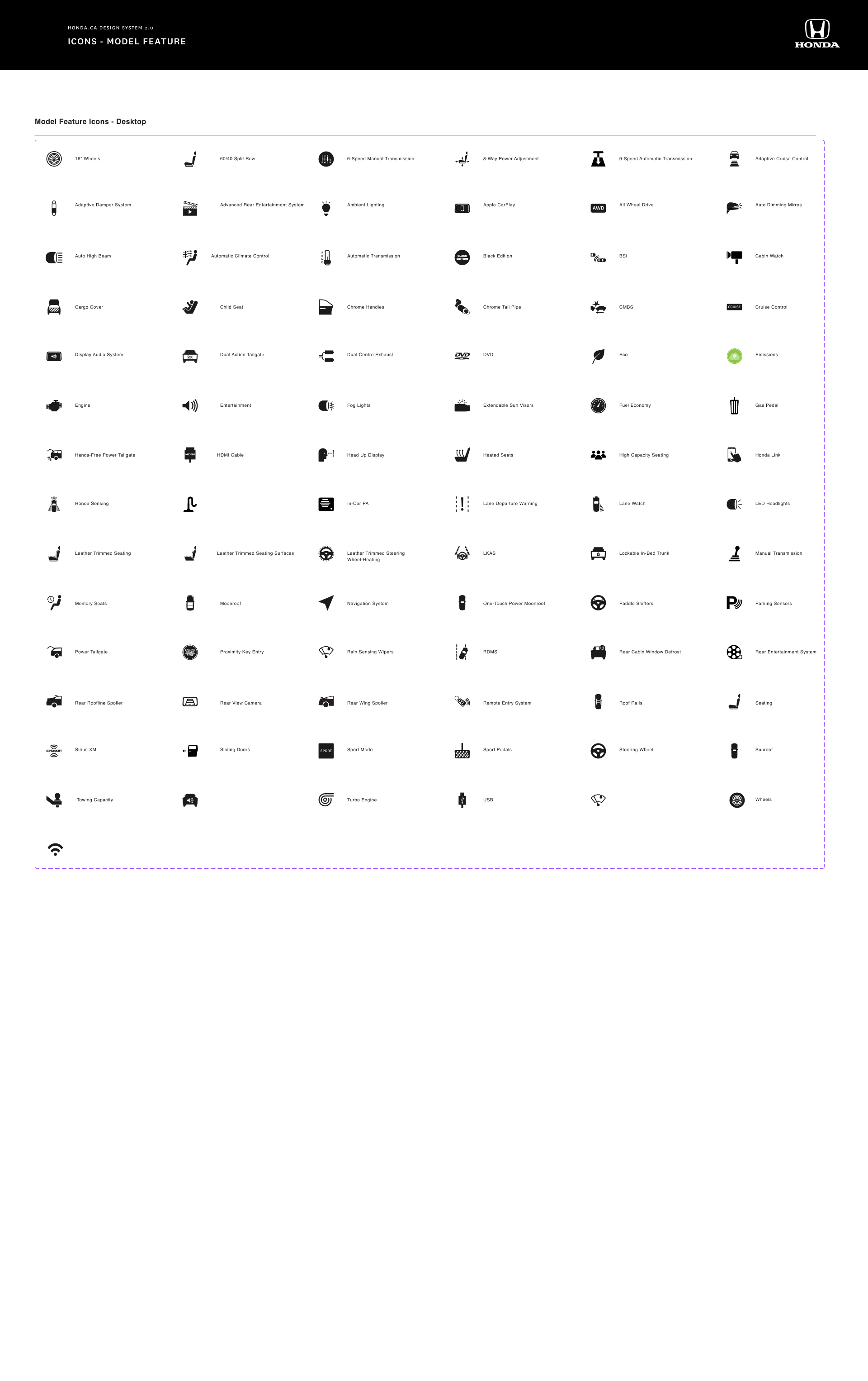
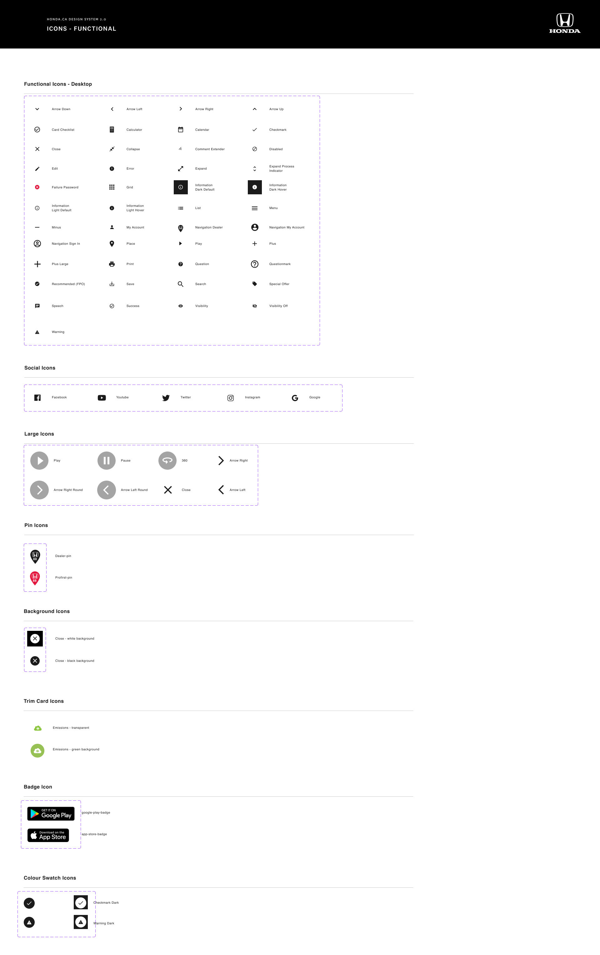
New Icon Component In-Take
Step Six: User Research
As components were being updated, we were also doing user research to make sure that components were being used the way we wanted them to be used and users were able to navigate the site using the components we were updating
Component User Research
Once components were planned out they were designed pixel perfect using auto layout, variants, and the appropriate properties to make sure each component had every state needed. Base components were built first with any dev notes needed and then laid out into sections so devs could understand spacing and usage.
Step Seven: Component Design
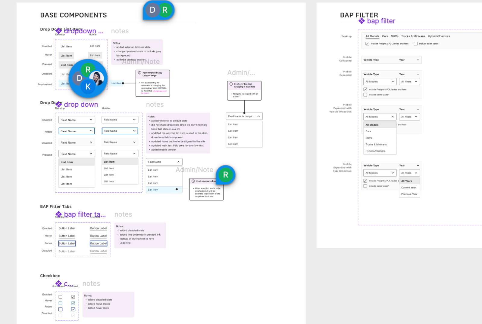
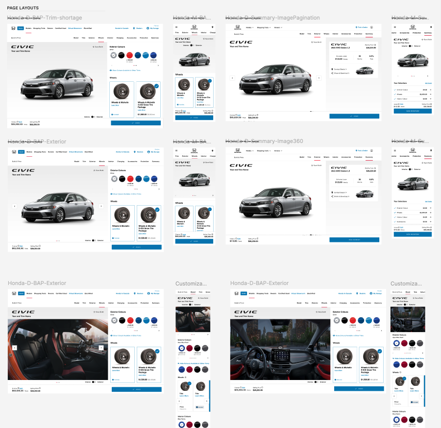
Once components were created, and sections laid out, full pages were laid out with multiple examples. These were used by design and dev to understand spacing and usage as well as user flows and interactions.
Step Eight: Page Design
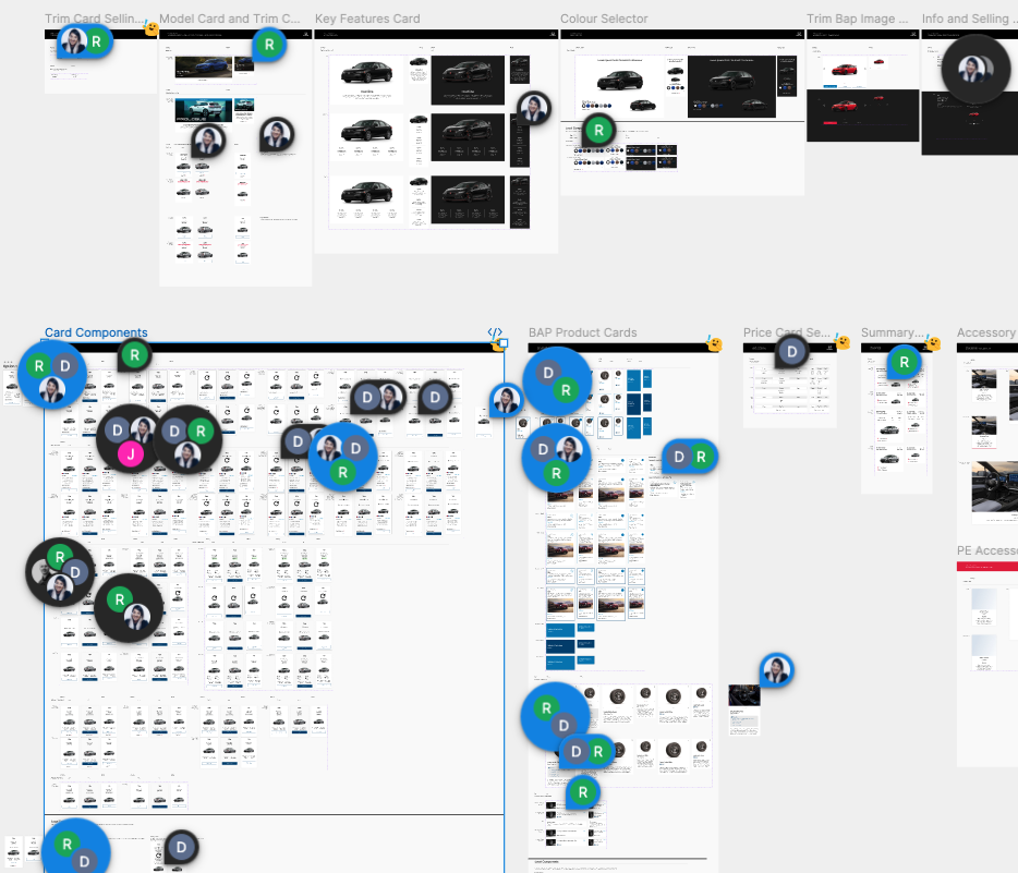
All updated components in the new Design System were also updated by the dev teams and new components & pages were built out as per design system specs. This meant they had to be vetted by the client, legal, the design team and the dev team. Some concerns were raised through comments but larger discussions were happening consistently via Figma calls, Teams calls, presentations…etc.
Step Nine: Team Input
Design System 2.0 Examples & Run Throughs
The Honda Design System went from 1305 to 3086 components
The Design System file consists of 64 pages of components organized intuitively using atomic design and 44 full page templates
Every component was redesigned using auto layout, components, and variants, including appropriate properties so users could adjust designs to whatever they needed without detaching.
The Title Card component consisted of a bunch of components (and some variants not even set up as components) so these were merged with updated properties so that users could switch variants easily.
Example One: Title Card Component
Title Card Component showing Properties
Title Card Component Properties
Title Card Before
Title Card After
Example Two: Button Component
The Button Component was missing many variants and most of the designs were split up so as a designer using the system, you’d need to get the button from various places in the design system. When these were brought into the updated design system they were organized differently so that designers and devs had everything they needed in one place.
Button Component After
Button Component Before
We also designed full page layouts for all the pages on the live site. Not only were users able to edit components to get variants they wanted, they were able to add and remove sections from pages easily, edit copy while components and full pages flexed to fit.
Example Three: Full Page Layouts
Video showing Styles, Pages, & some Components
Video showing components being added
Video showing Hero Component variants
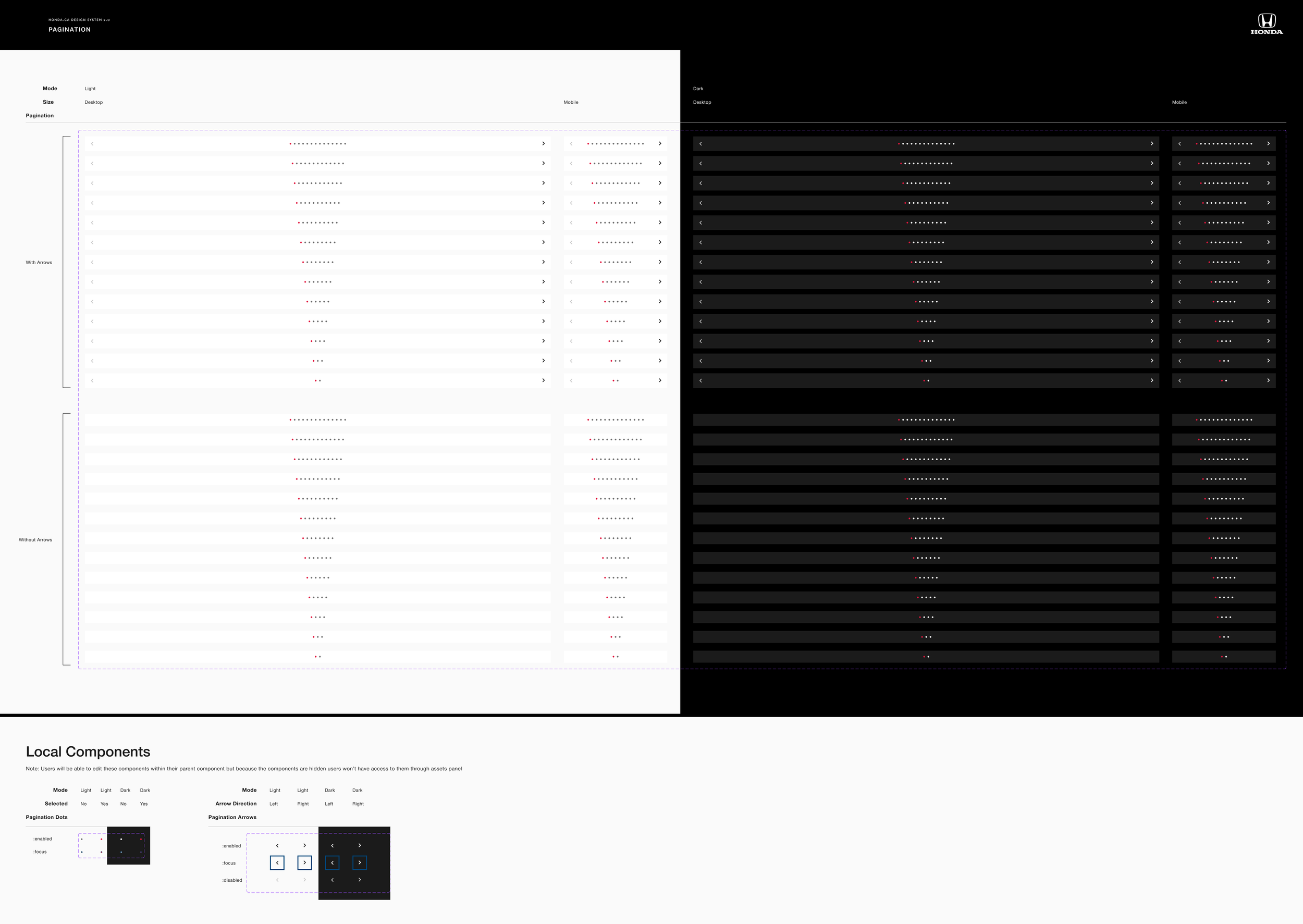
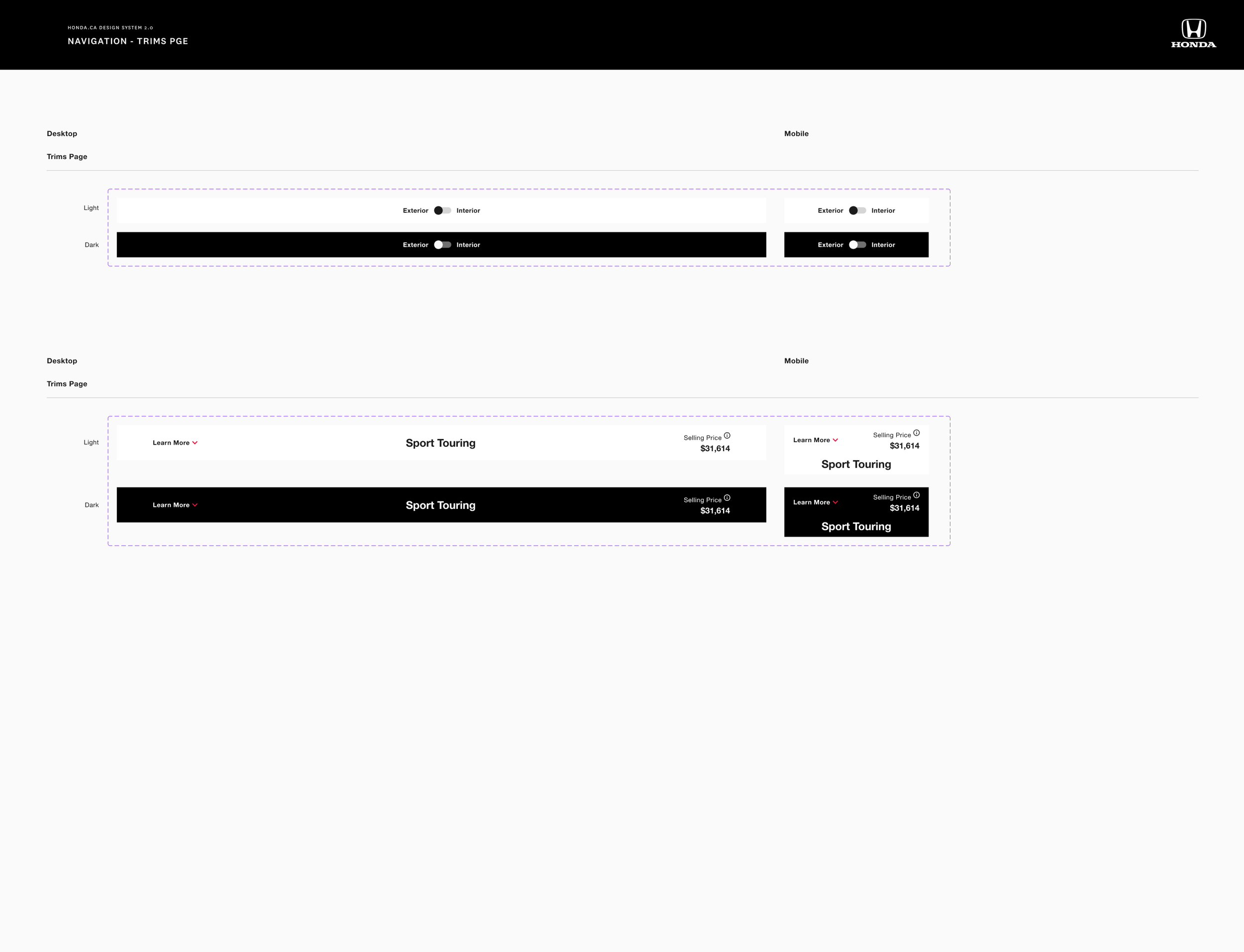
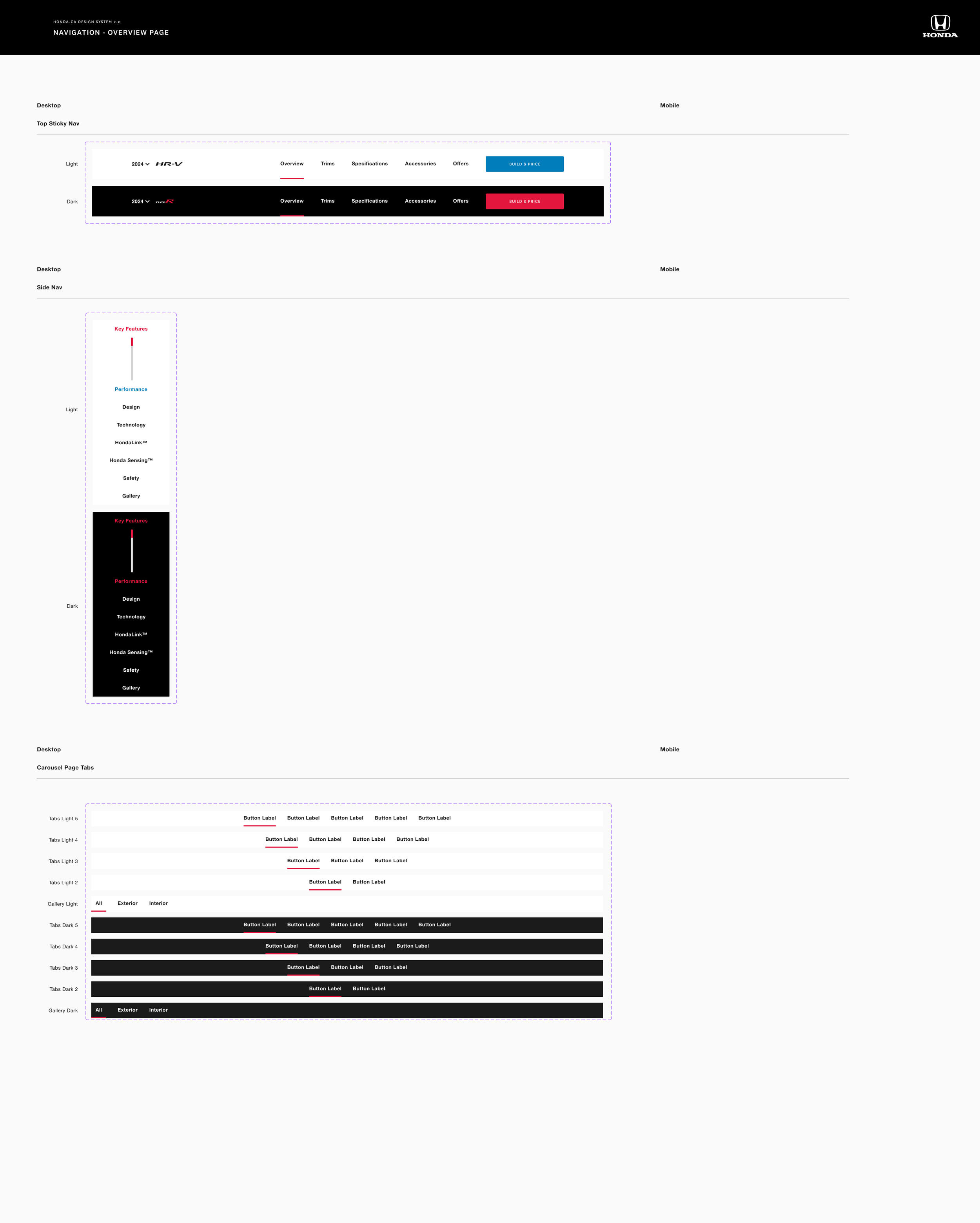
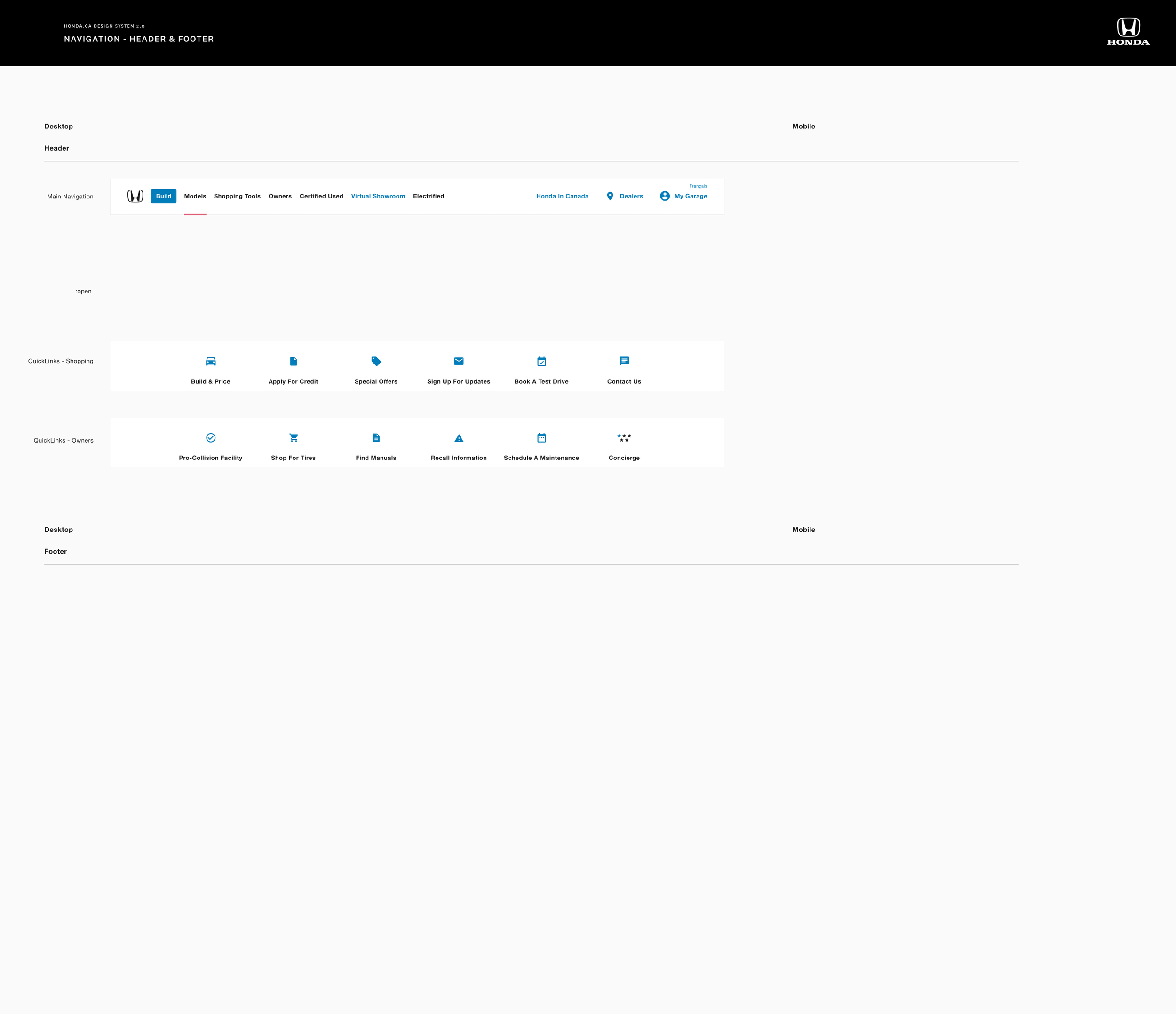
Design System 2.0 Selected Final Designs
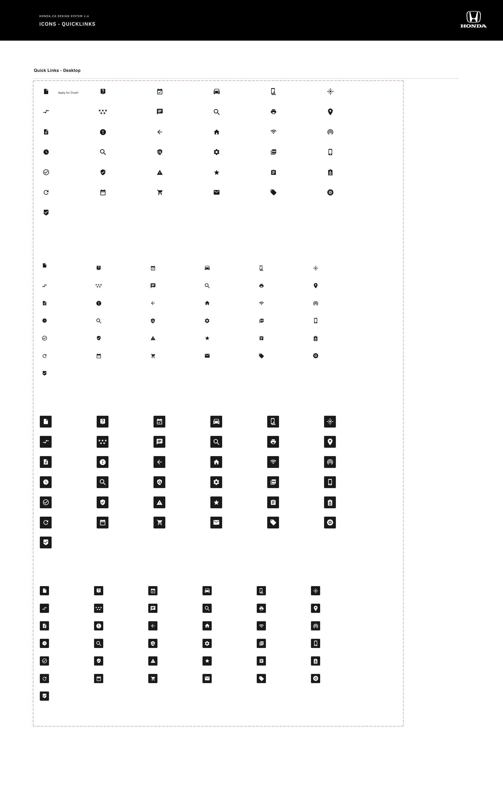
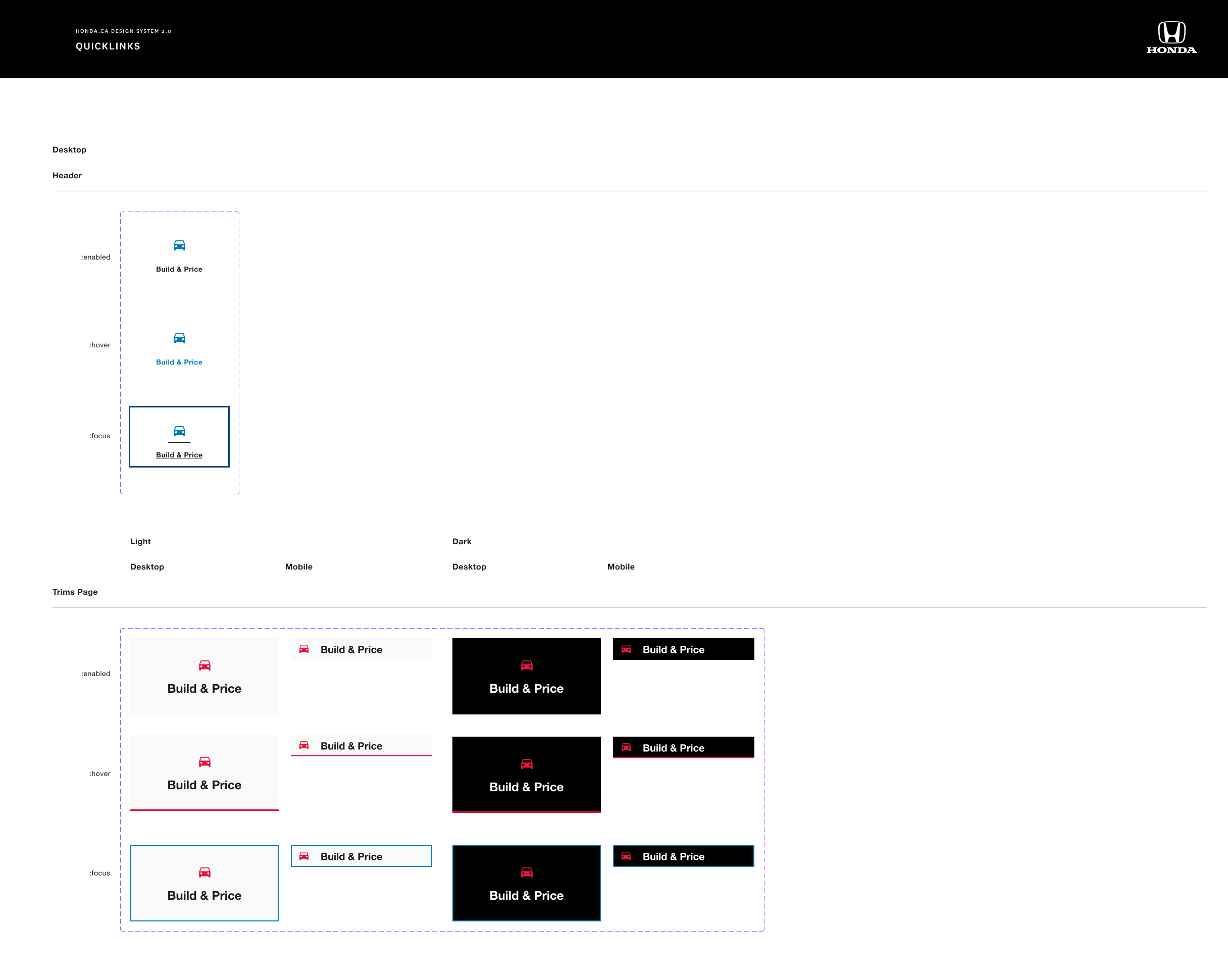
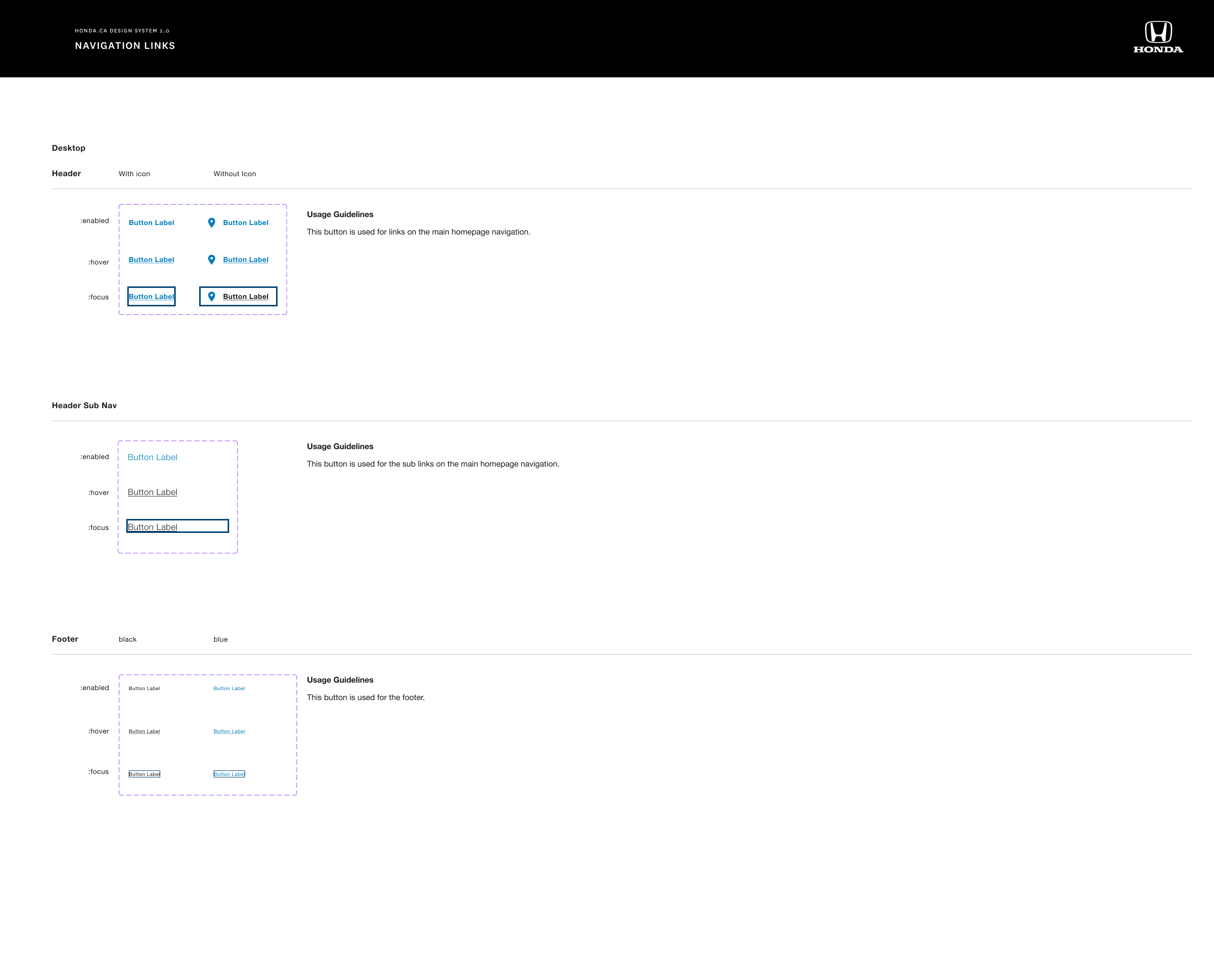
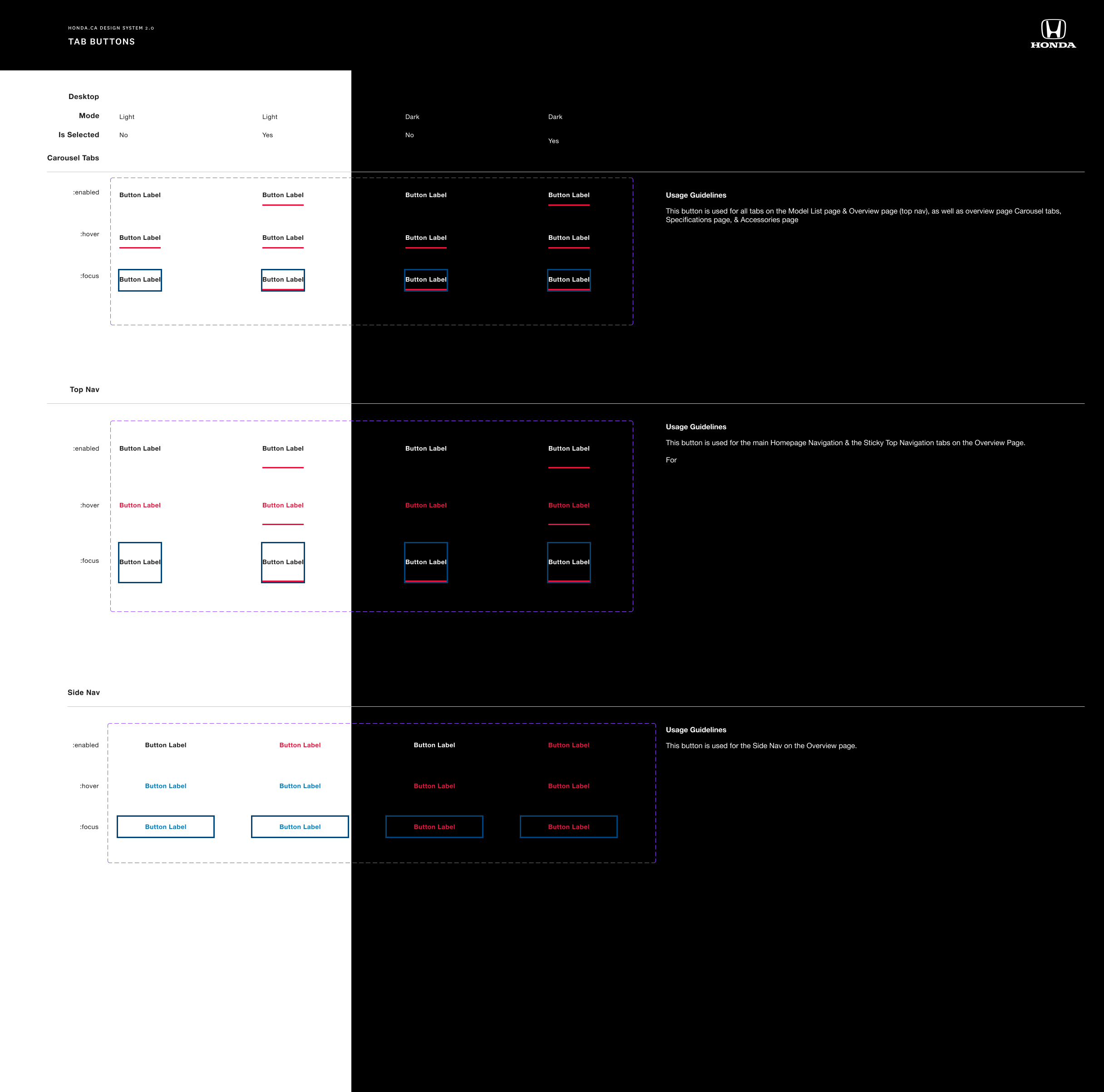
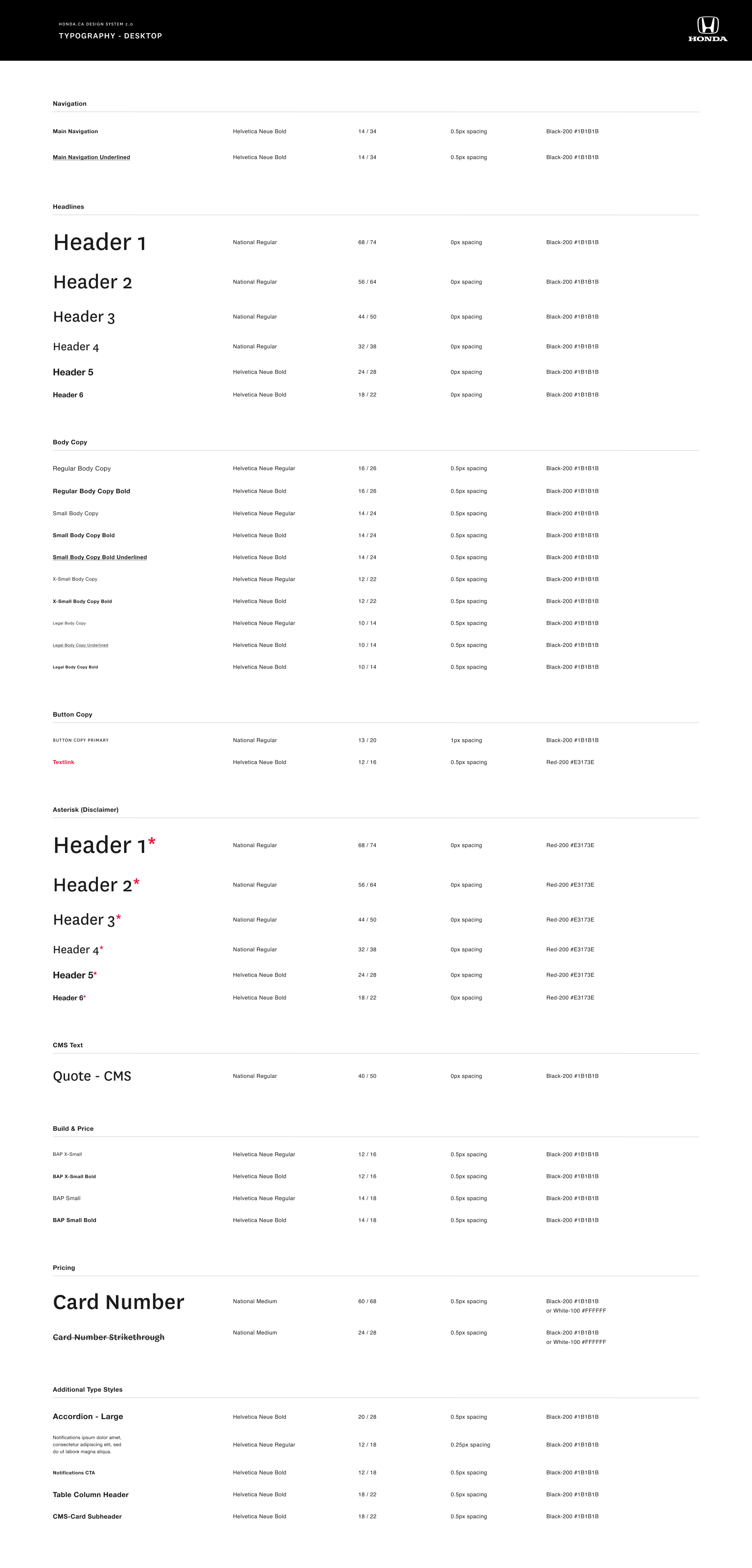
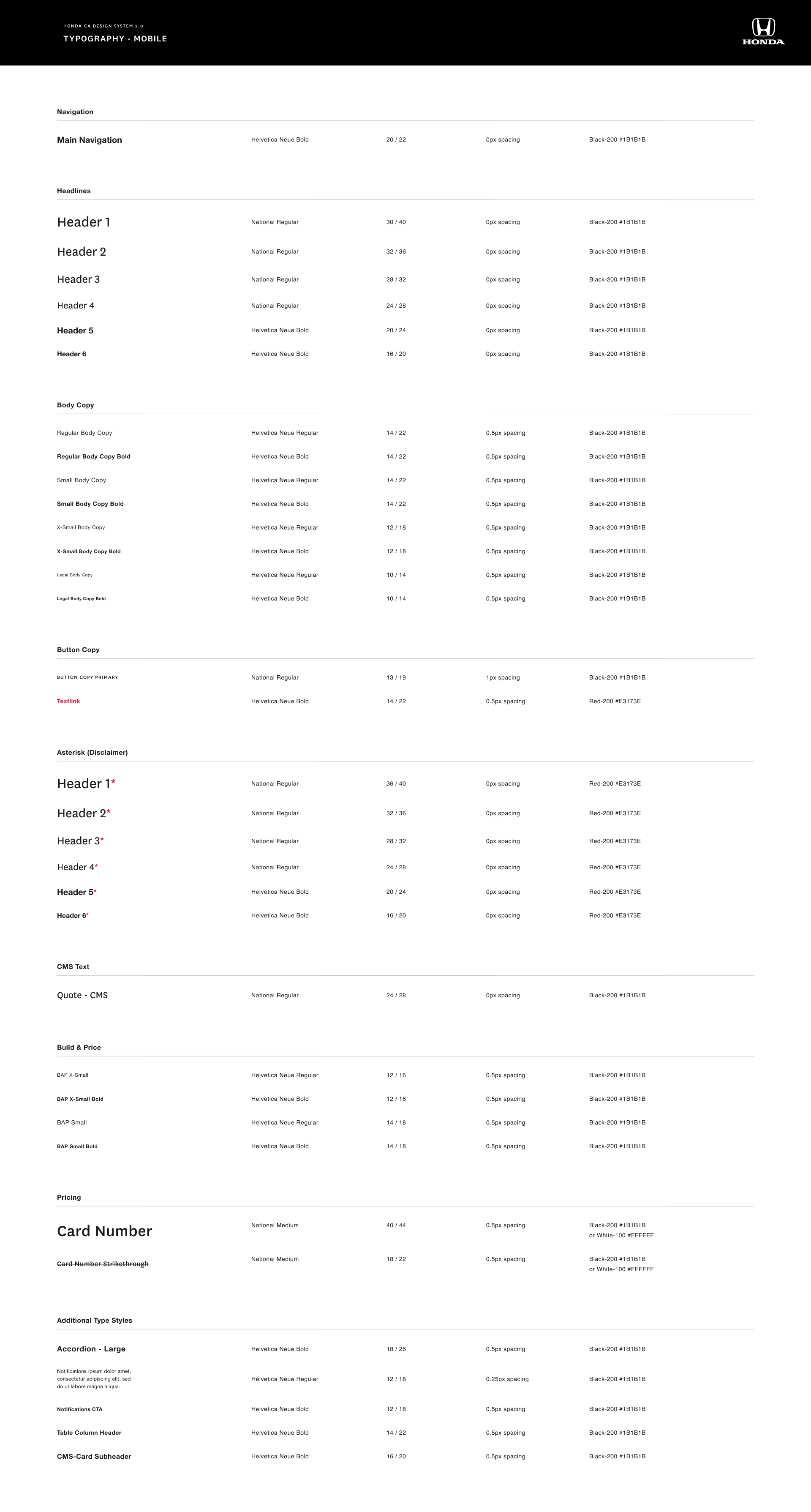
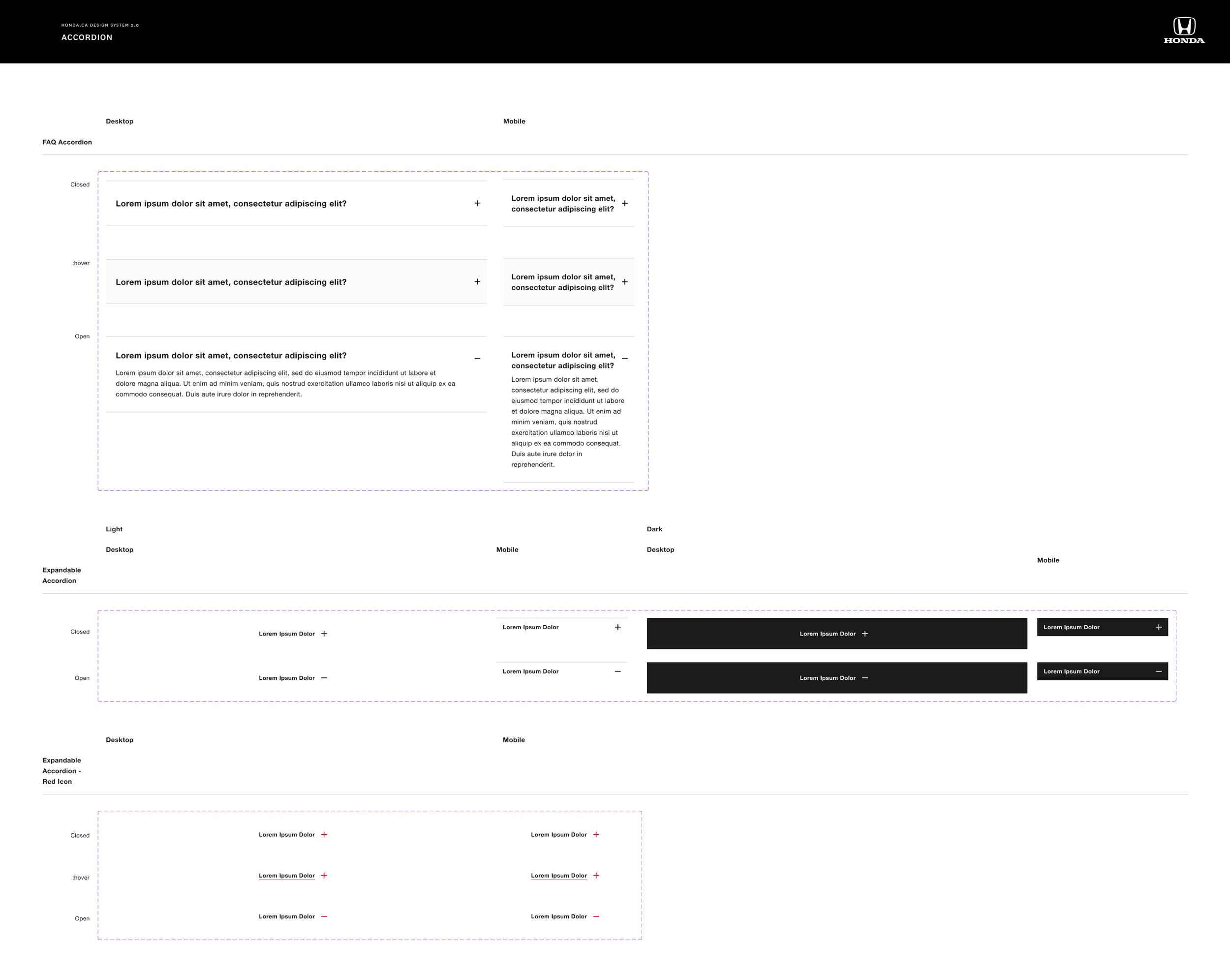
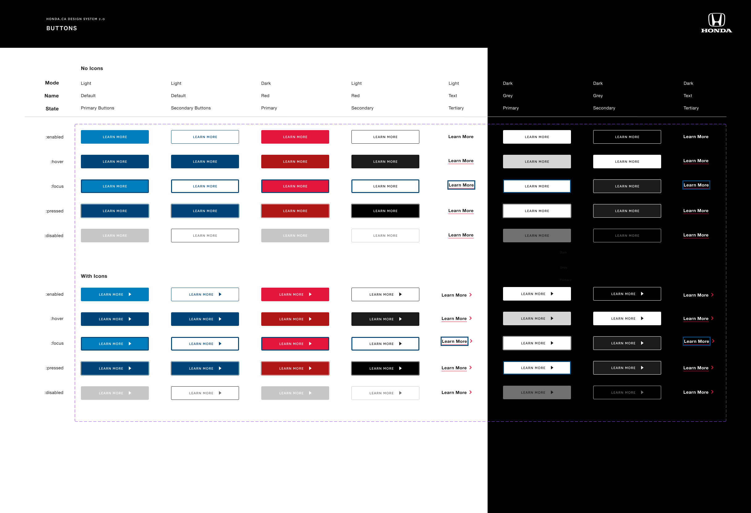
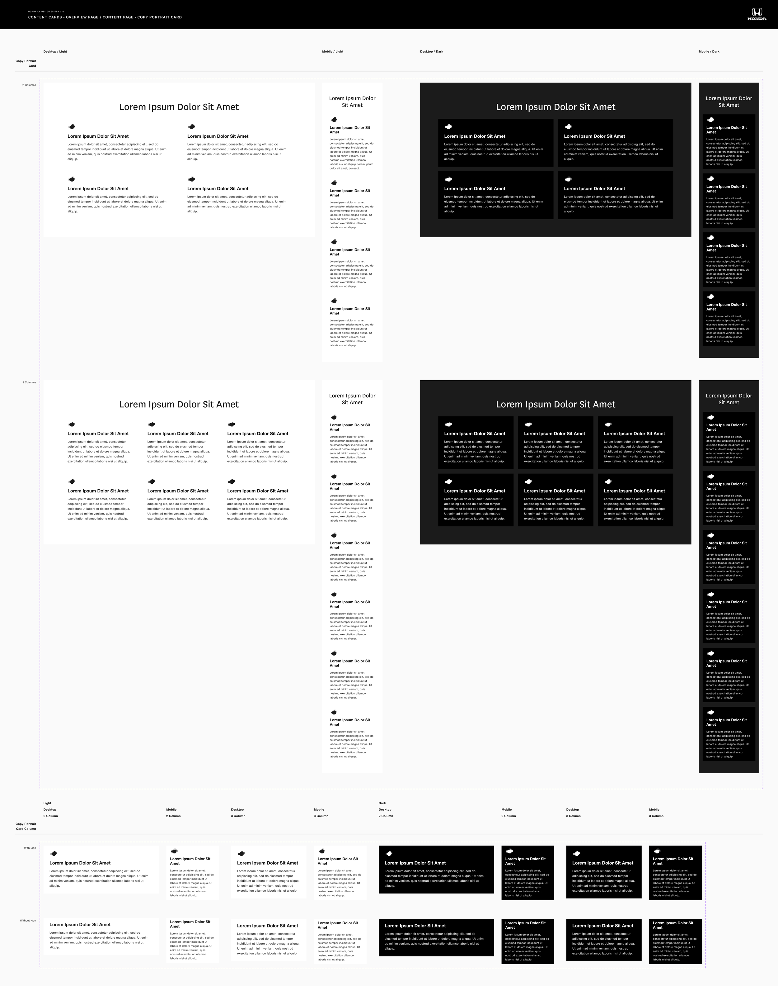
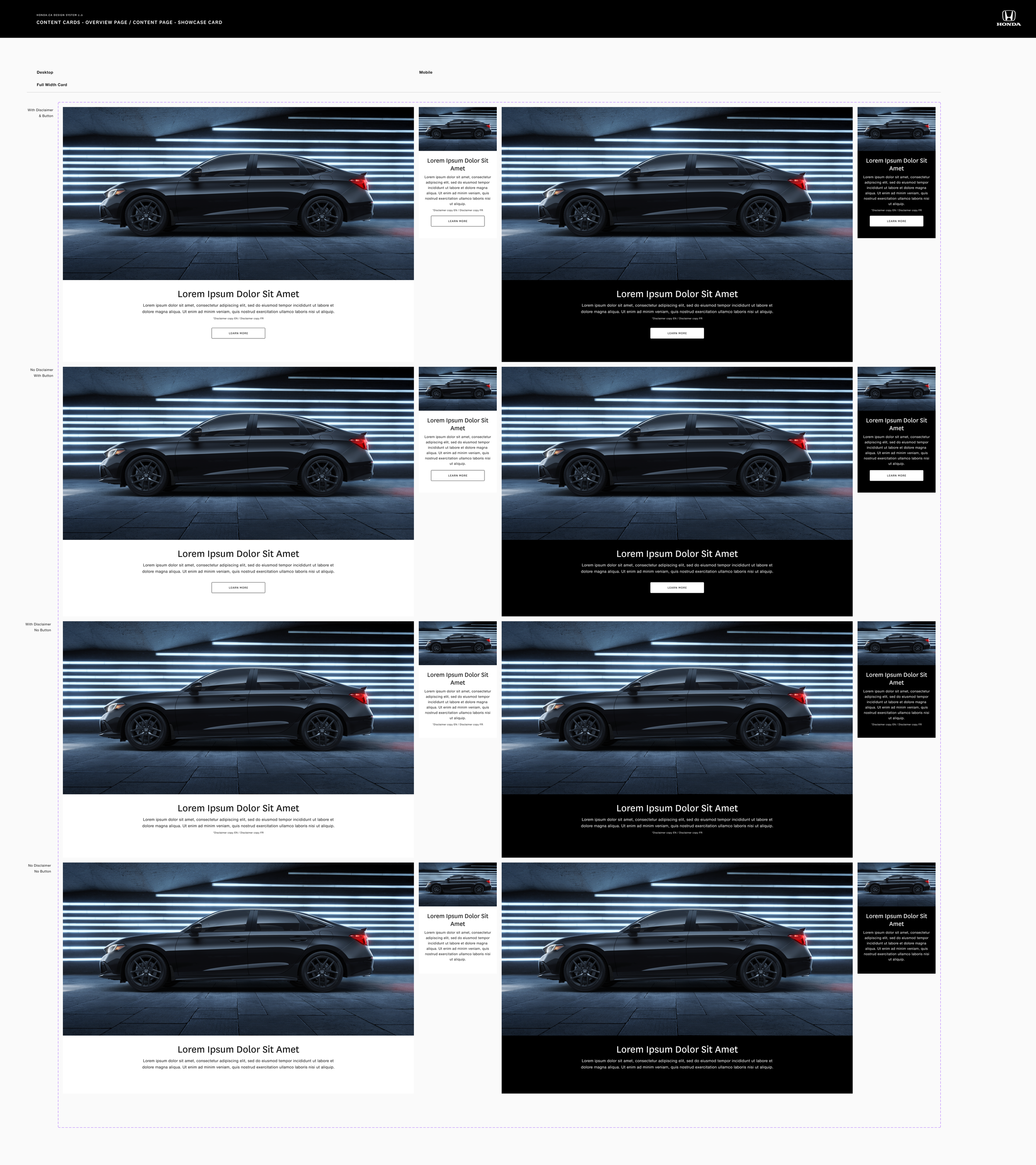
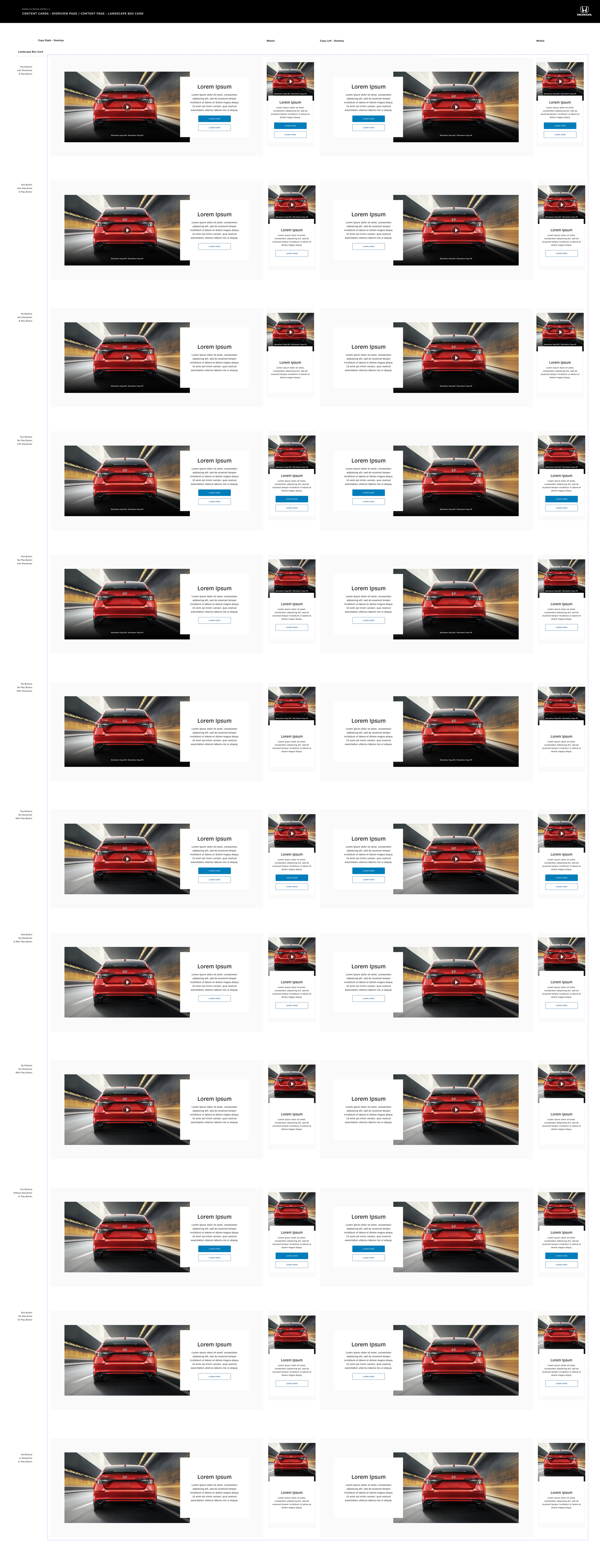

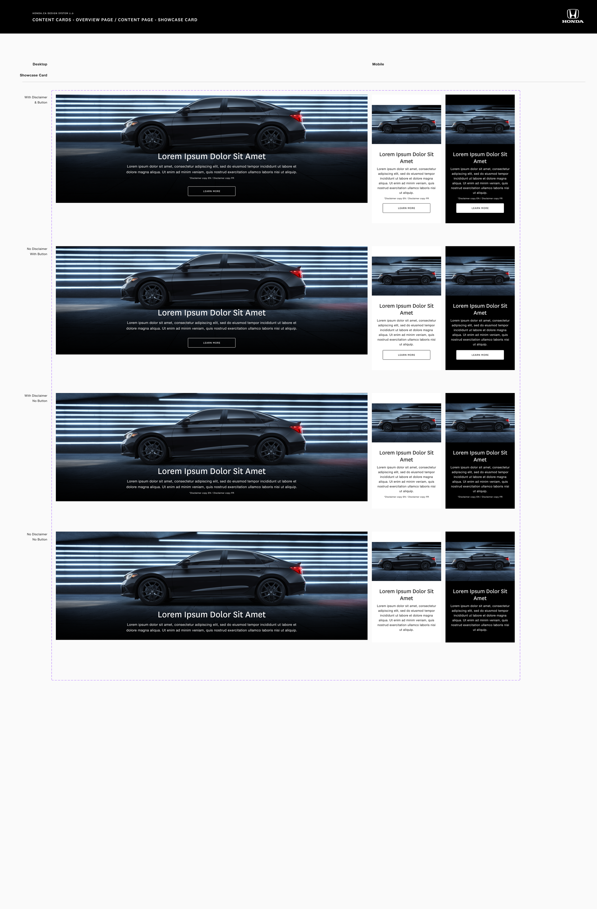
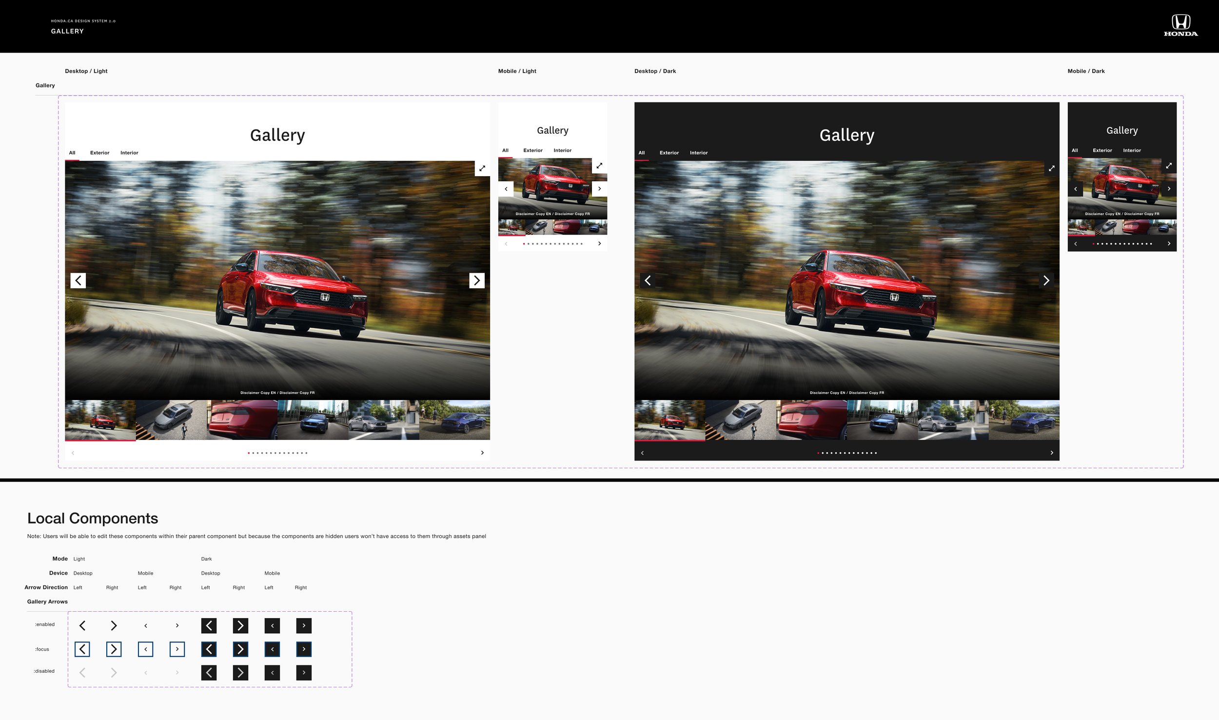
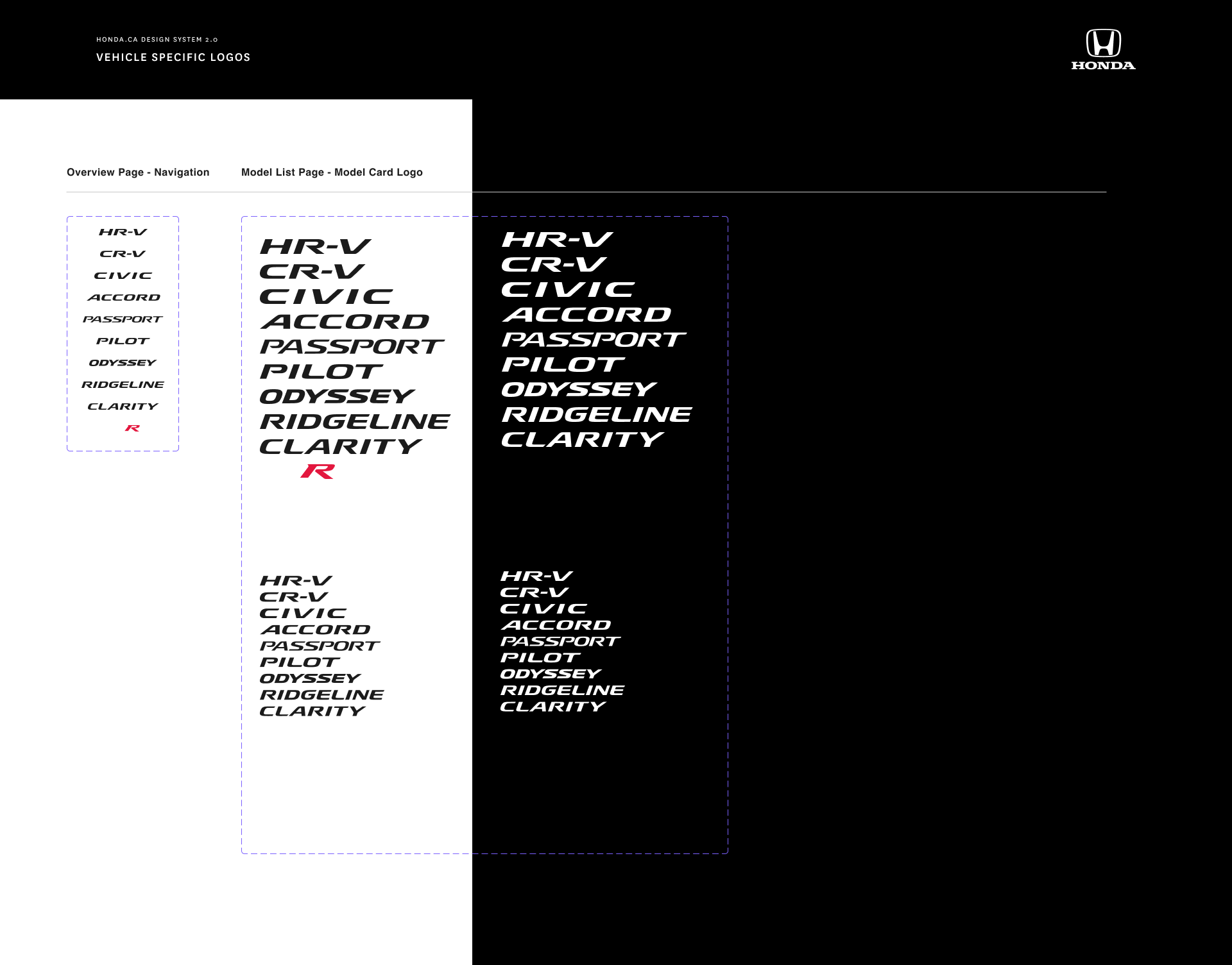
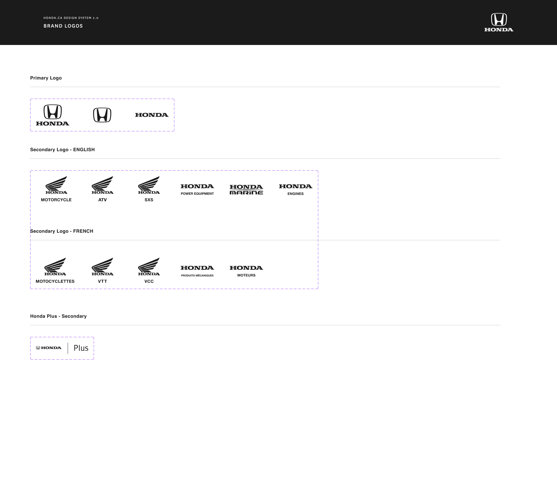
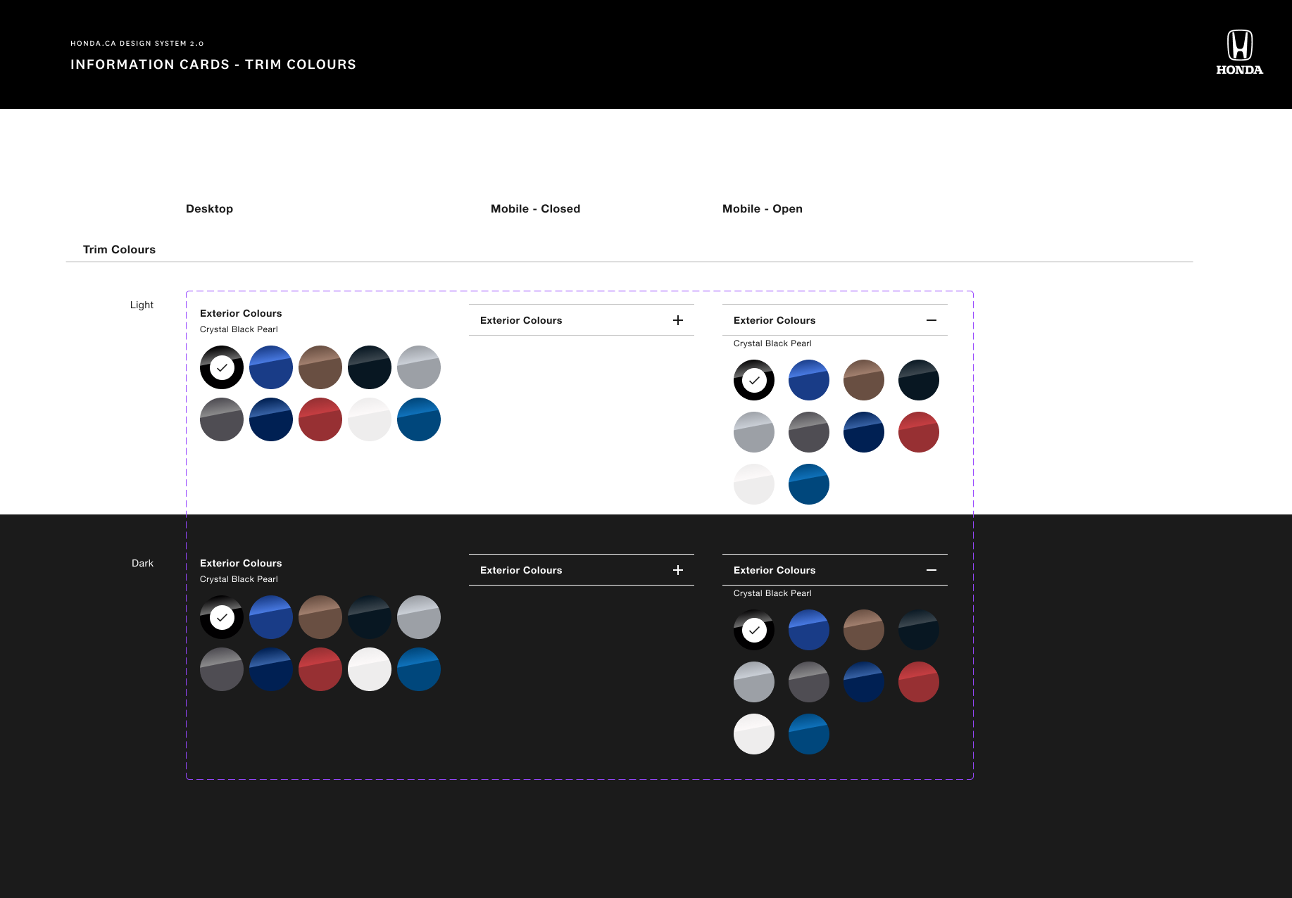
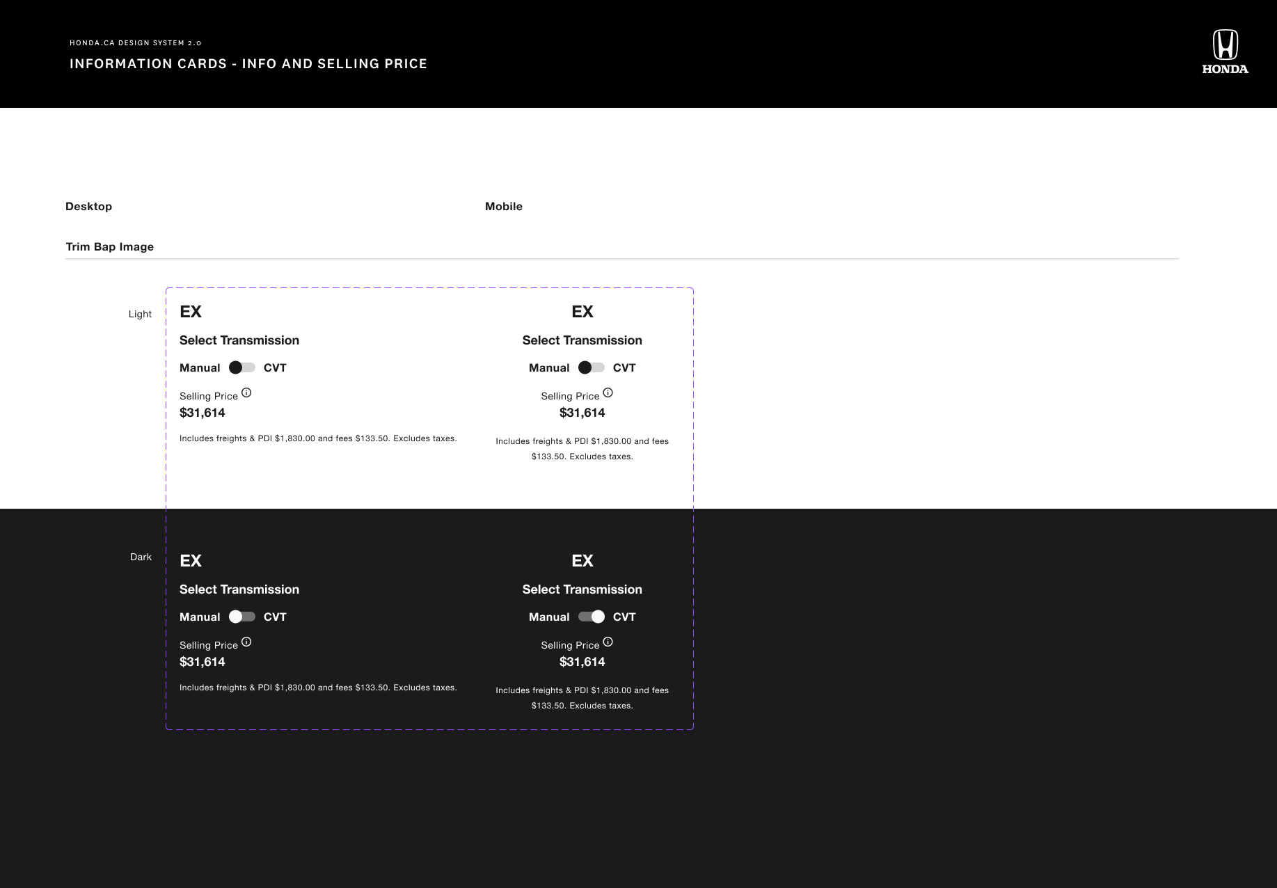
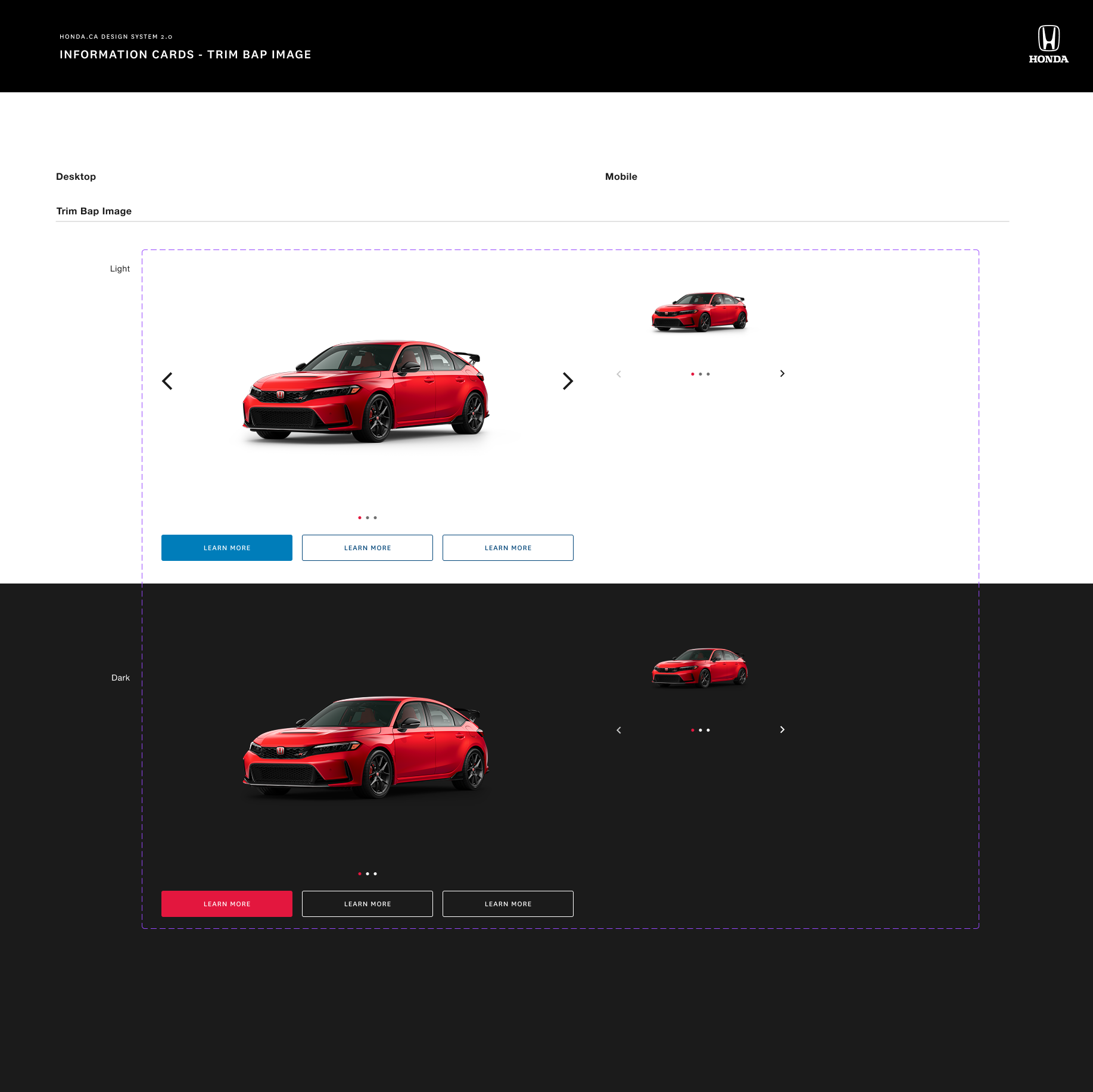
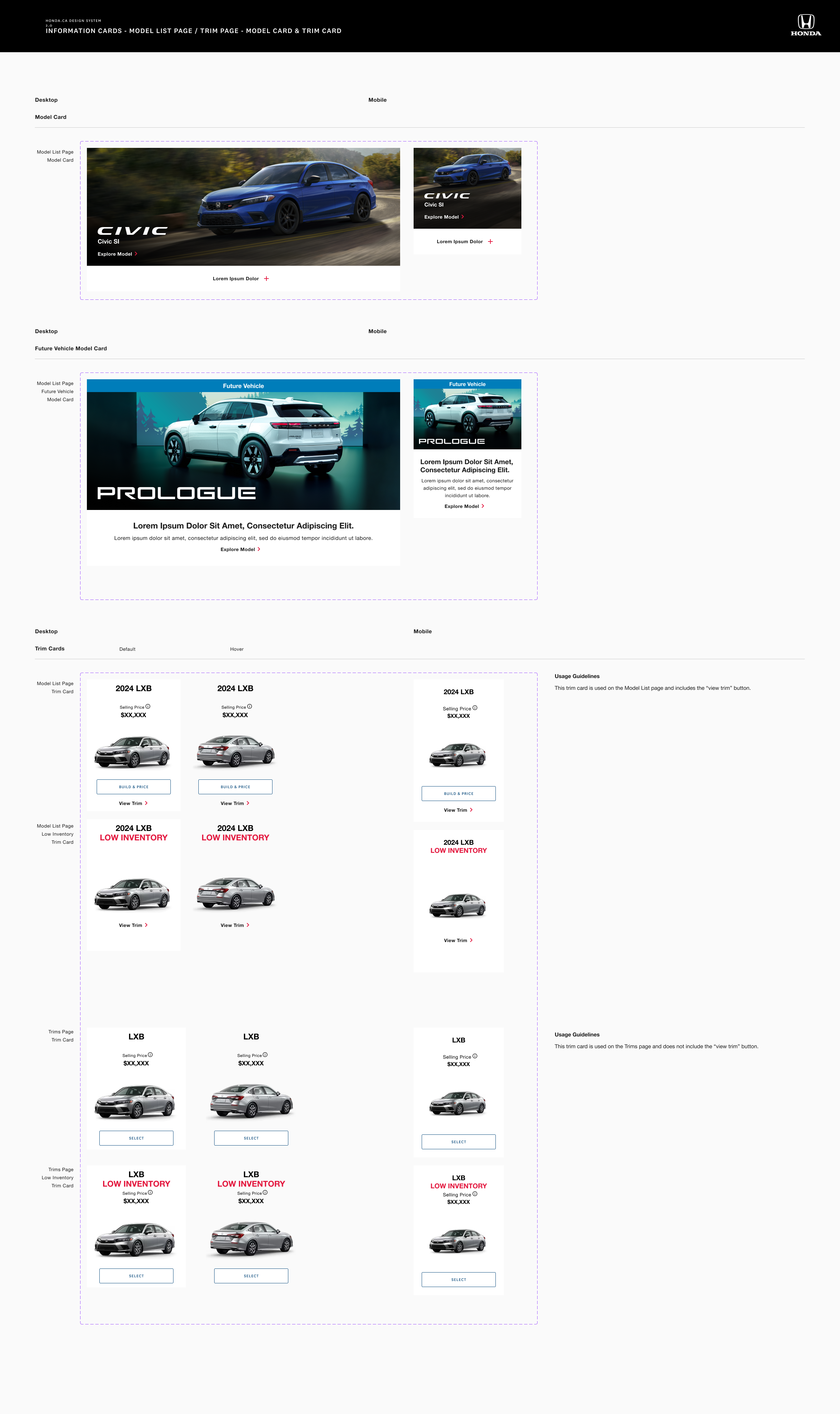
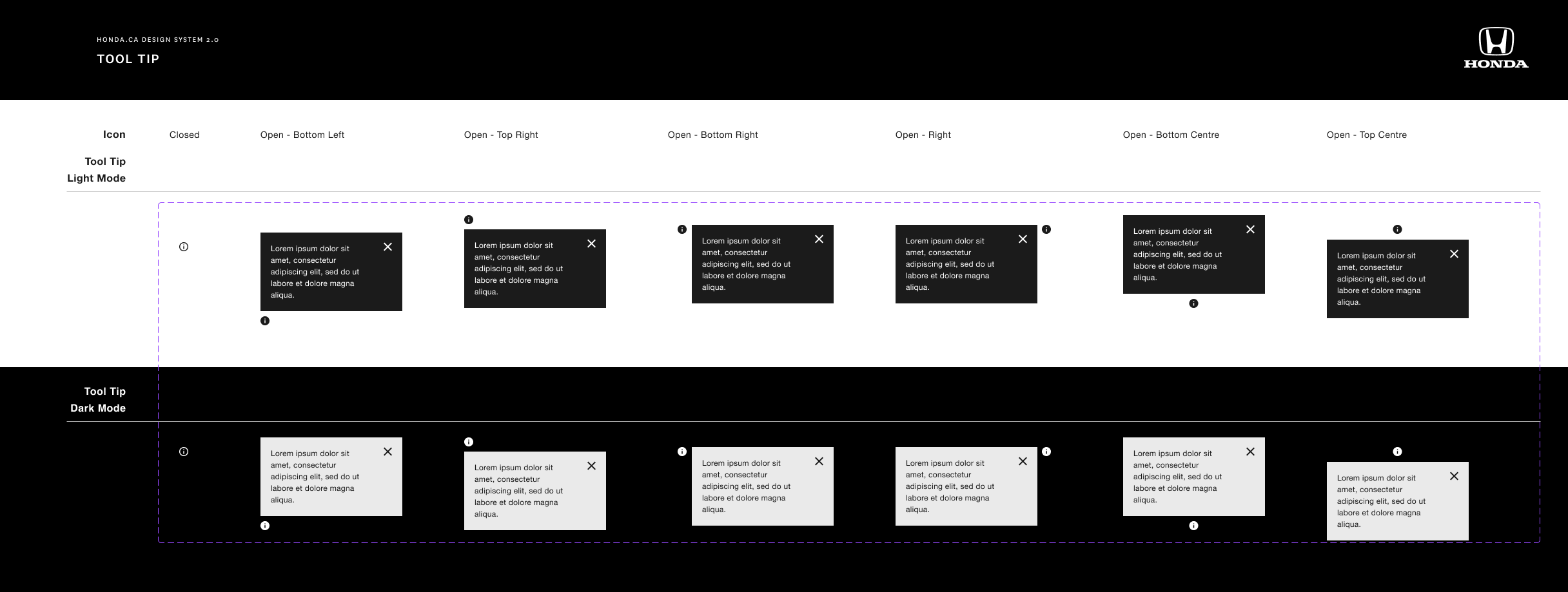
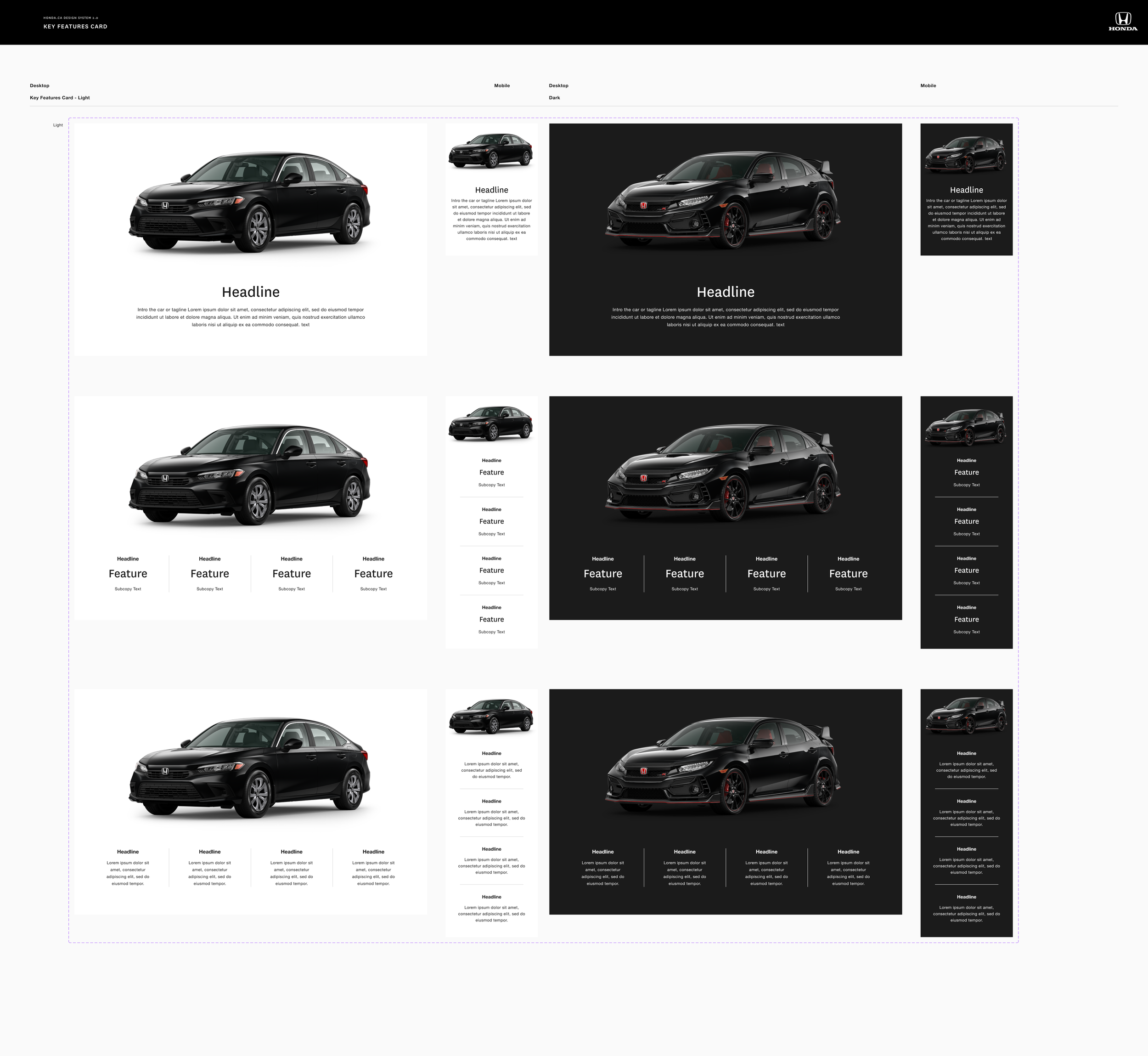
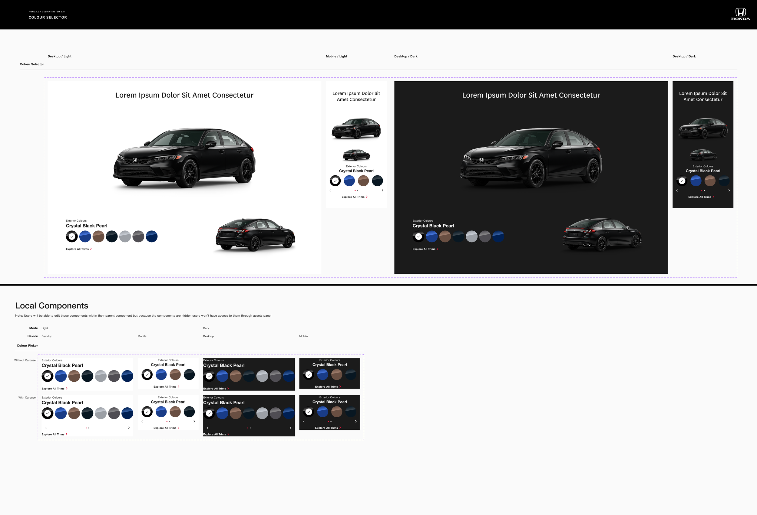
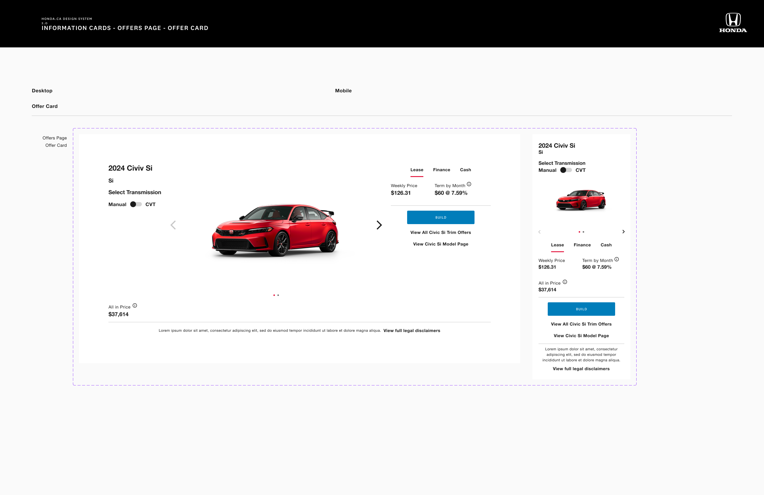
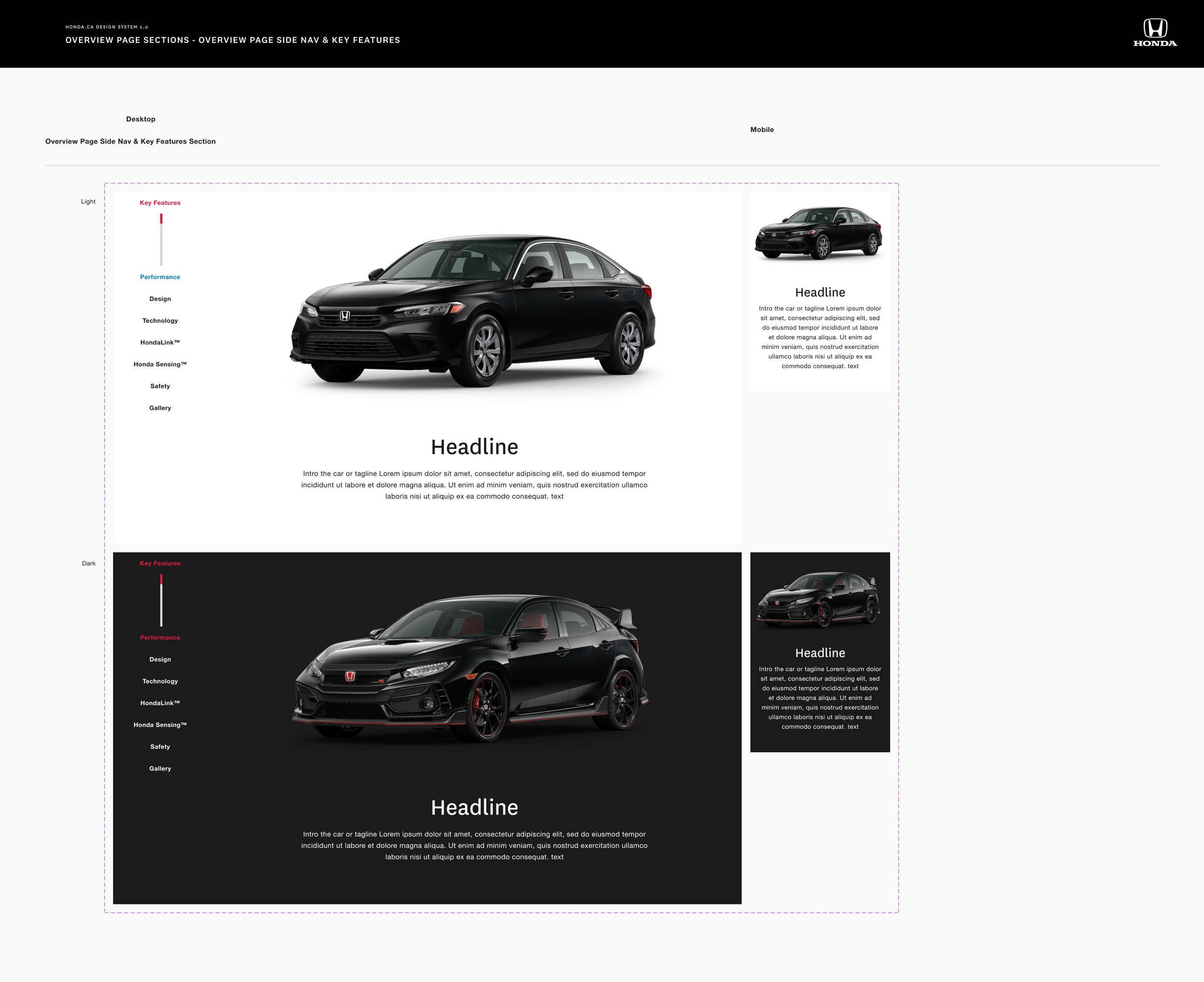
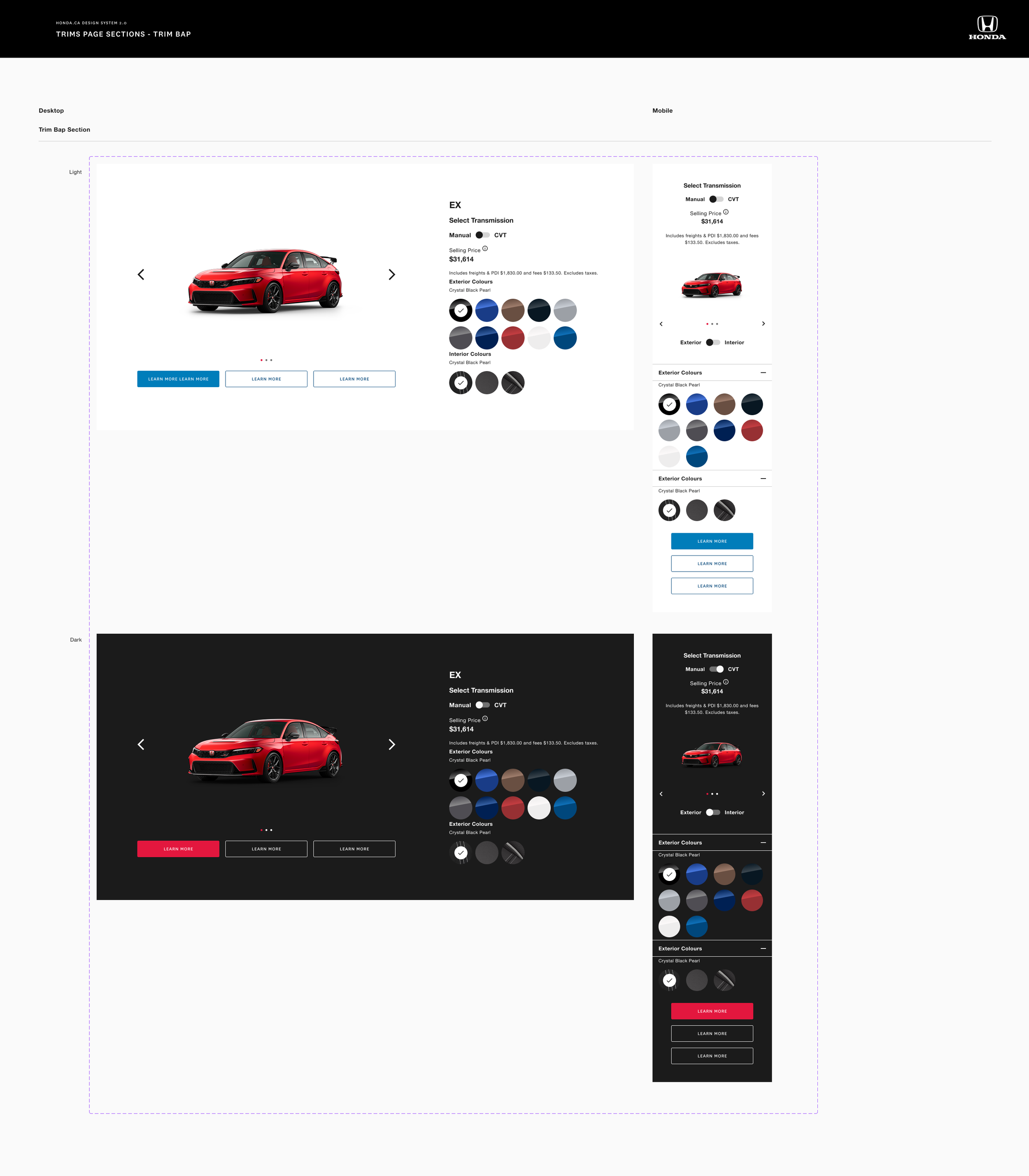
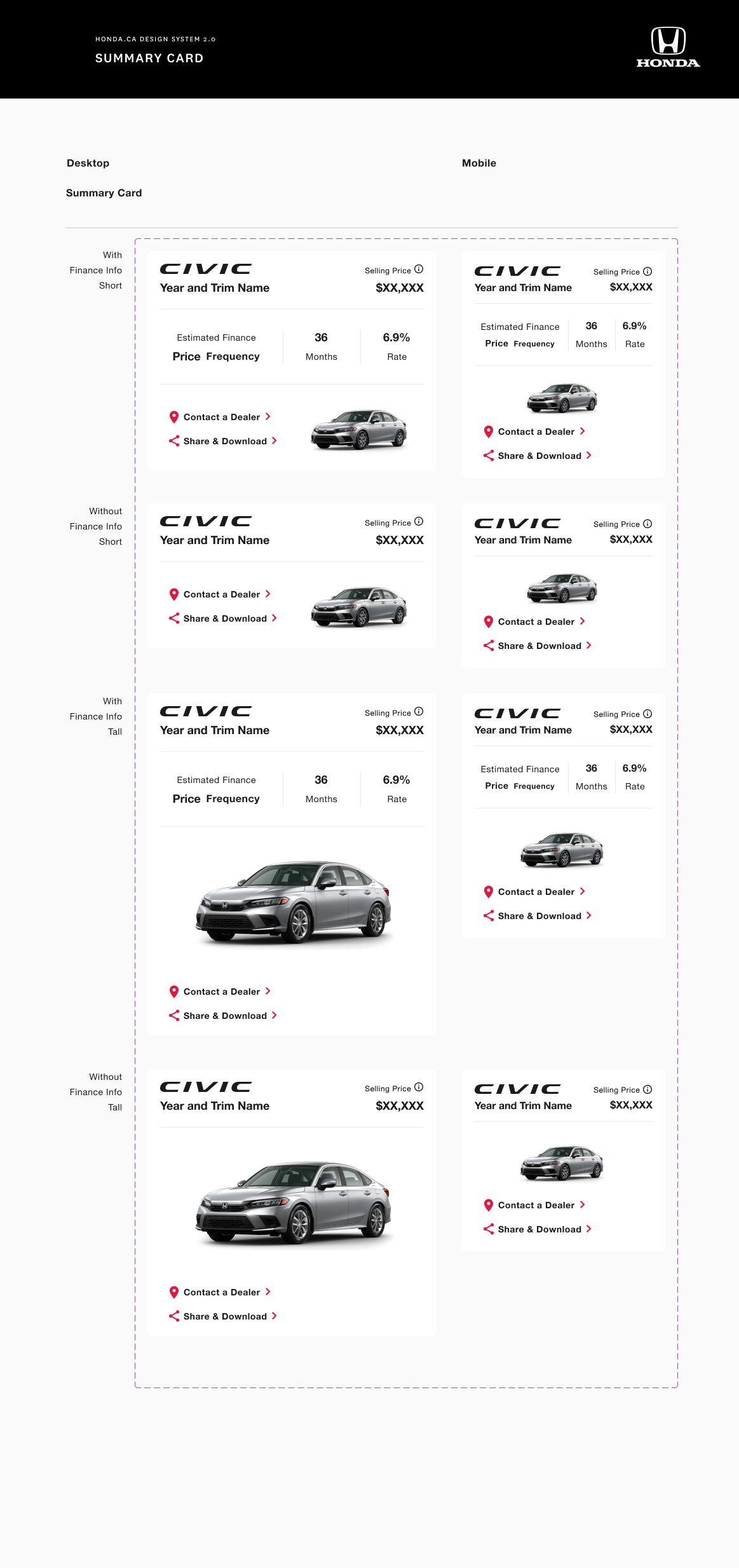
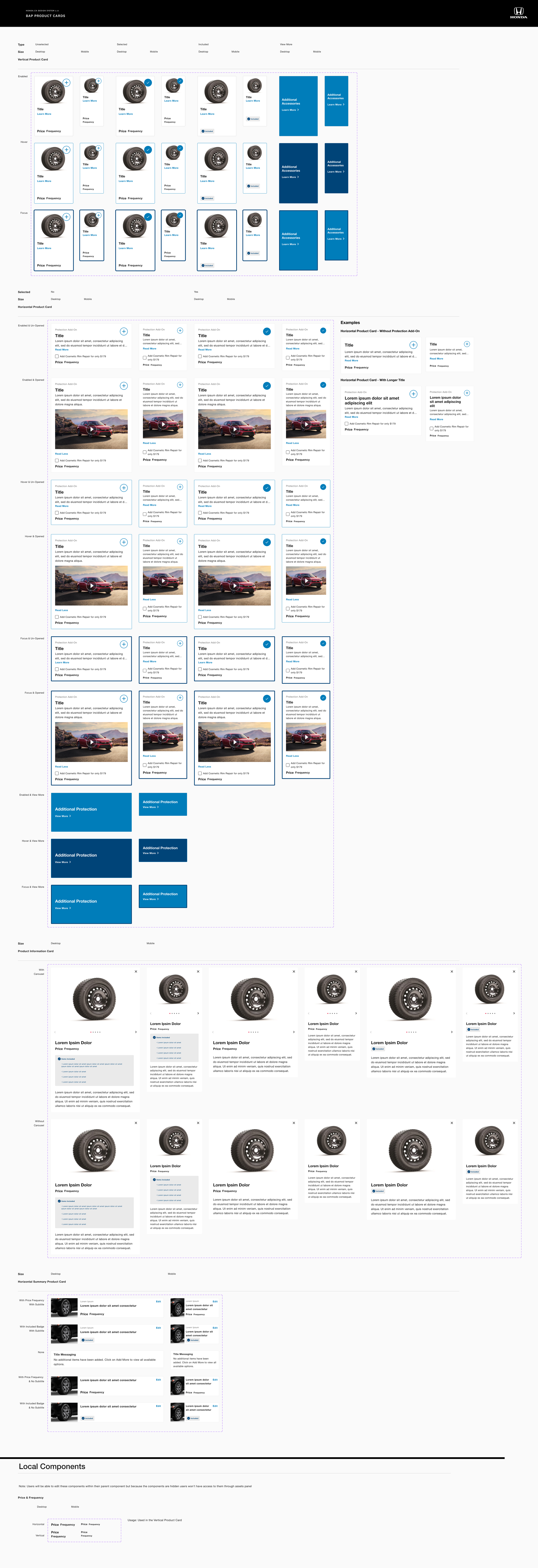
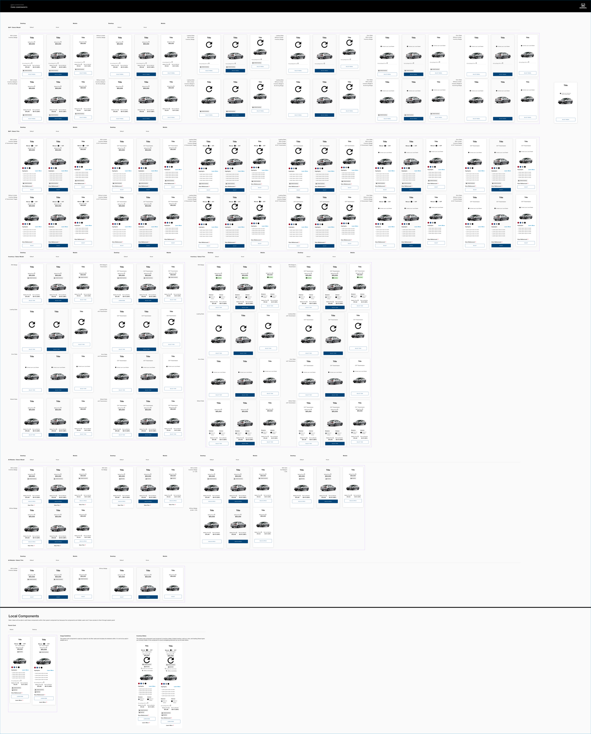
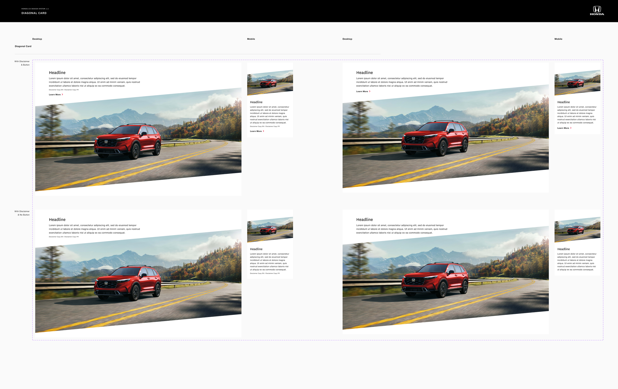
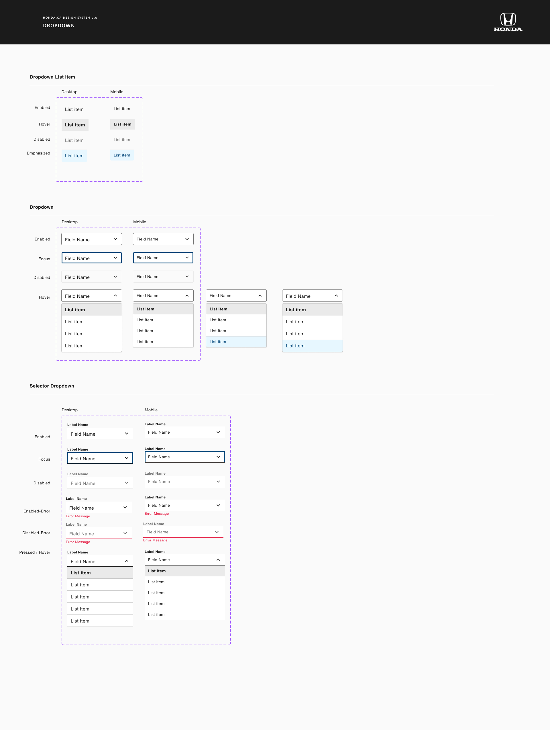
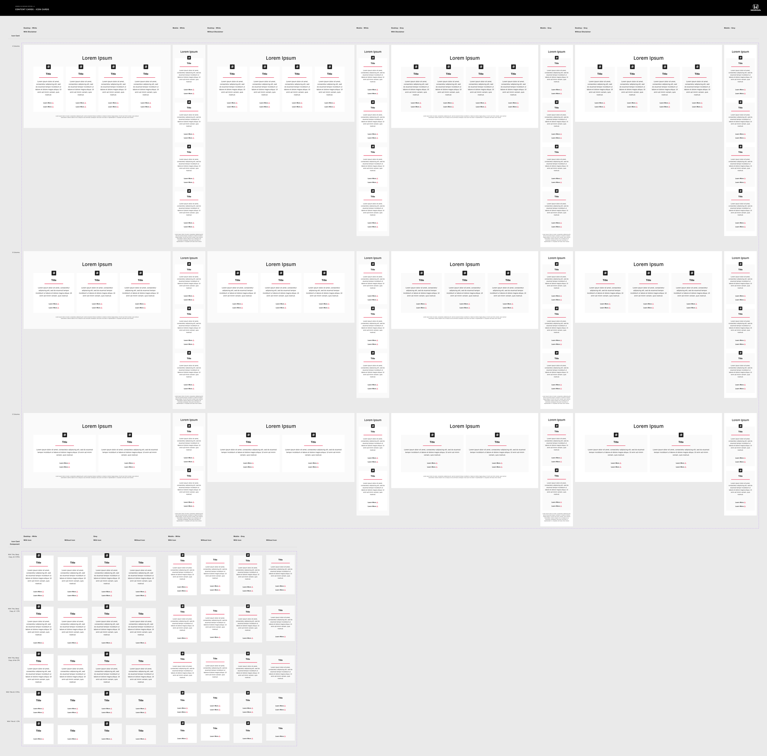
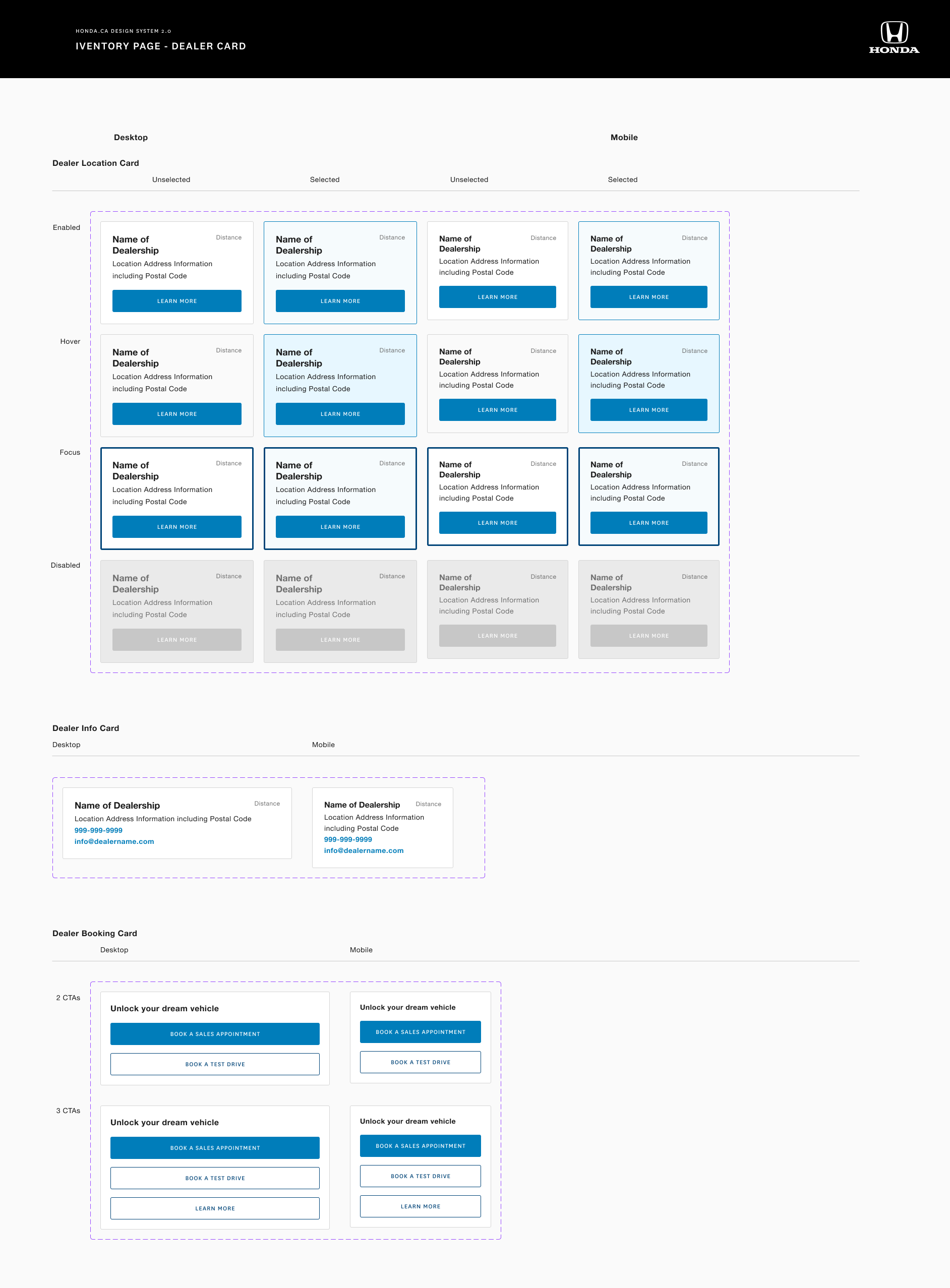
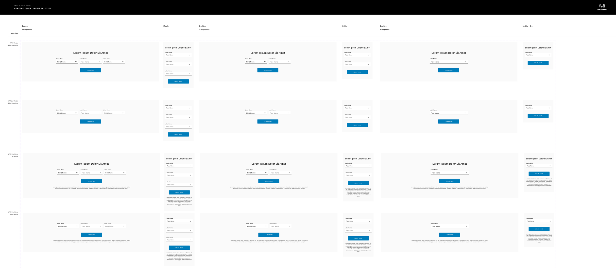

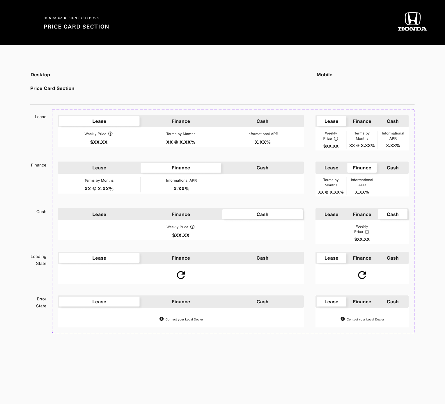
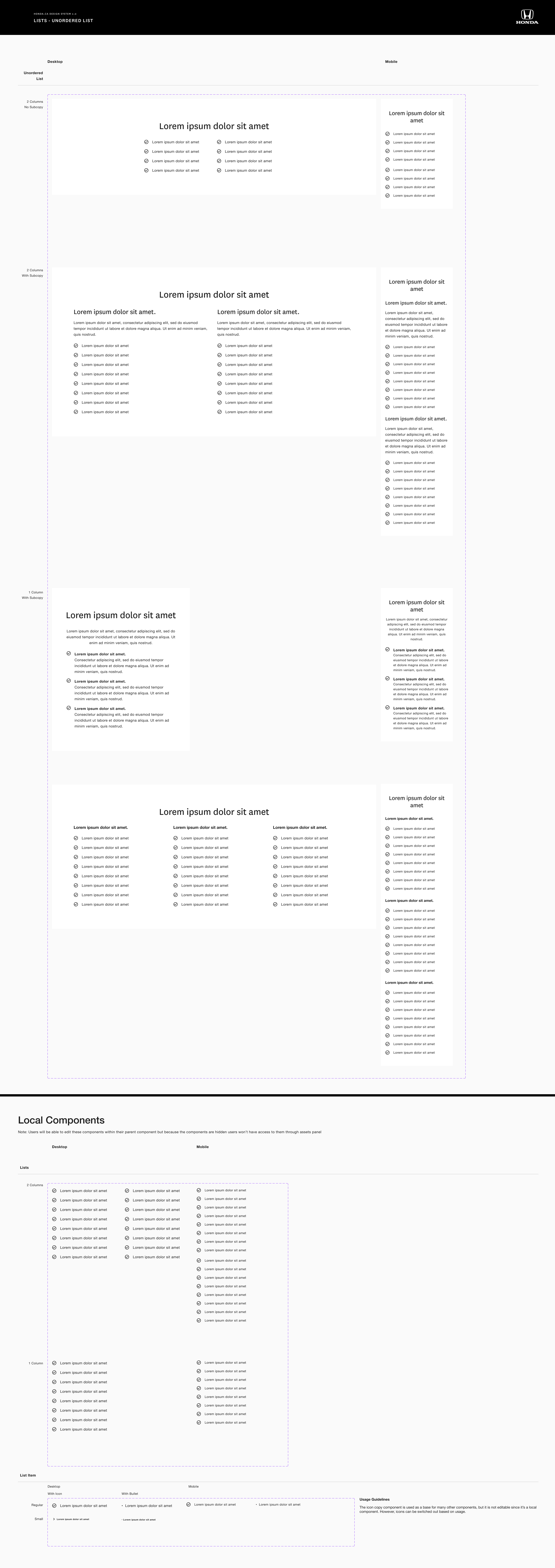
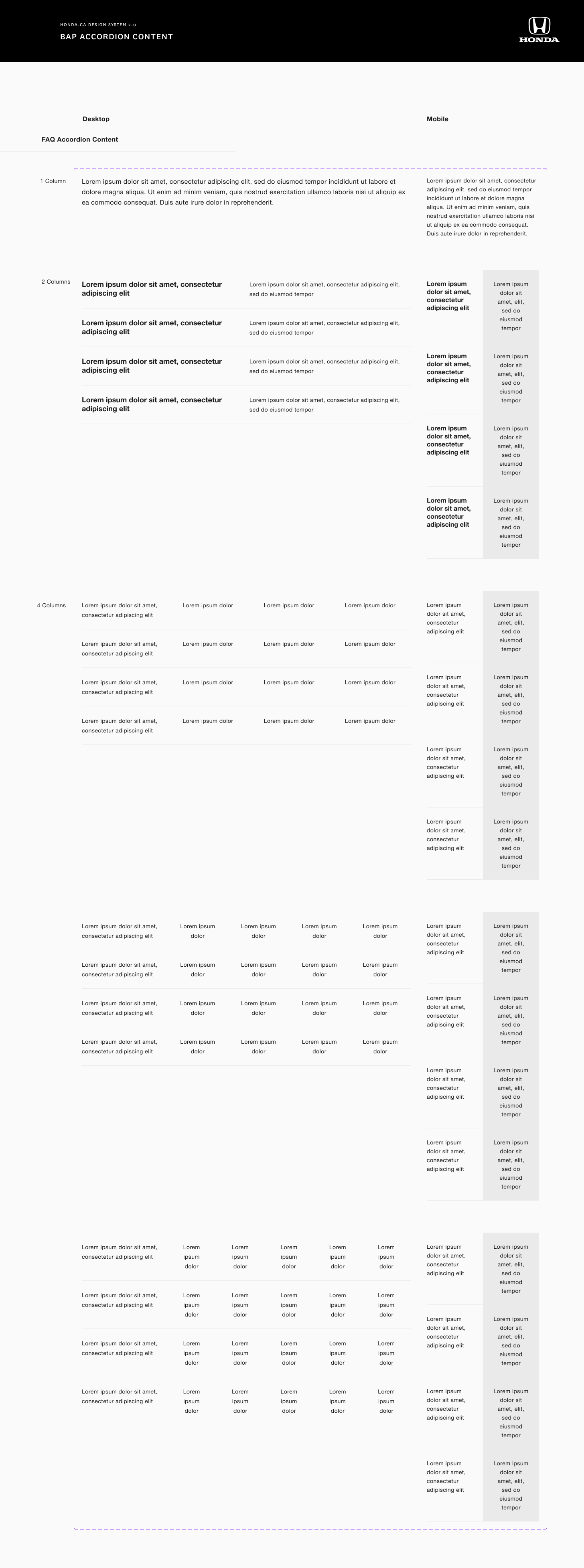
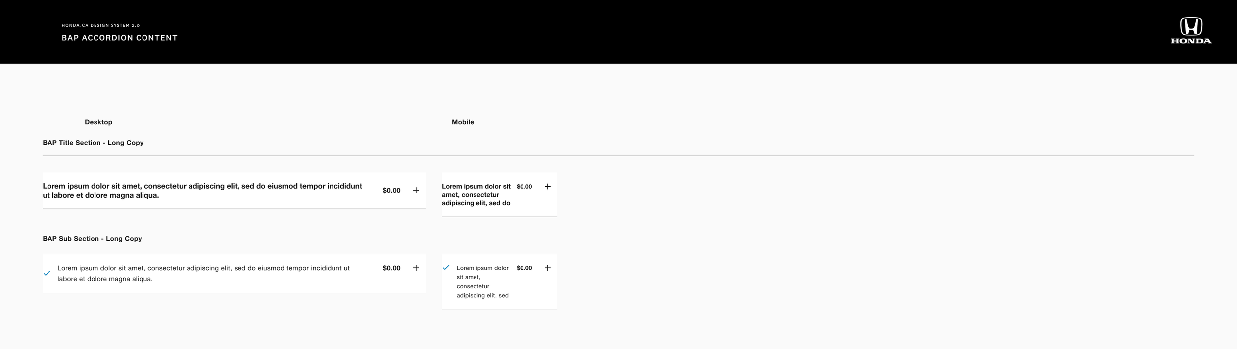
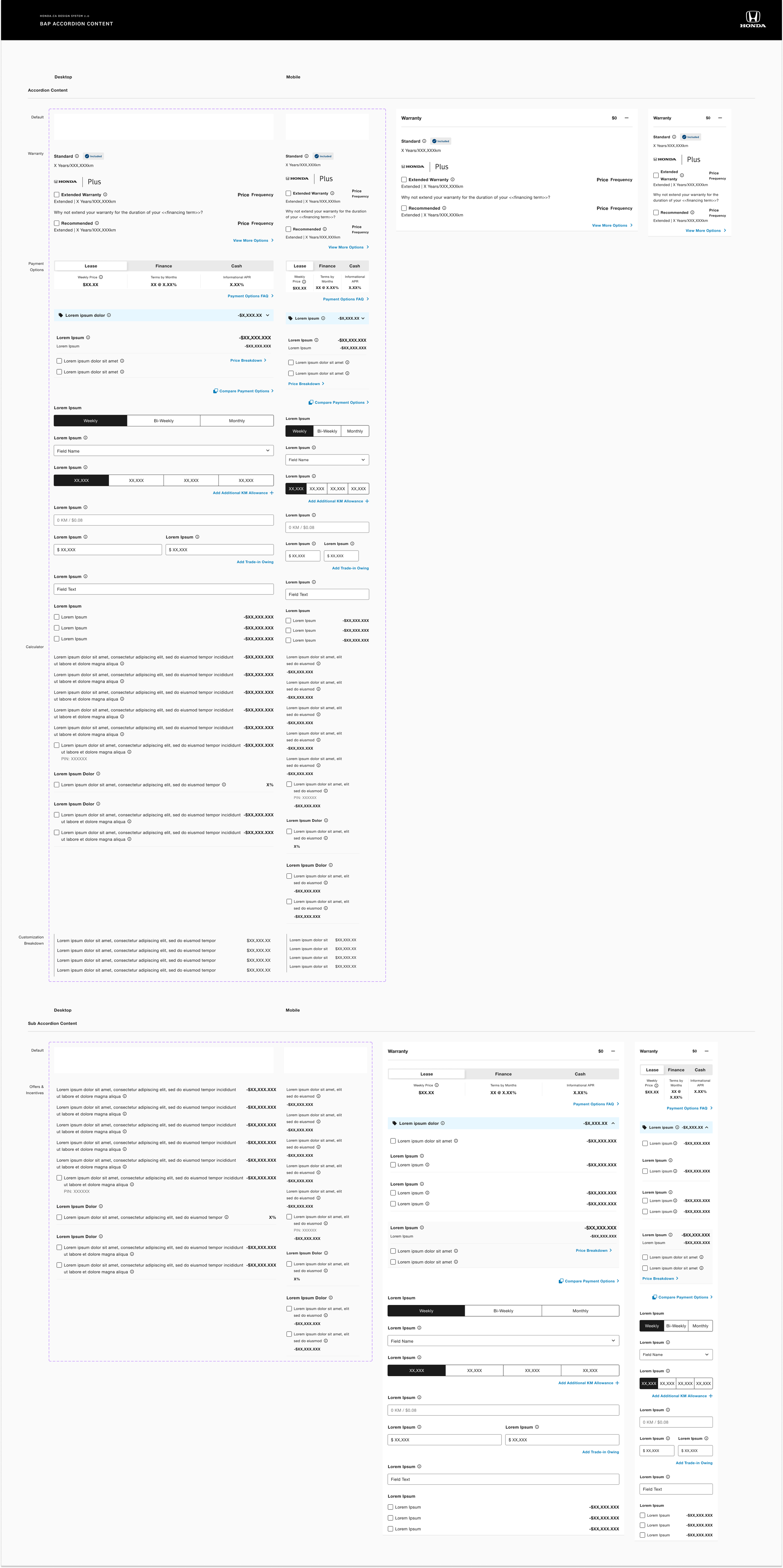
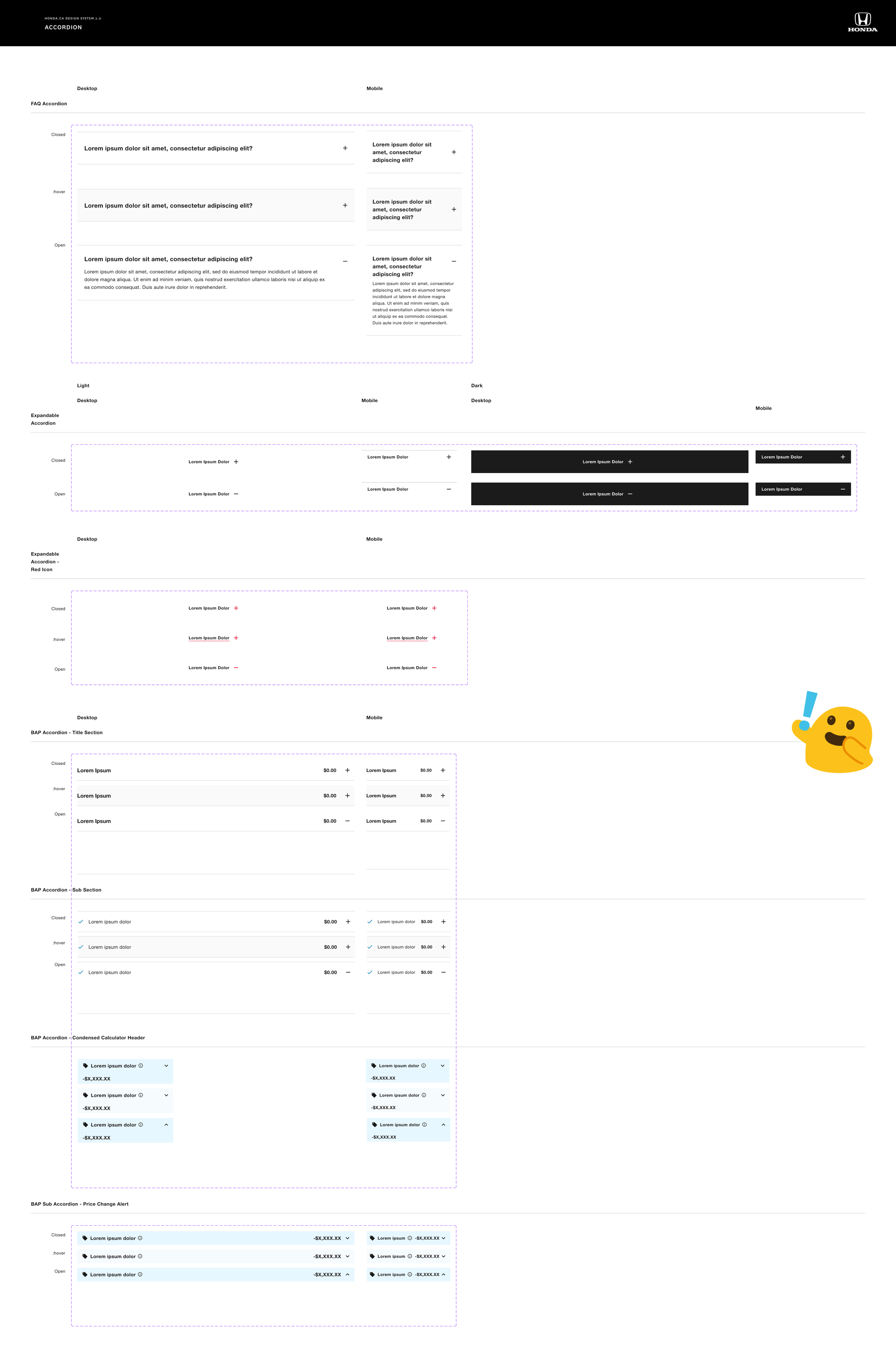
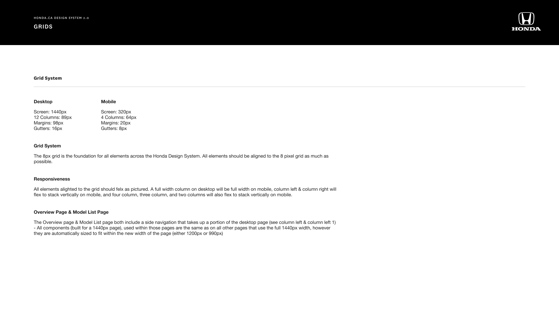
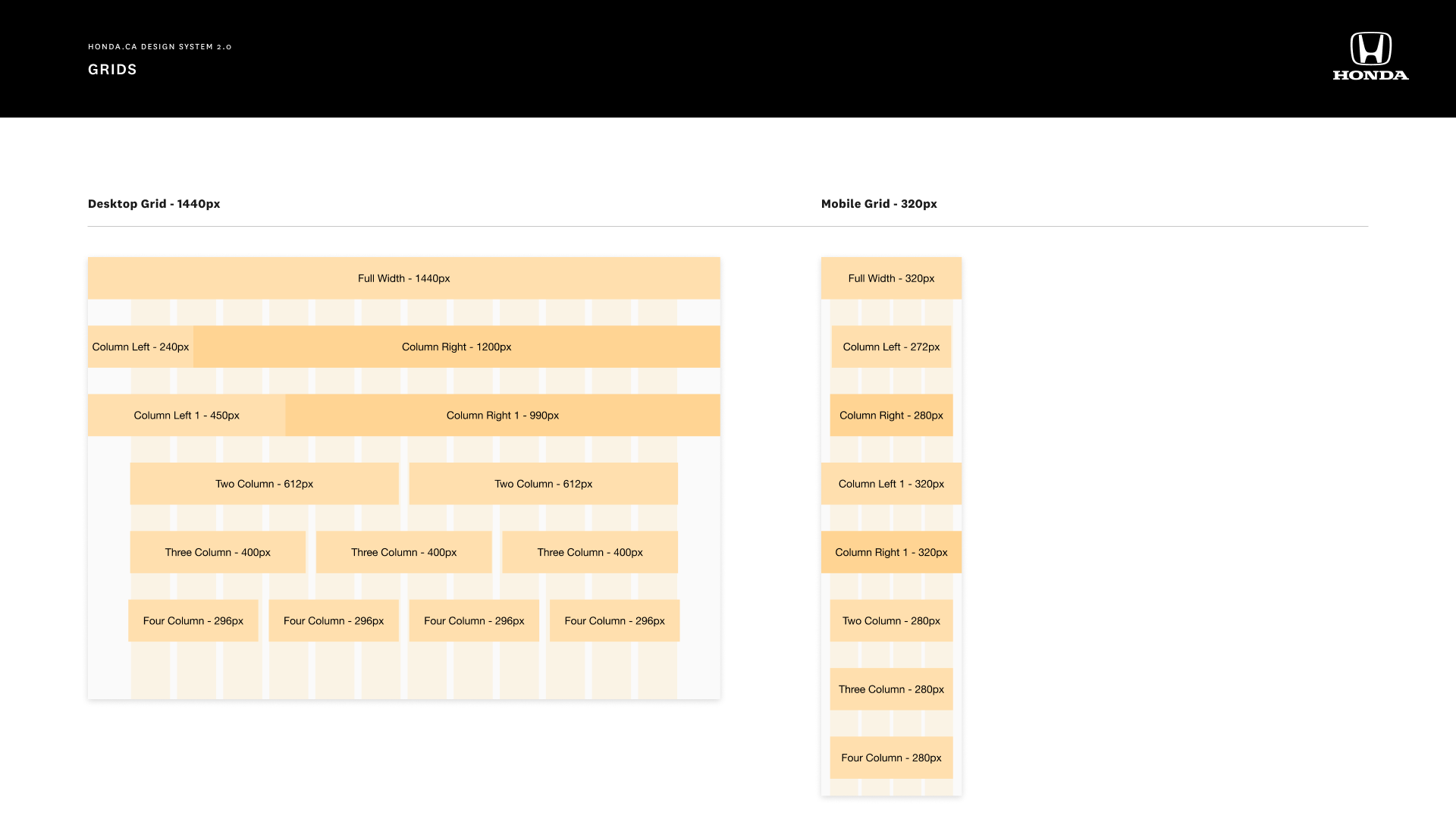
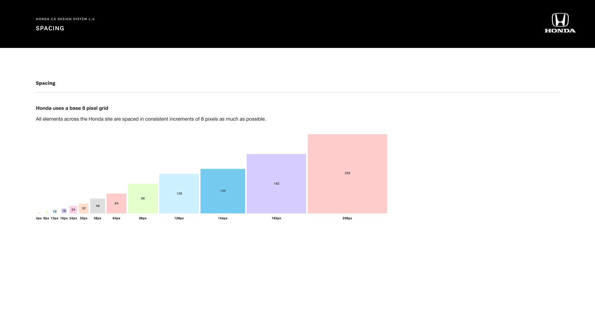
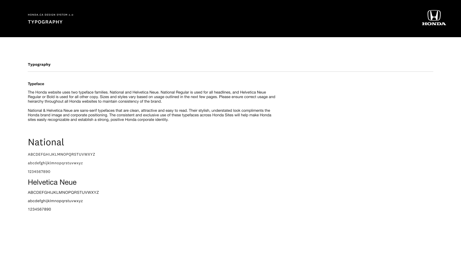
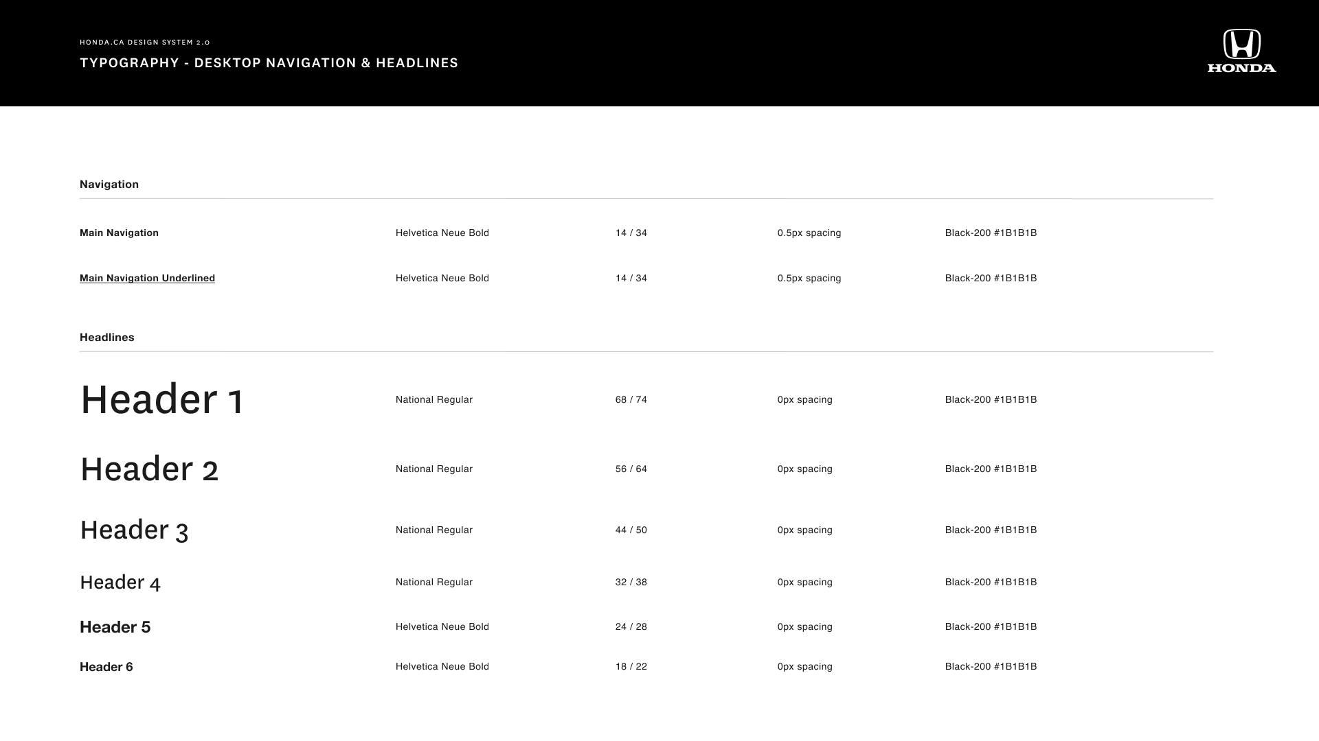
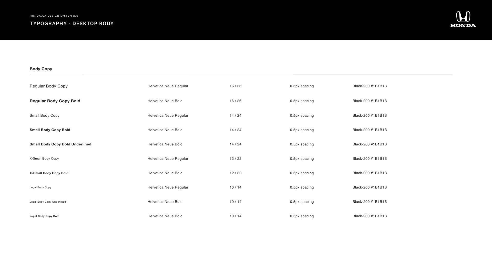
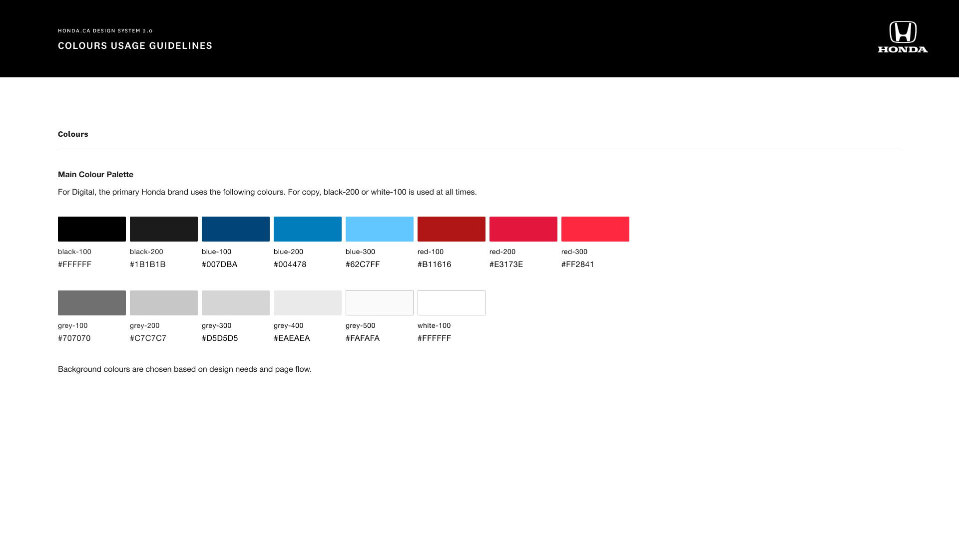
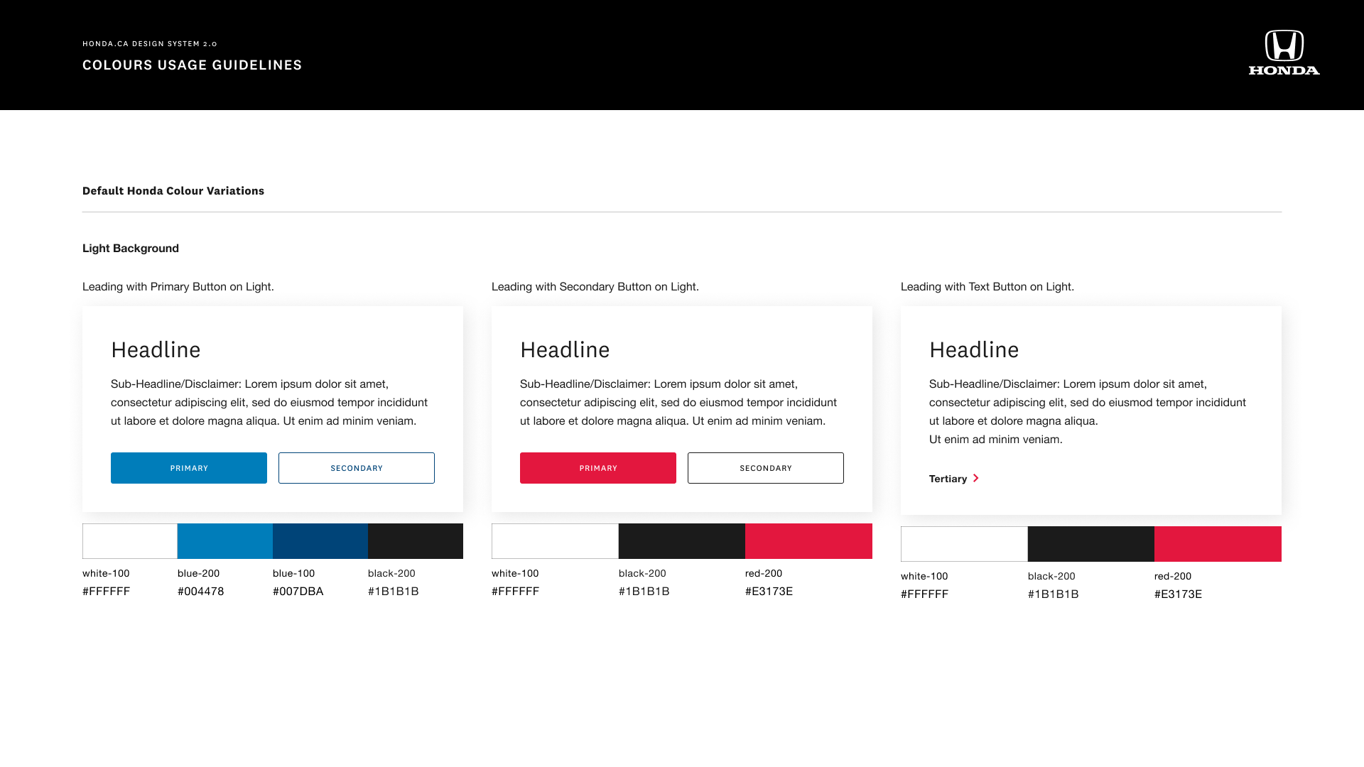
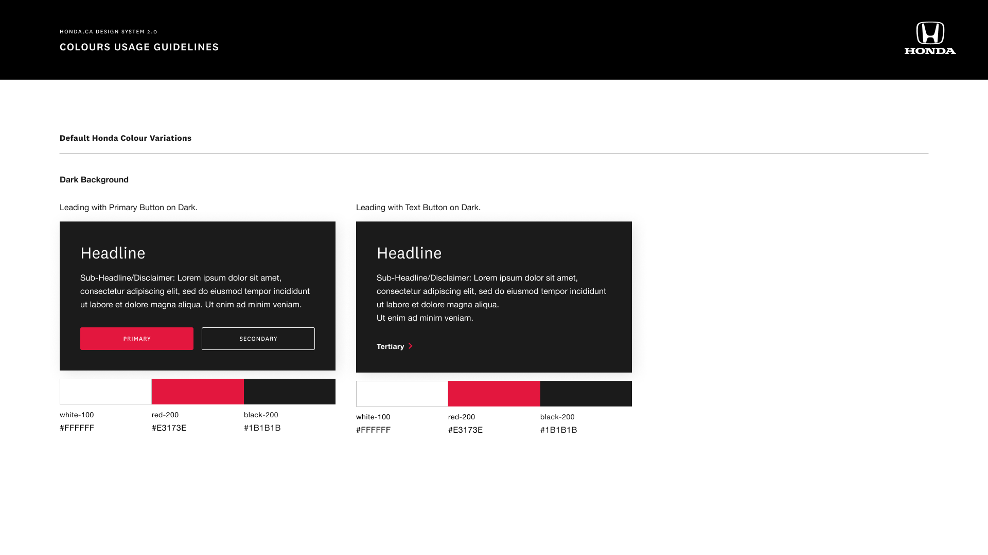
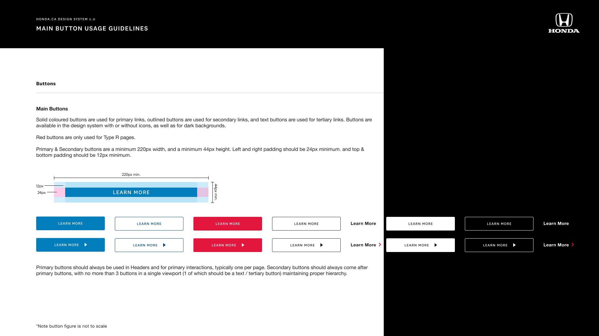
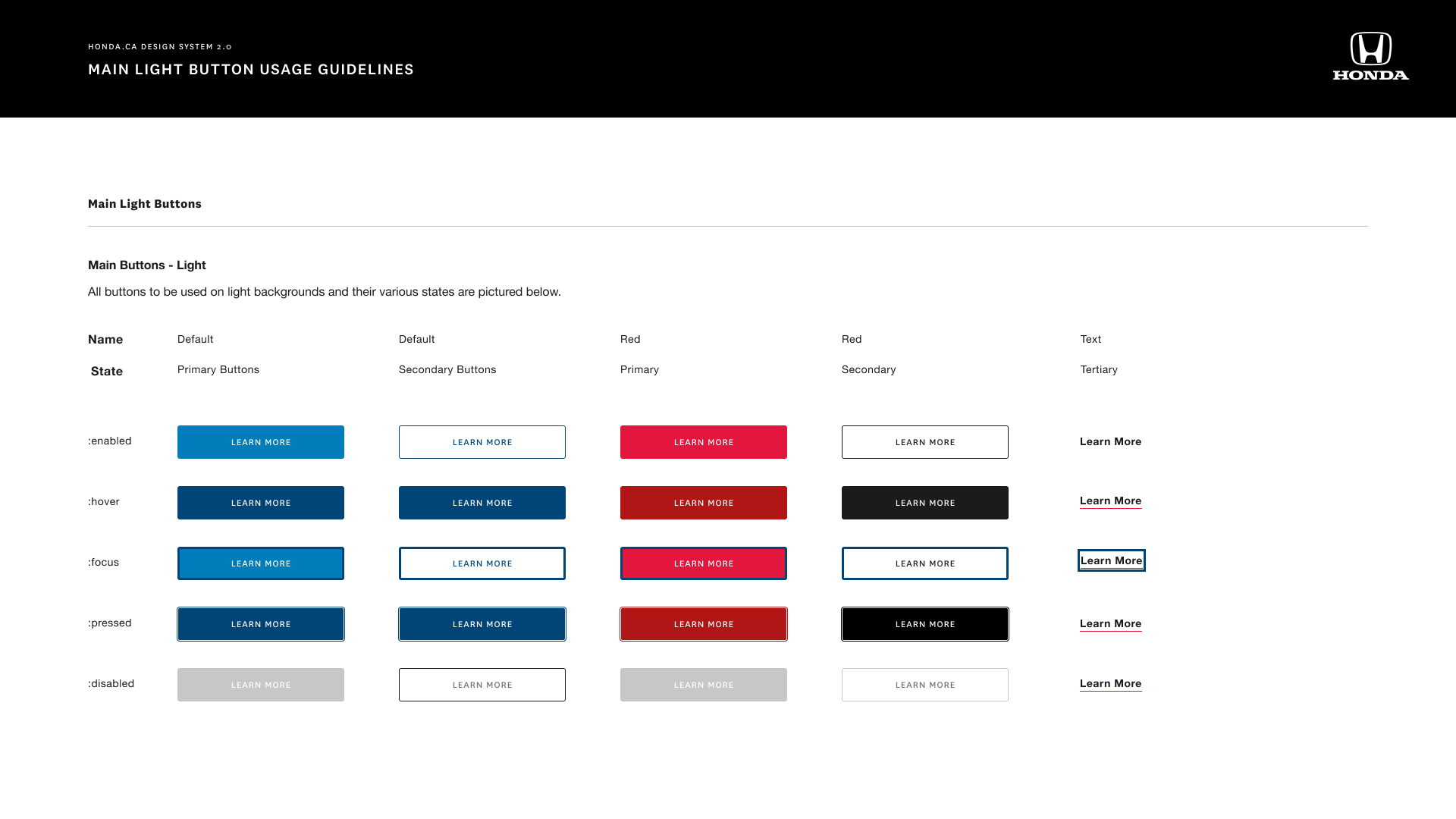
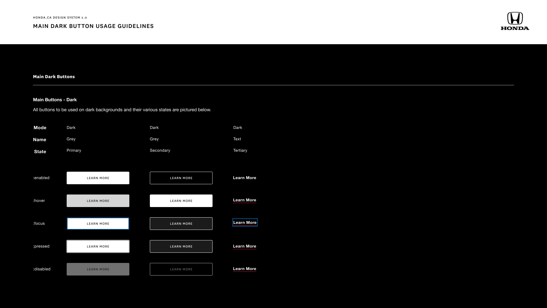
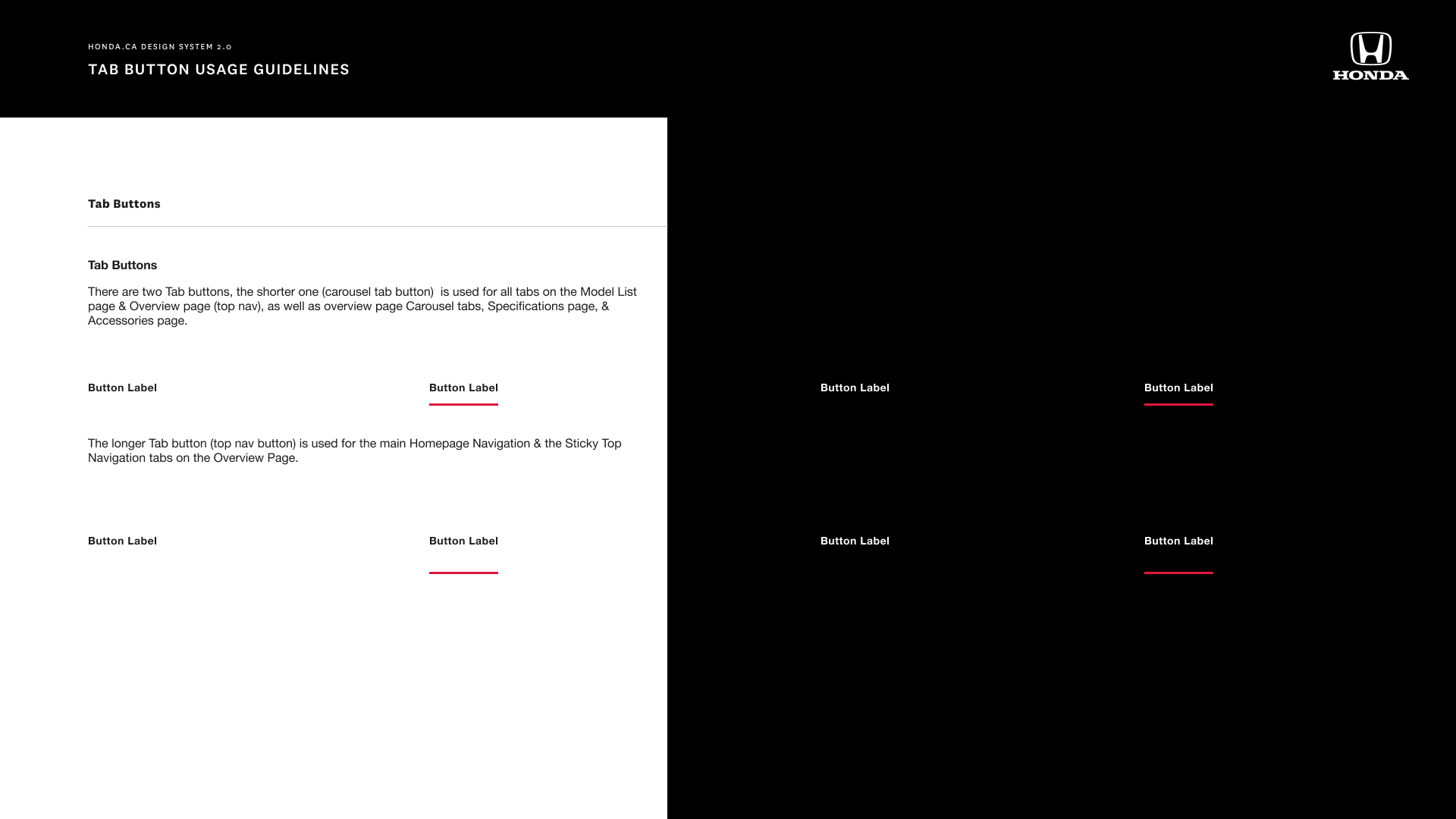
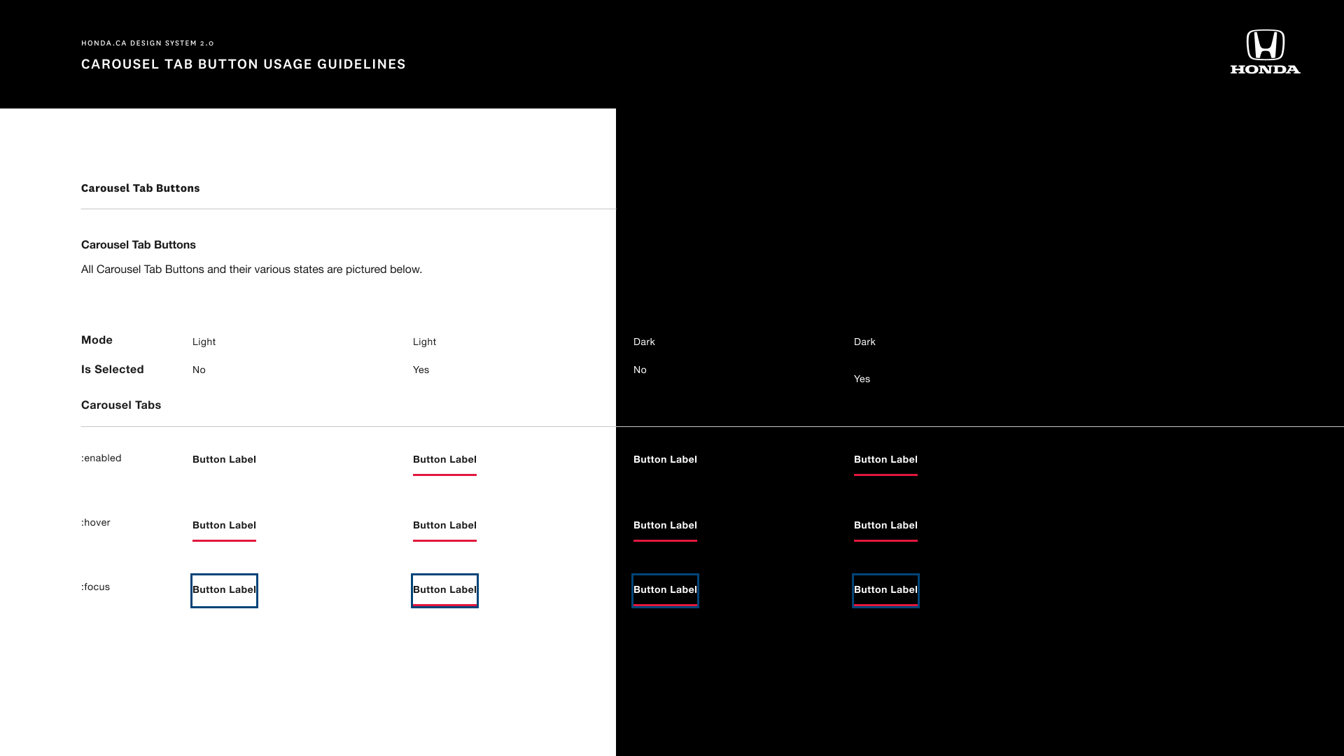
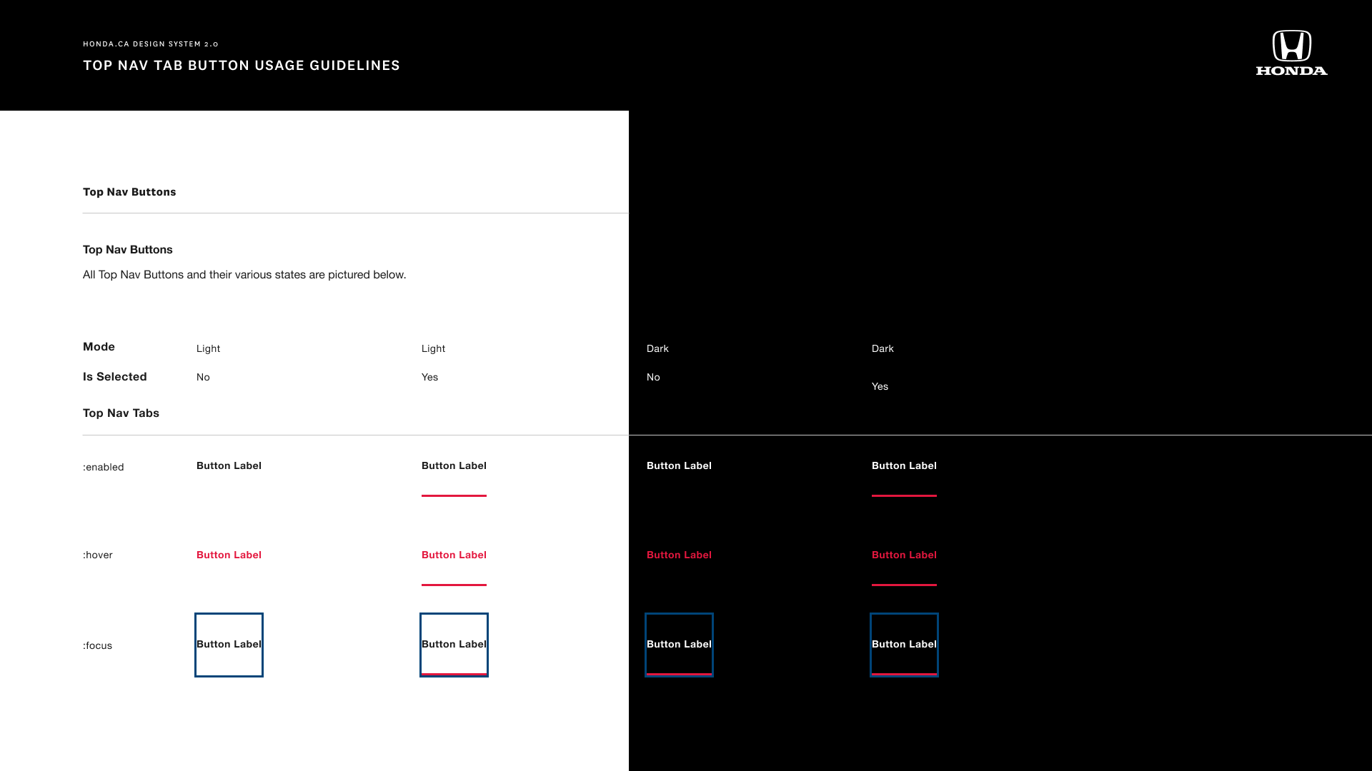
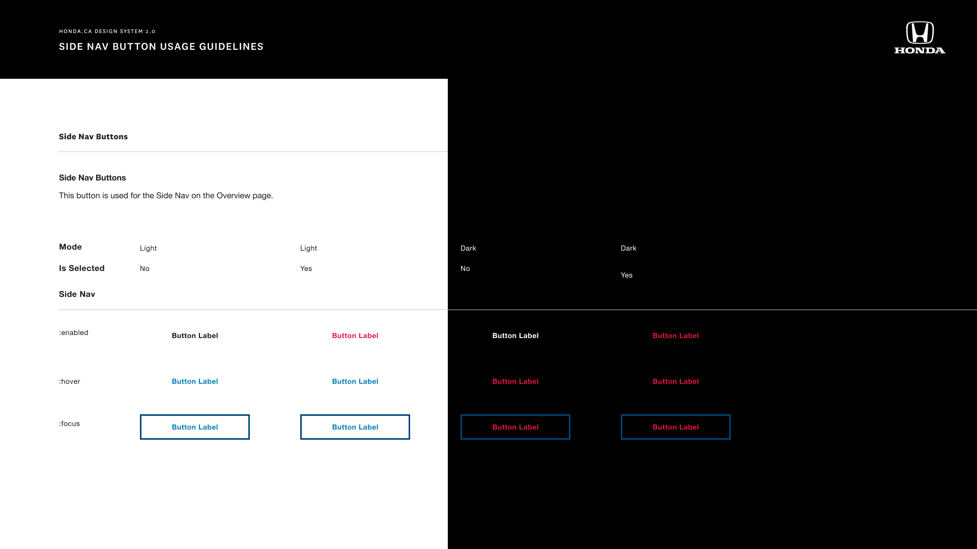
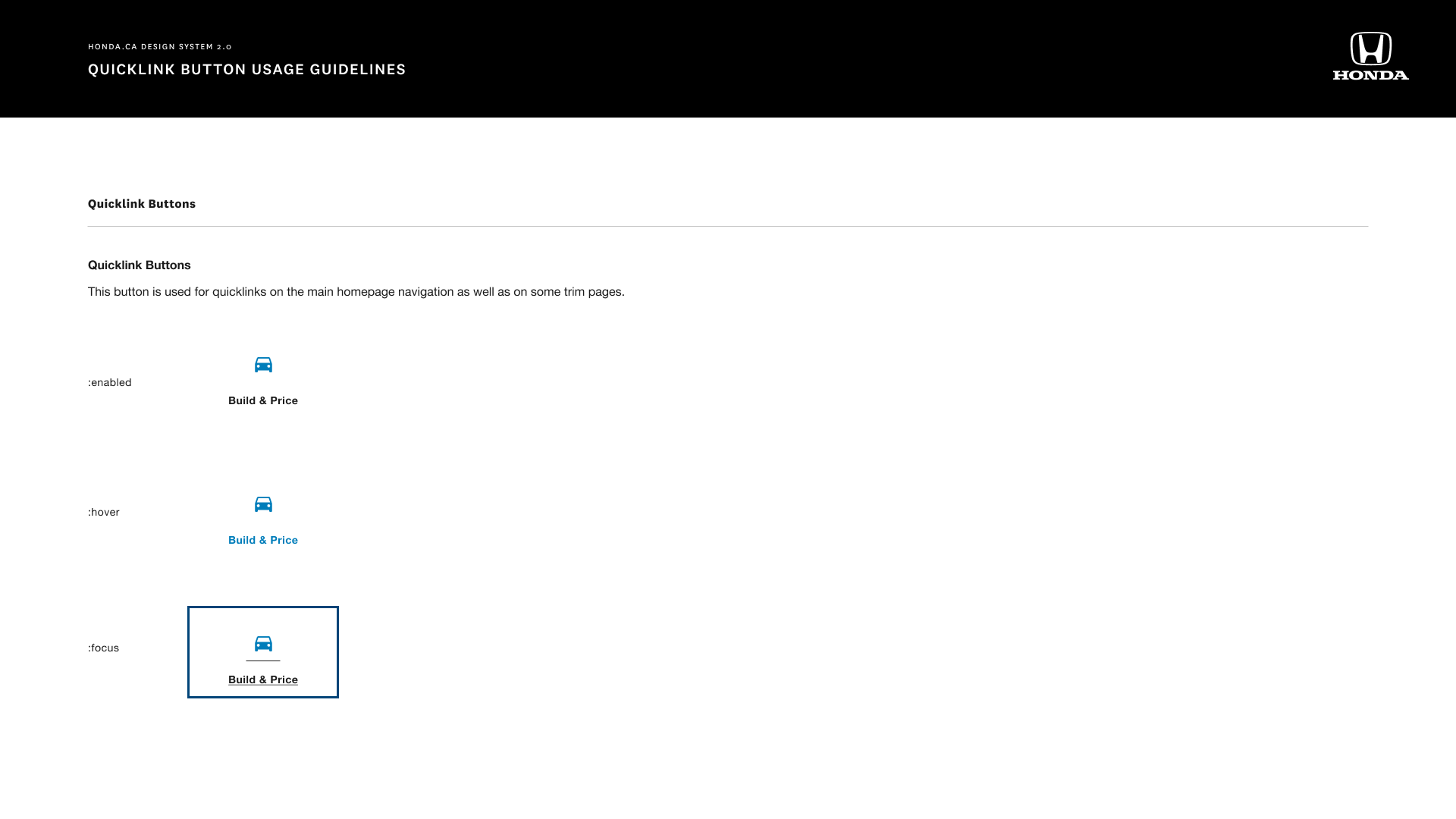
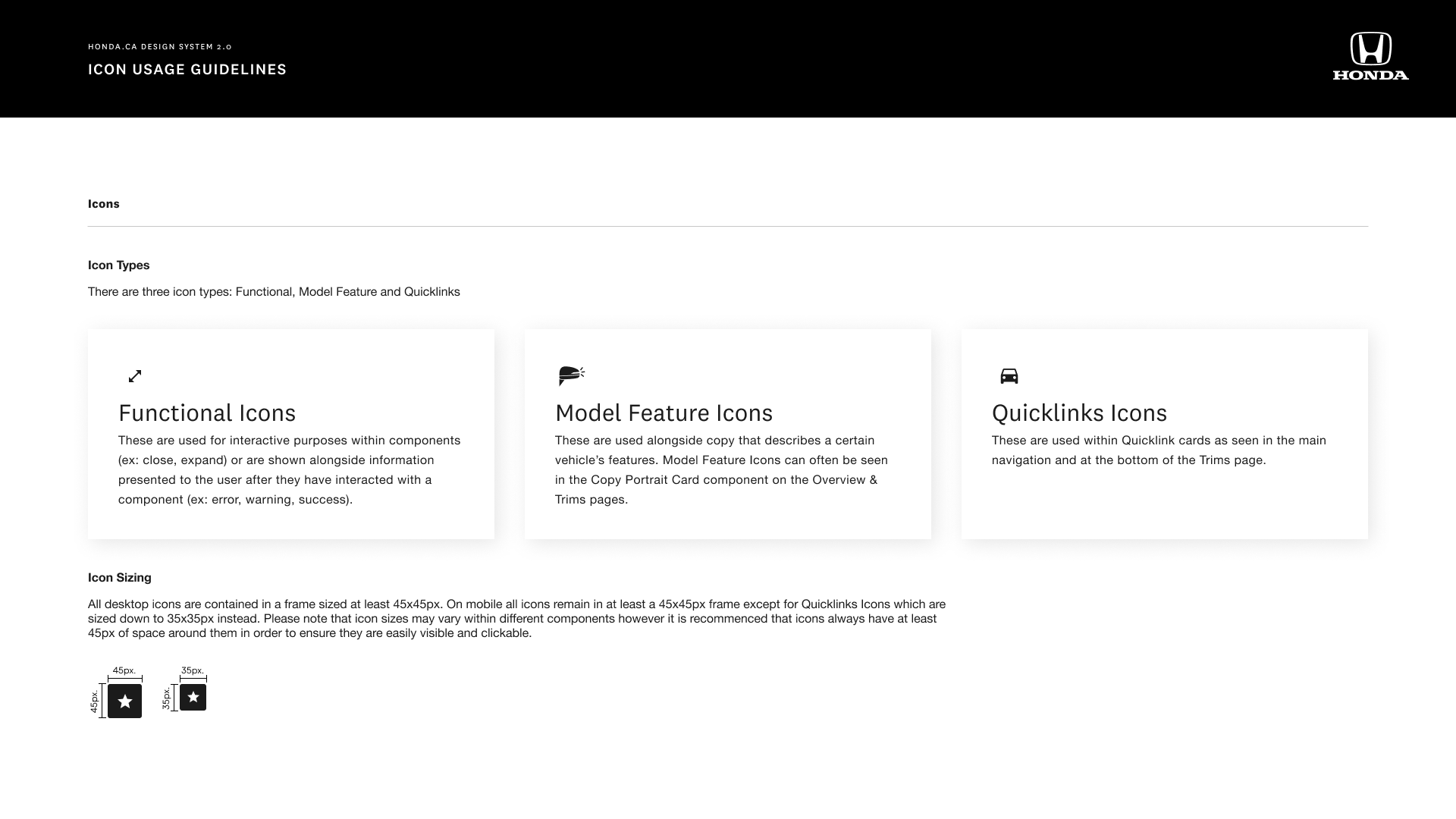
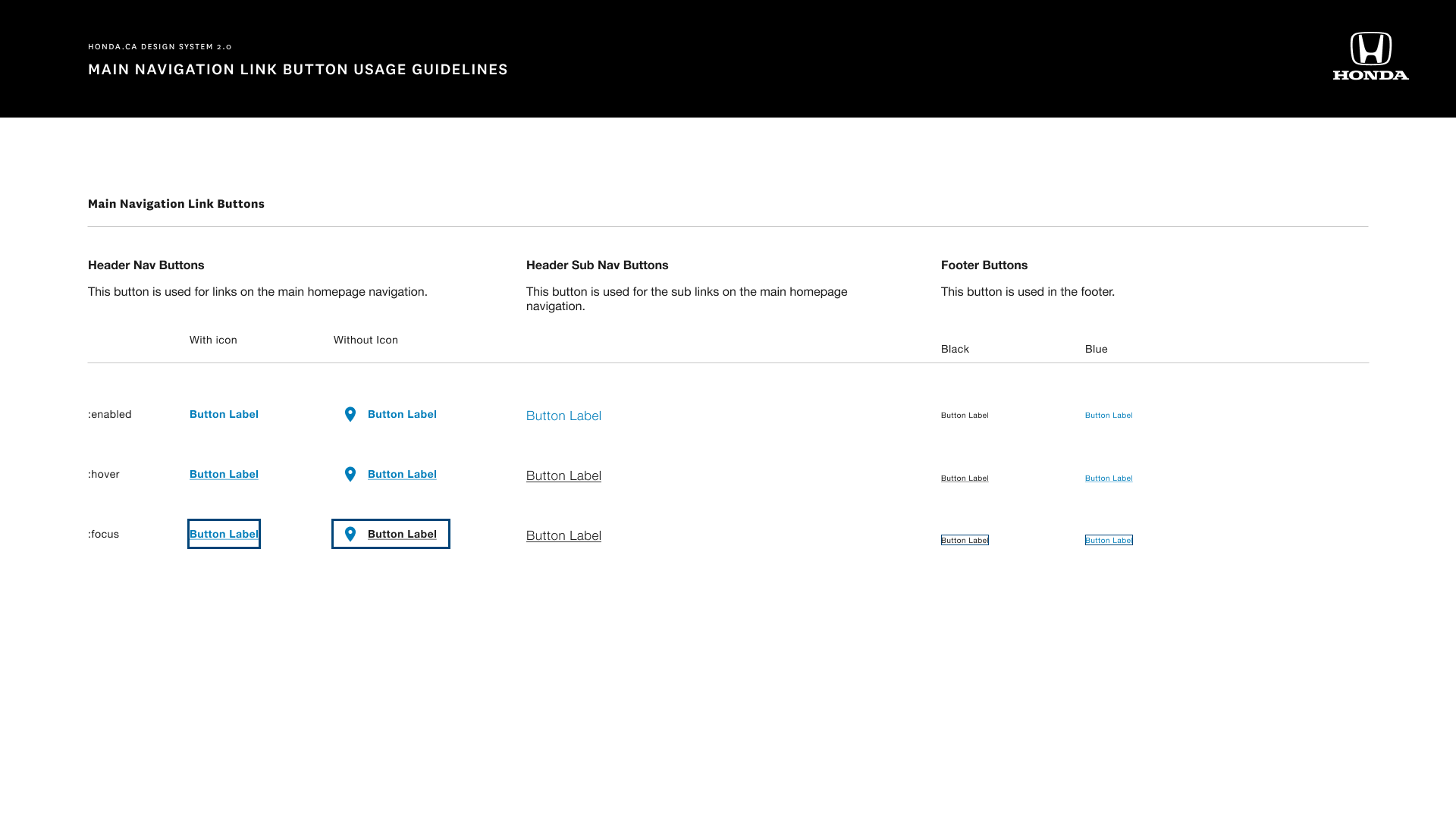
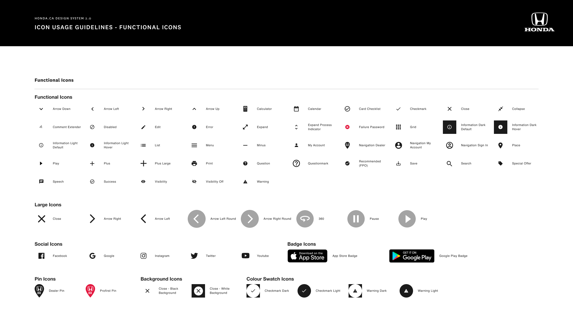
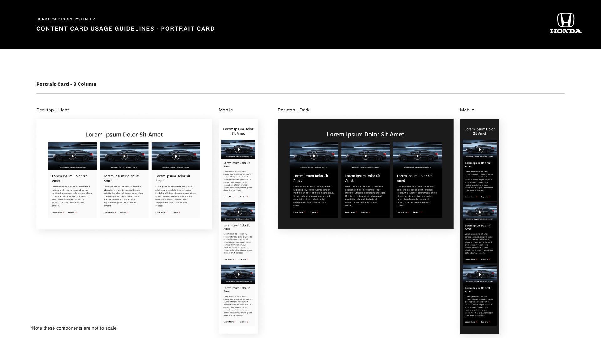
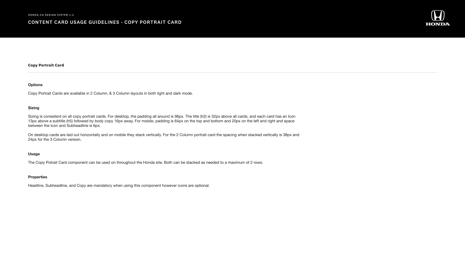
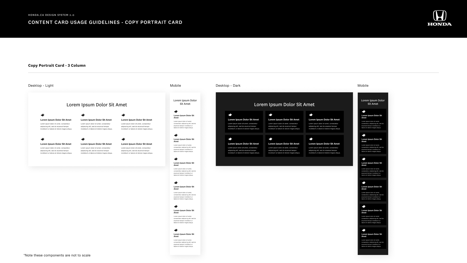
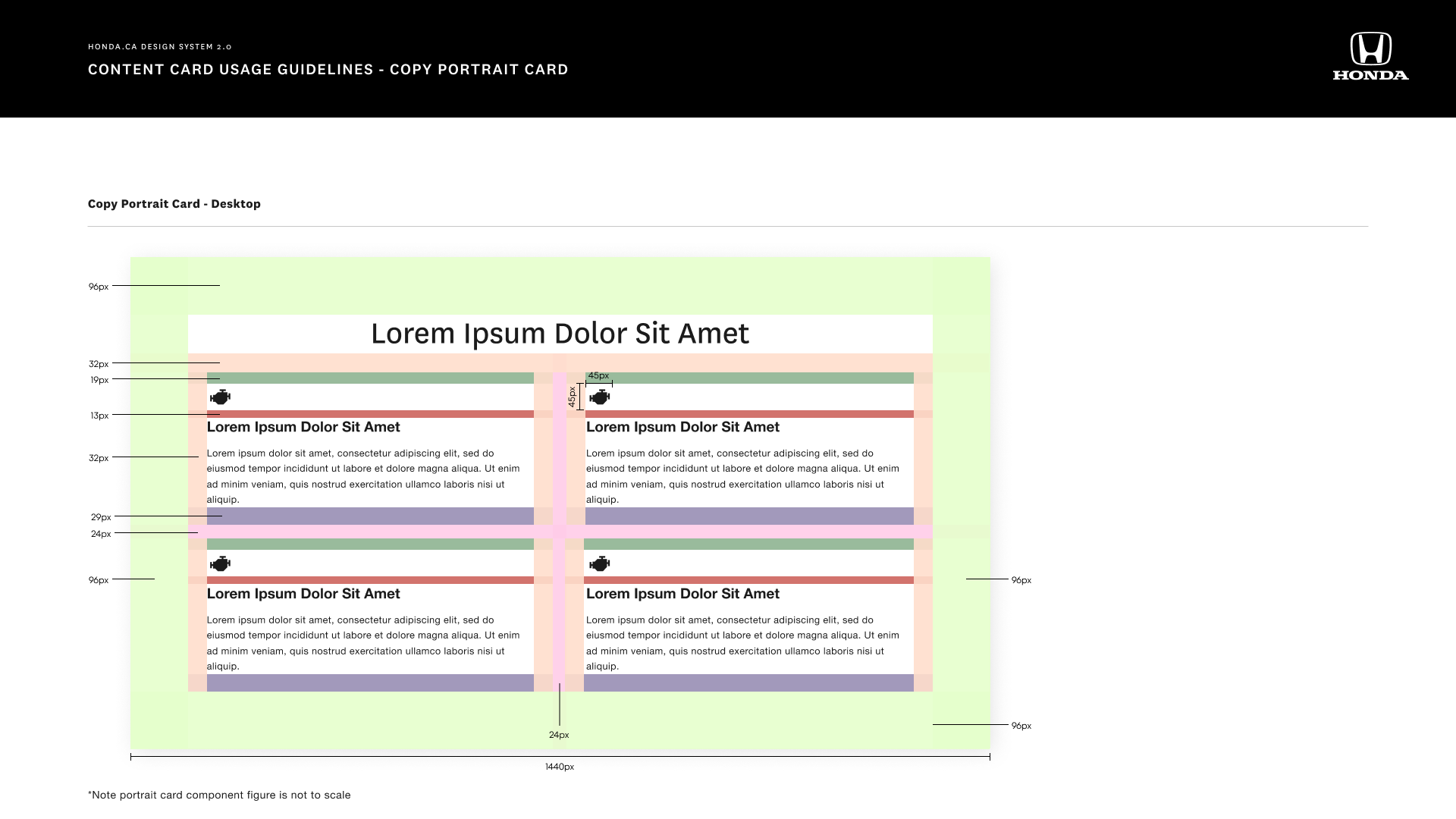
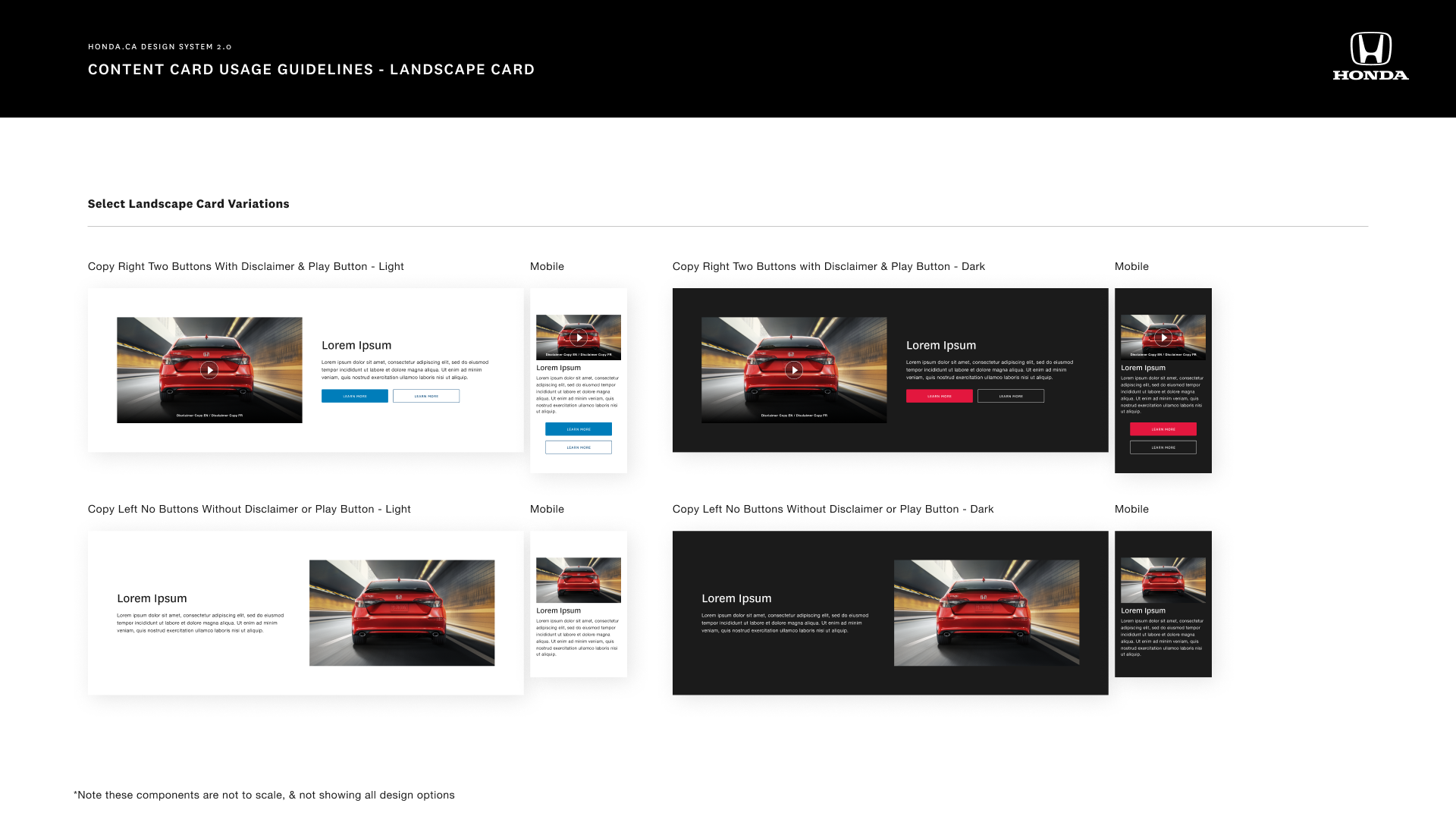
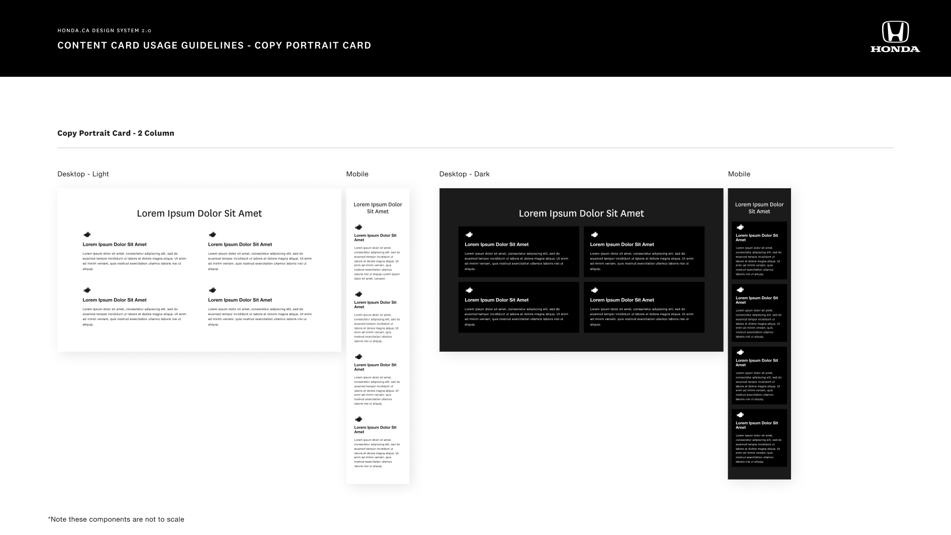
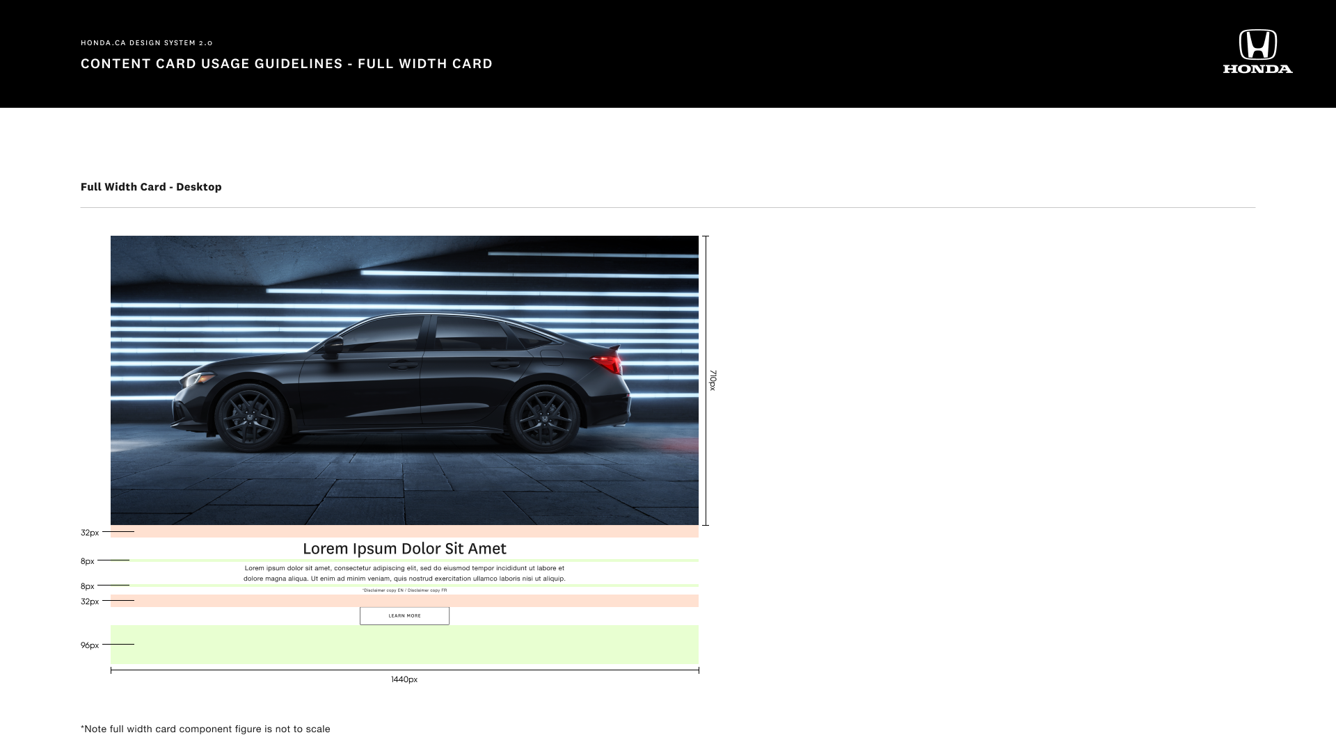
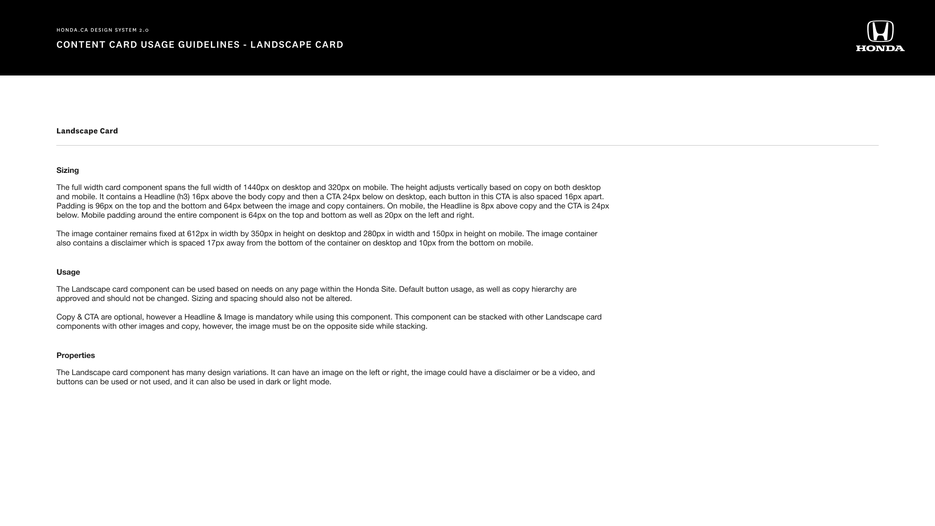
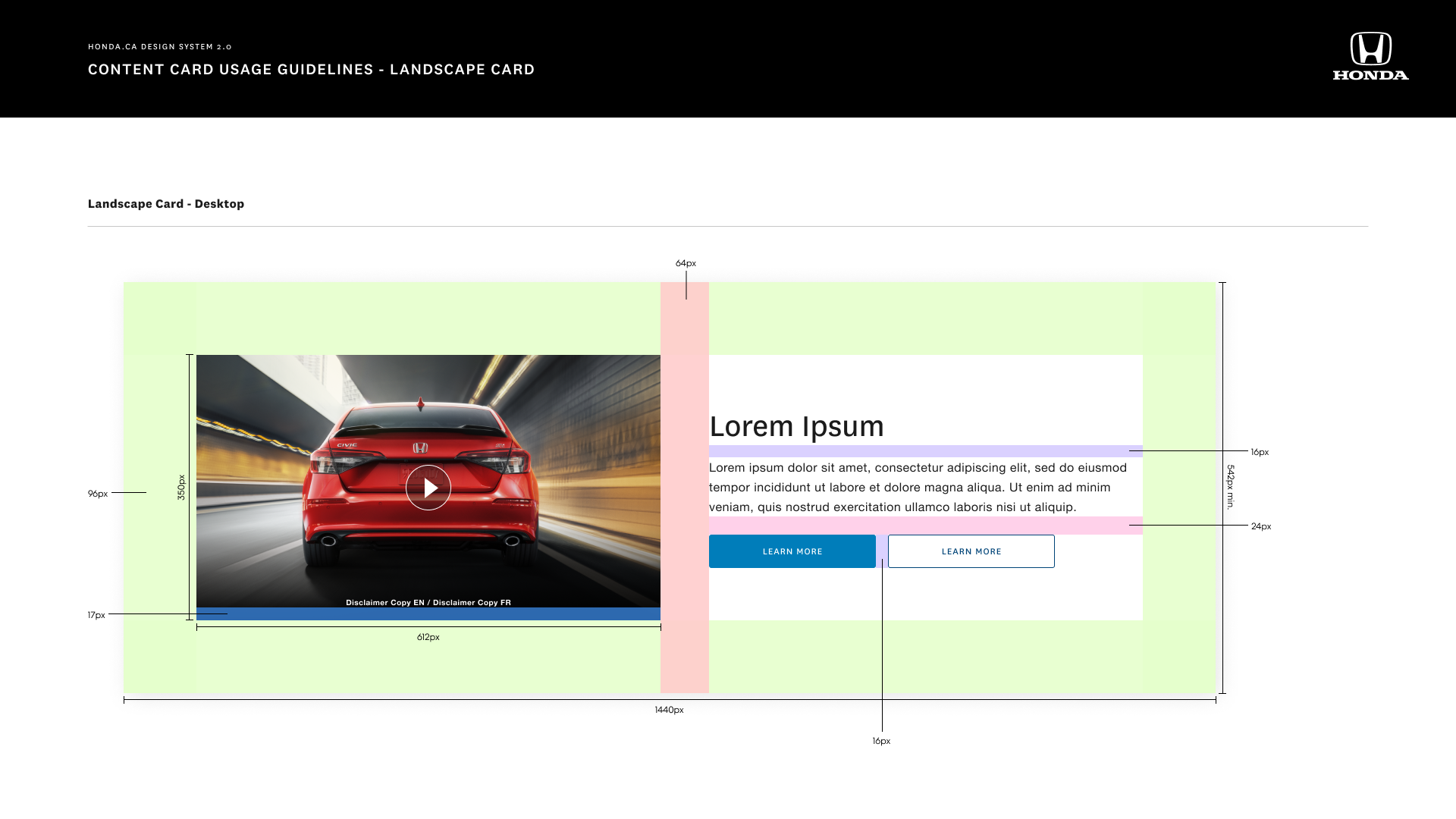
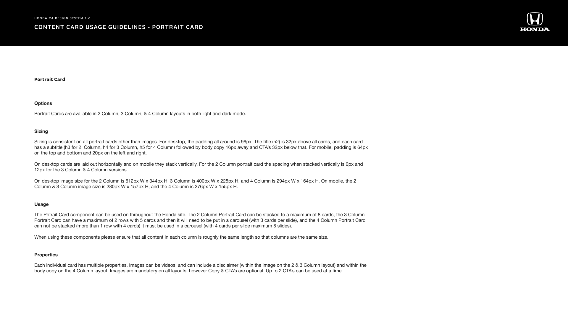
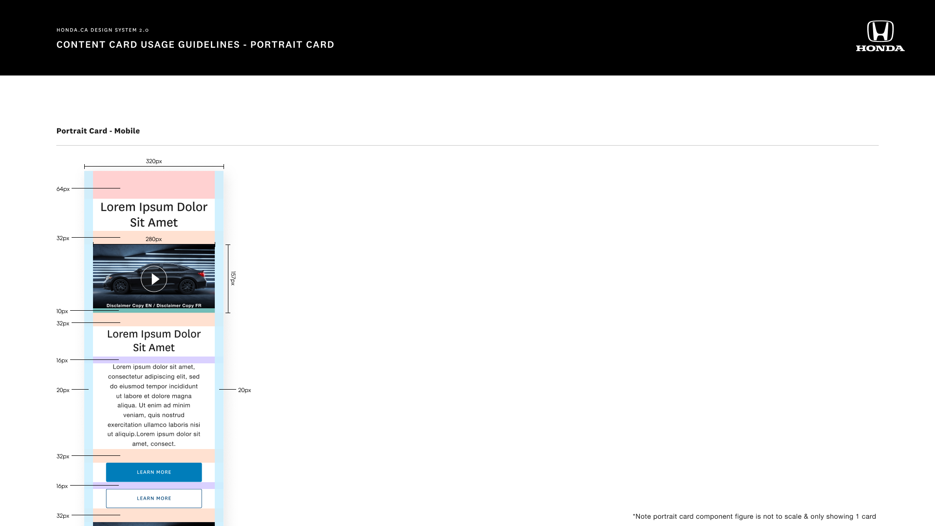
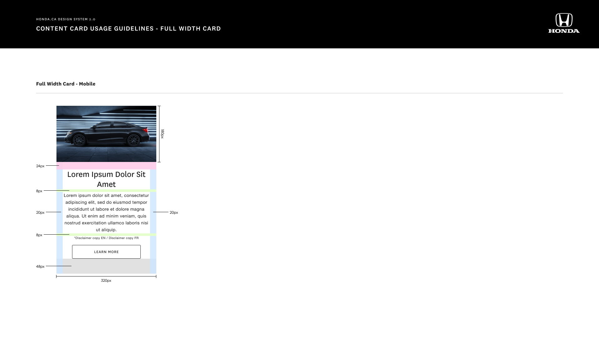
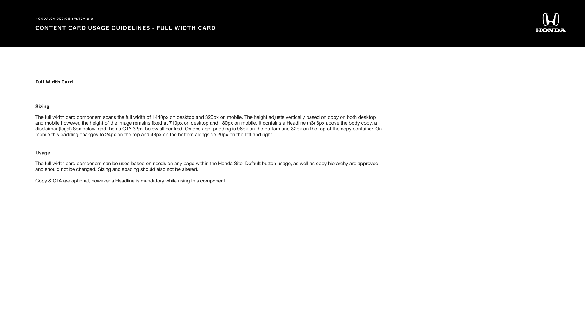
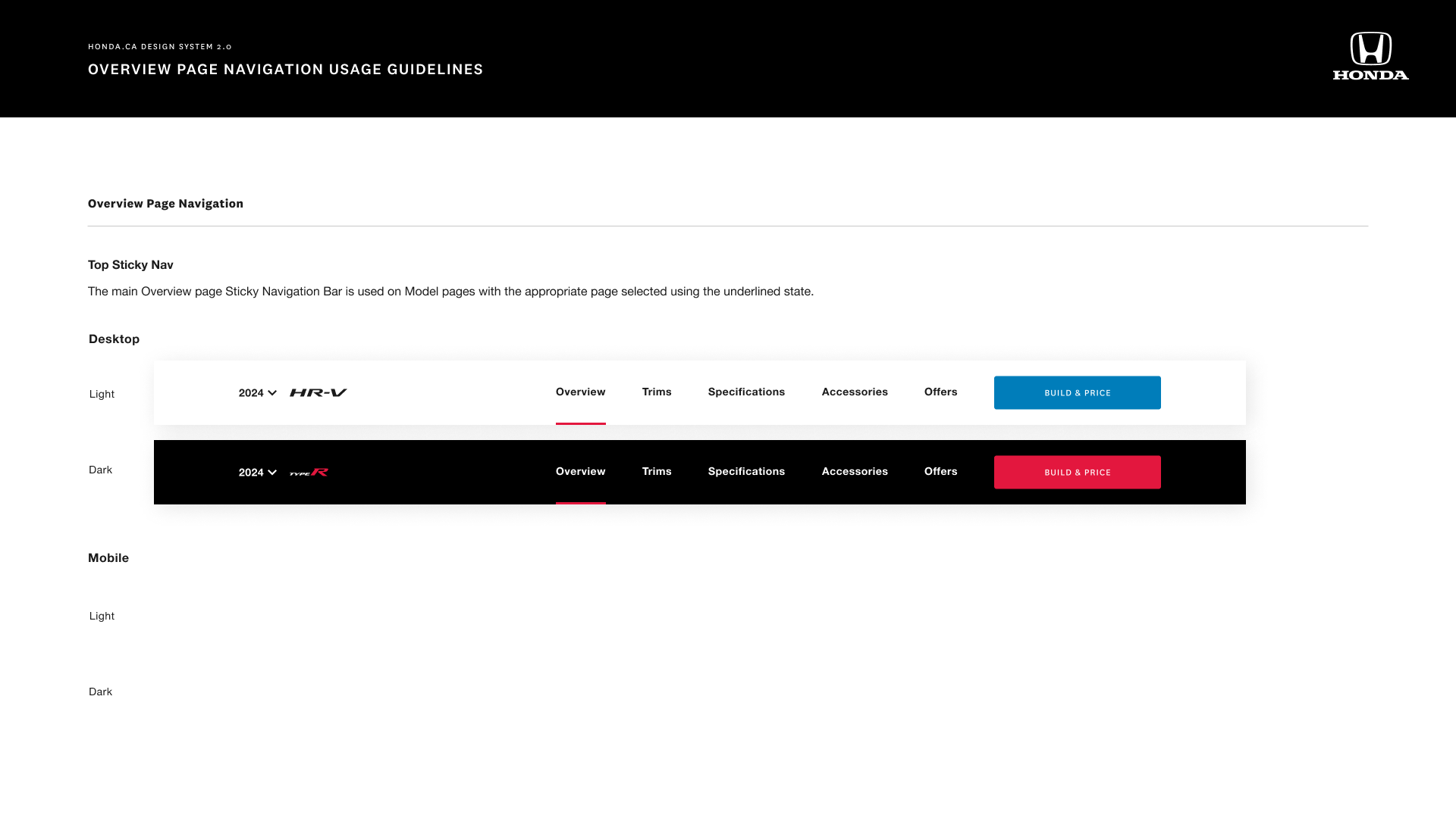
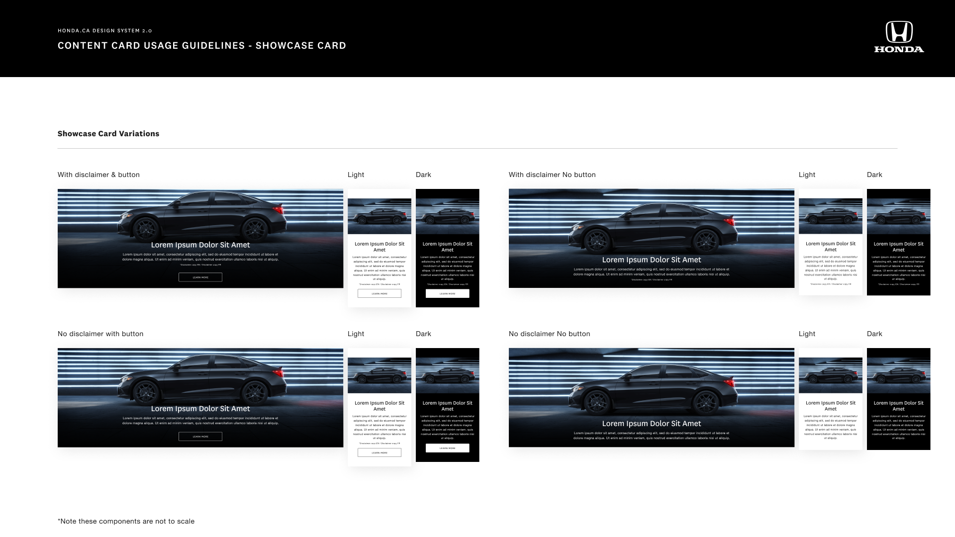
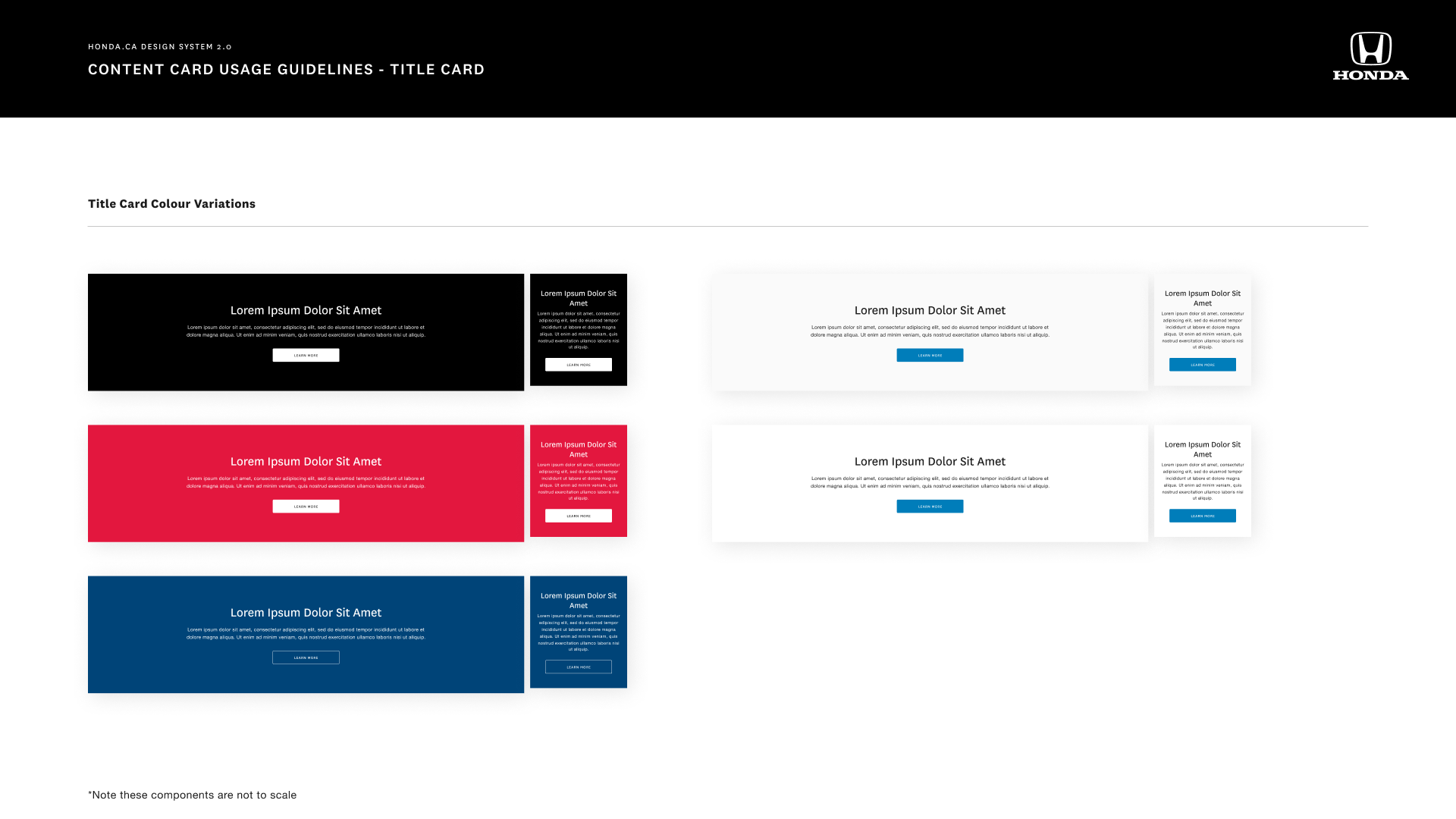
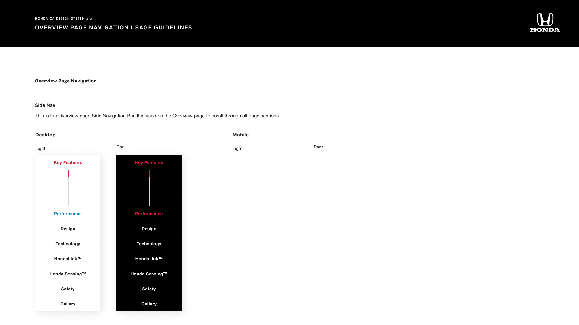
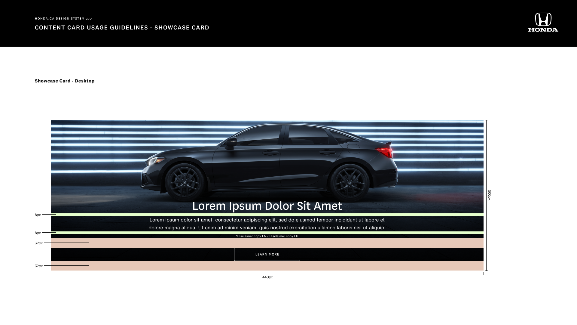
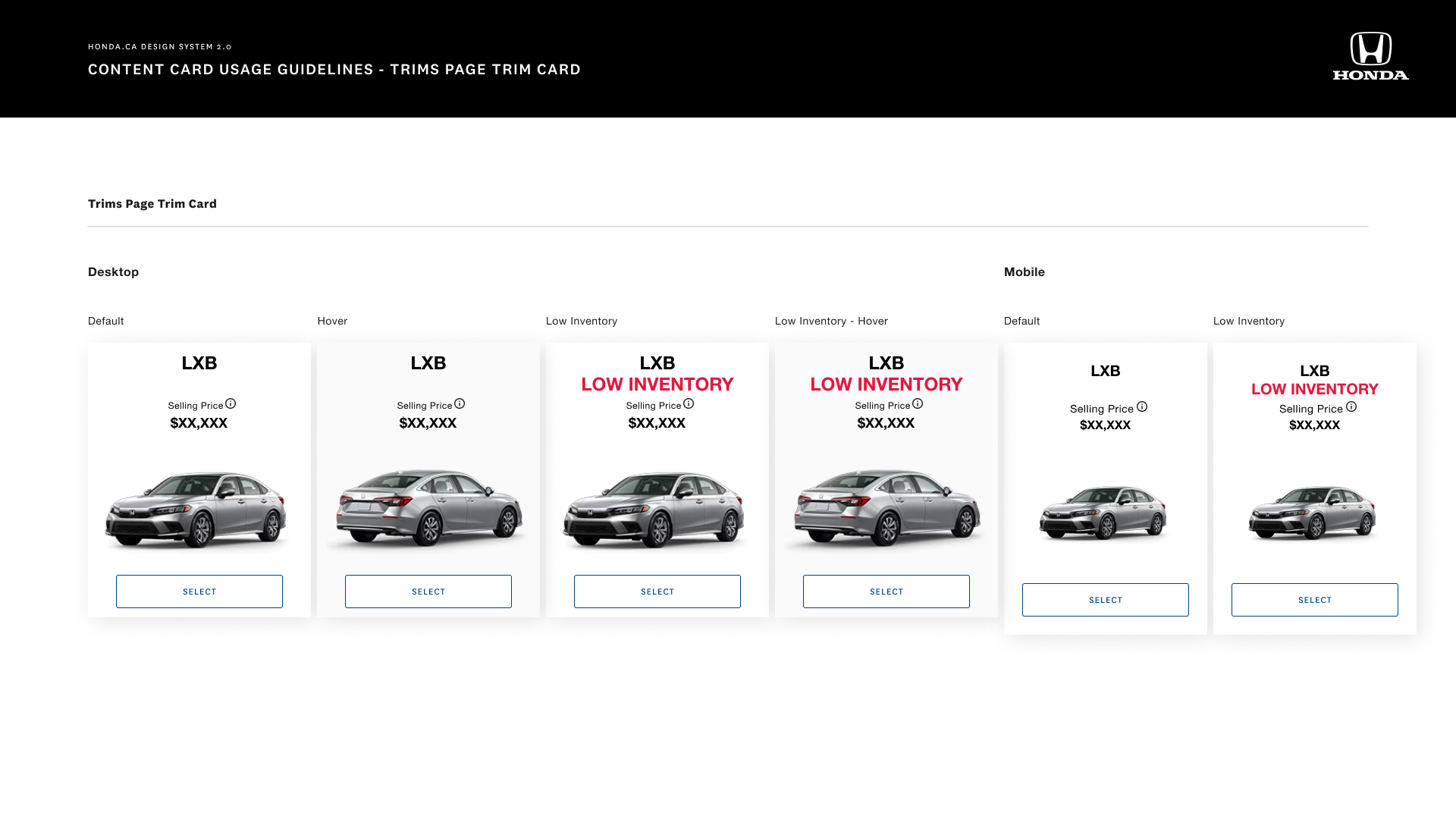
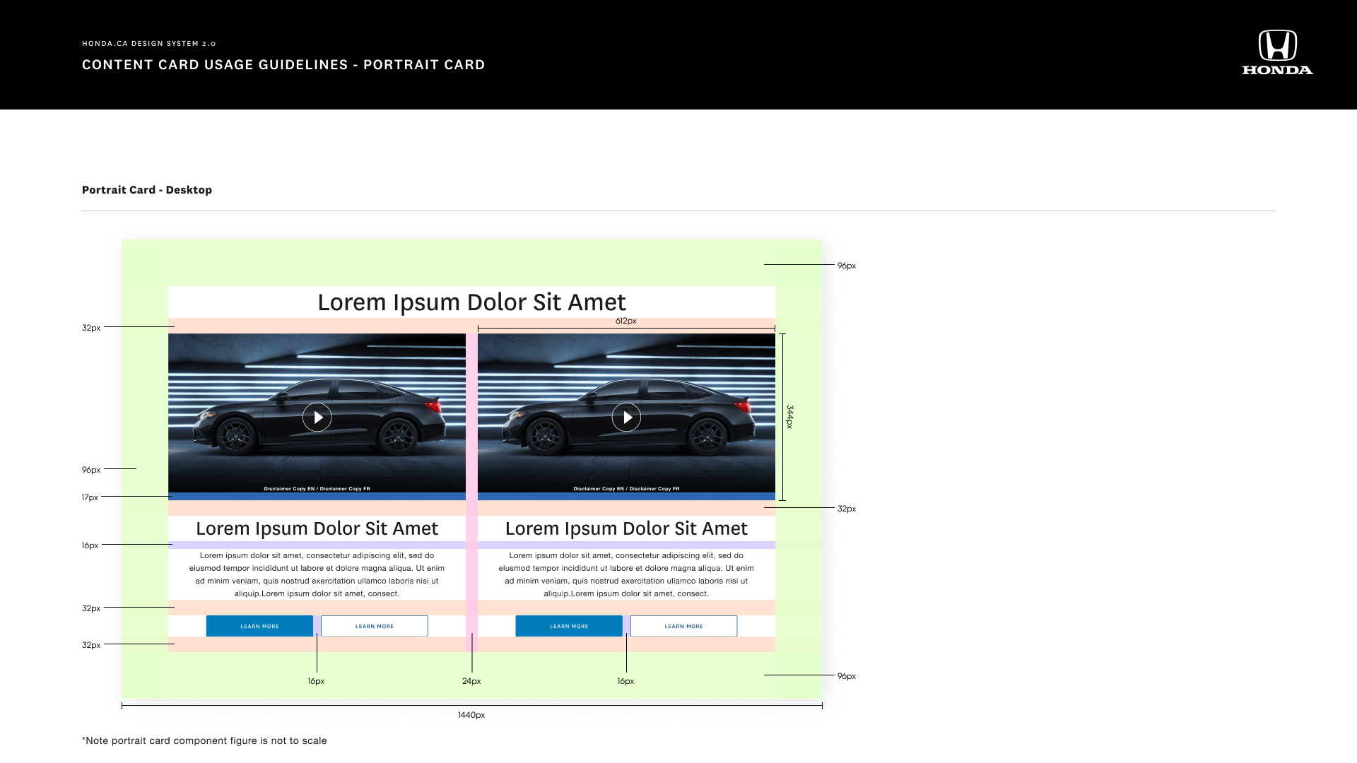
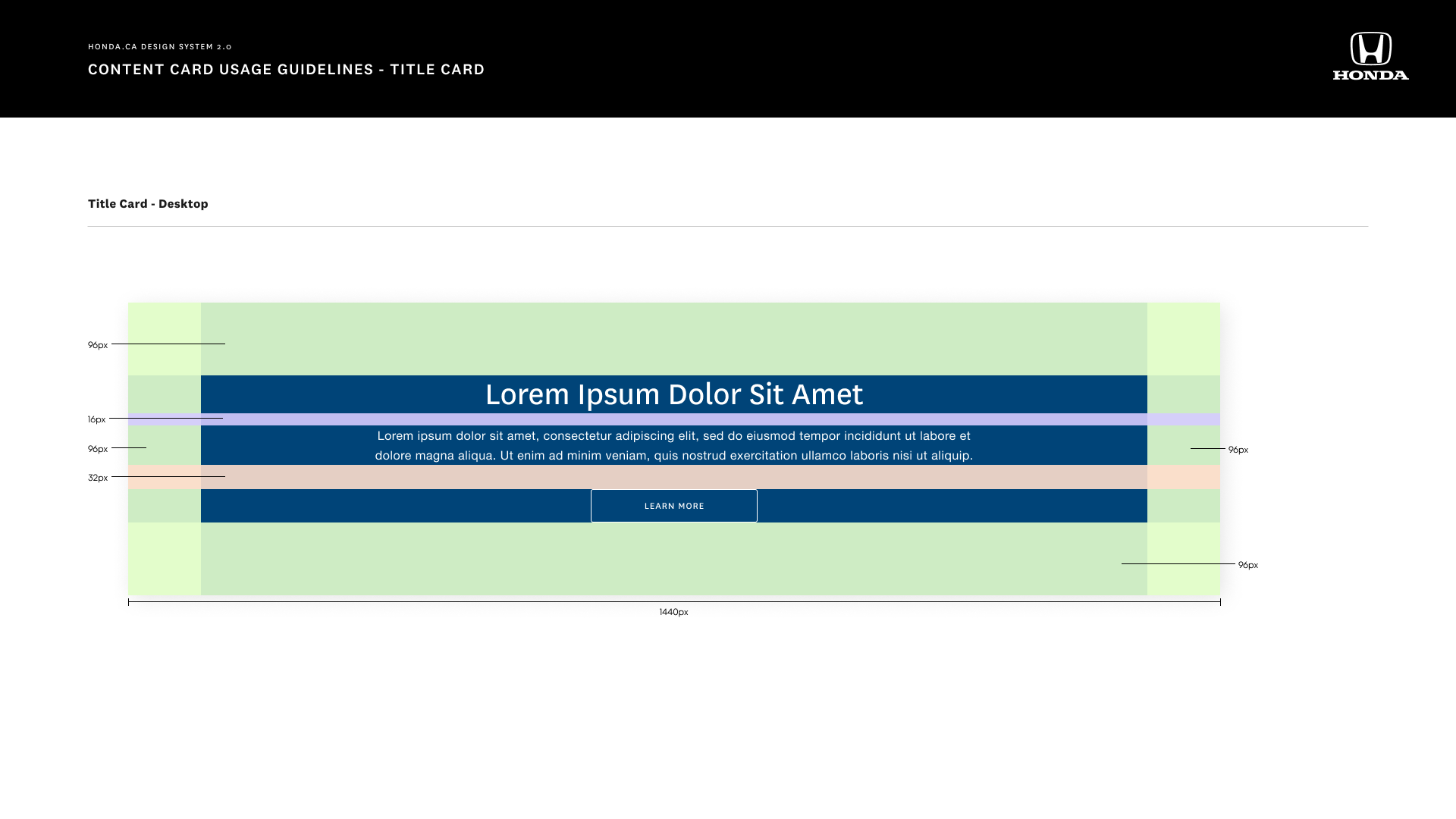
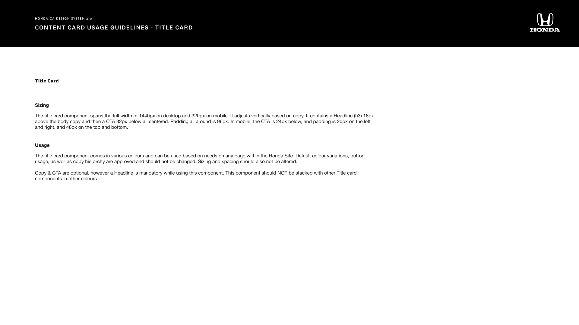
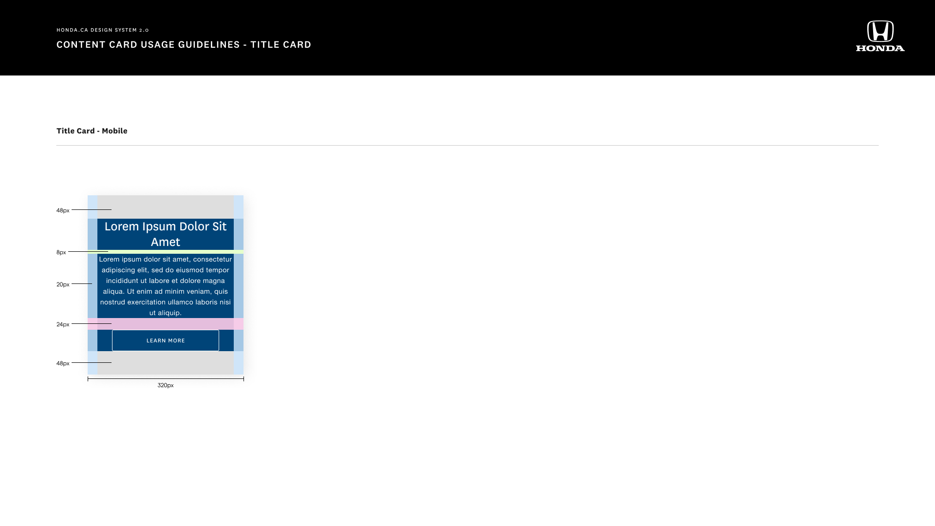
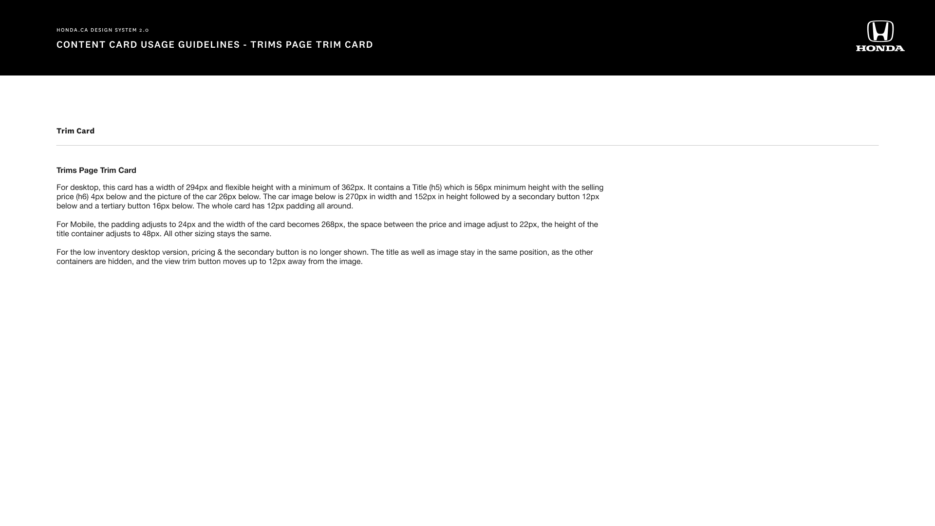
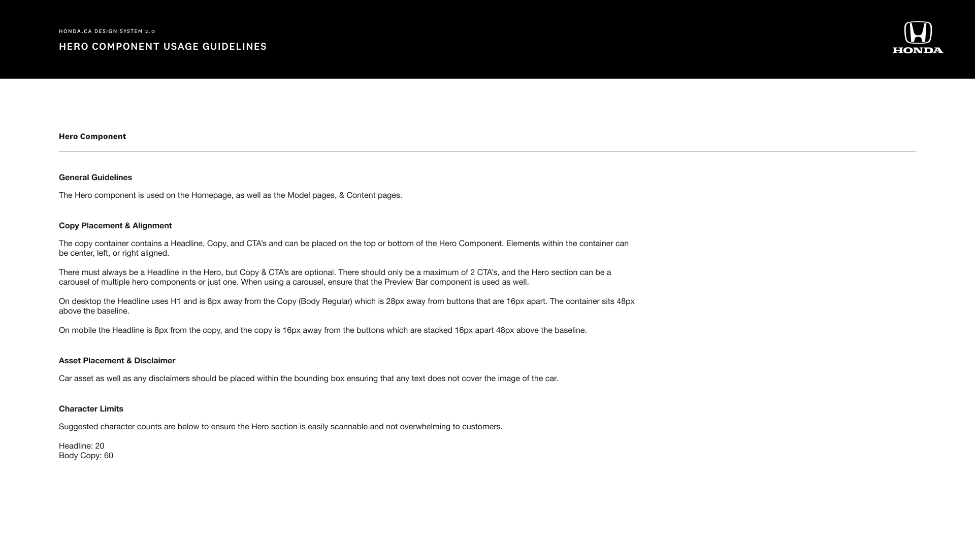
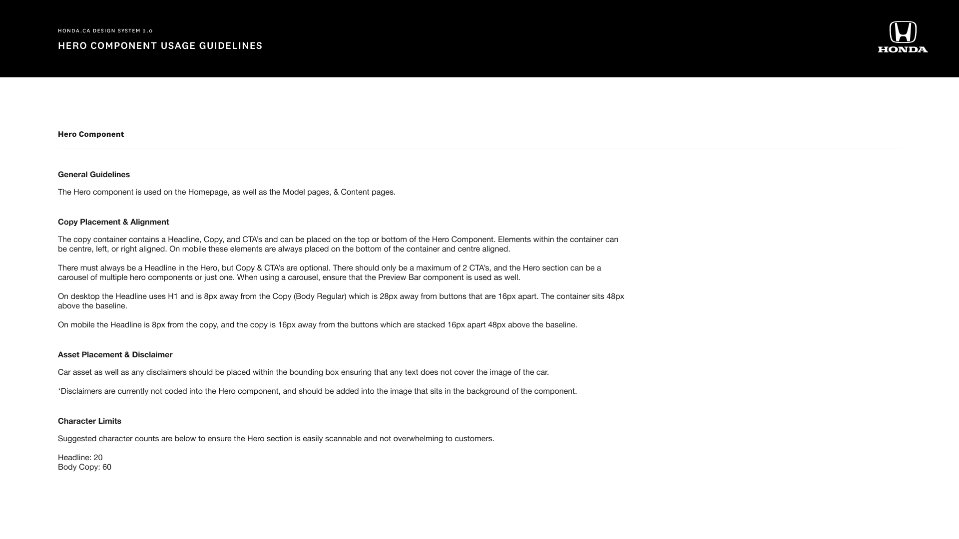
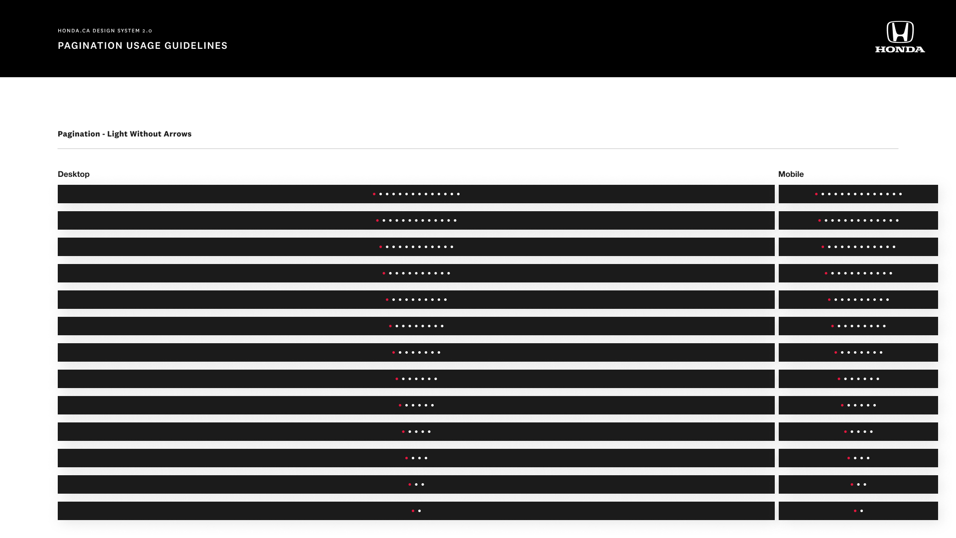
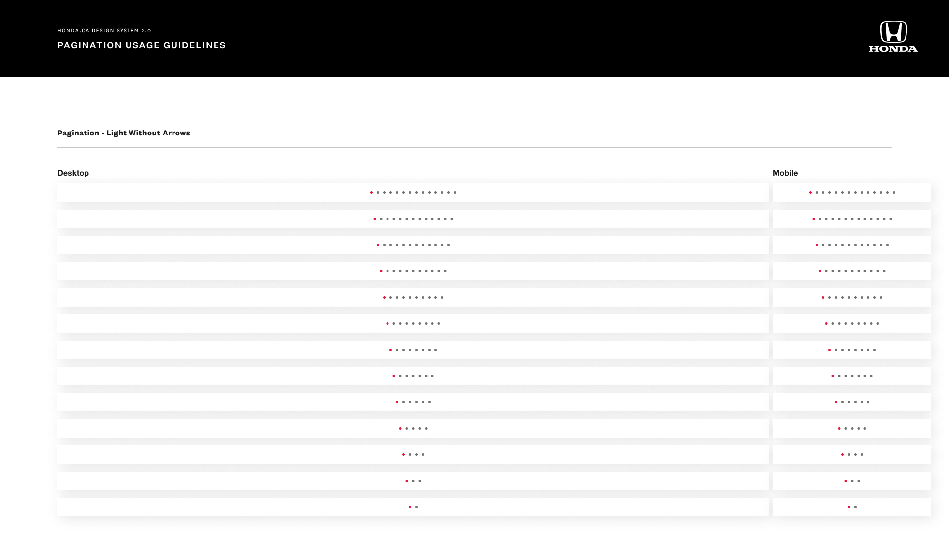
Design System 2.0 Documentation
Once the new design system was in a good place, we started with documentation
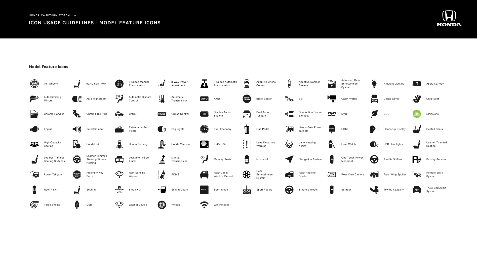
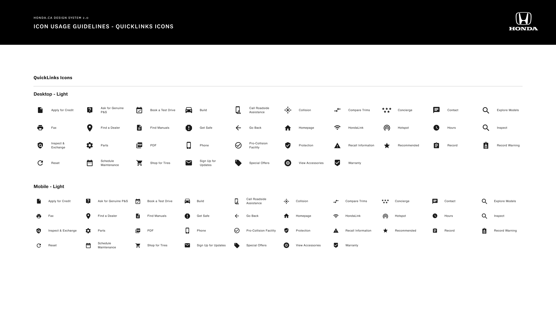
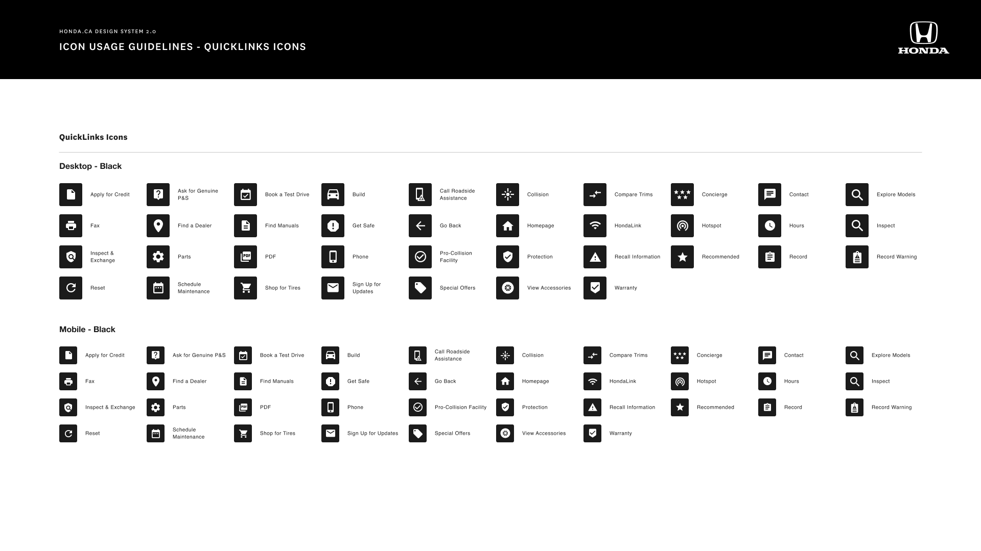
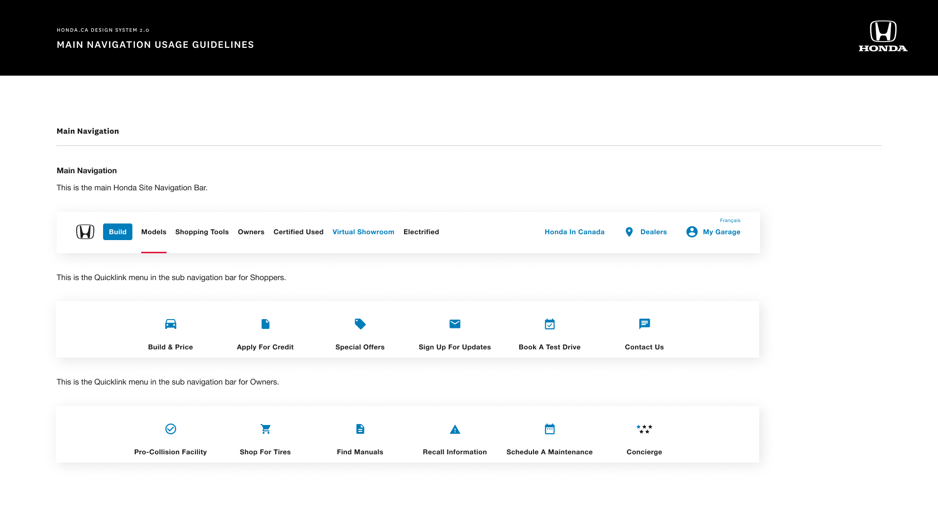
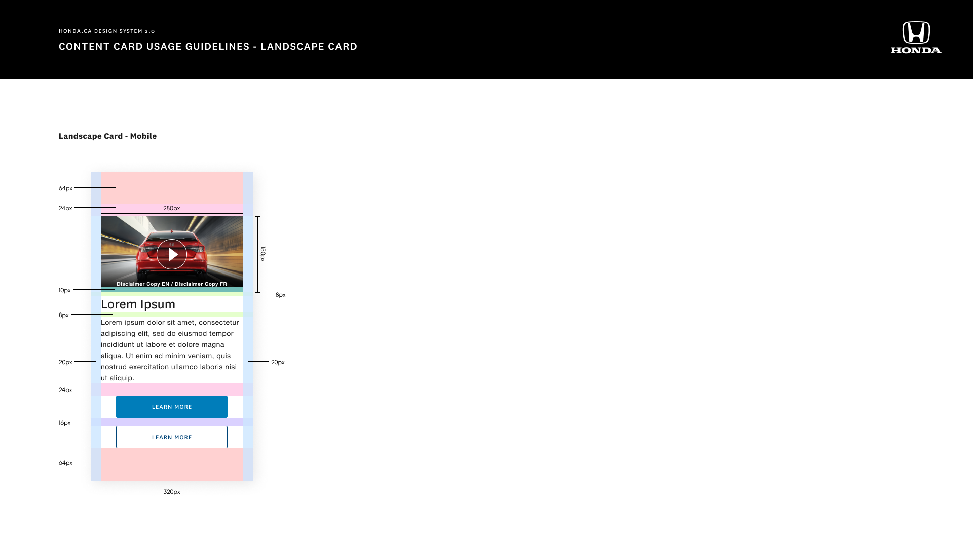
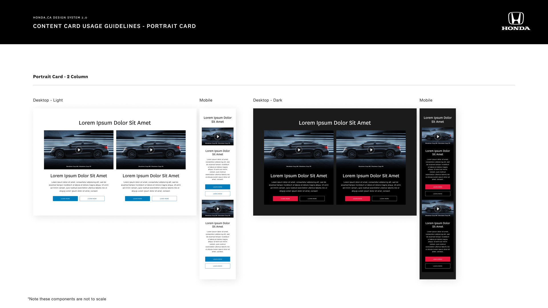
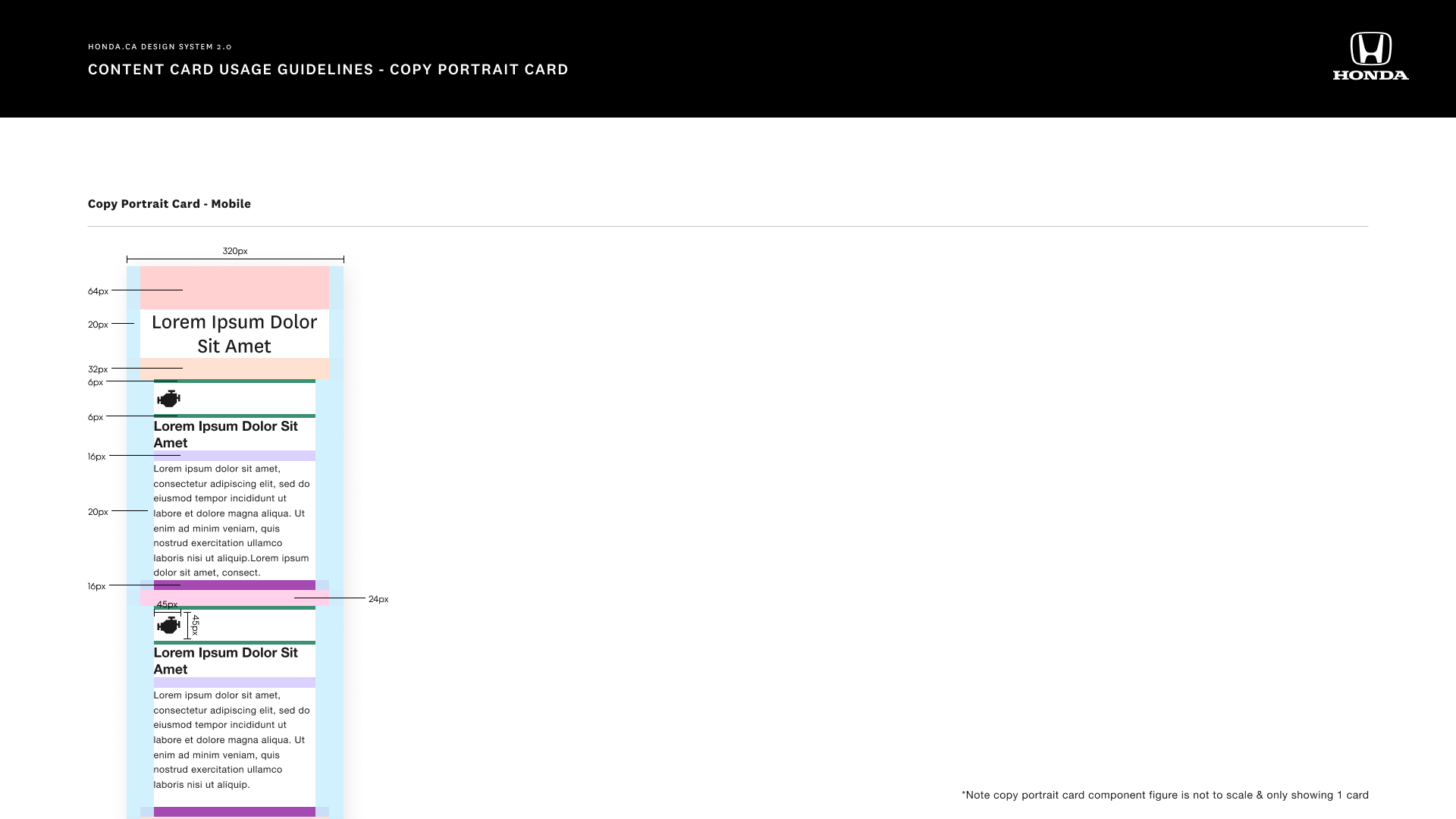
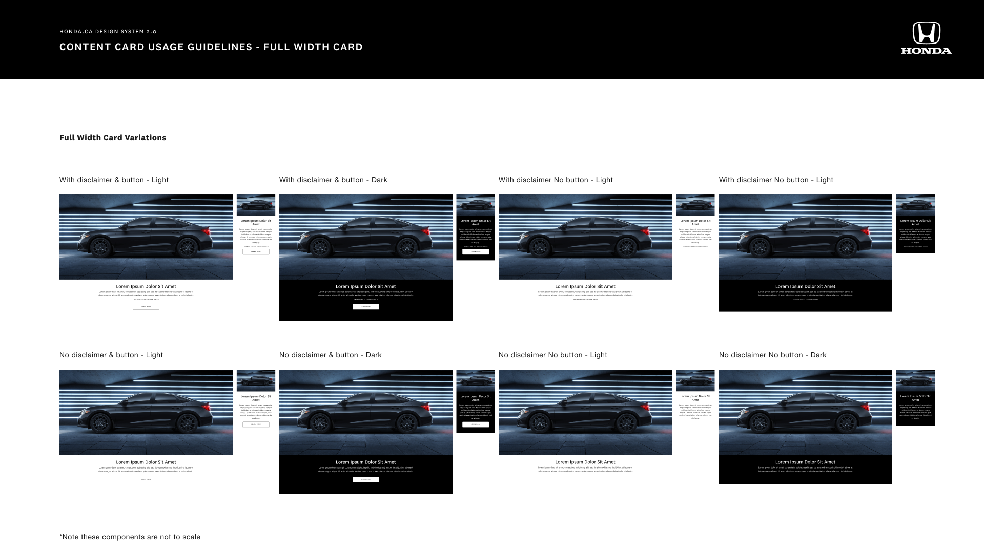
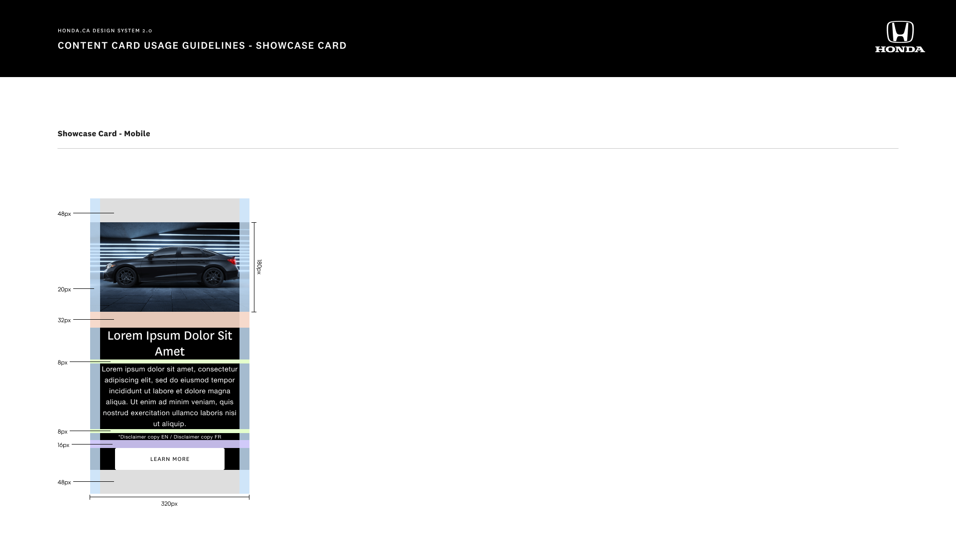
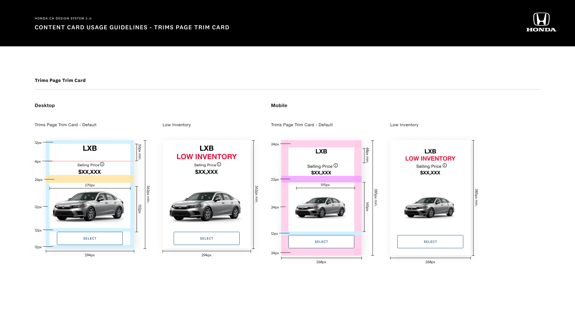
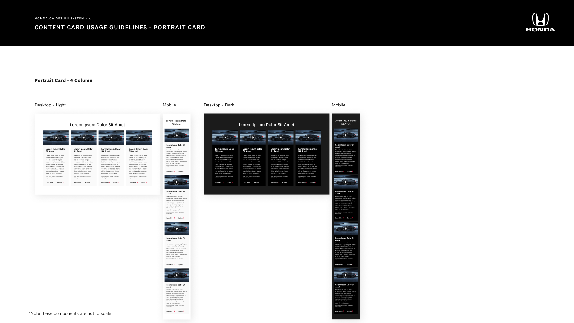
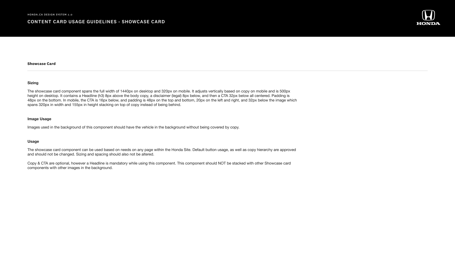
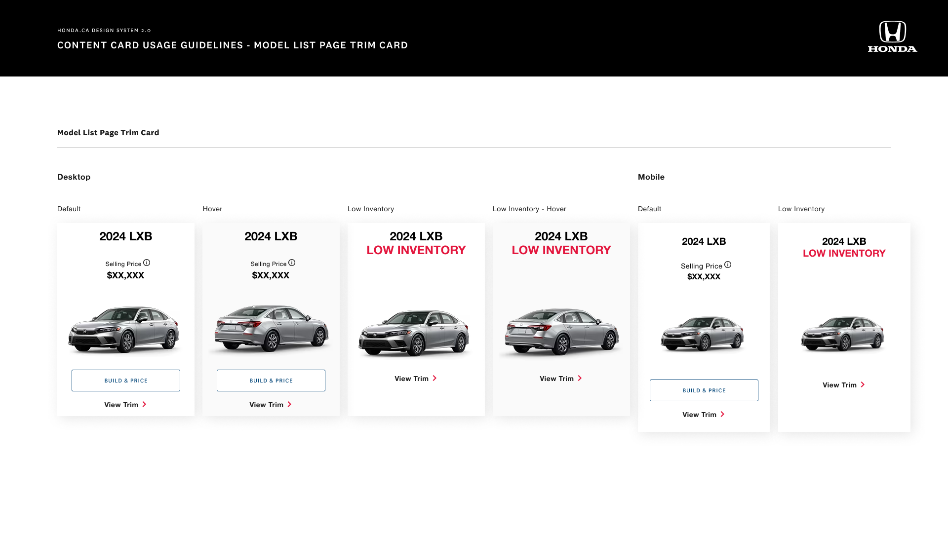
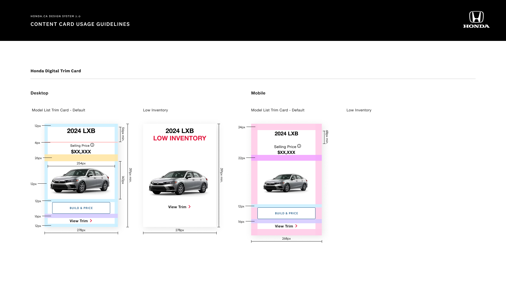
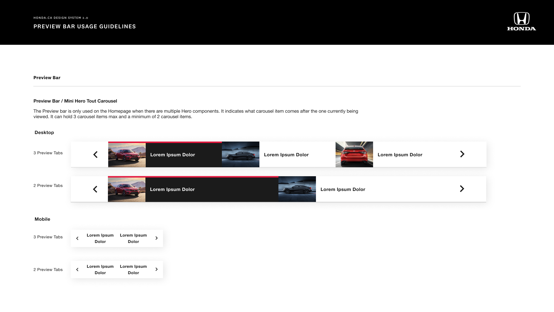
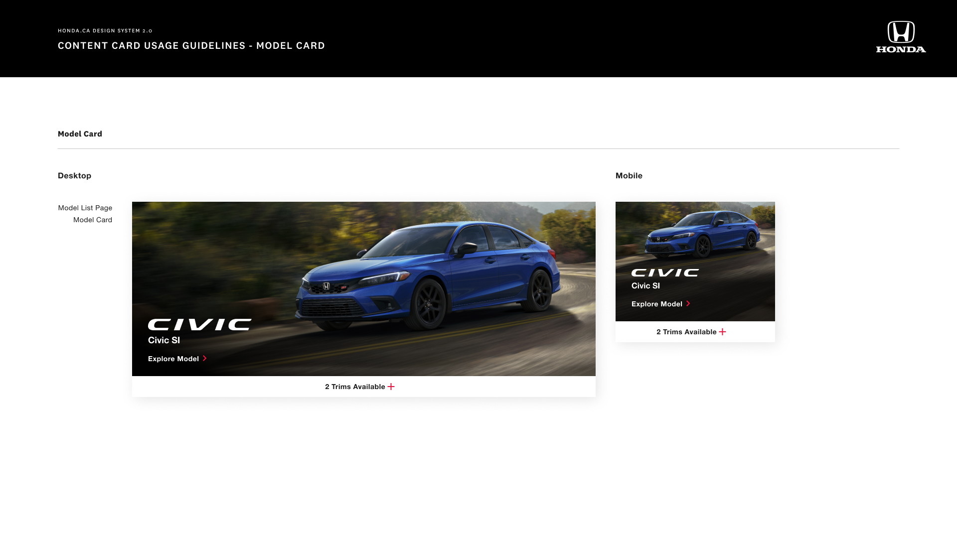
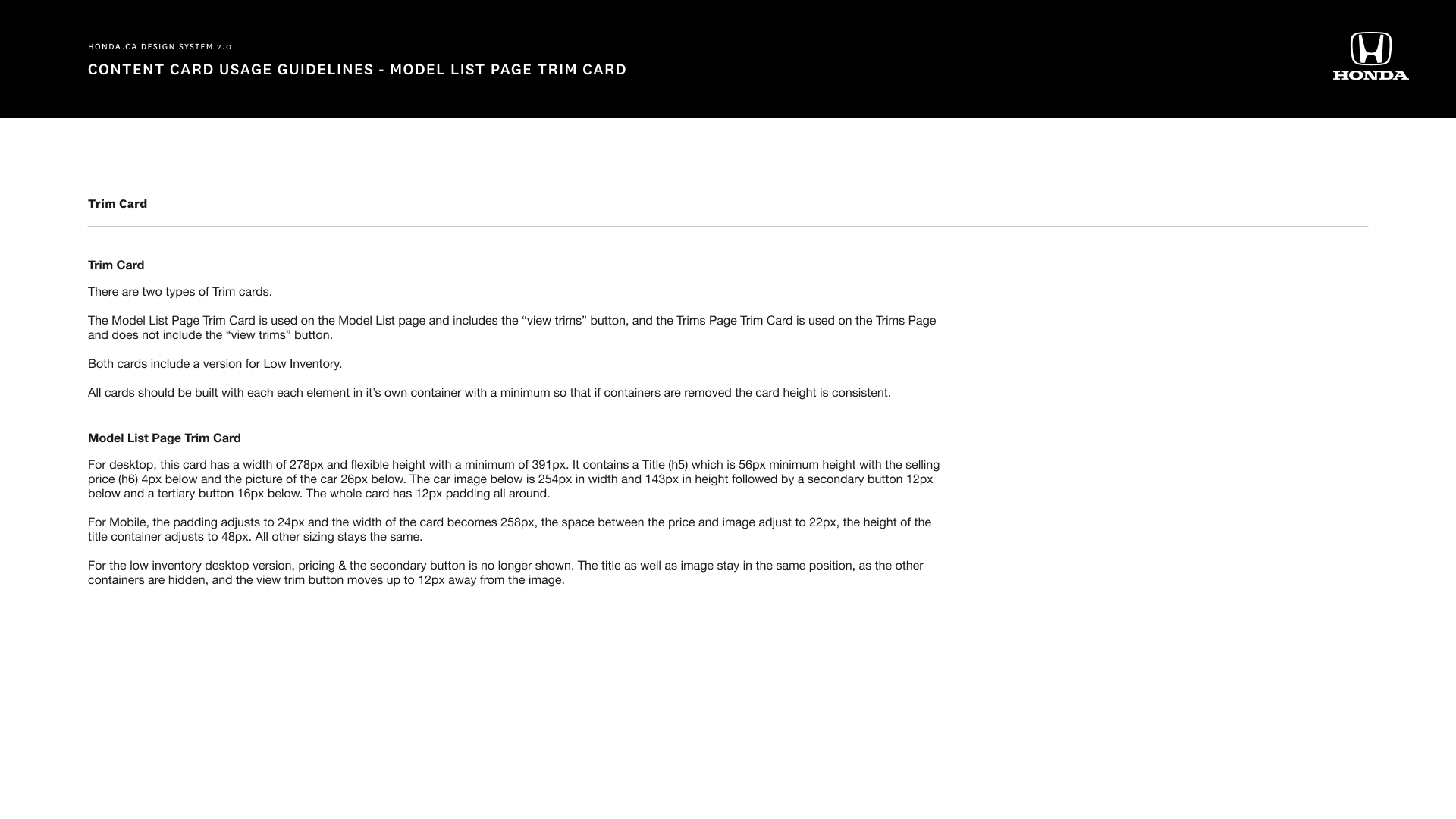
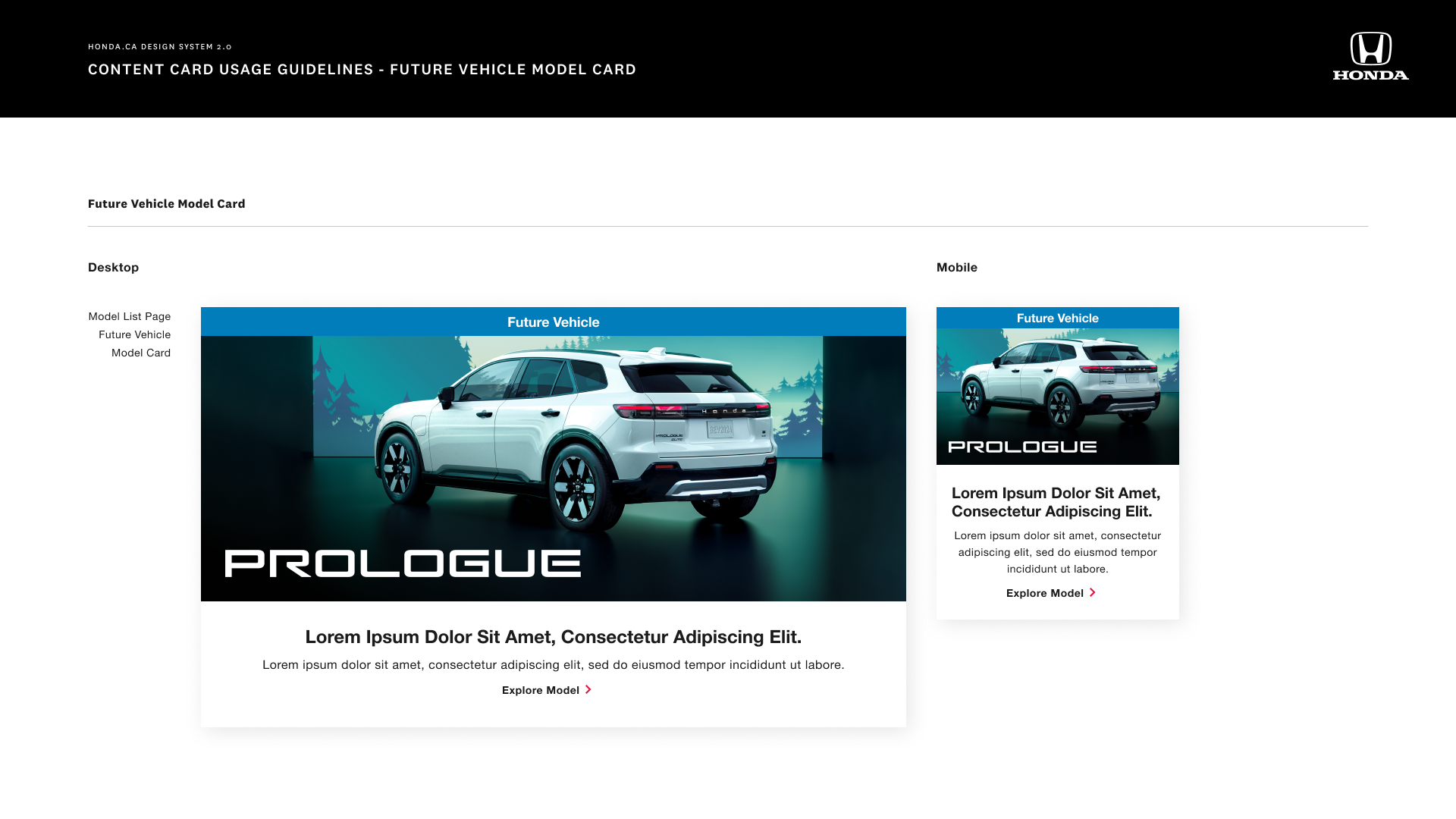
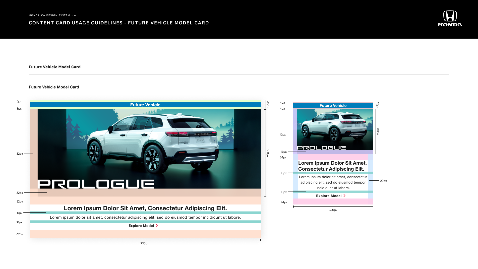
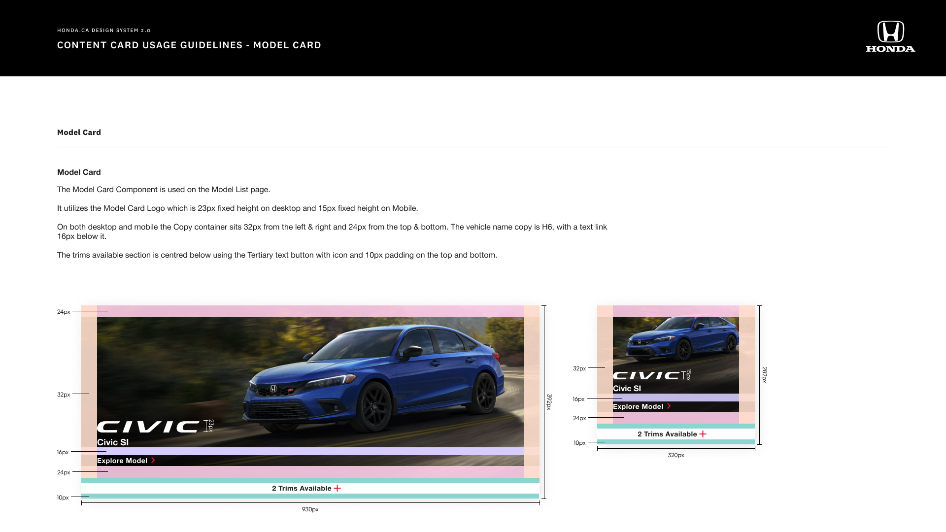
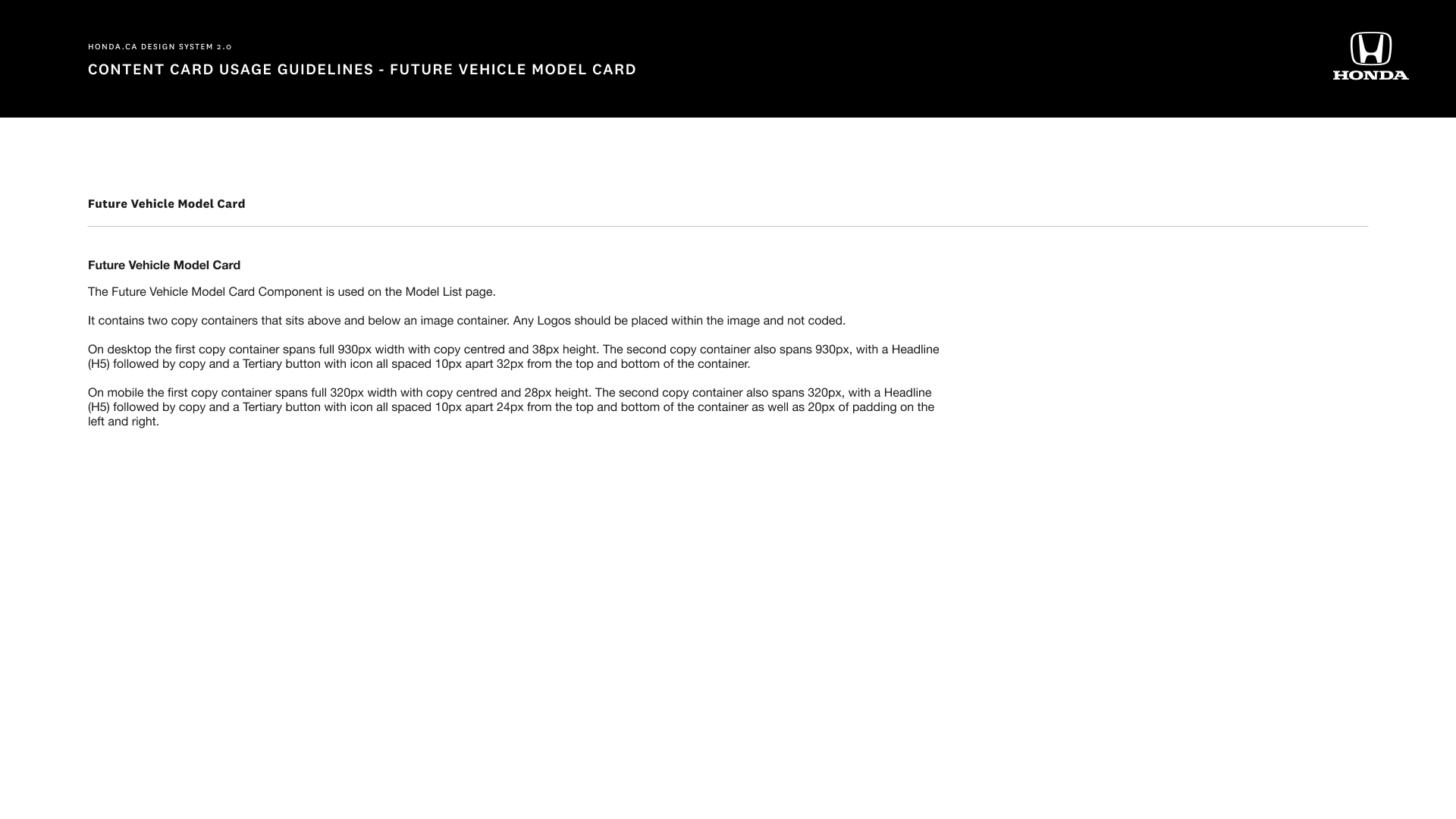
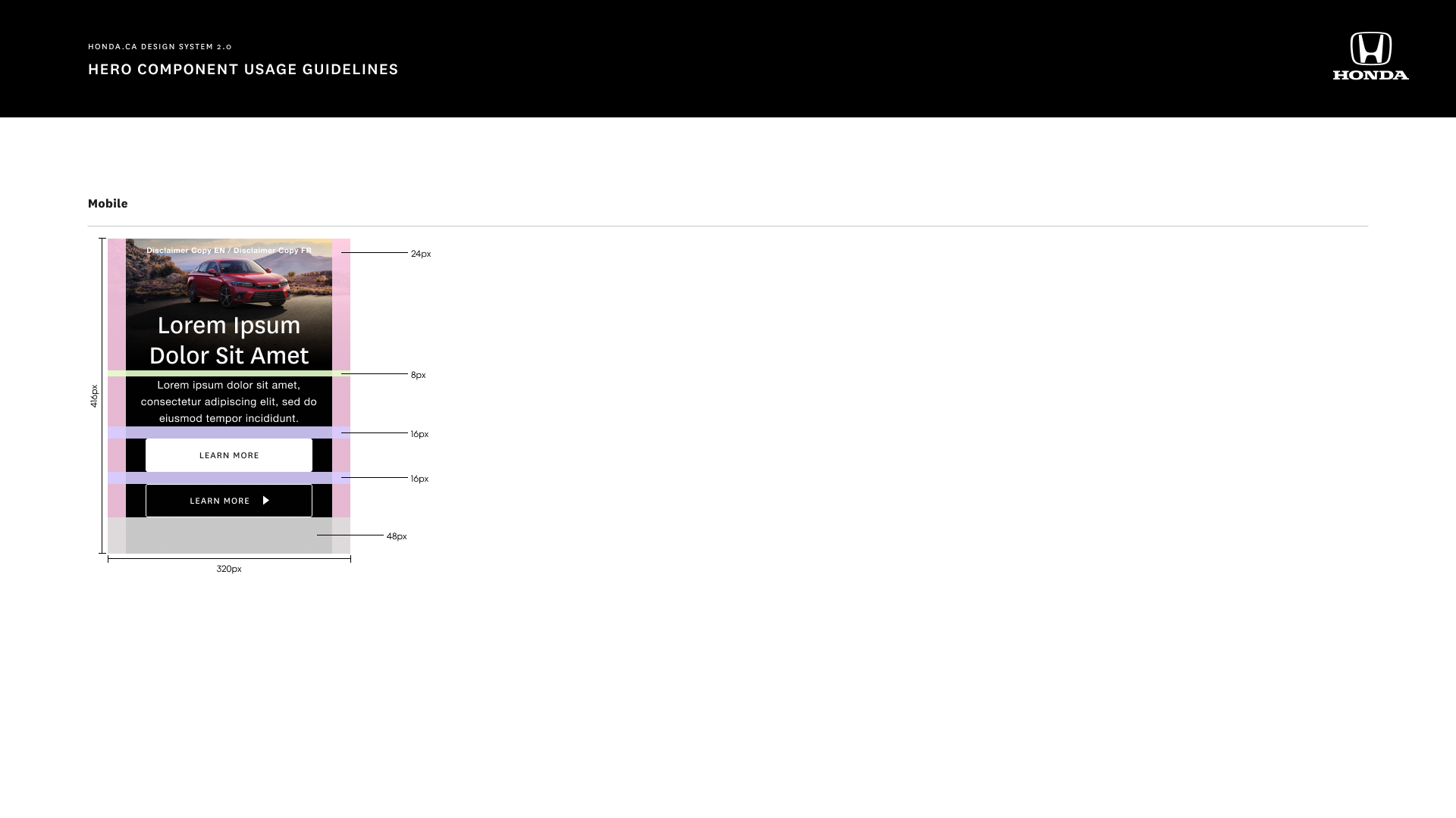
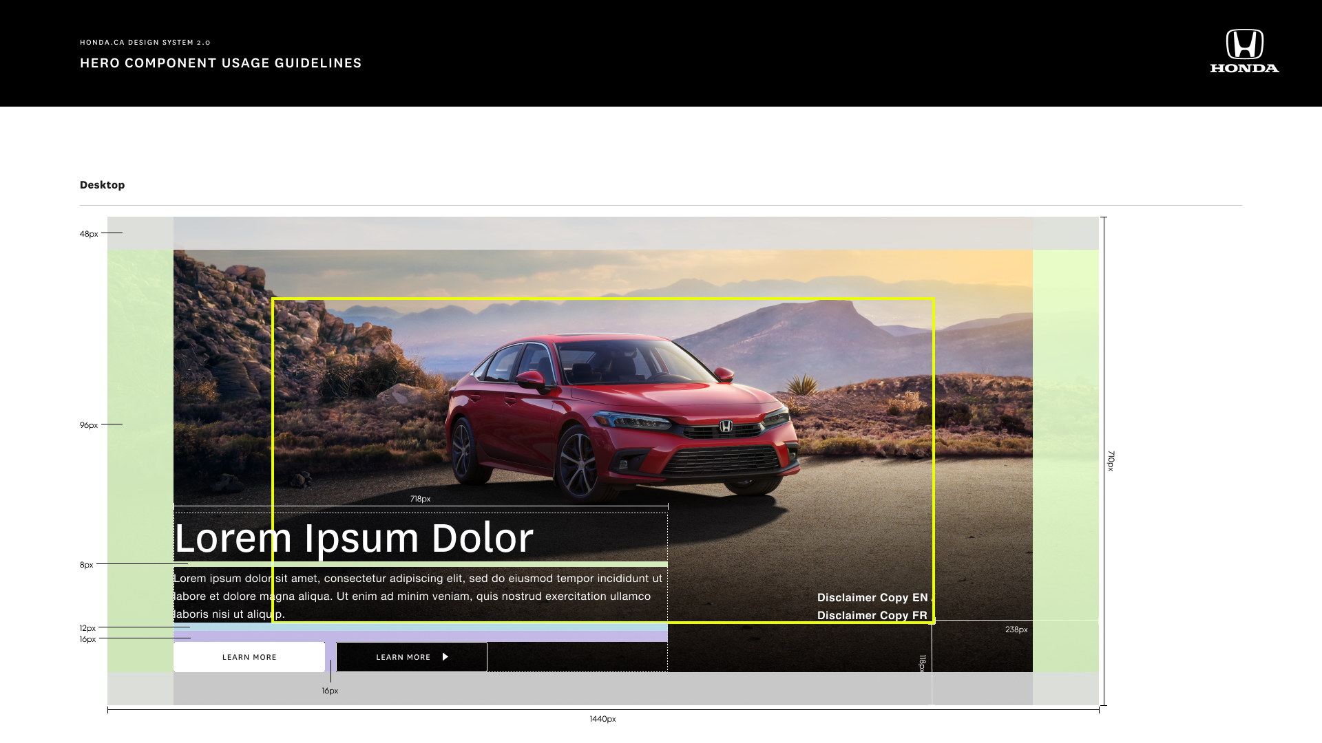
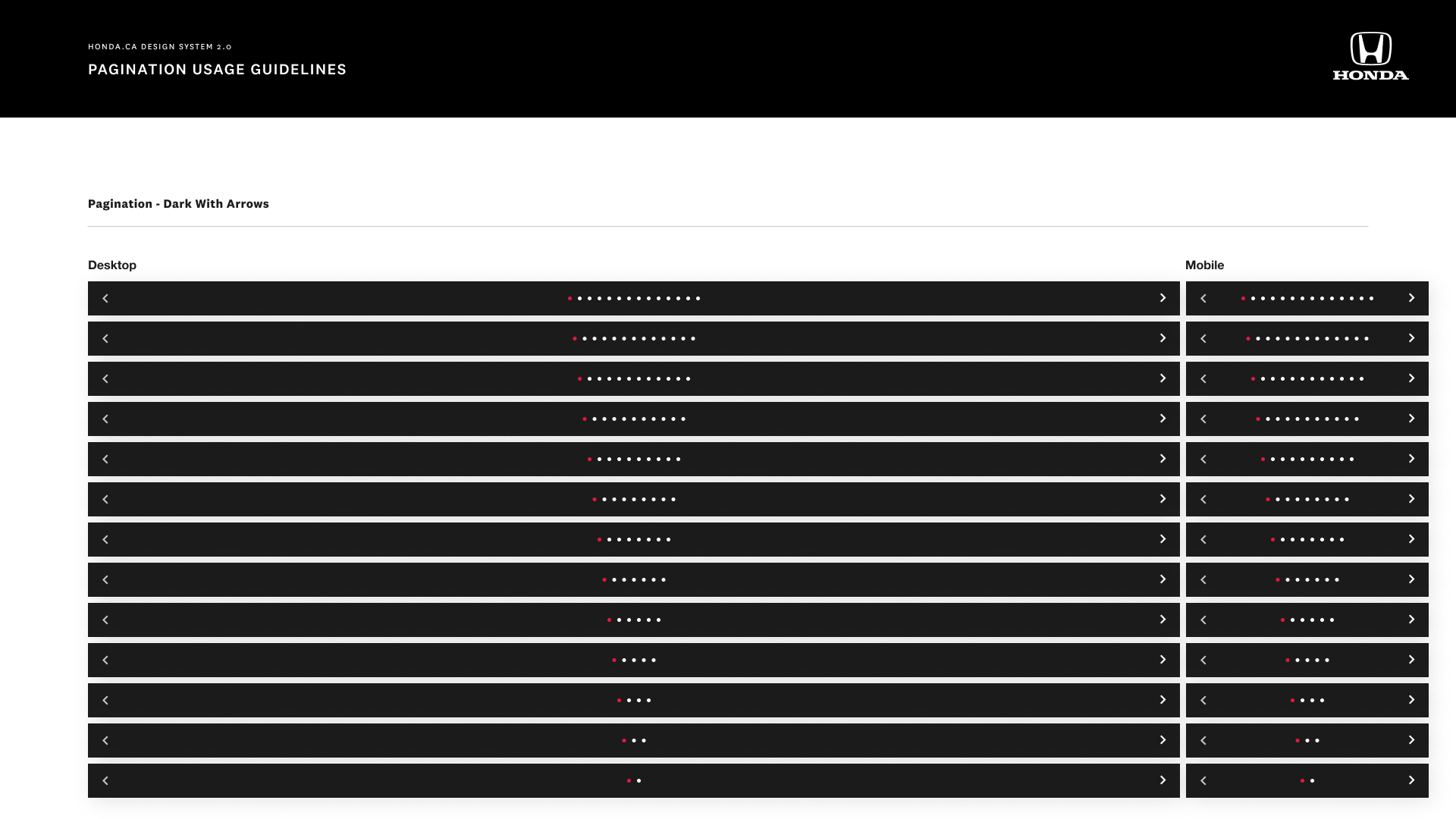
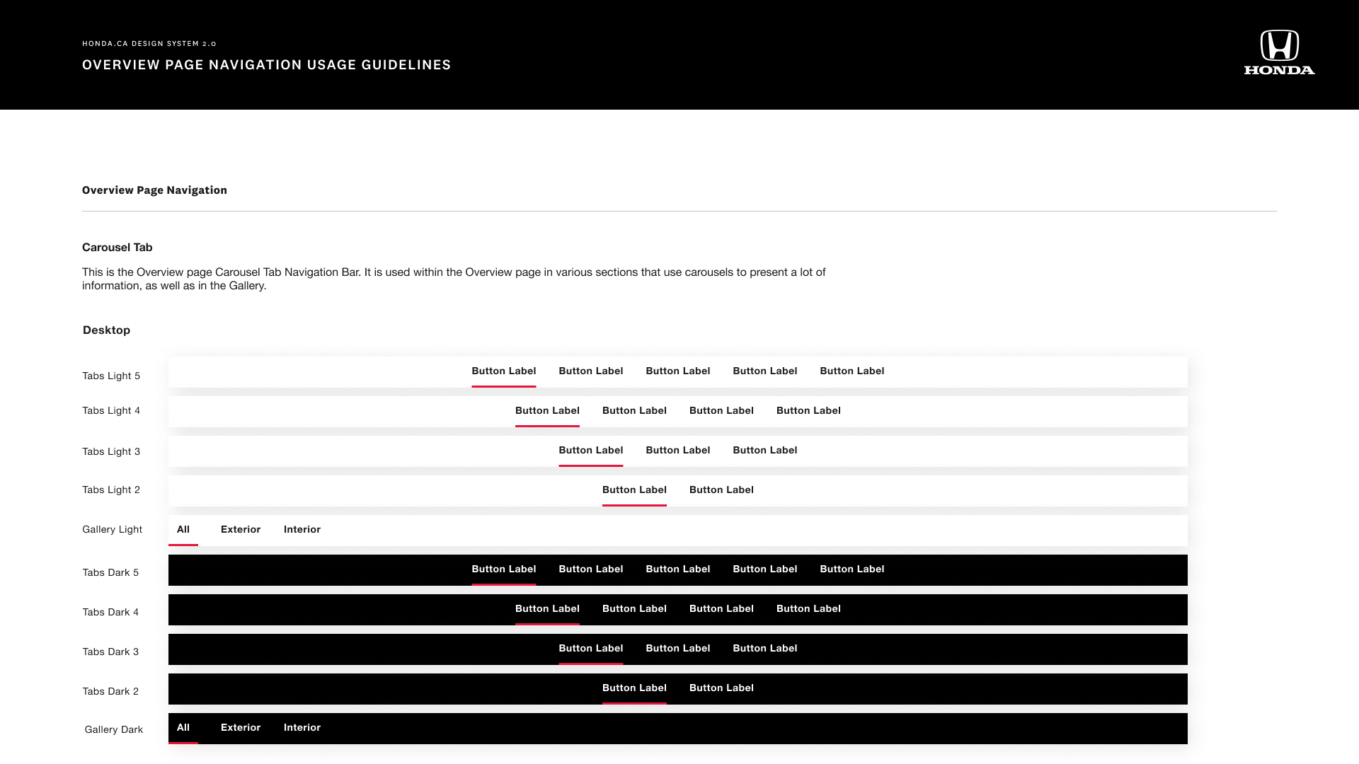
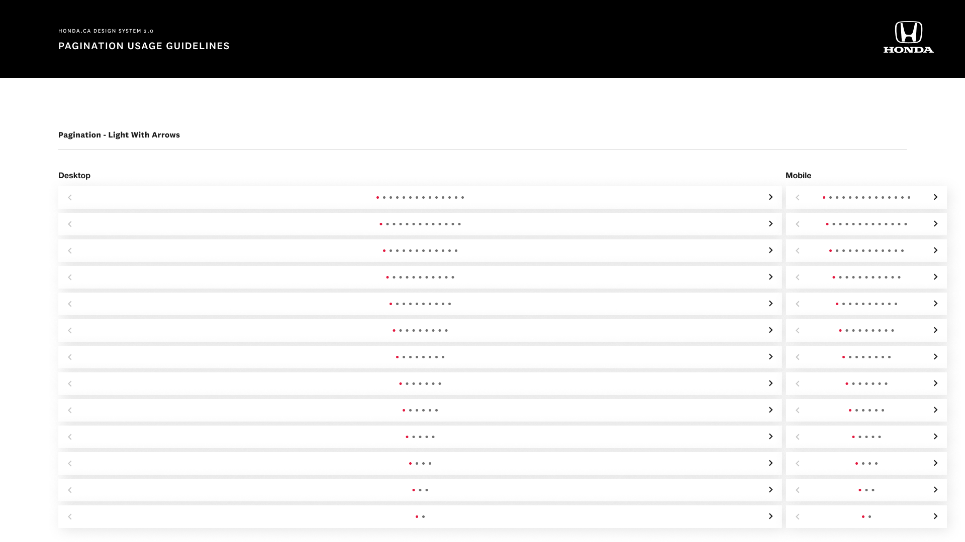
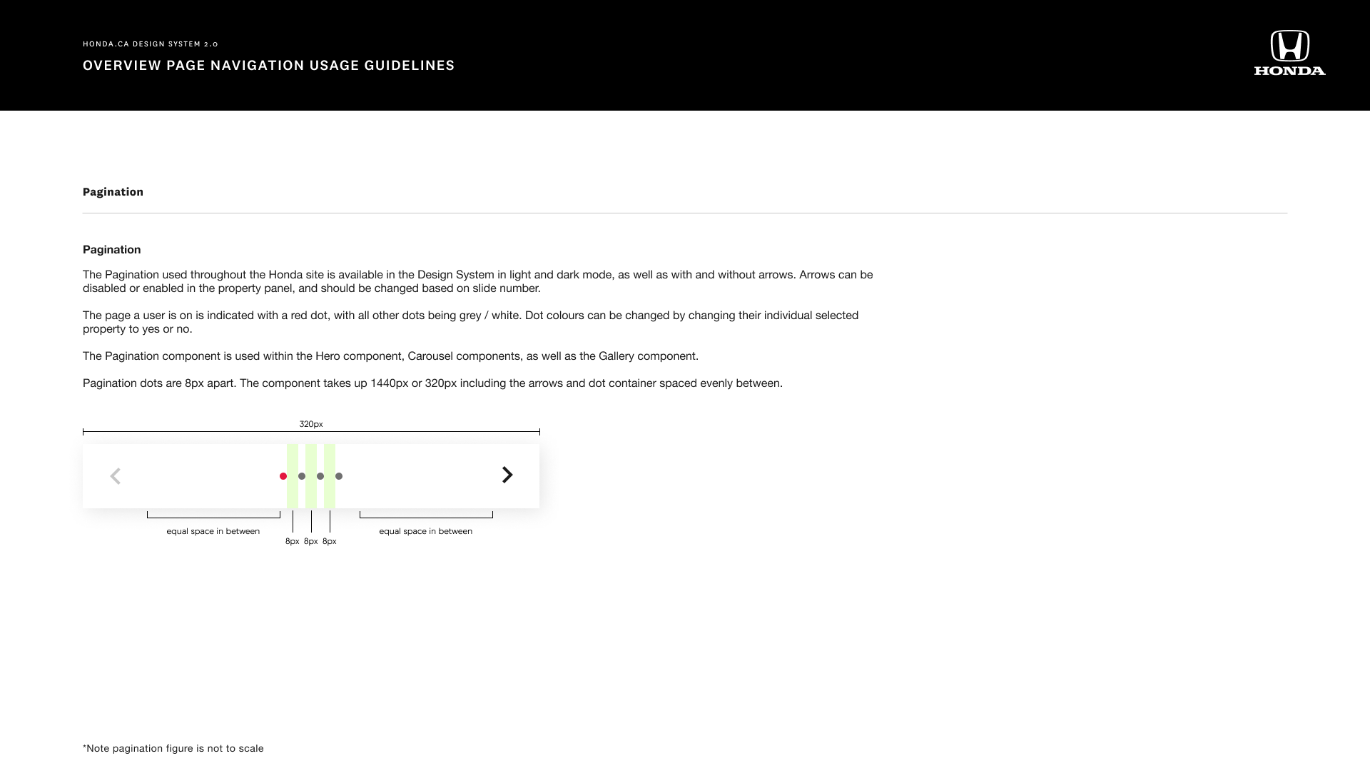
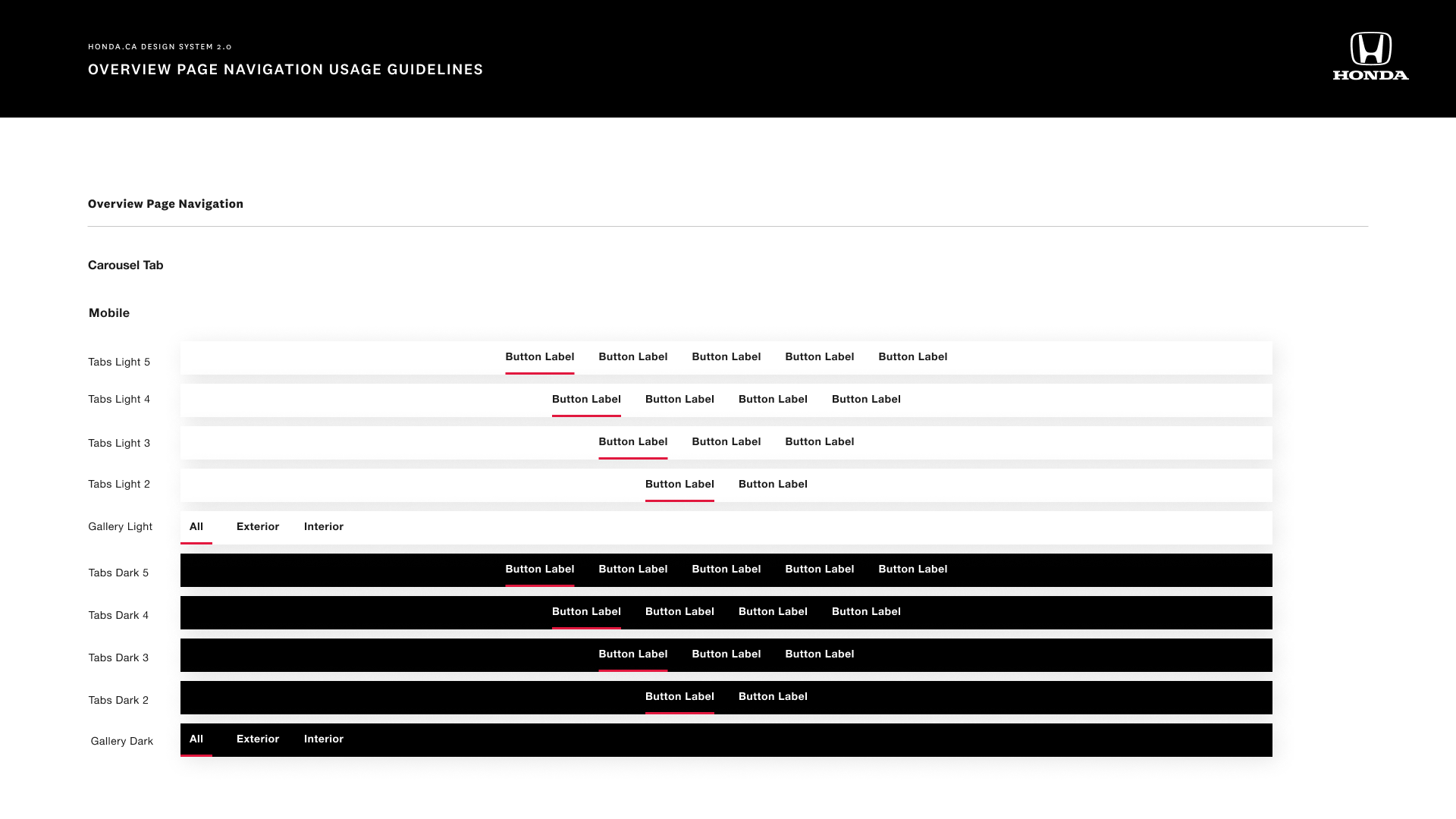
Documentation included general guidelines, usage guidelines, spacing, and any Honda specifics we needed to outline.
Over two weeks our tiny team of two documented out the system in over 160 slides!
Landing Page Update Examples
I was also responsible for landing page creation & updates
Honda launched new vehicles regularly, so I was also responsible for designing landing pages, content pages, and model & make pages.
I needed to work closely with the client team, PMs, & dev team to make sure landing pages were designed and updated on time and there was consistency throughout.
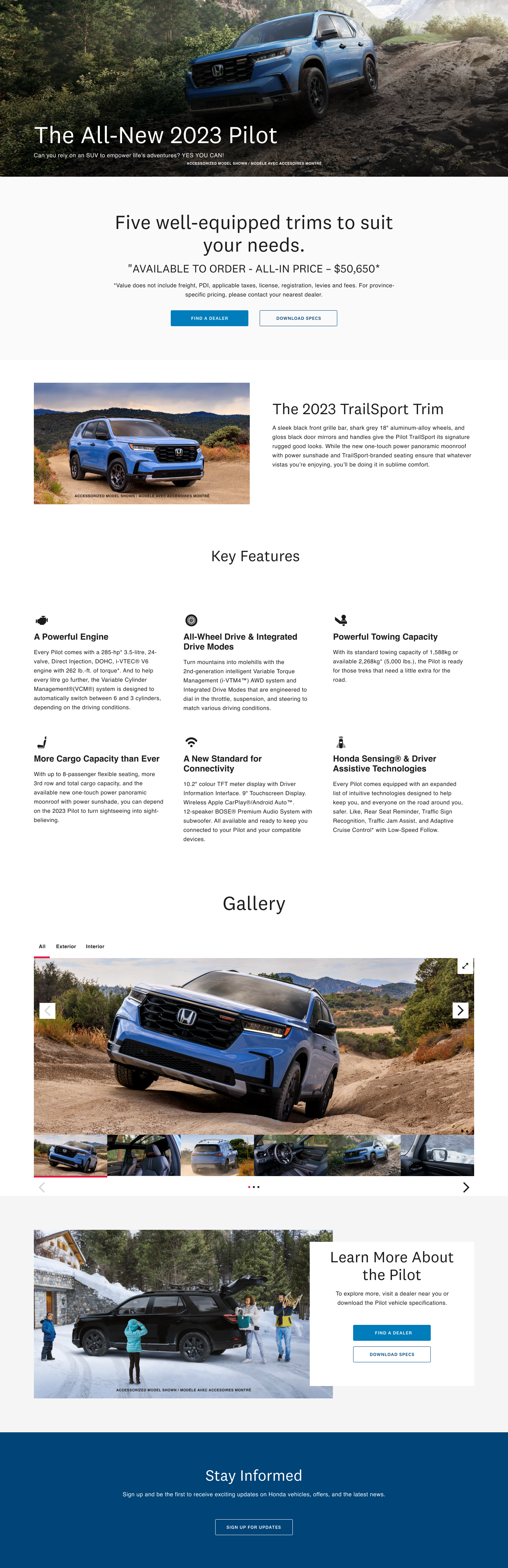
Honda Pilot Interim Page

Type R

Honda Hatchback Desktop

Honda Pilot Desktop
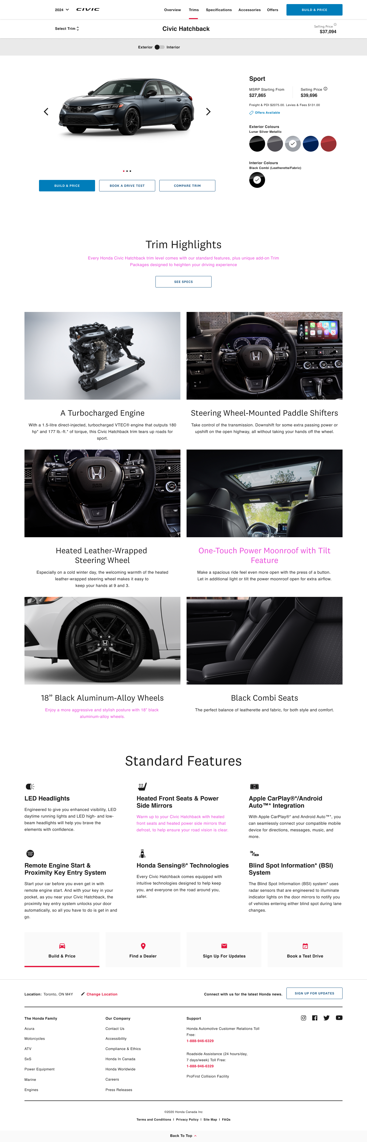
Hatchback Trims
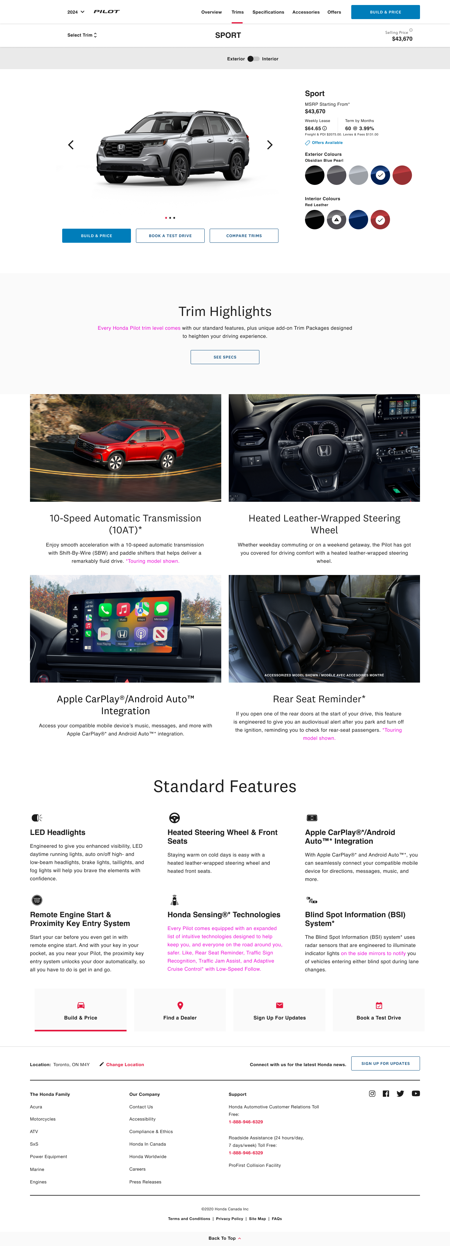
Pilot Sport Trim
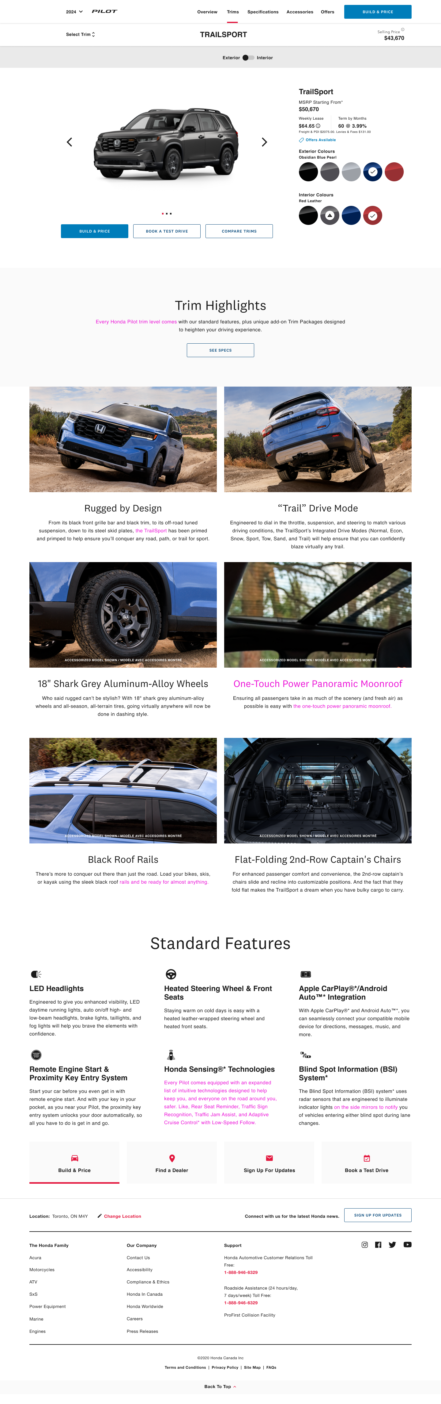
Pilot Trailsport Trim
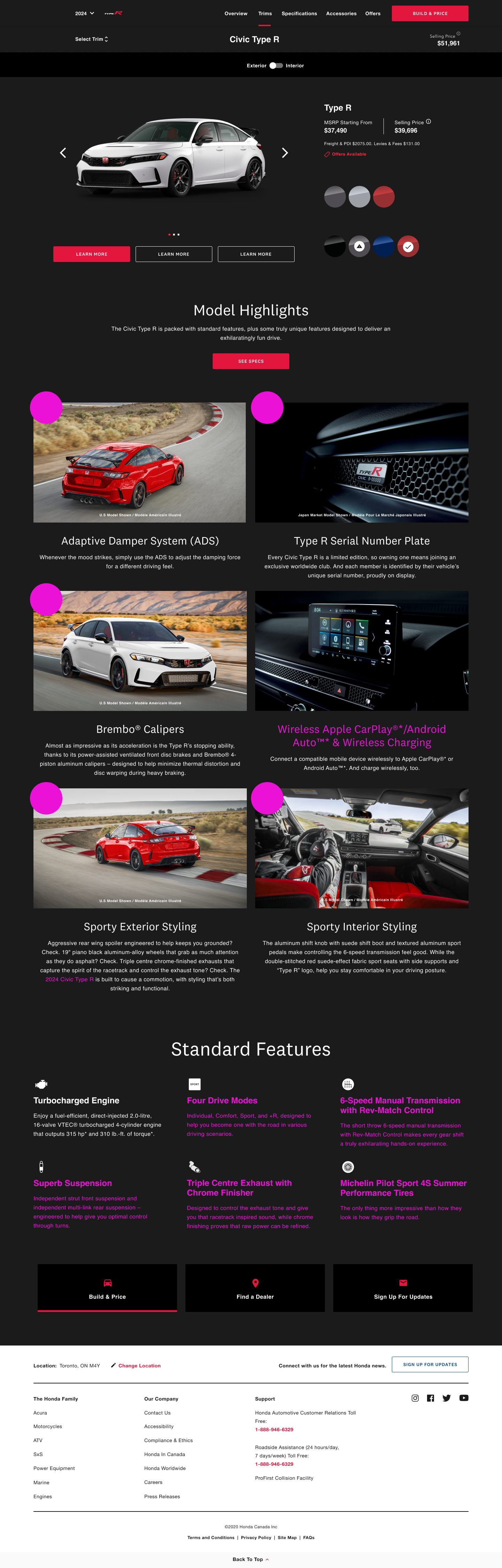
Type R Trim