
American Express Design System
While working for Dentsu, we had two internal teams creating American Express emails. The creative team designed everything in Photoshop, then got approval from the client (AMEX), then passed designs to the production team to code the emails. There was a huge gap between designs and development as timelines were tight, and designers were creating new layouts that did not exist in the codebase so I was brought in to create a design system for the team.
The goal of the design system was to streamline the process to allow us to work within our clients tight timelines. Email designs were turned around quickly with multiple rounds of feedback, however when it came to the builds, the production team struggled to develop the emails because designs were not vetted by production. Instead of using existing designs (with corresponding code that existed in the production team’s codebase) designers were creating new assets that were “approved” by the client but took way too long to be developed in time for launch. There was also a large team of designers so consistency was also a challenge because the only guidelines the team had were the style guides the client provided.

With only three weeks before our first team touch base I created our design system.
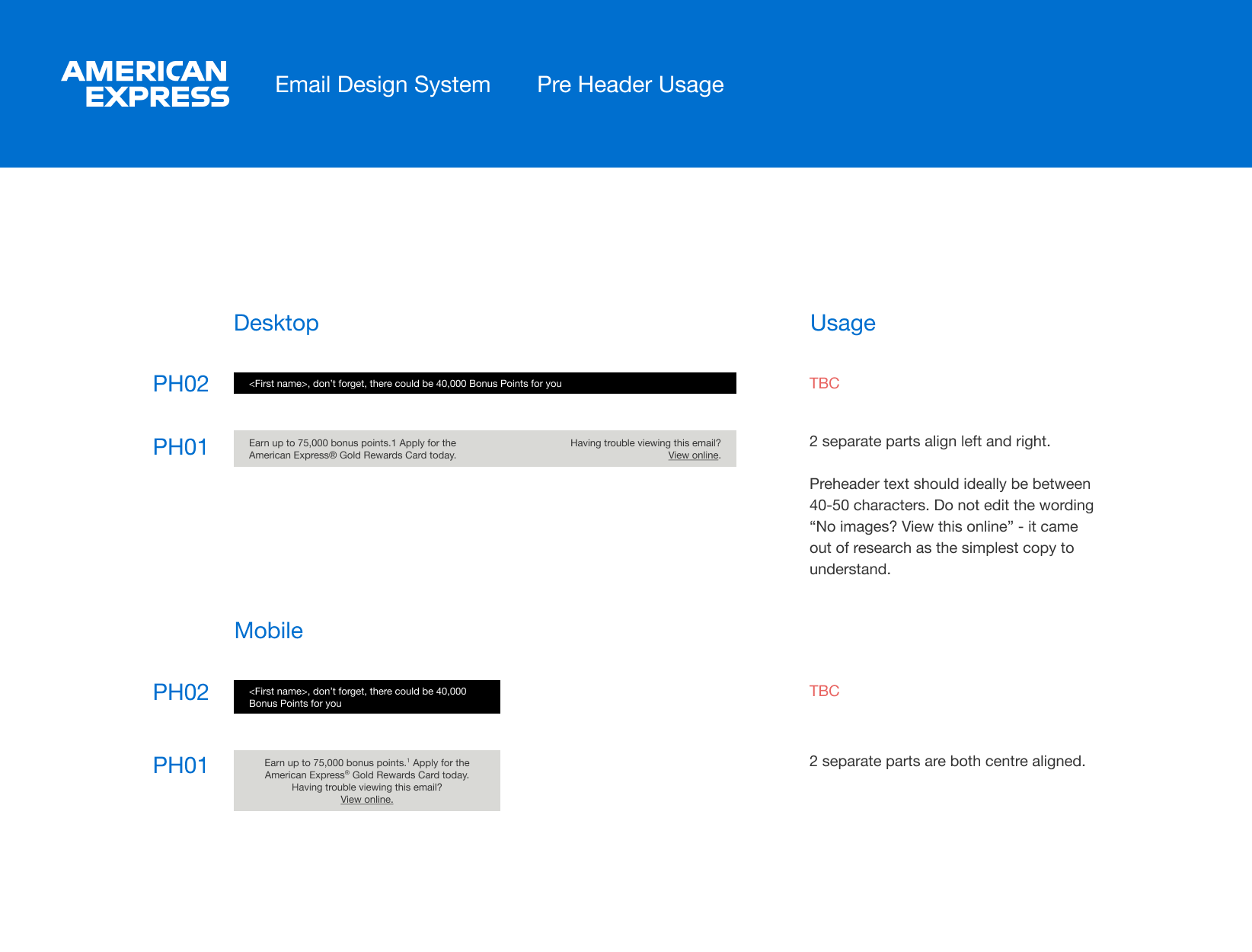
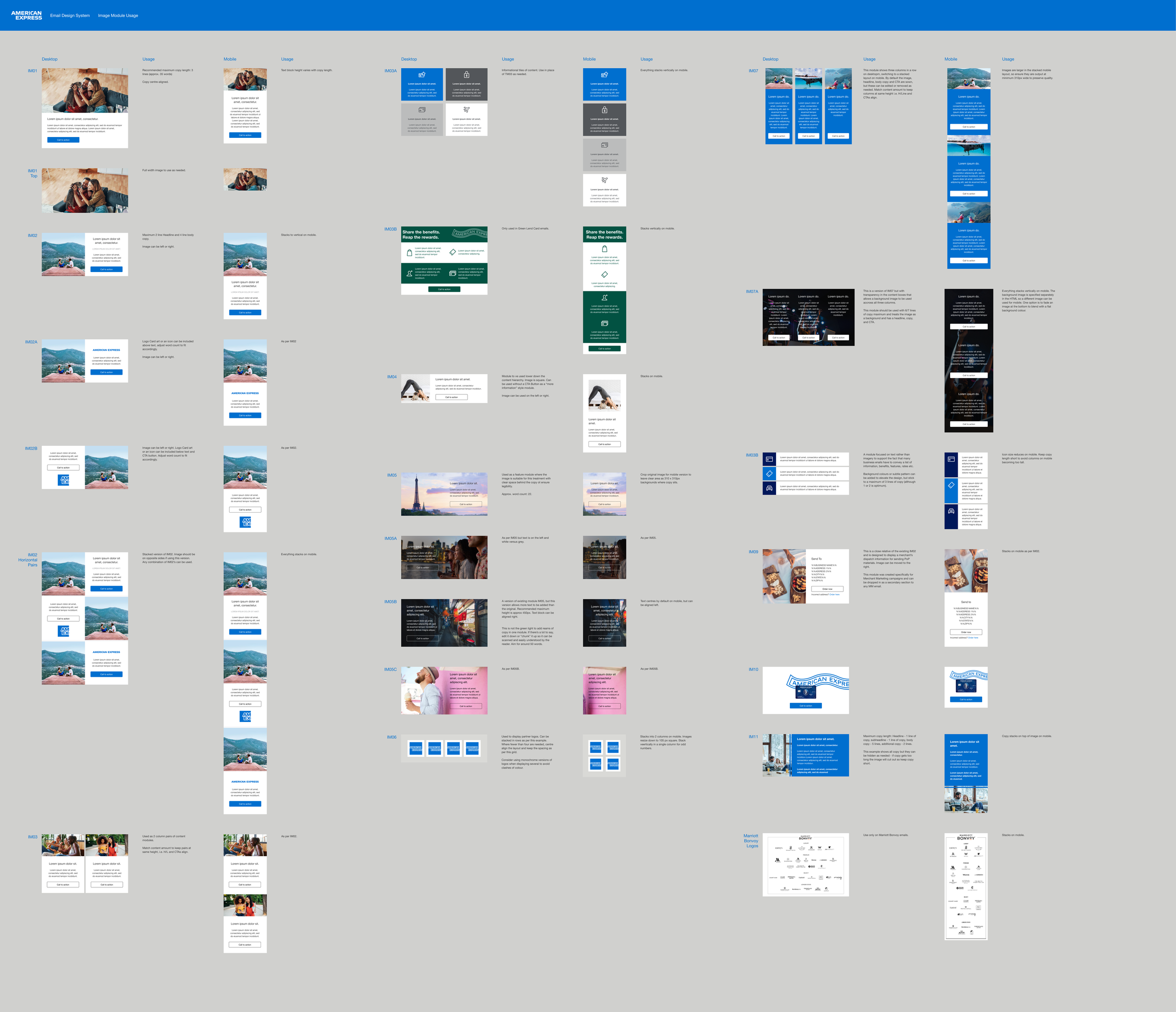
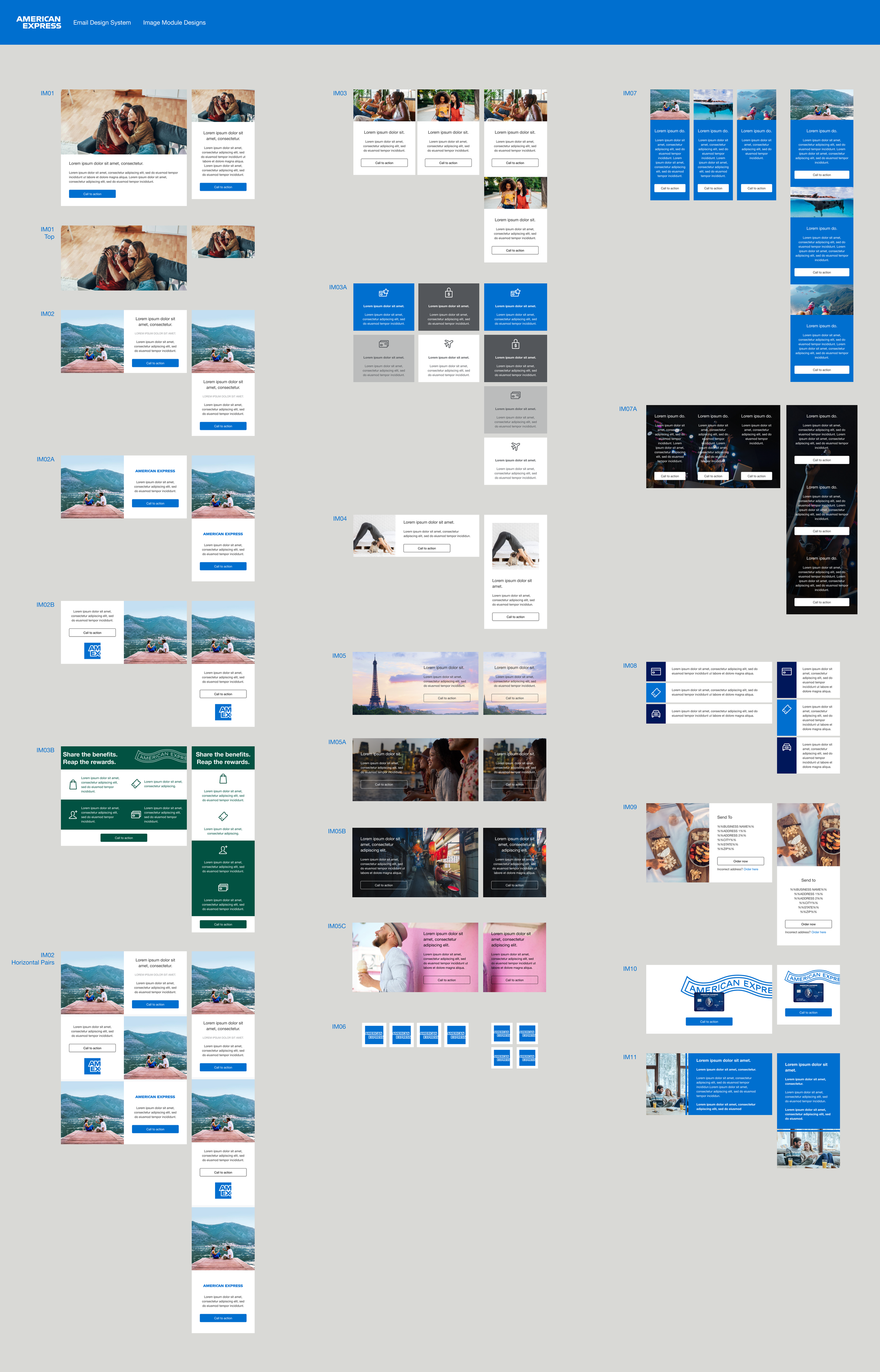
It included as many sections as I could make that were currently being used in member emails by our design team.
Built using atomic design principles I also built each section as components within components based on fundamentals that I had to set up all auto layouted with the correct spacing and sizing outlined in the client guidelines. I also set up each component to have the right variants, so that designers could easily switch between various layouts without needing to re-design them.
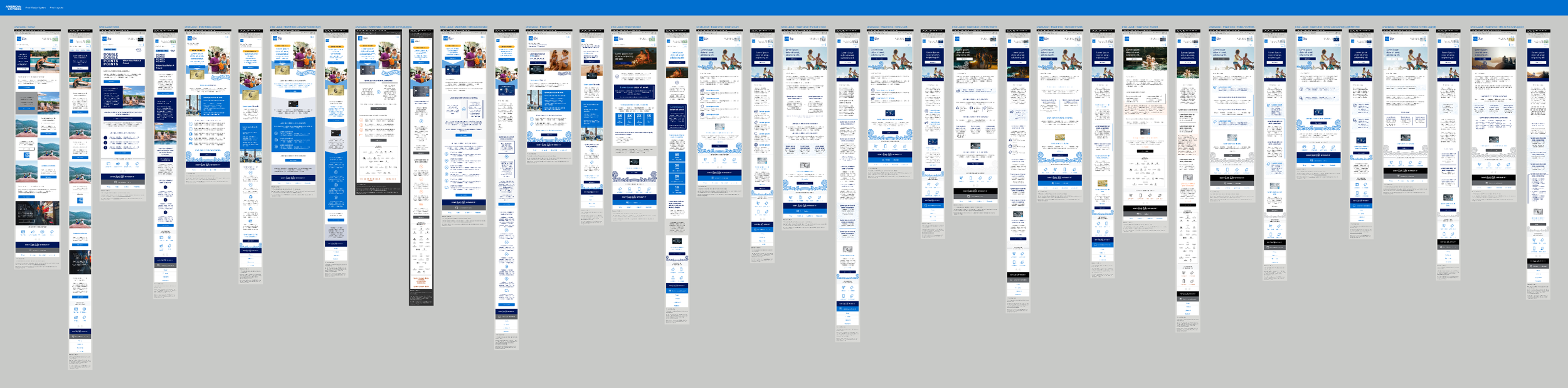
I also created a sticker sheet and email templates.
I separated the sticker sheet out from the design system so that individuals could use whatever they needed without overriding styles. I also created all documentation & full autolayouted email templates.
Individuals could then use the sticker sheet or the assets from the asset panel and drag and drop them into the template moving them into position and then update copy and images. They could also switch between different styles of each section easily building emails seamlessly and concentrate on solving the clients business problems instead of spending so much time designing.
This design system consists of 267 components with 688 variants.
Colours
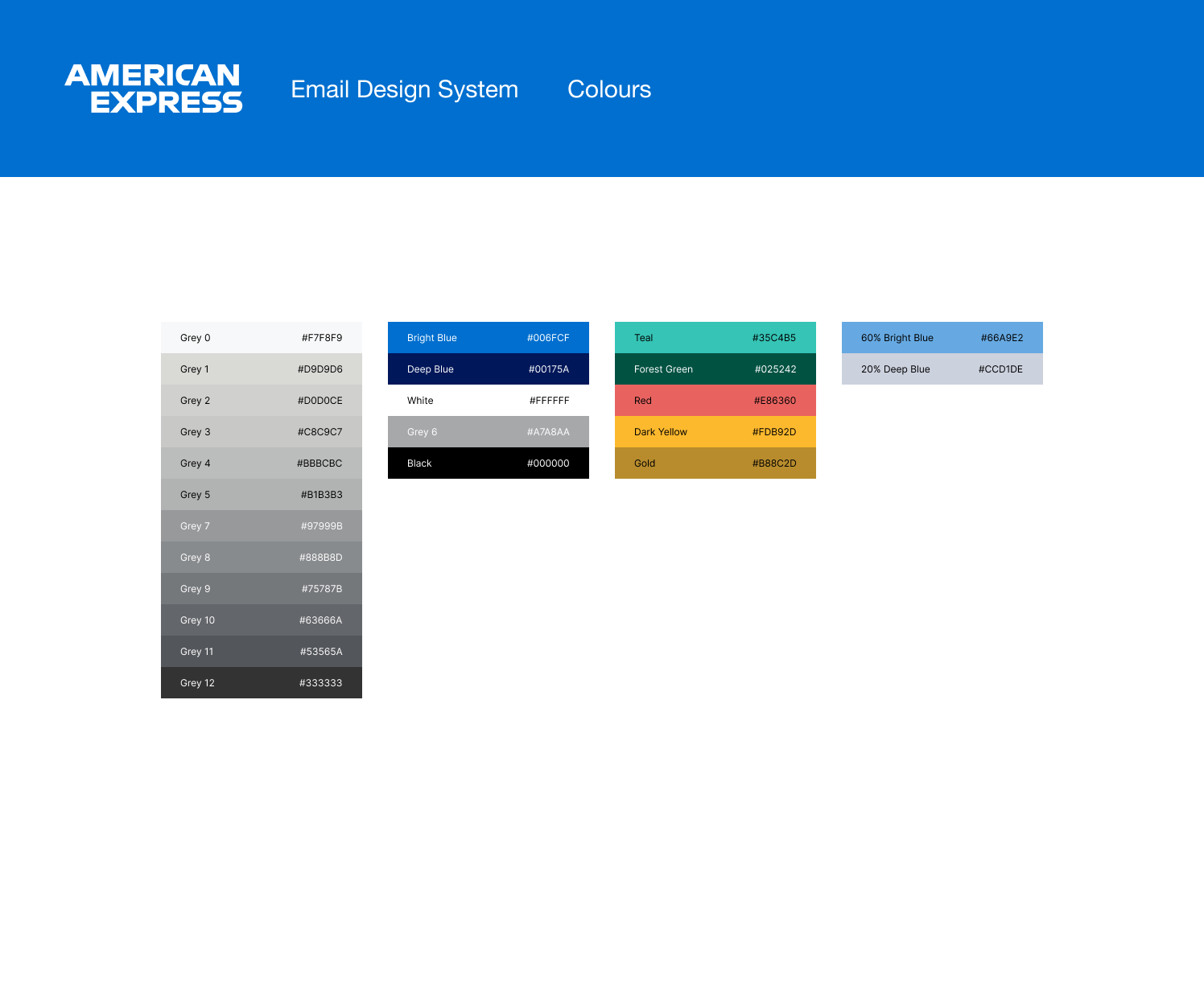
Colours
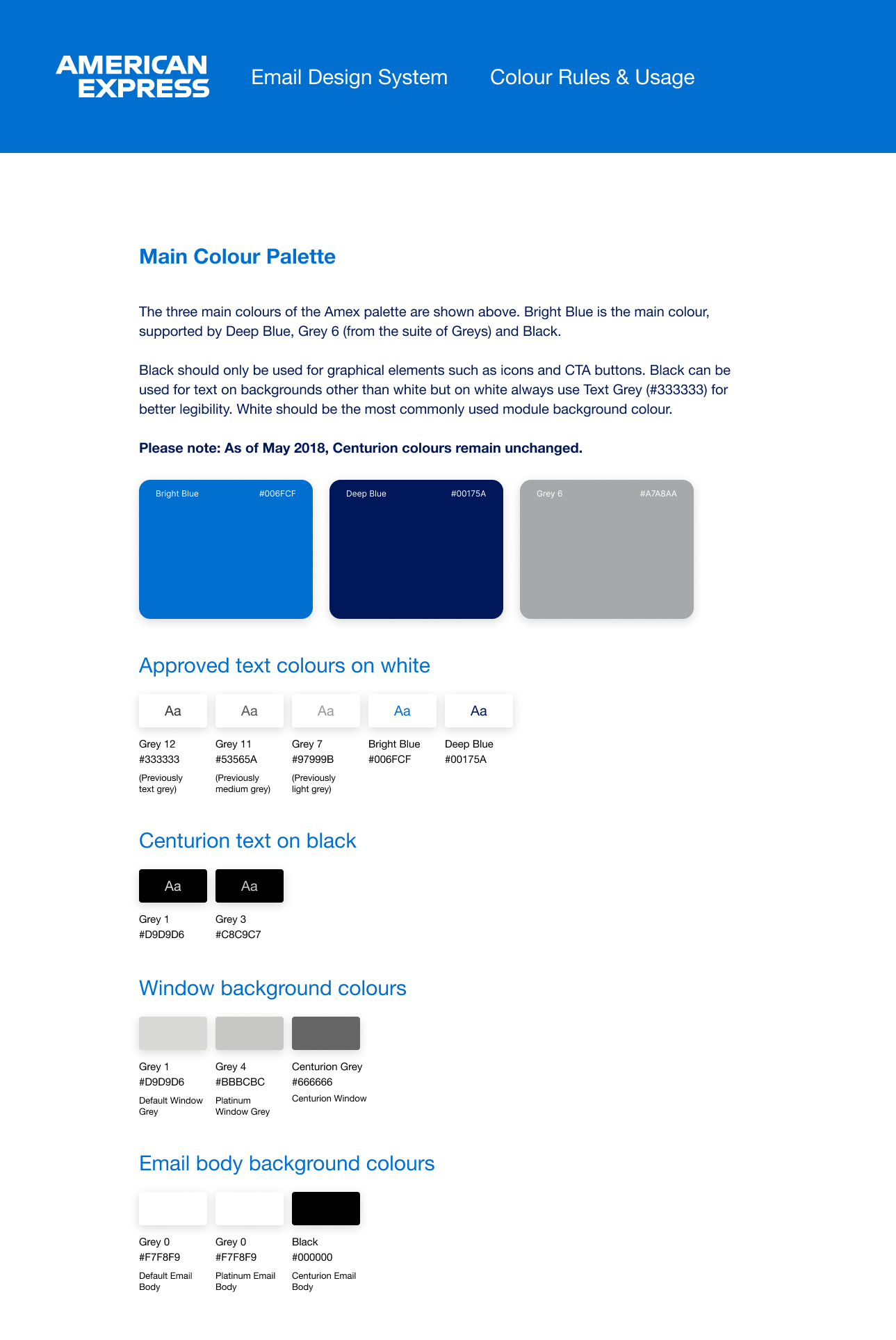
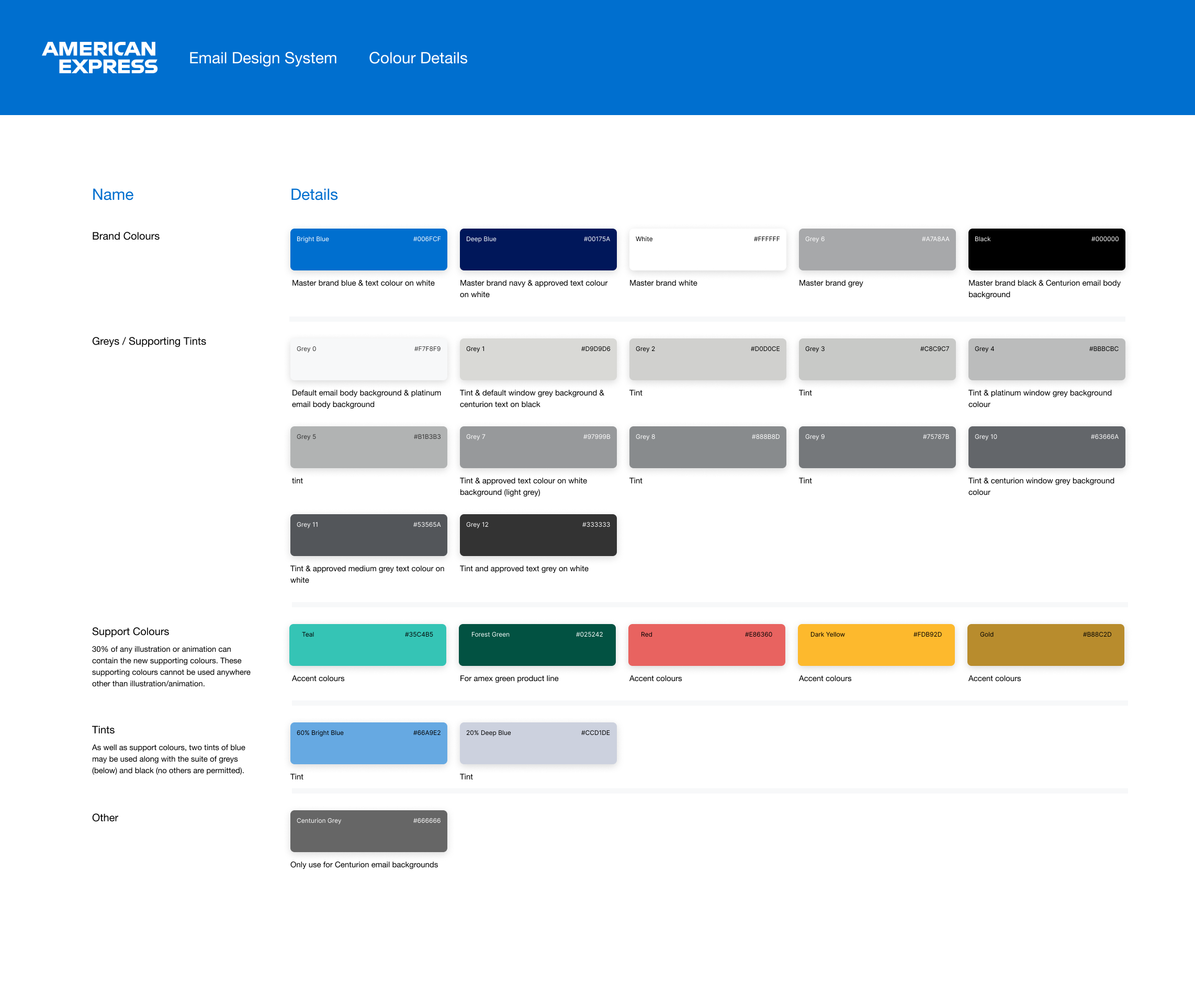
Typography
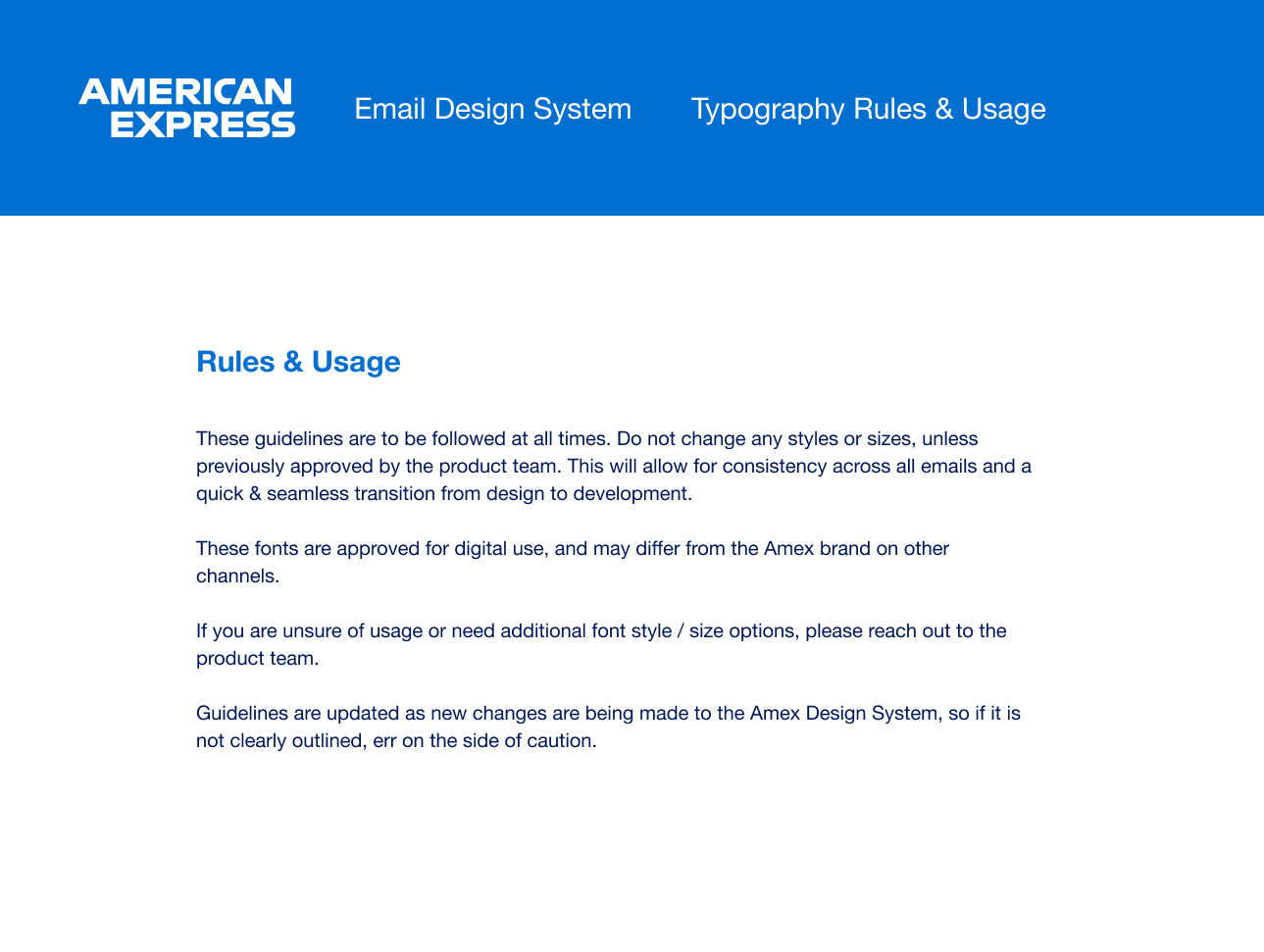
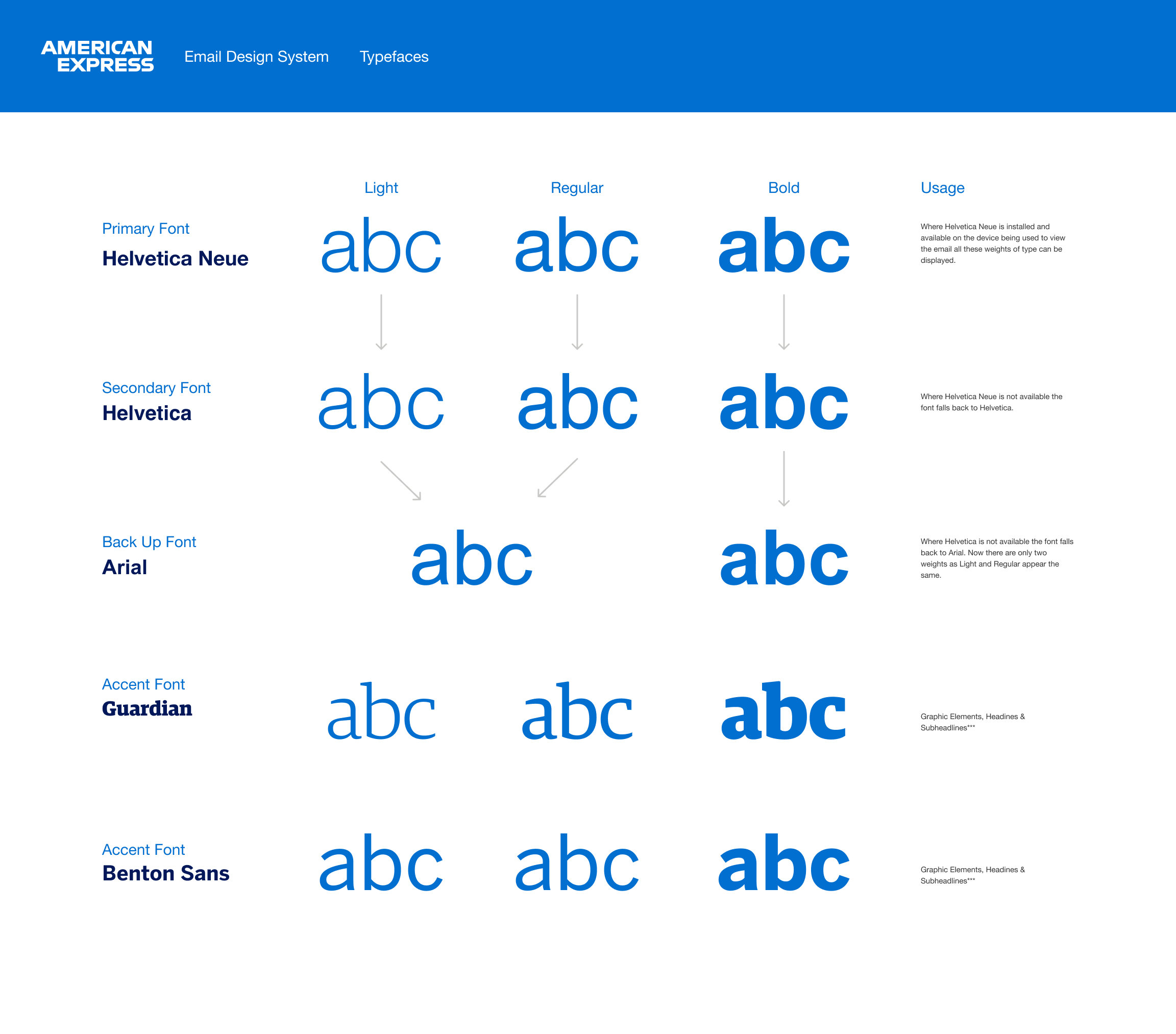
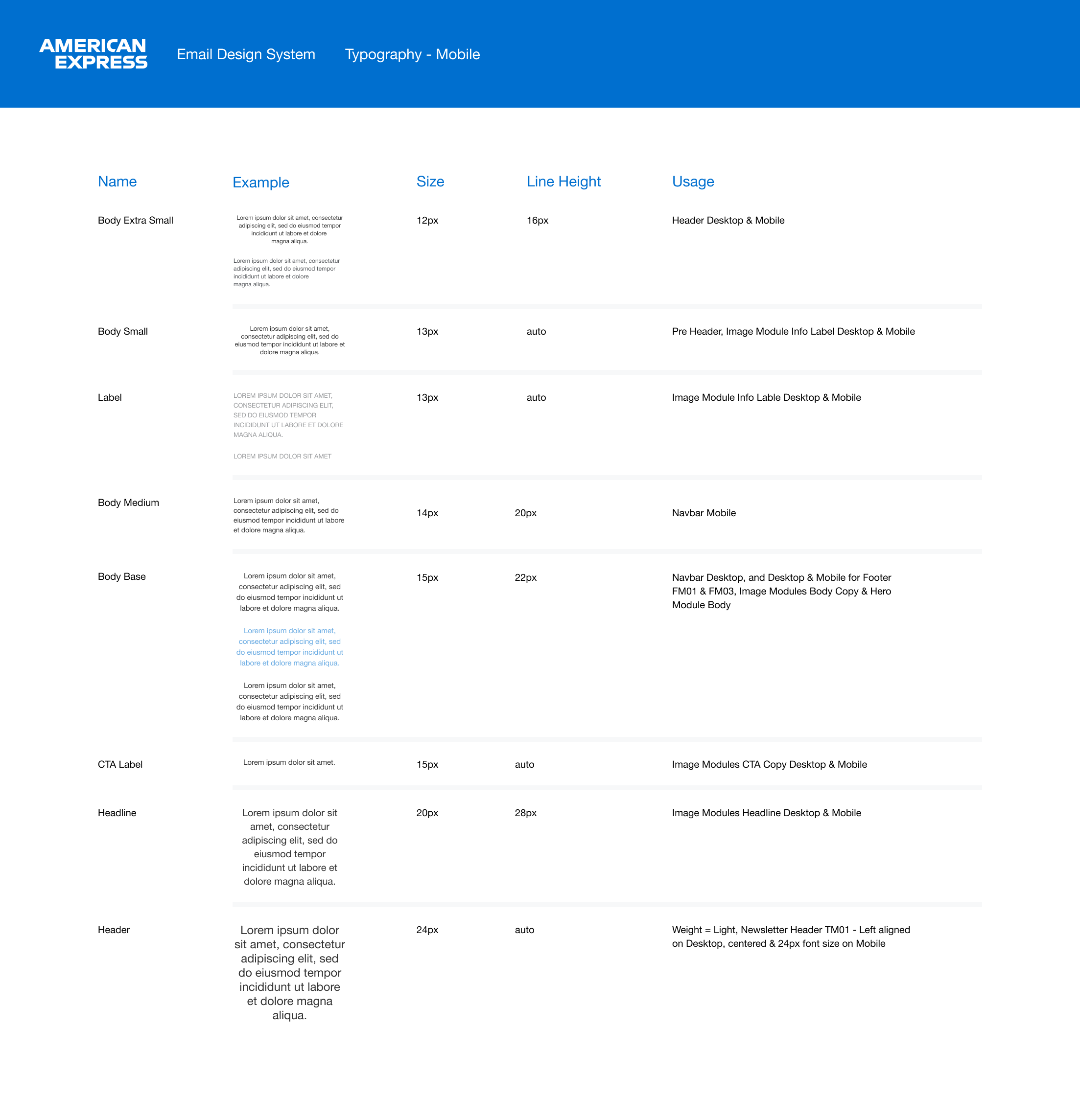
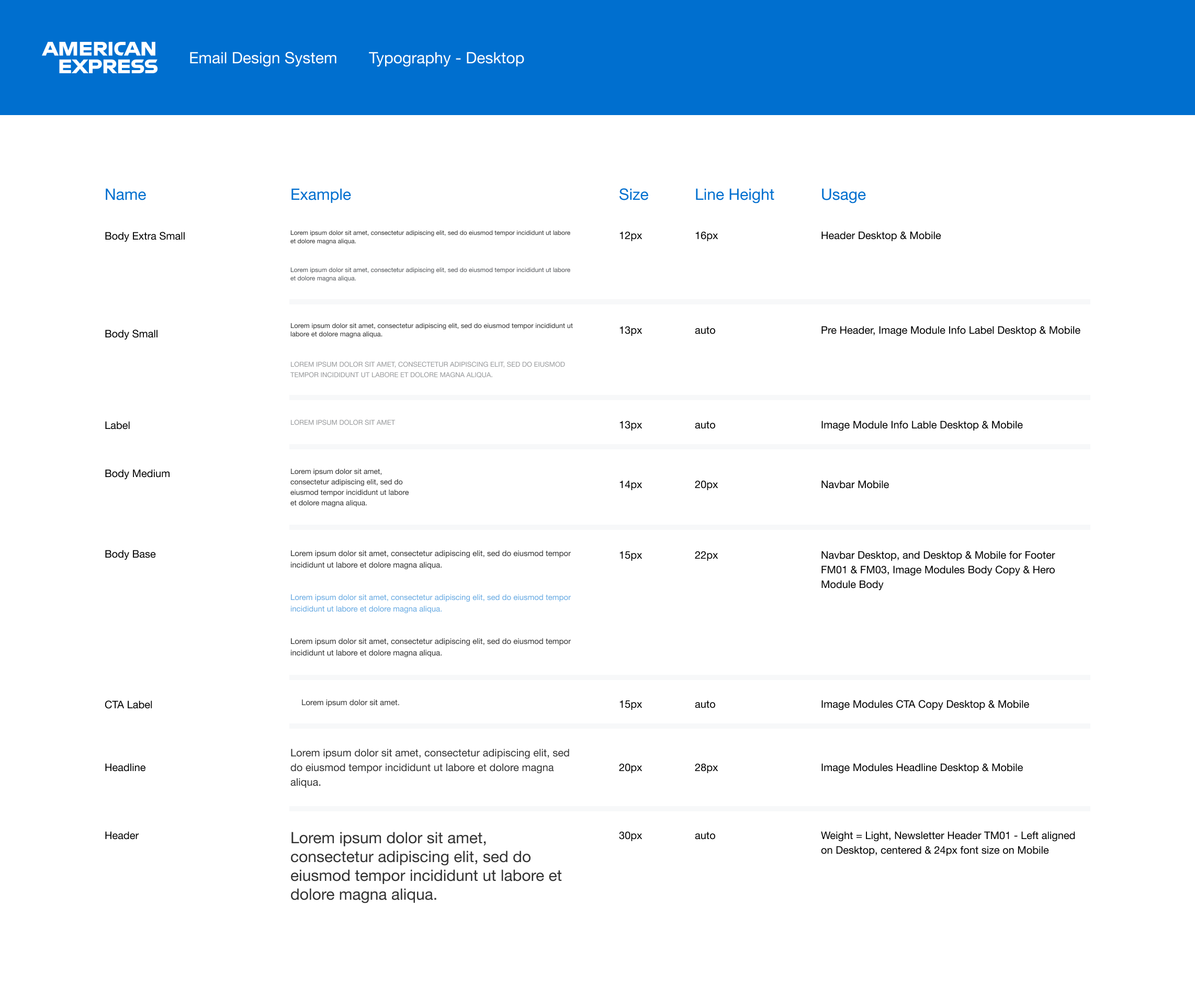
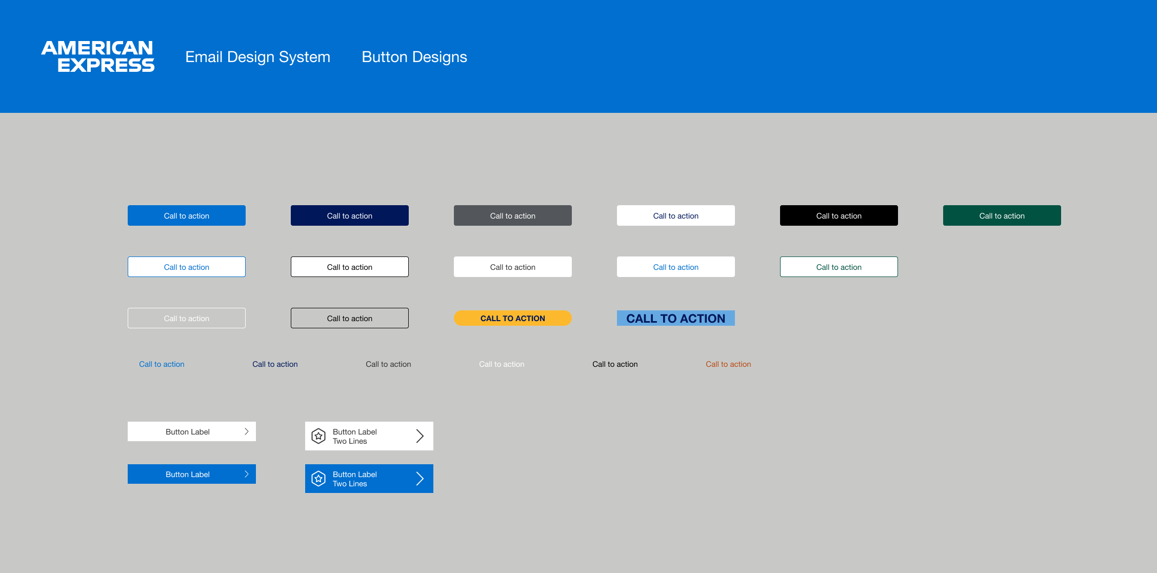
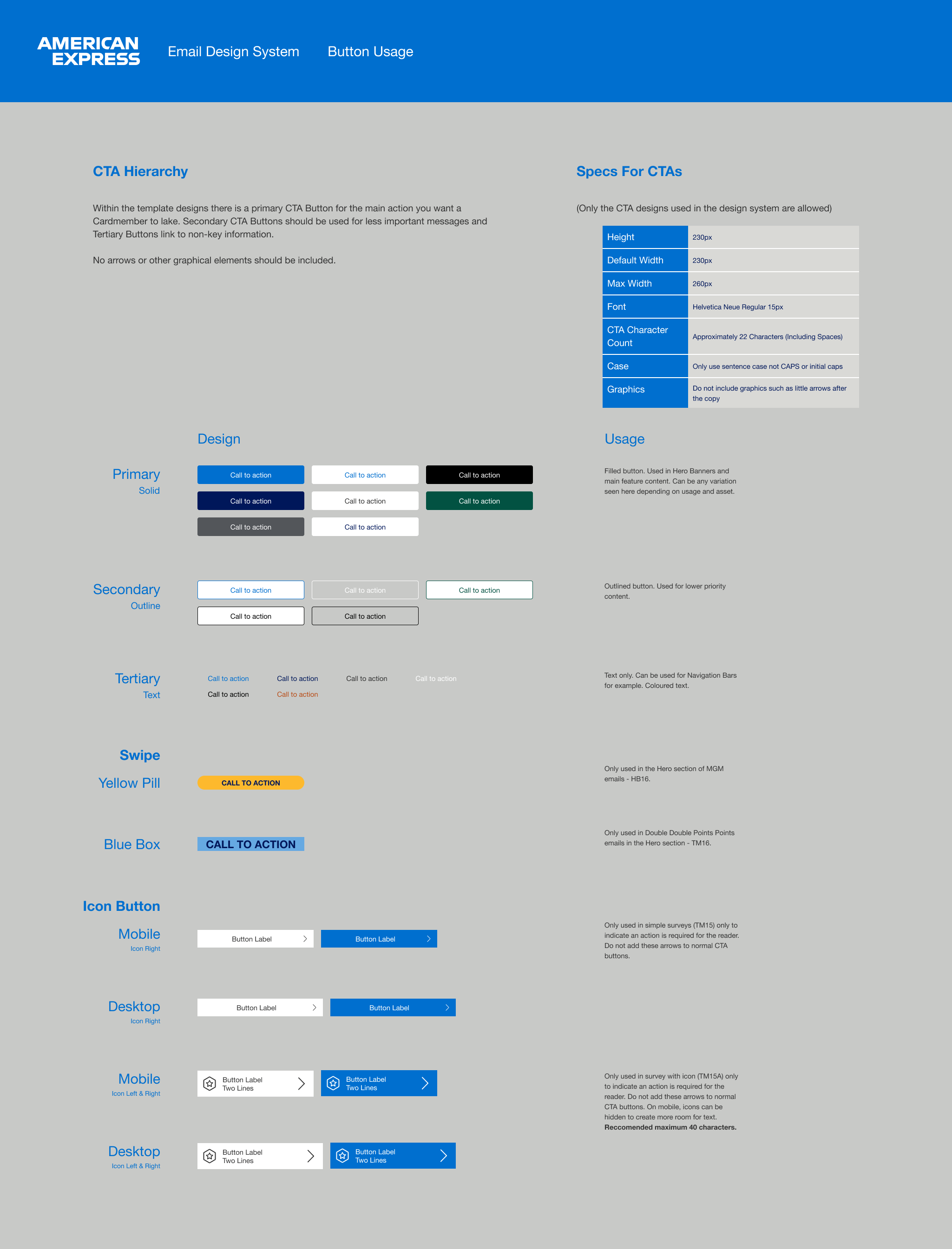
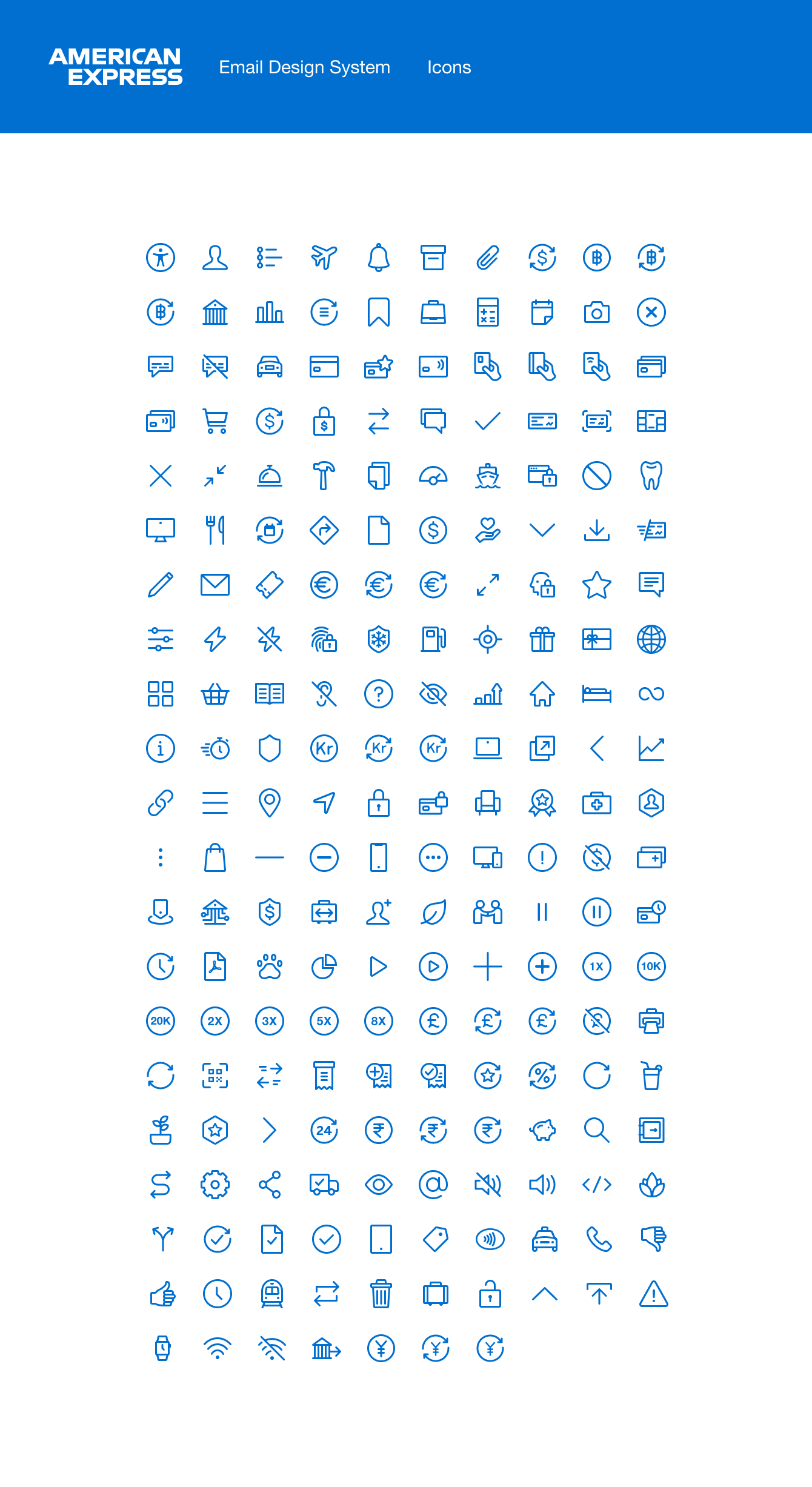
Buttons & Icons
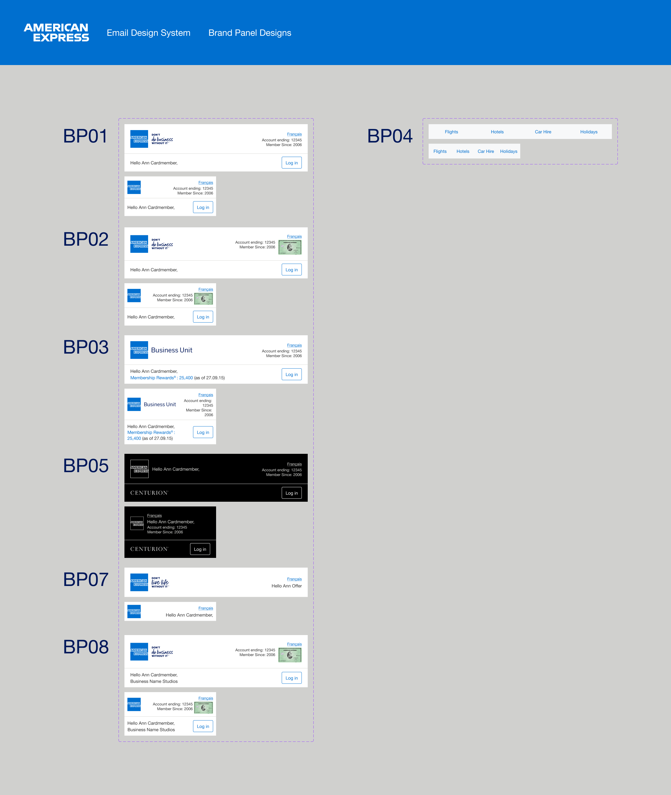
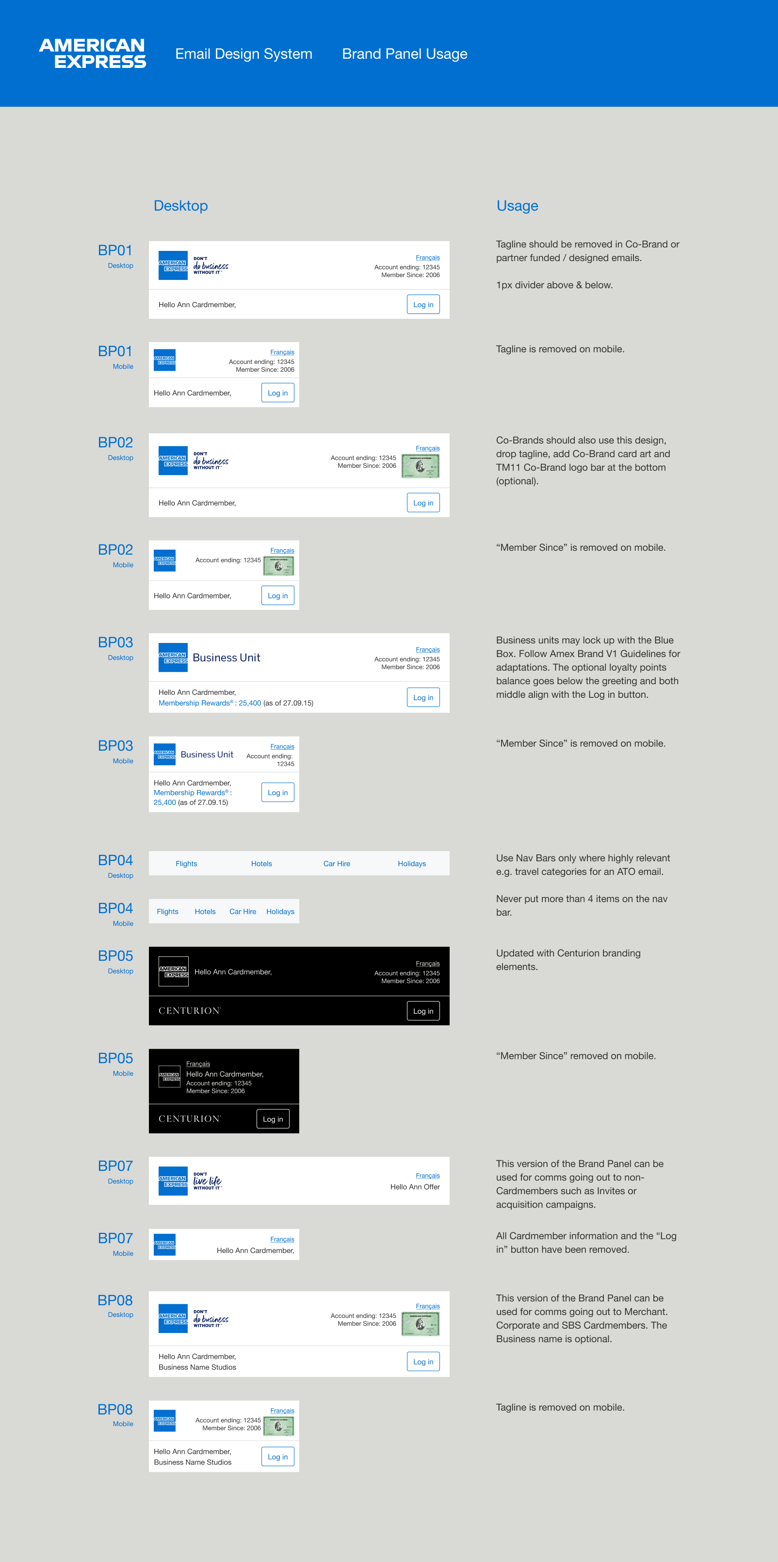
Brand Panel
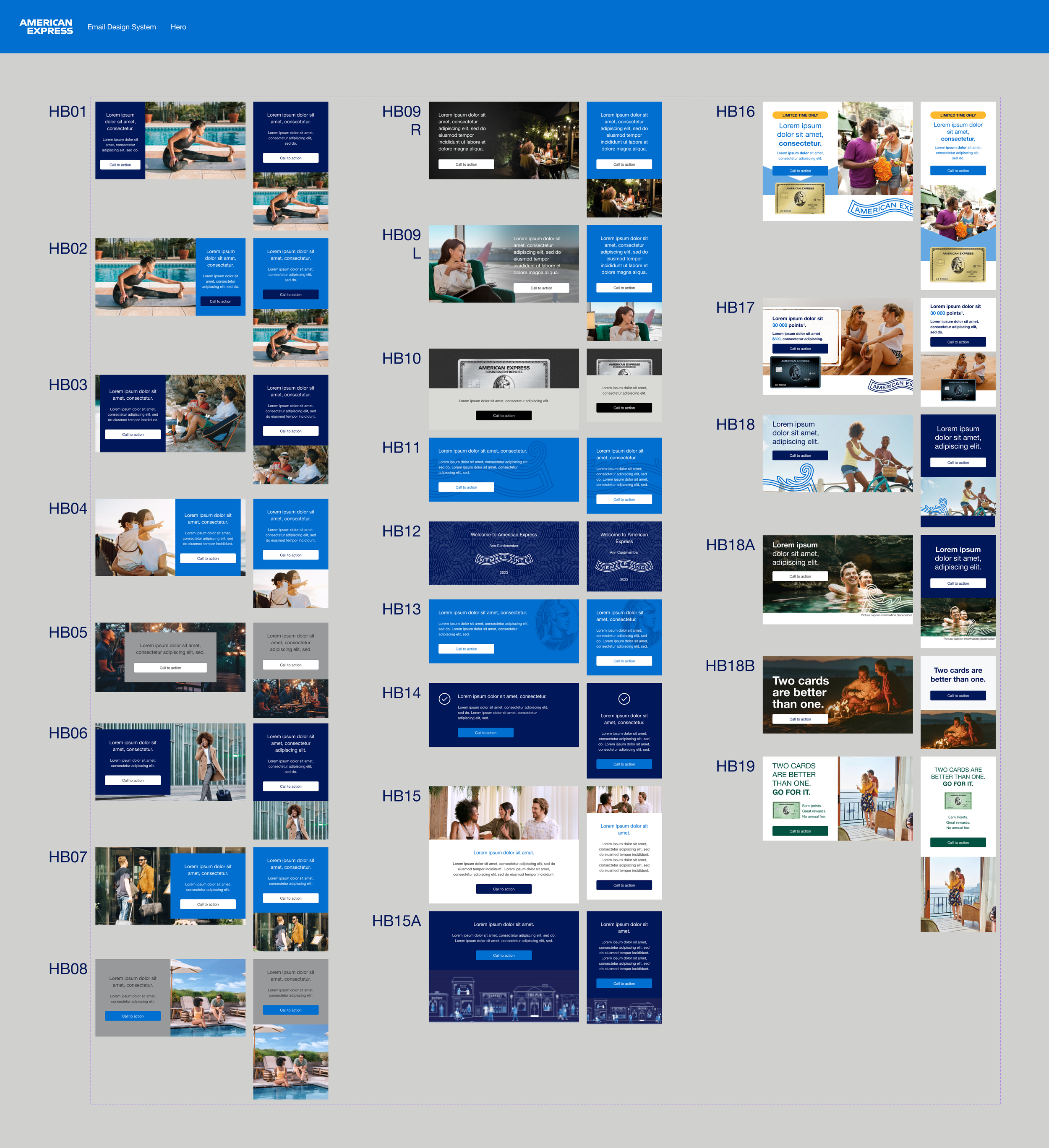
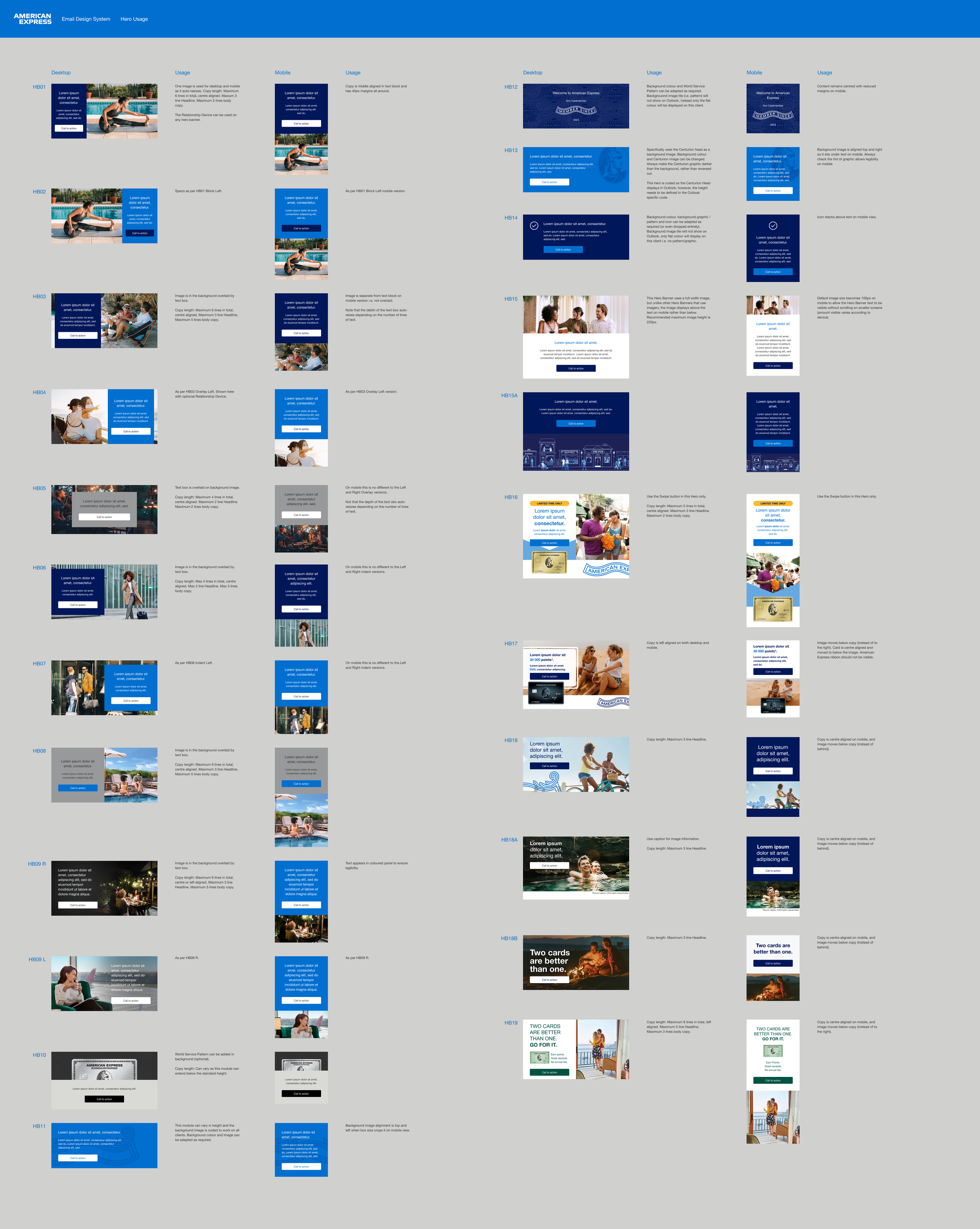
Hero
Text Modules
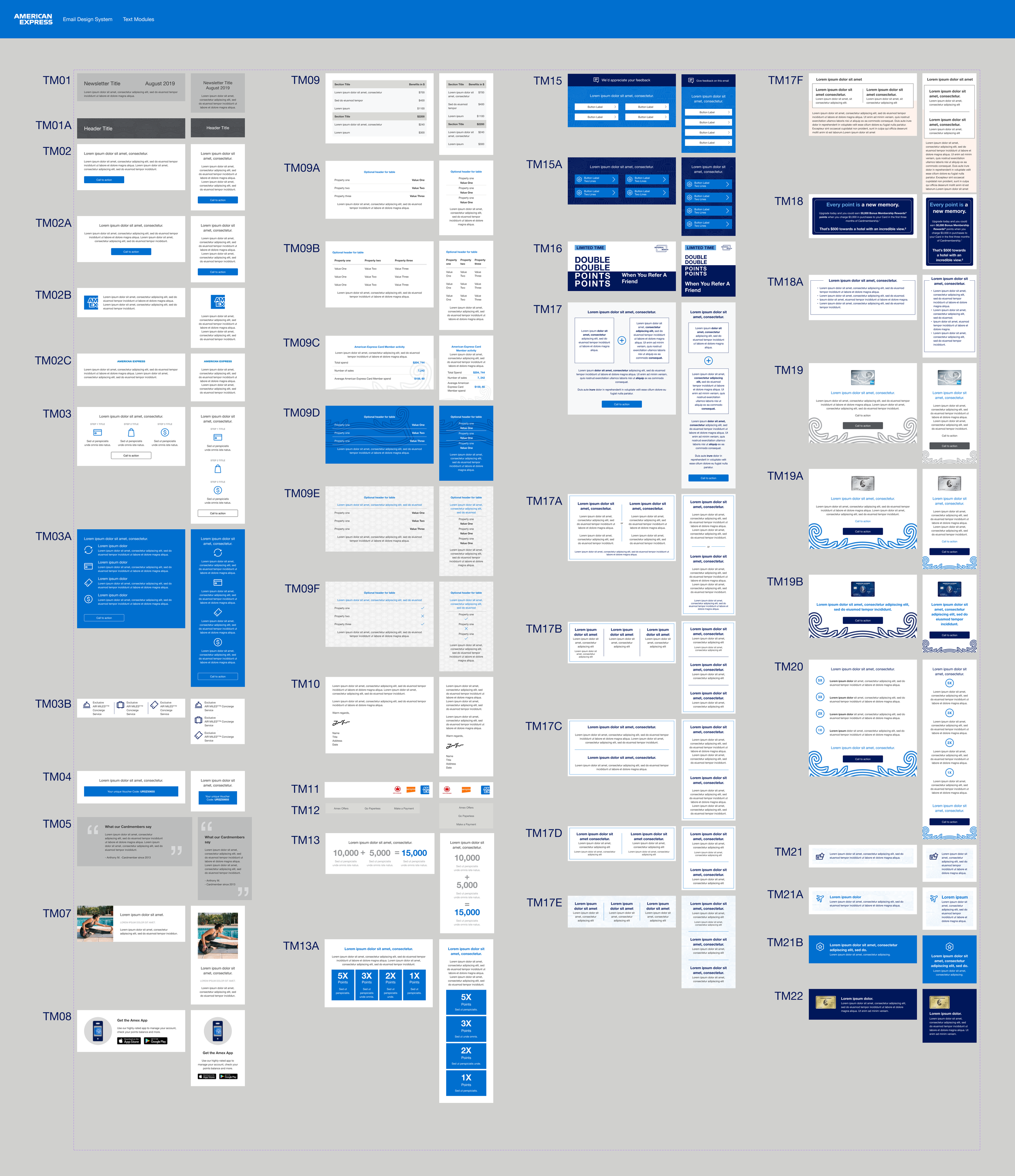
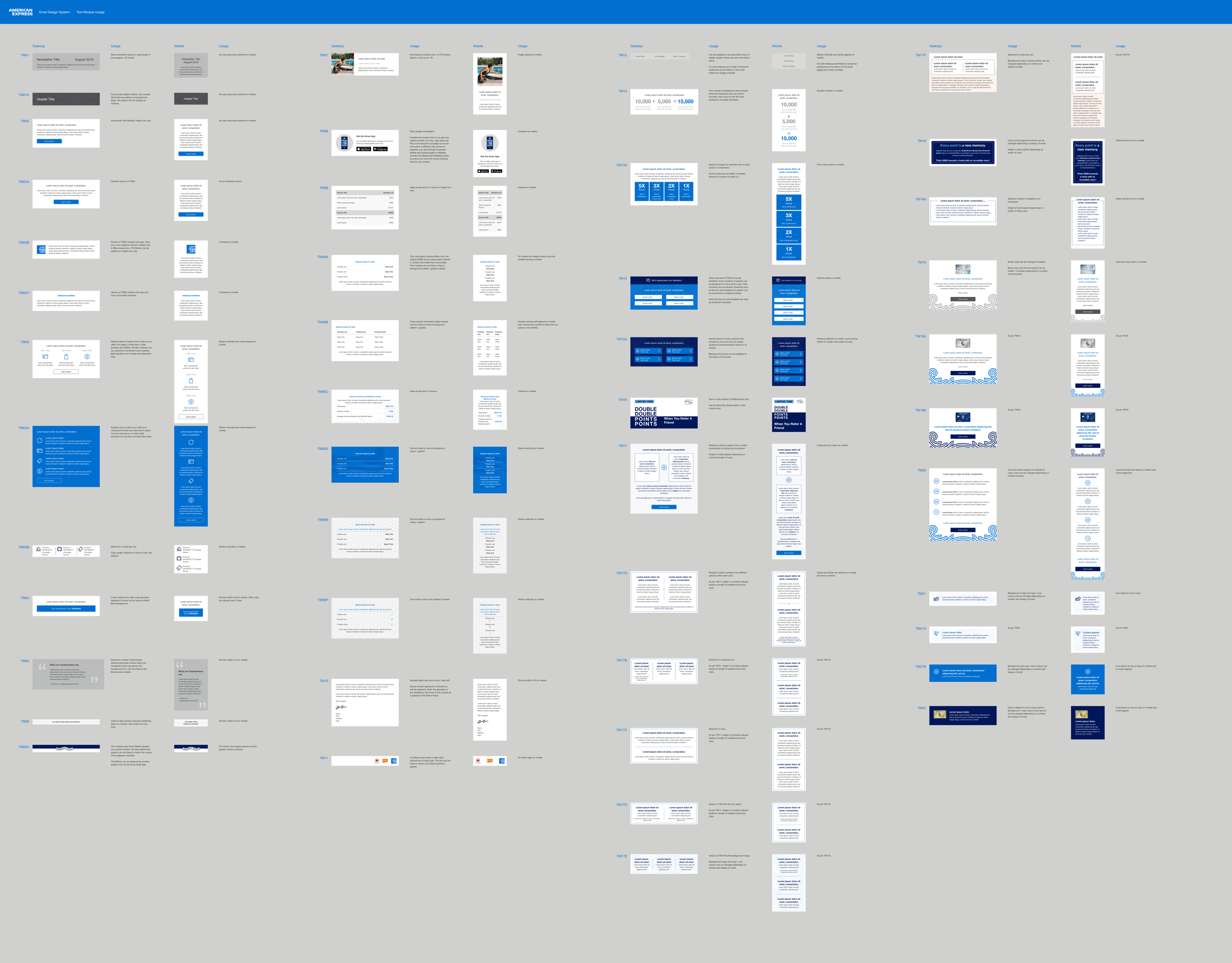
Image Modules
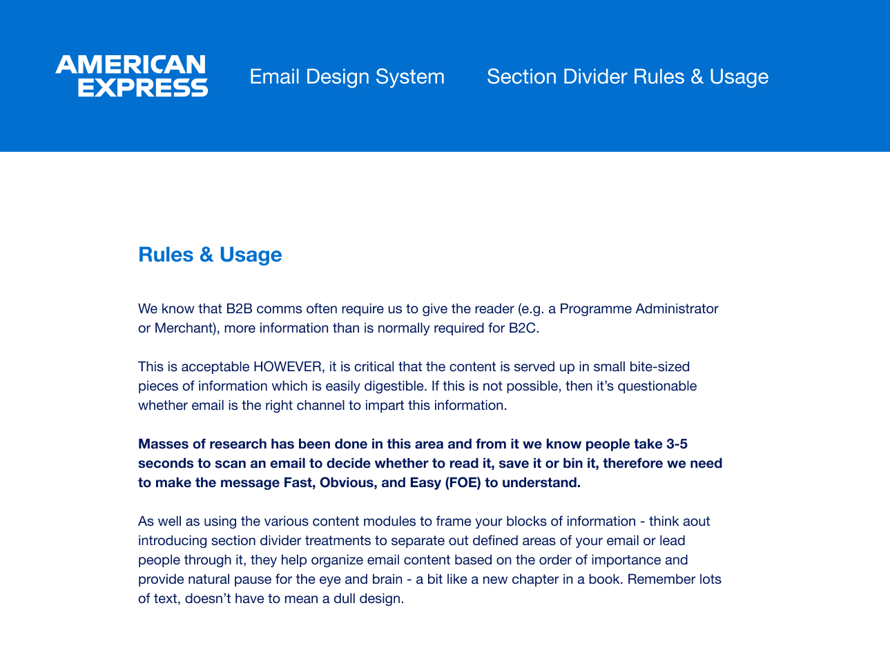
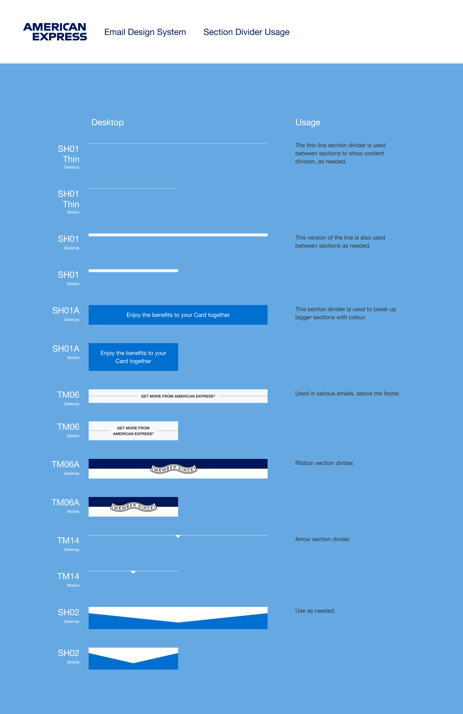
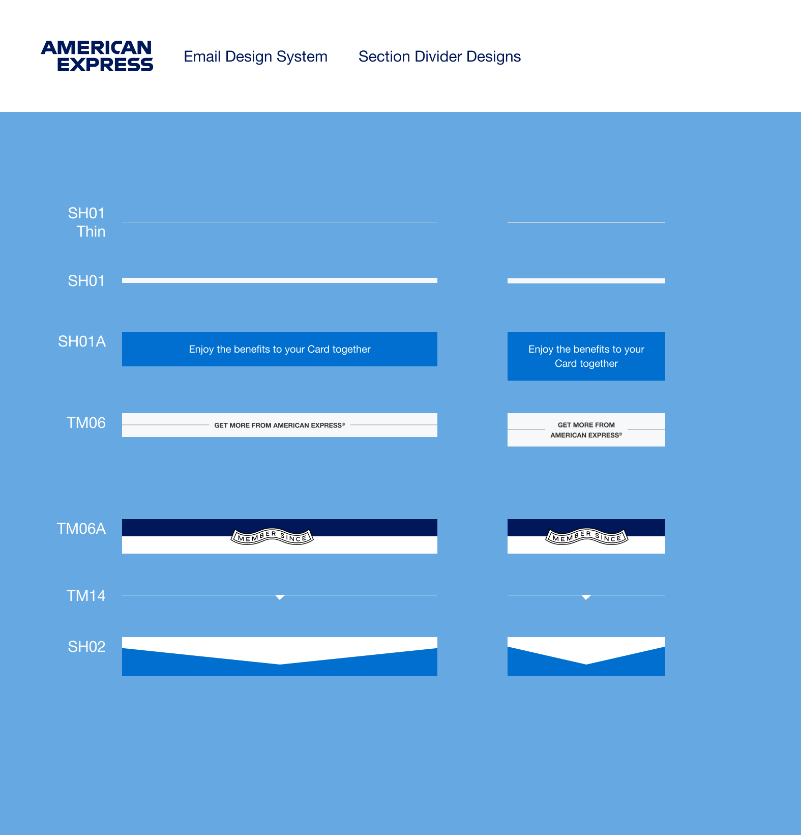
Section Dividers
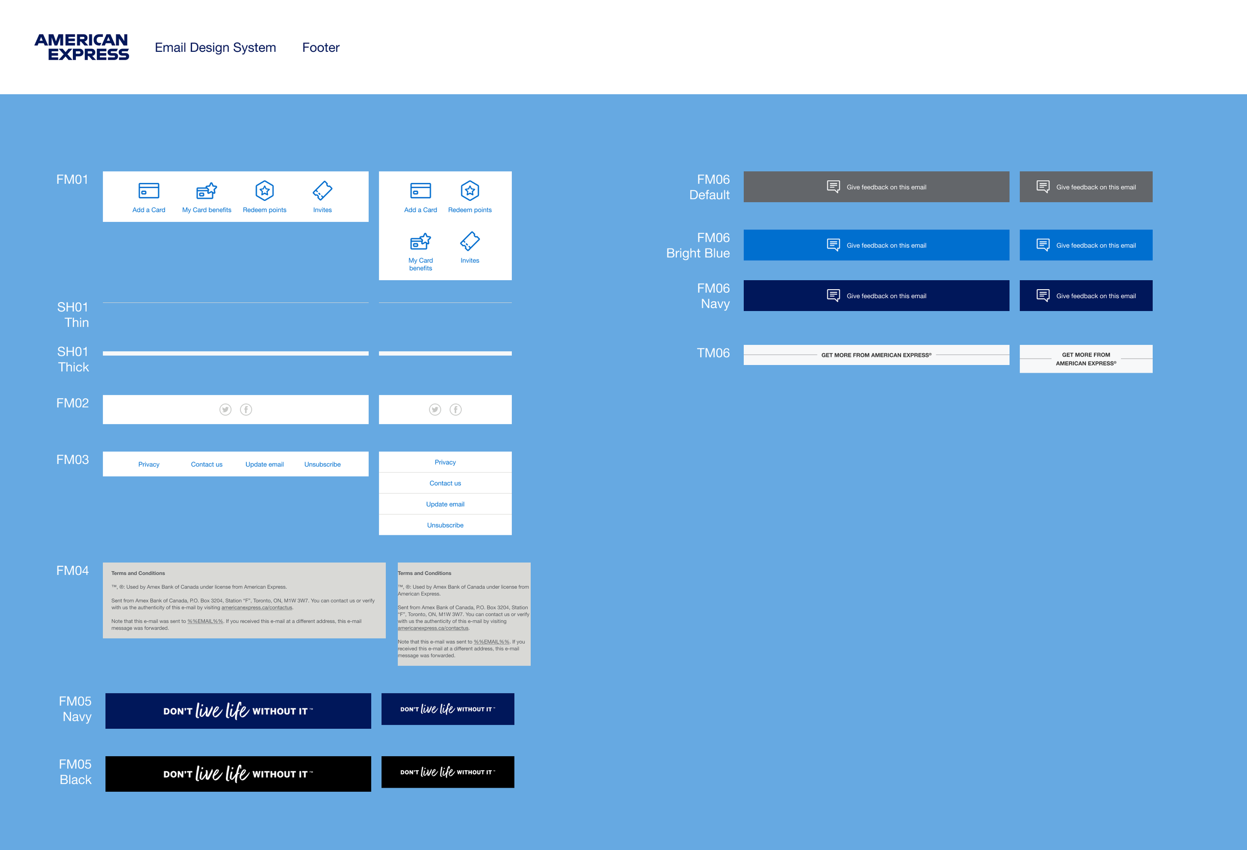
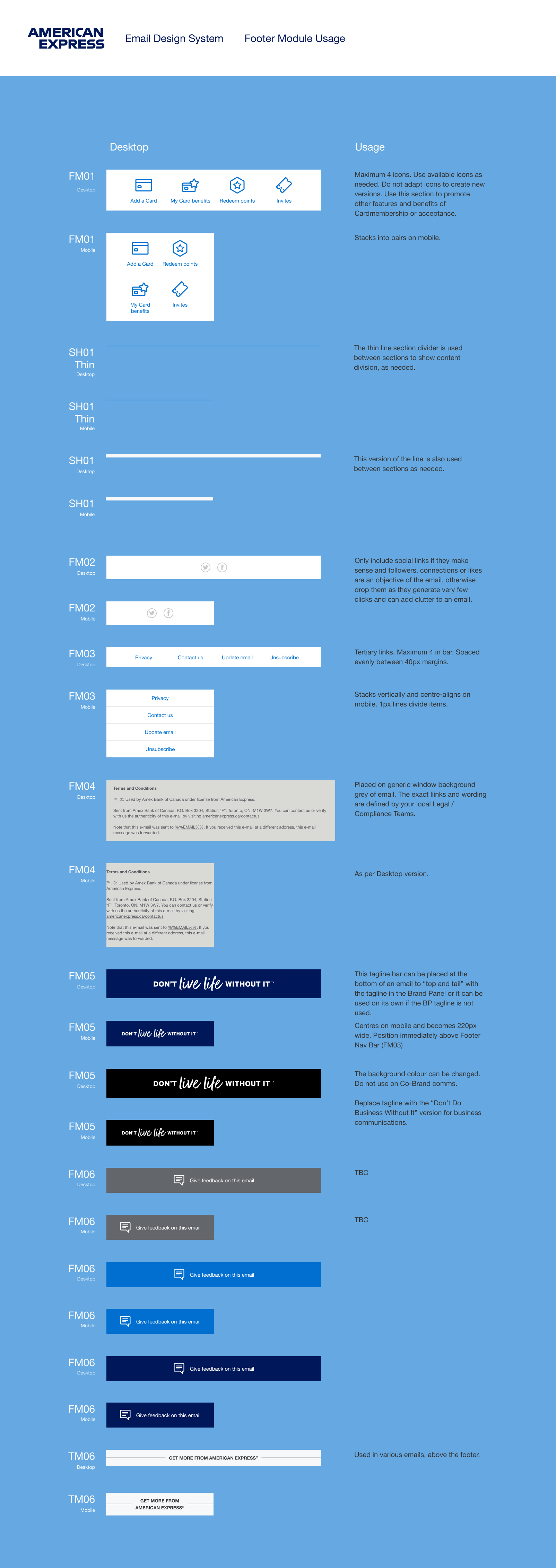
Footer Modules
Email Layouts
How To Documentation
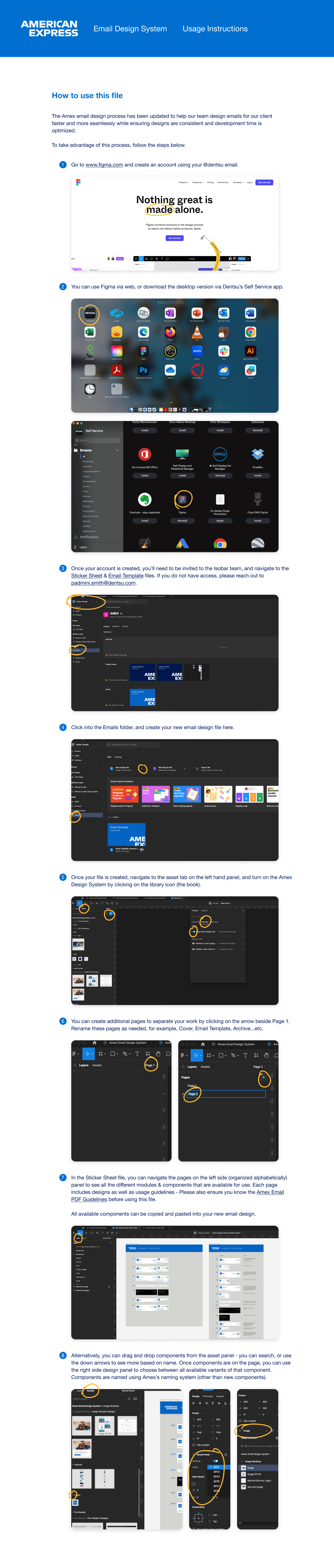
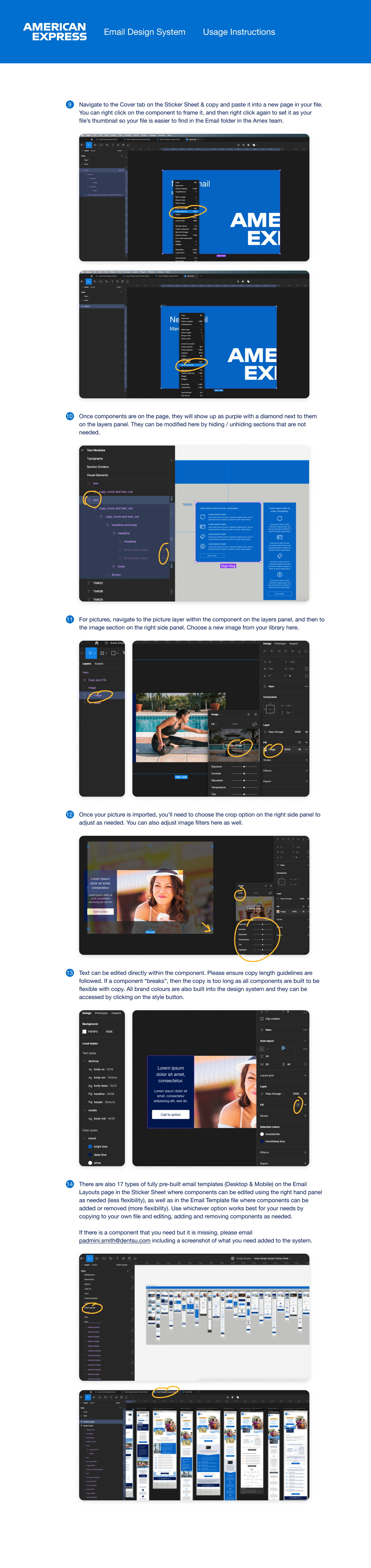
Finally, I trained our team
I set up training sessions as needed for the team (some of whom had never even used Figma) using these templates & created how to videos and presentations.
I was able to walk the team through how the templates were set up, where they could find all the styles they needed, and how they could move sections as needed, add and remove sections easily, and edit copy & images quickly so that the template would flex as they worked.
What’s next?
The first iteration of this project was built in 3 weeks, with an additional month for additional components and sections and then training & documentation.
AMEX also released updated modules that needed to be added to the system that I am currently working on. This project is ongoing as new components are added and as the team continues to use it. Team members and new designers are also always being onboarded to client work so training is always needed.